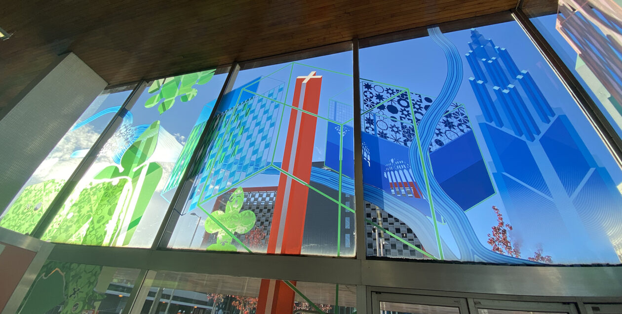
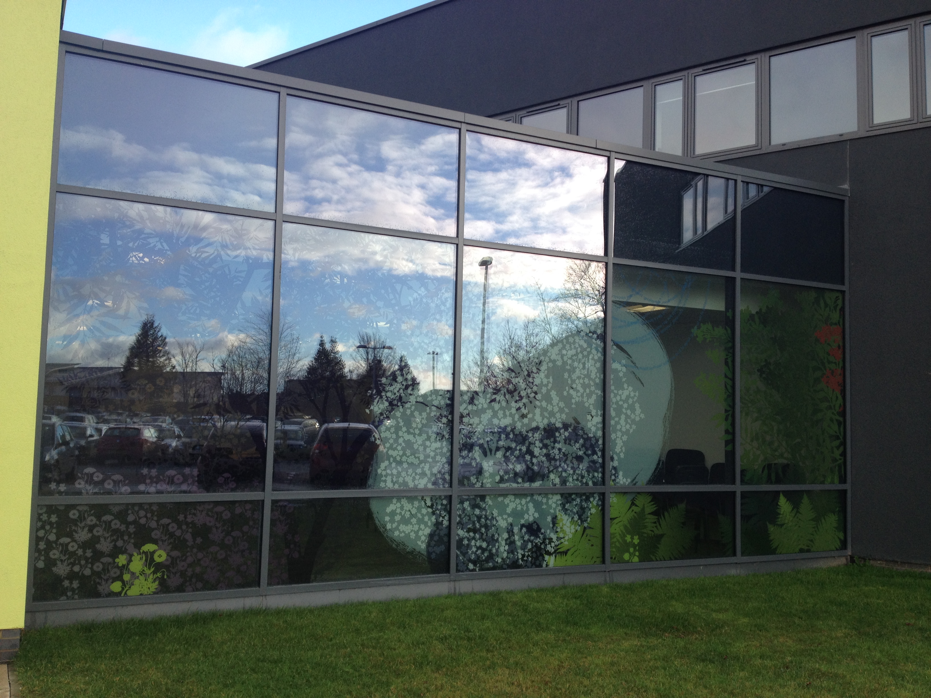
The West Elevation artwork has a great impact on the building facade.
Heart of the Campus, Sheffield Hallam University. Image: GRAHAM, Project Artist: Christopher Tipping
The rainscreen artwork was produced in collaboration with Rockpanel and The Cutting Room in Huntingdon. Project Contractors:GRAHAM – Project Architects: HLM Sheffield.
Heart of the Campus, Sheffield Hallam University. Image: GRAHAM, Project Artist: Christopher Tipping
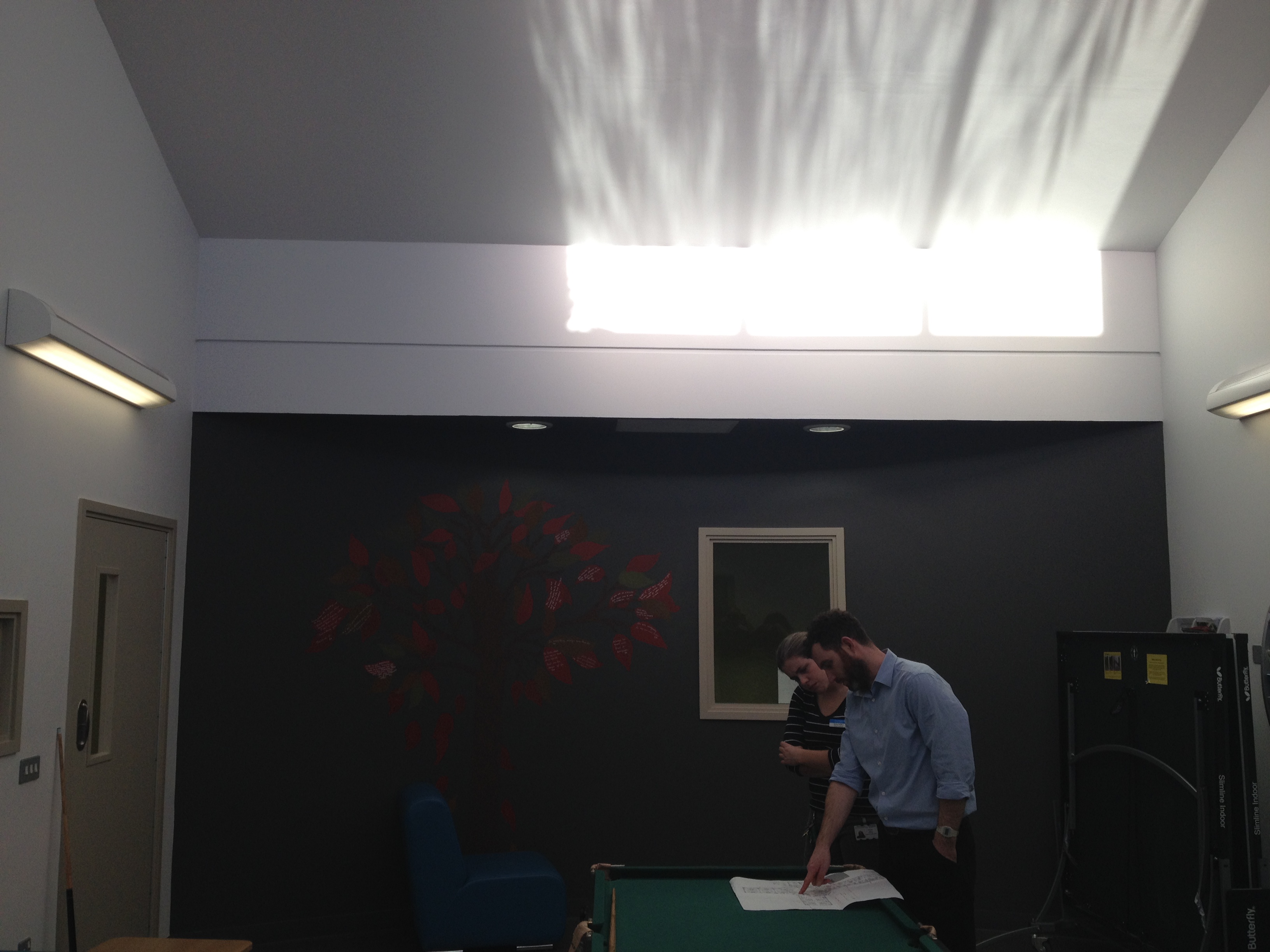
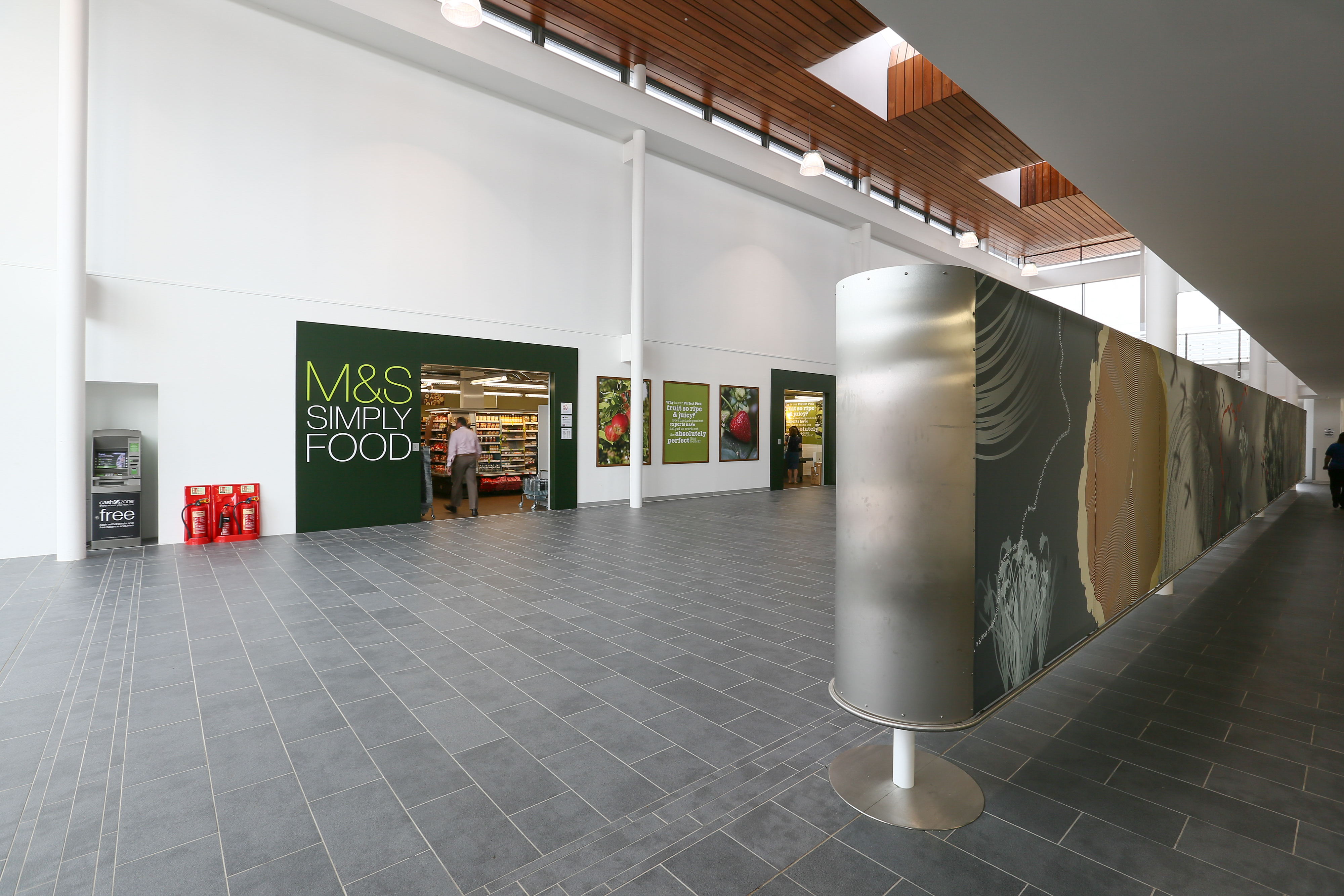
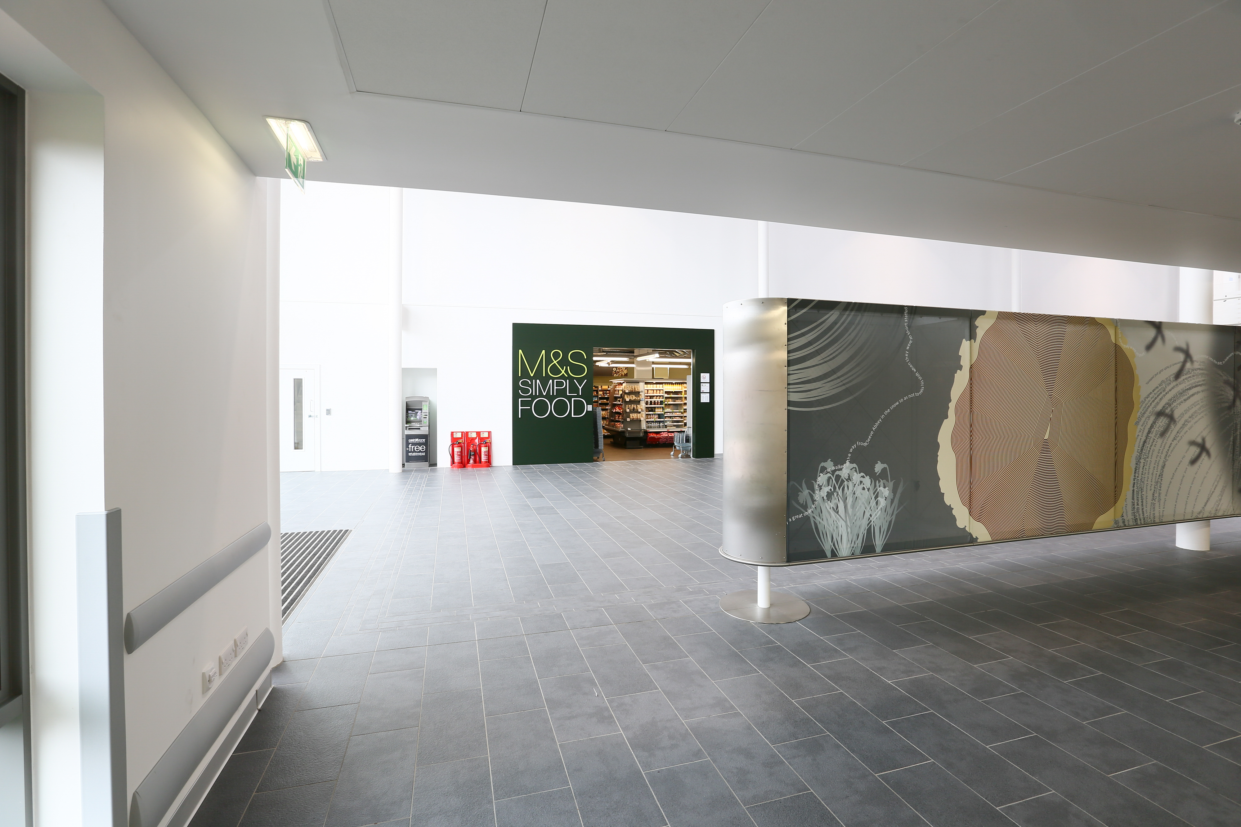
Yesterday, I travelled up to Aylesbury to discuss the possibility of being commissioned for more work for the Whiteleaf Centre, which is now open and fully operational. This is the first visit I have made since the Centre opened. Really interesting to see it animated & full of people. Tom Cox from Artcare at Oxford Health NHS Foundation Trust who commissioned all the artists for the project accompanied me around the wards and introduced my to staff who discussed with us the impact of the original artwork installations and the possibility of future collaborations with staff and service users to build upon this. Watch this space !
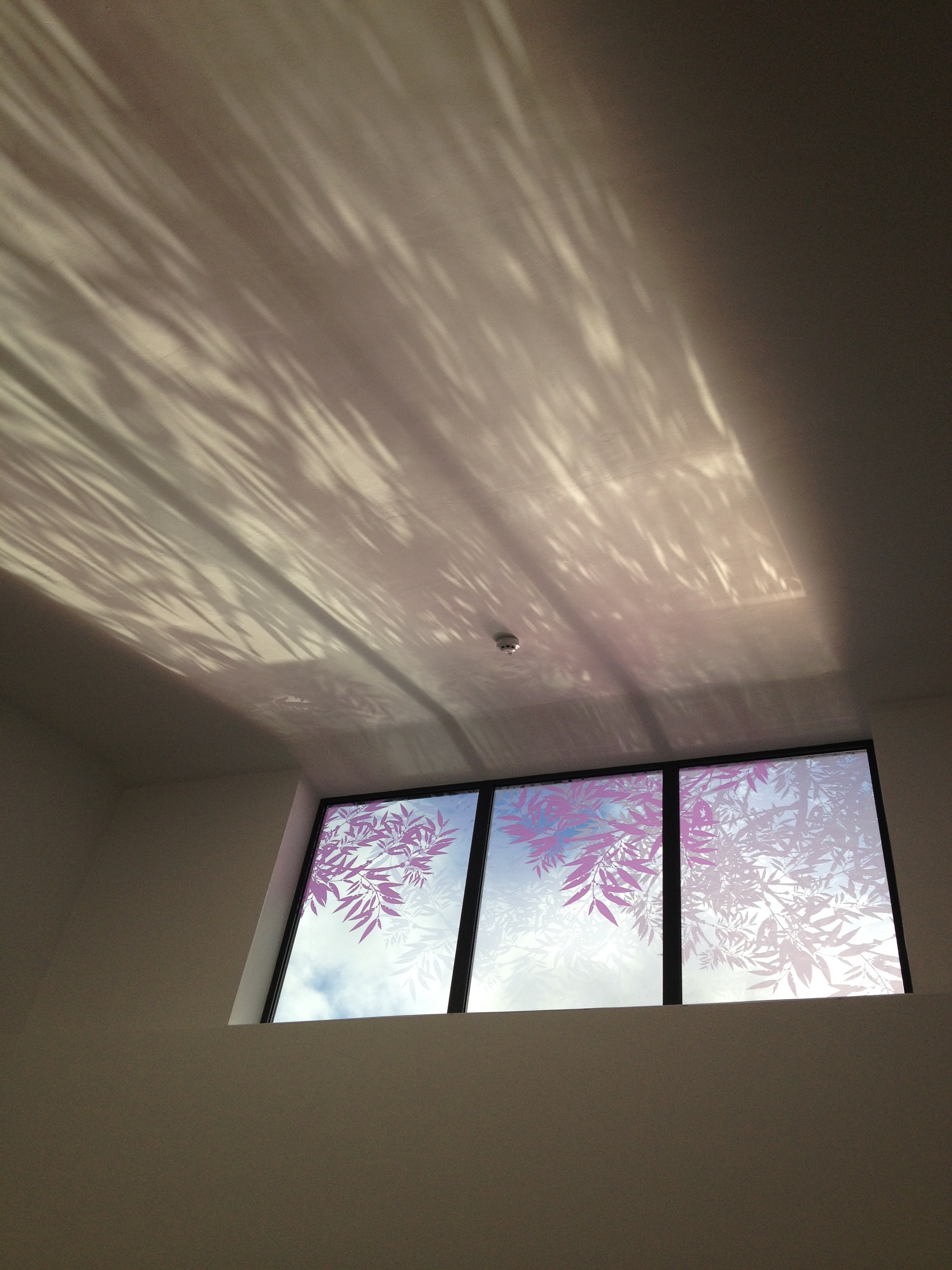
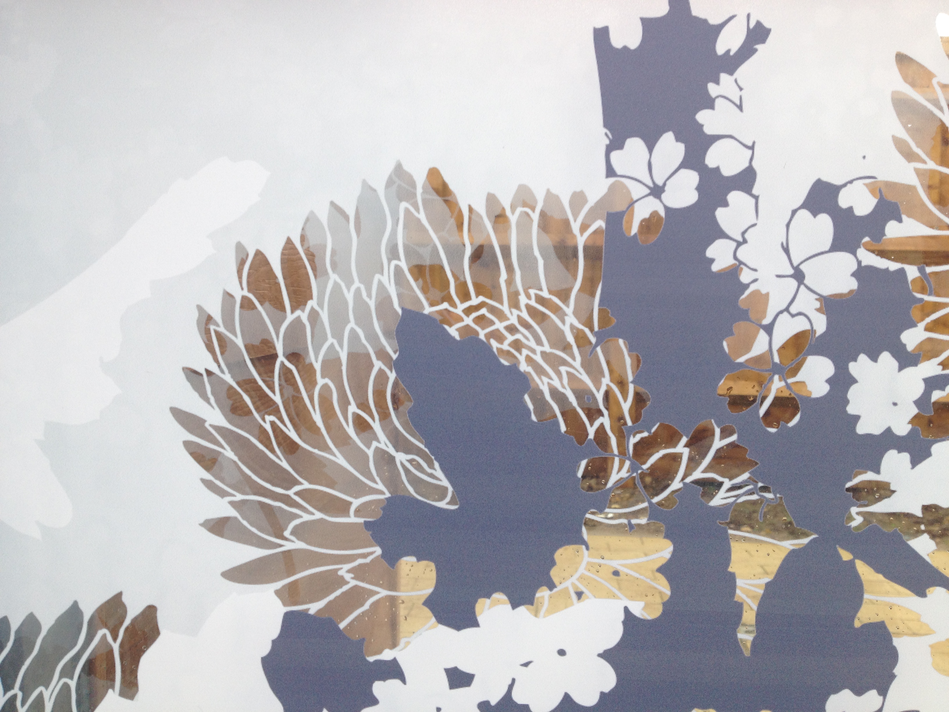
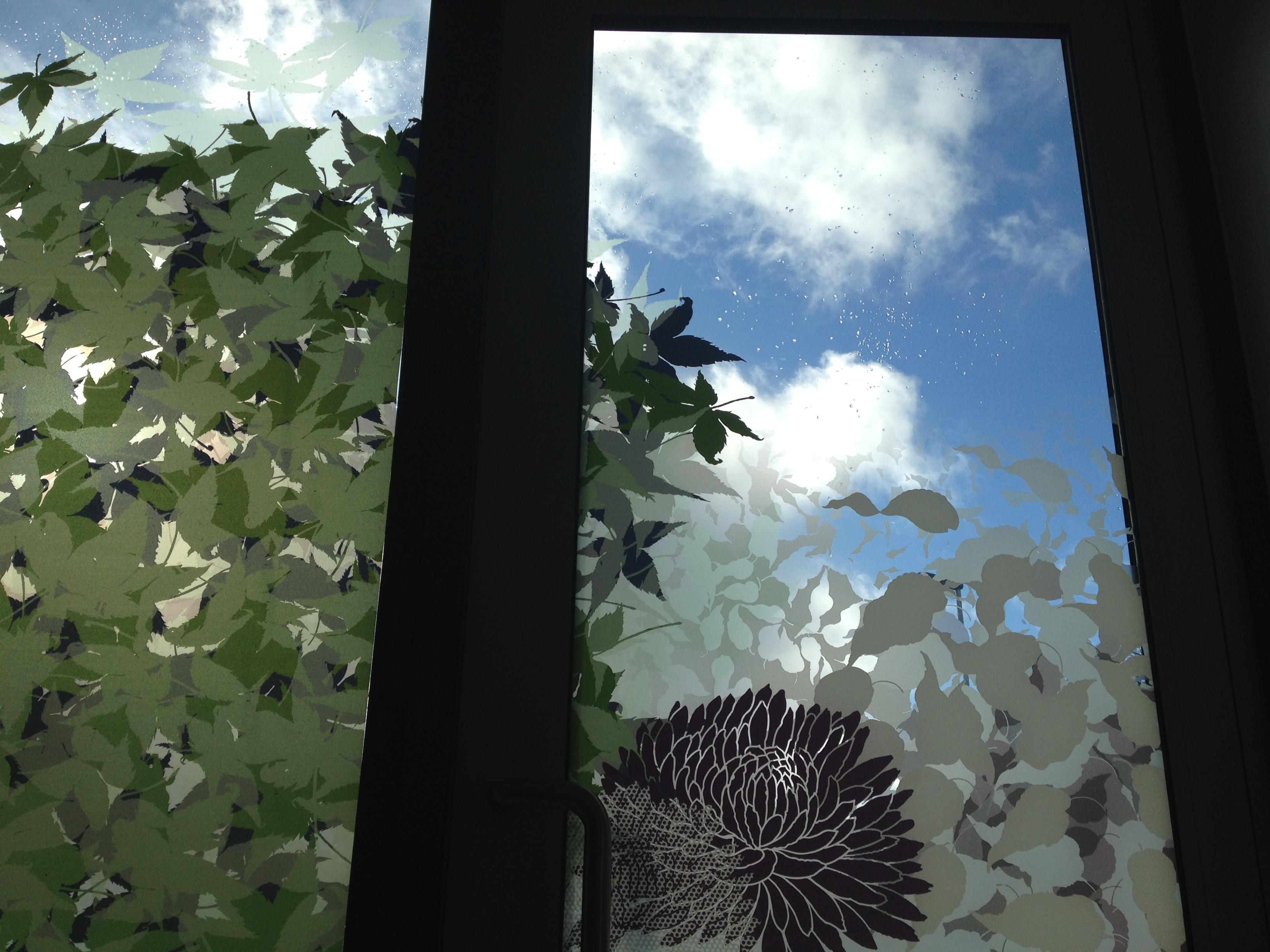
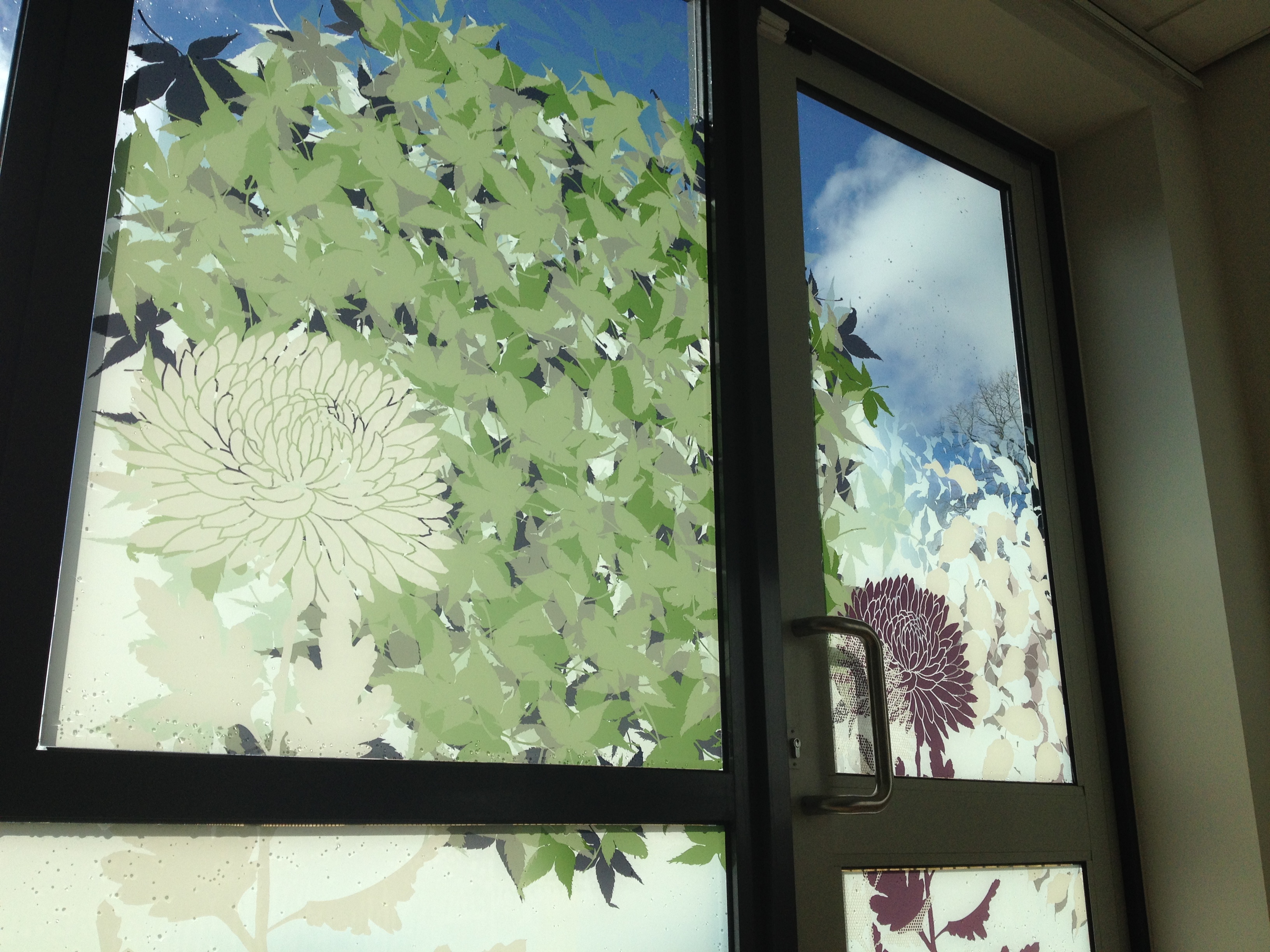
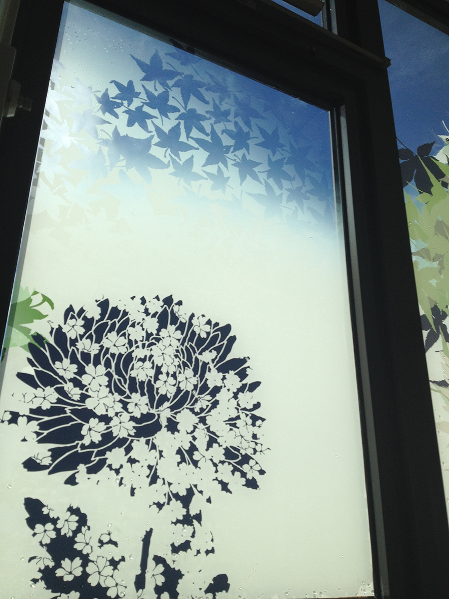
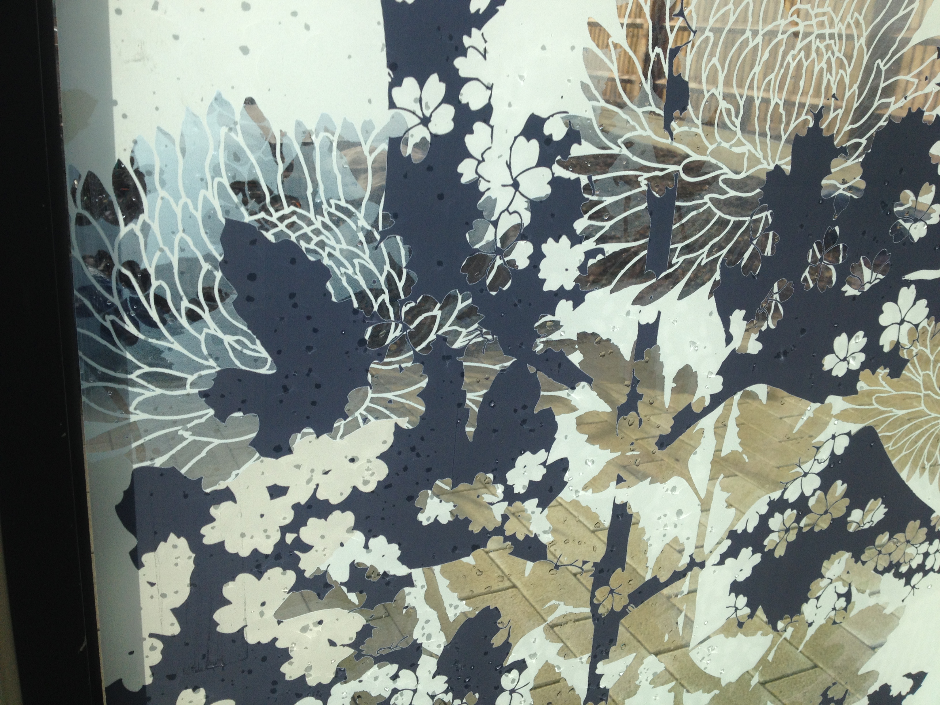
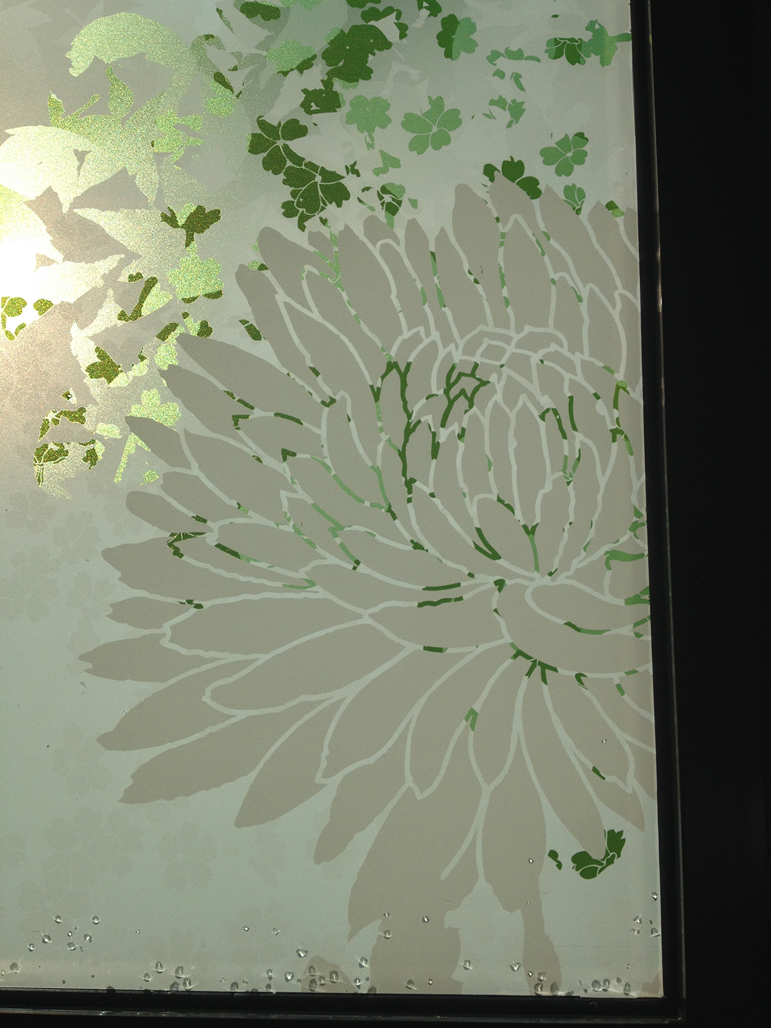
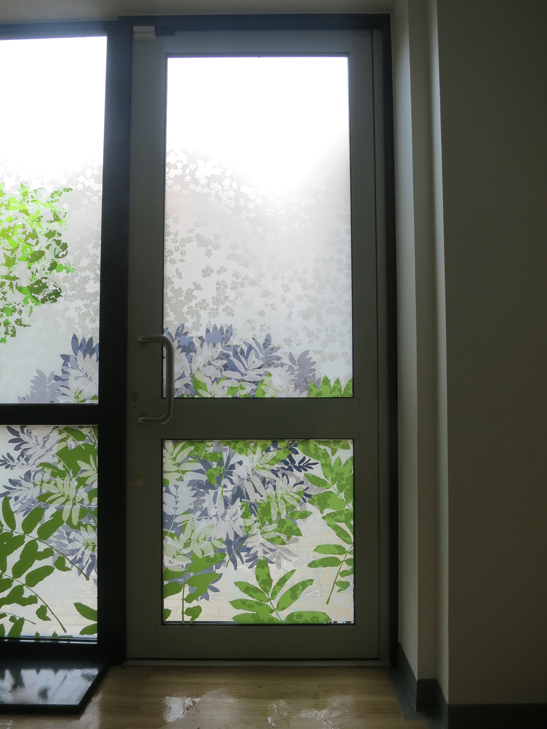
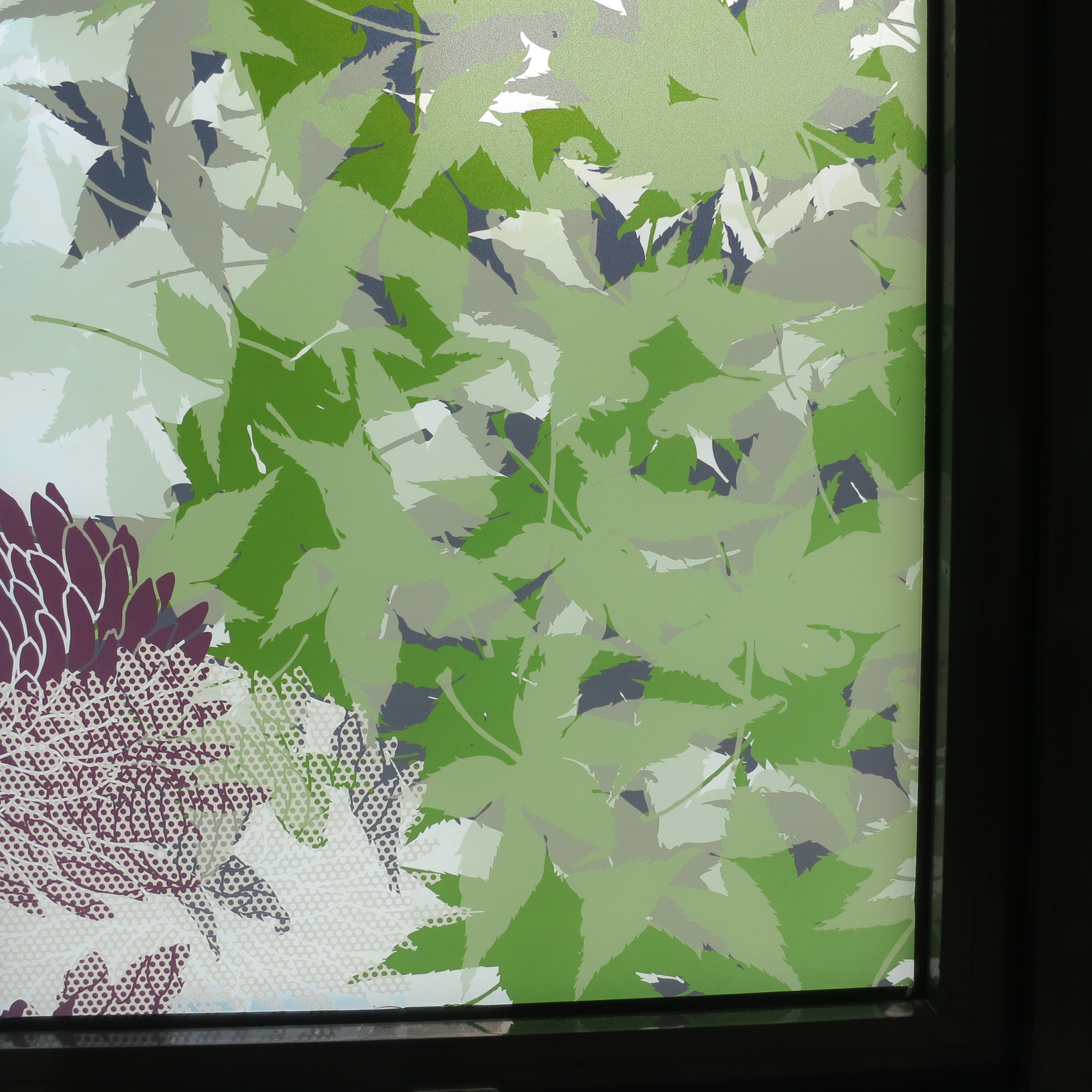
Within the ward hubs there are some high windows, which really demonstrated the effectiveness of the glazing manifestations in producing variation and change within the spaces depending on the weather.
Whiteleaf Centre, Aylesbury. Glazing manifestation by Christopher TippingWhiteleaf Centre, Aylesbury. Glazing manifestation by Christopher TippingWhiteleaf Centre, Aylesbury. Glazing manifestation by Christopher TippingWhiteleaf Centre, Aylesbury. Glazing manifestation by Christopher Tipping.Whiteleaf Centre, Aylesbury. Detail of entrance corridor glazing manifestation by Christopher Tipping.Whiteleaf Centre, Aylesbury. Detail of glazing manifestation in entrance corridor by Christopher TippingWhiteleaf Centre, Aylesbury. Detail of glazing manifestation to cafe & waiting area by Christopher TippingWhiteleaf Centre, Aylesbury. External view of large meeting room glazing manifestation by Christopher Tipping
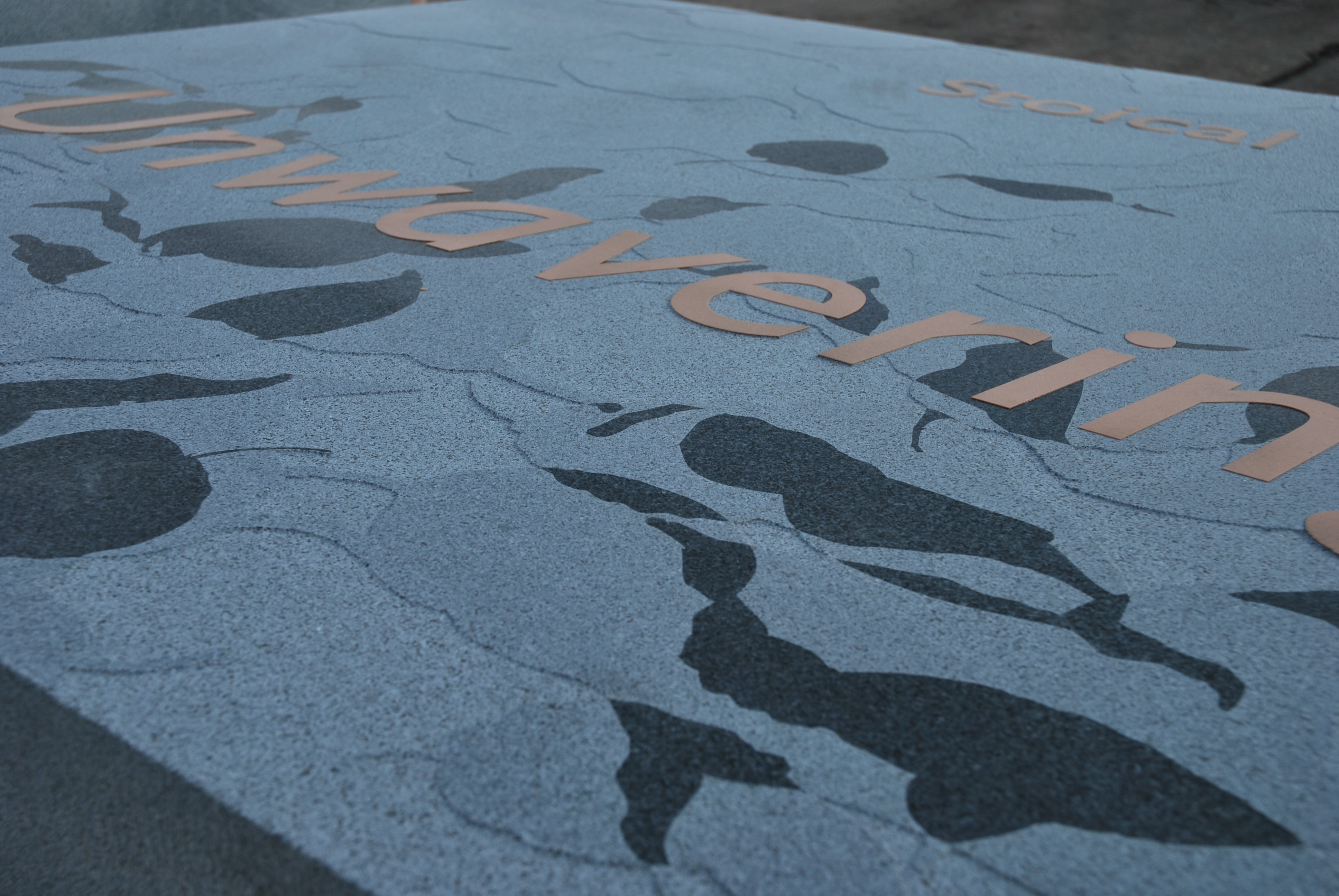
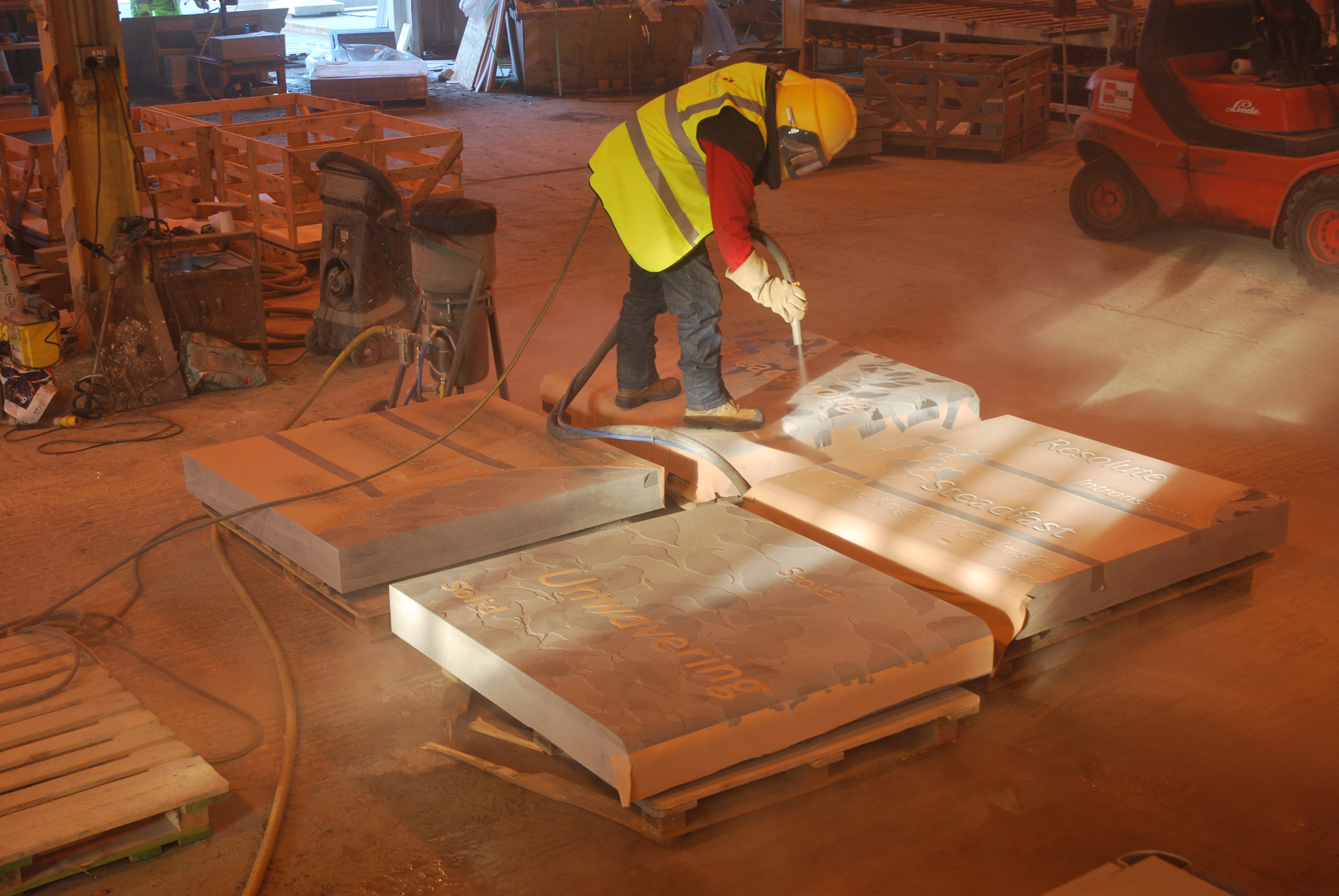
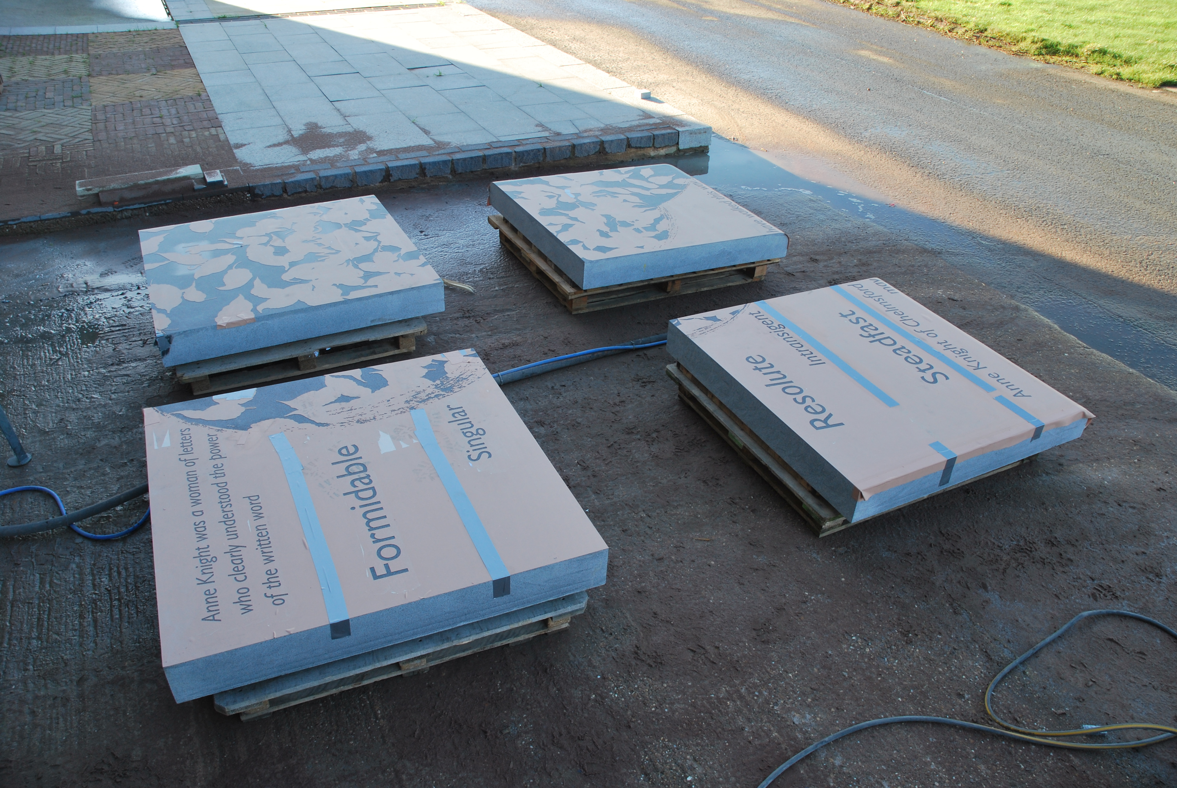
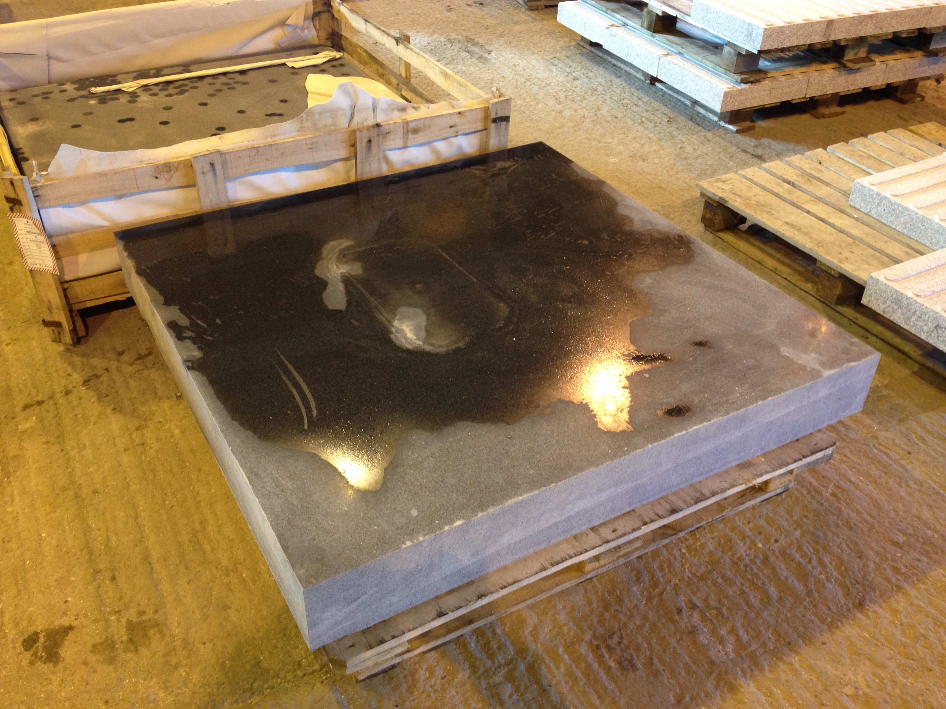
More images in today from Hardscape detailing the manufacture of the large platform seat for Central Chelmsford.
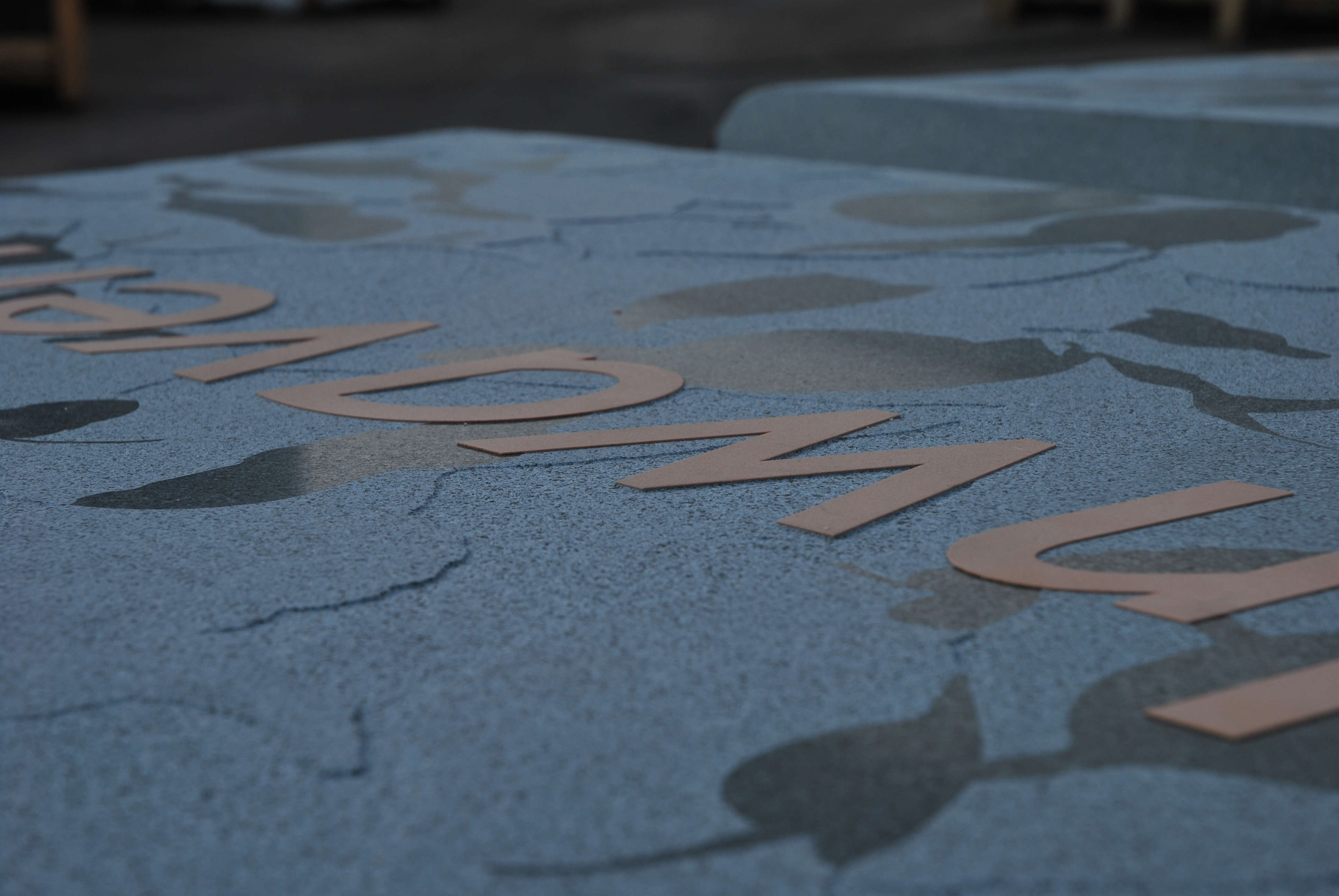
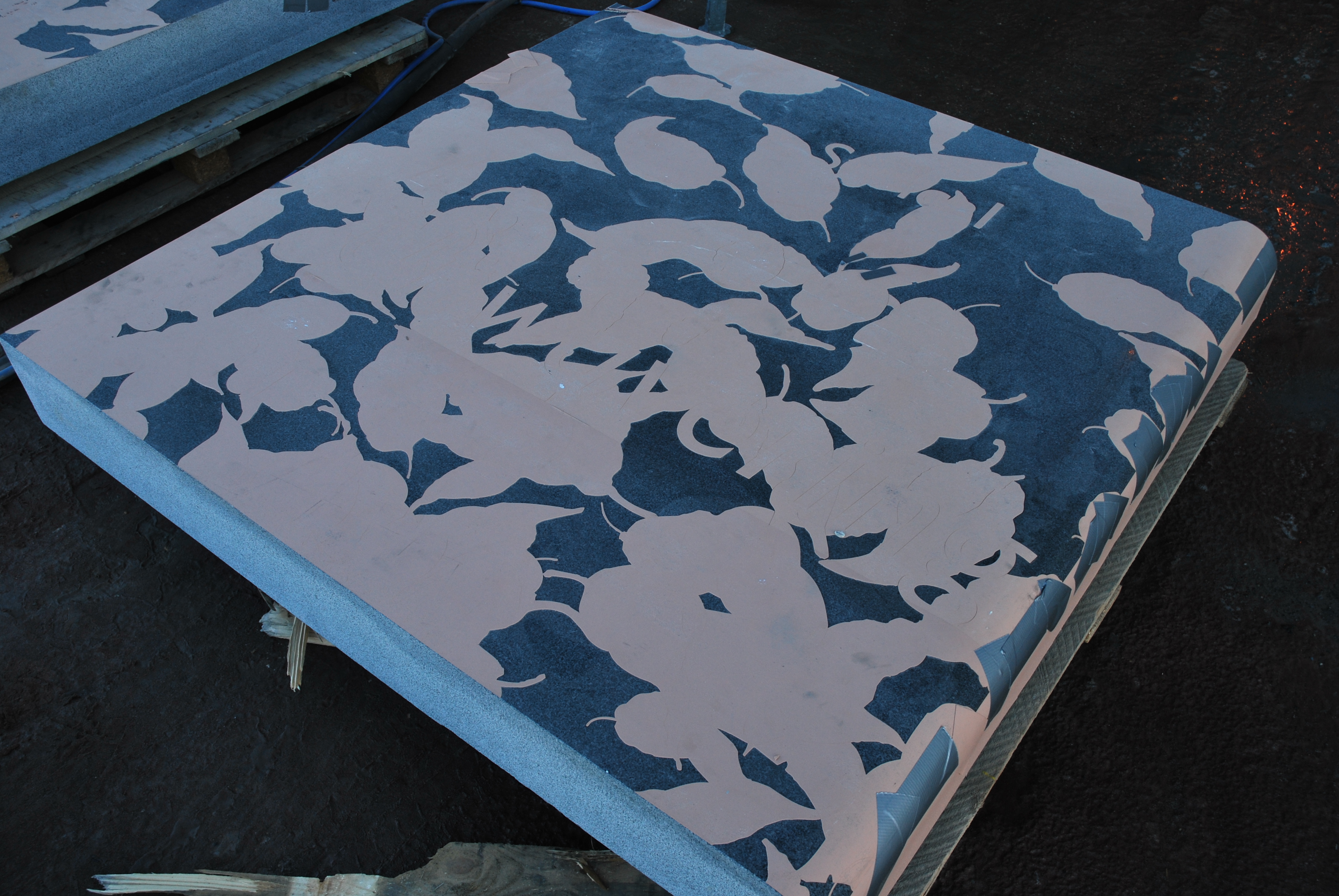
Vinyl plotted with the design is applied to the granite slab before sandblasting.AS the process continues, the vinyl is stripped away to reveal areas to be sandblasted.The process is a skilled & precise one for Vlad to undertake. The slabs cannot be moved easily, so he has to move around the work.
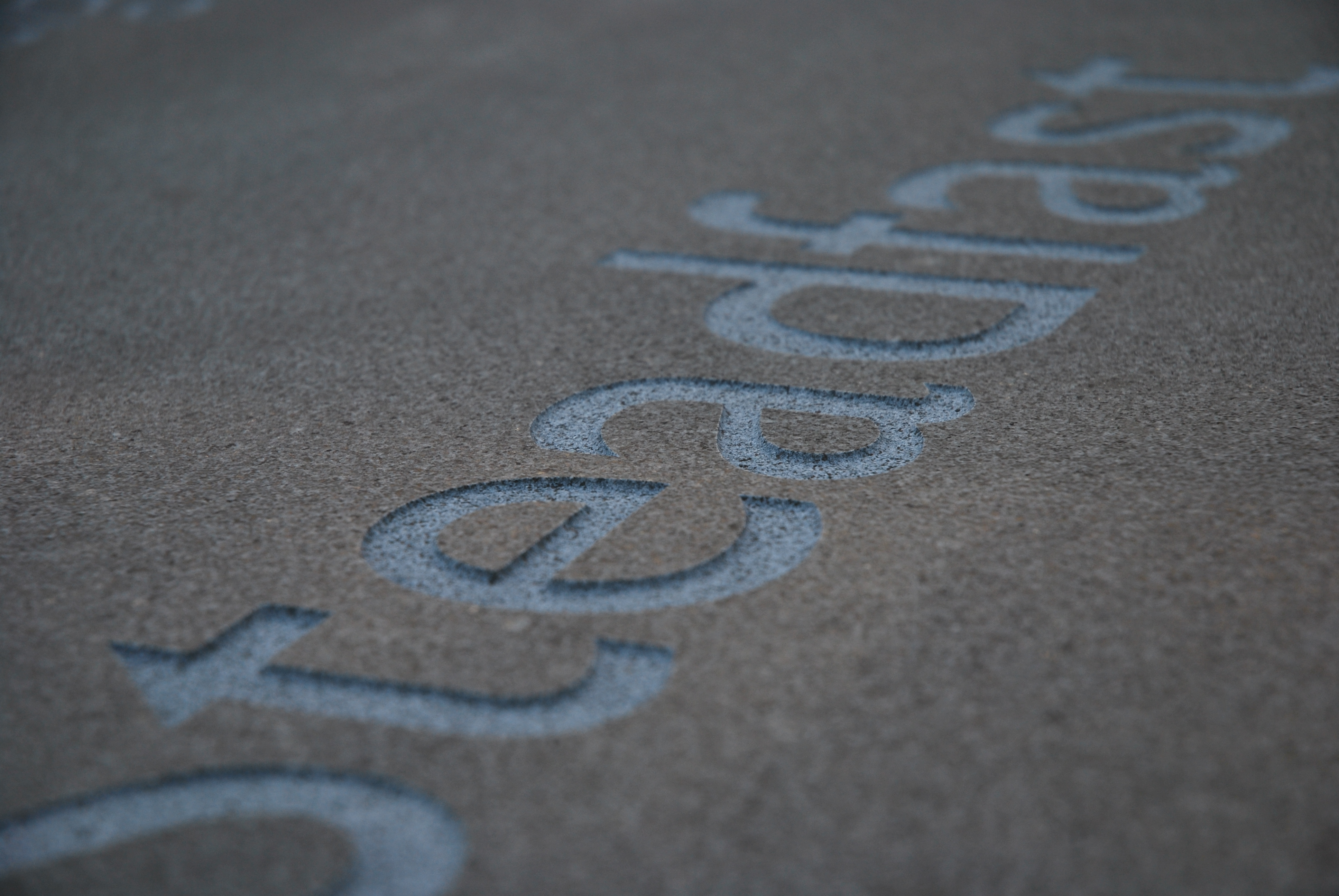
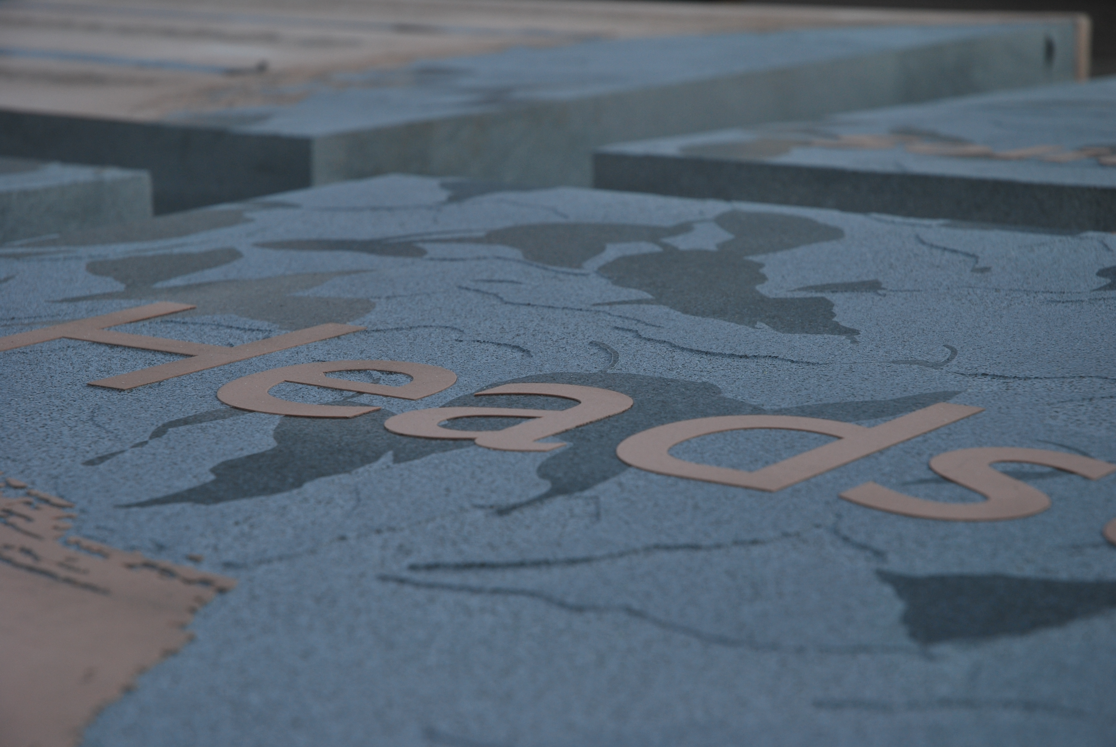
The sandblast is no more than 2mm deep across the slab. The fine honed finish on the surface will be retained under the vinyl which still covers the letters.
The fine work is excellent. All the vinyl stencil which has been plotted and cut has to be weeded out by hand for sandblasting.The four granite slabs which make up the large platform seat awaiting more sandblasting outside.
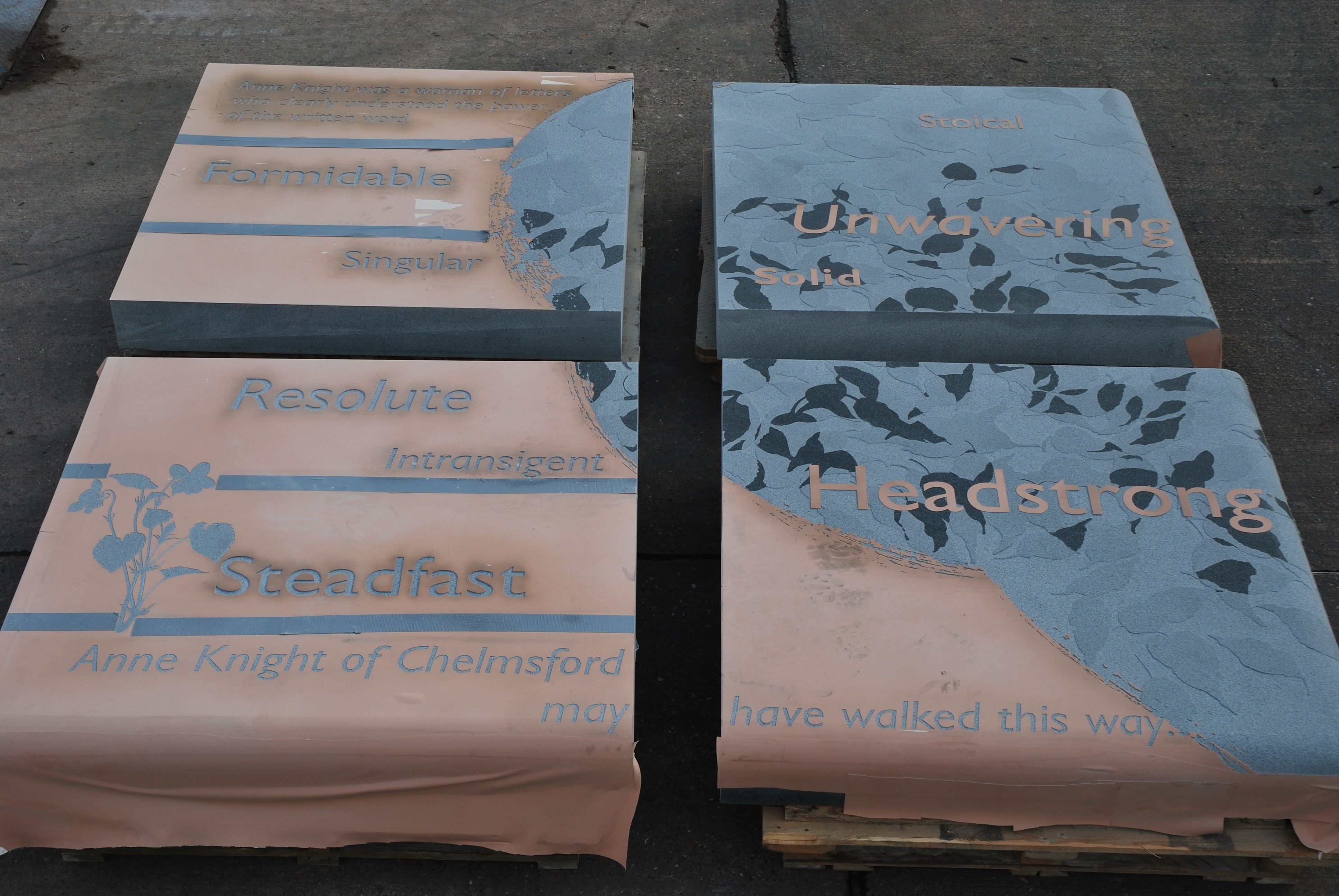
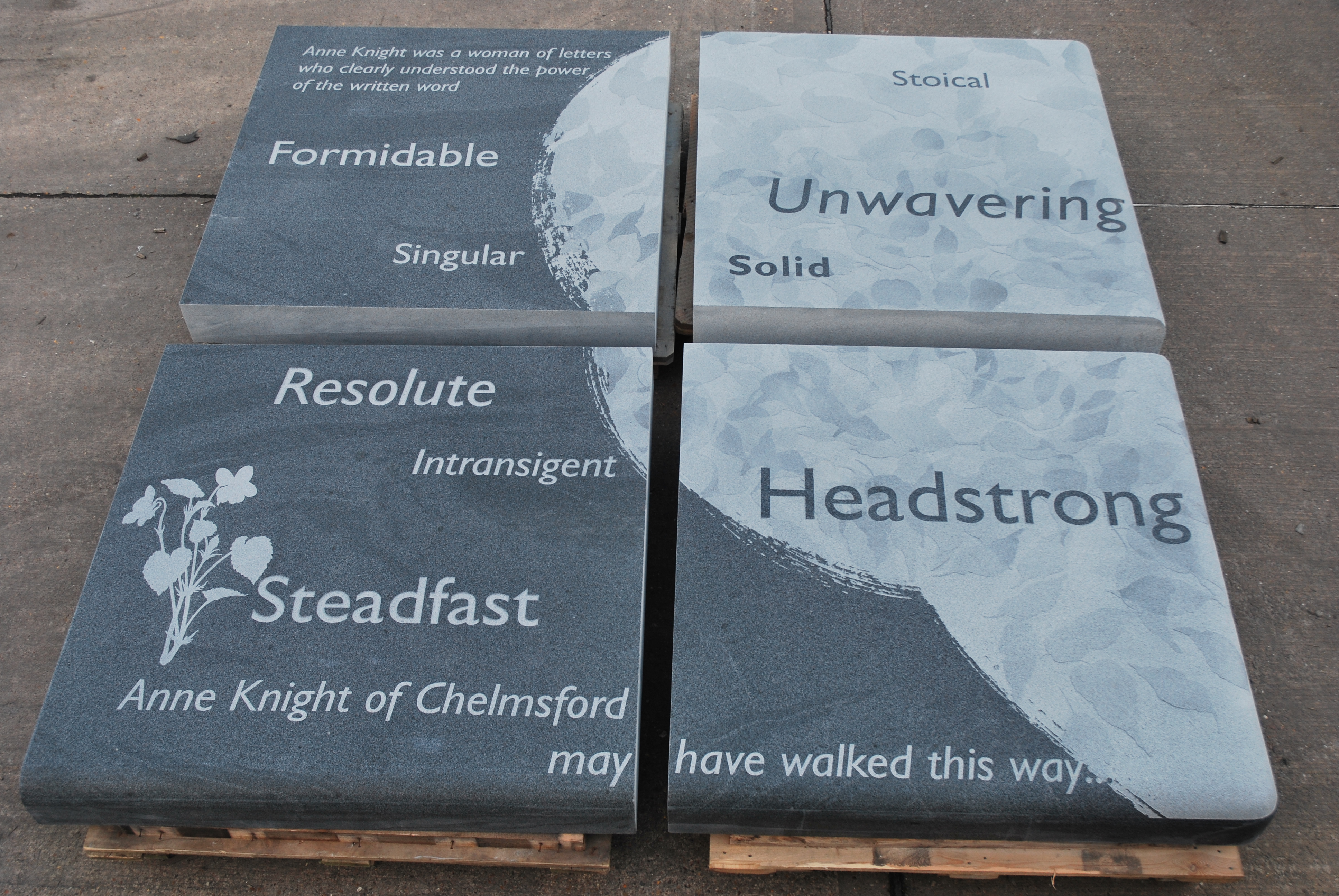
Granite slabs completed. When wet the granite will become almost uniformly dark. As the surface dries, the images and text will begin to reveal themselves. The areas with no sandblasting or shallow detail will dry out first.
We have now agreed on which artworks will be delivered as A1 framed prints for the Trust Offices –
Draft Print 1 – The design was used for the Entrance Corridor glazed screen. It will be paired with Draft Print 2
Draft Print 2 – The design was used for Ward A . It will be paired with Draft Print 1
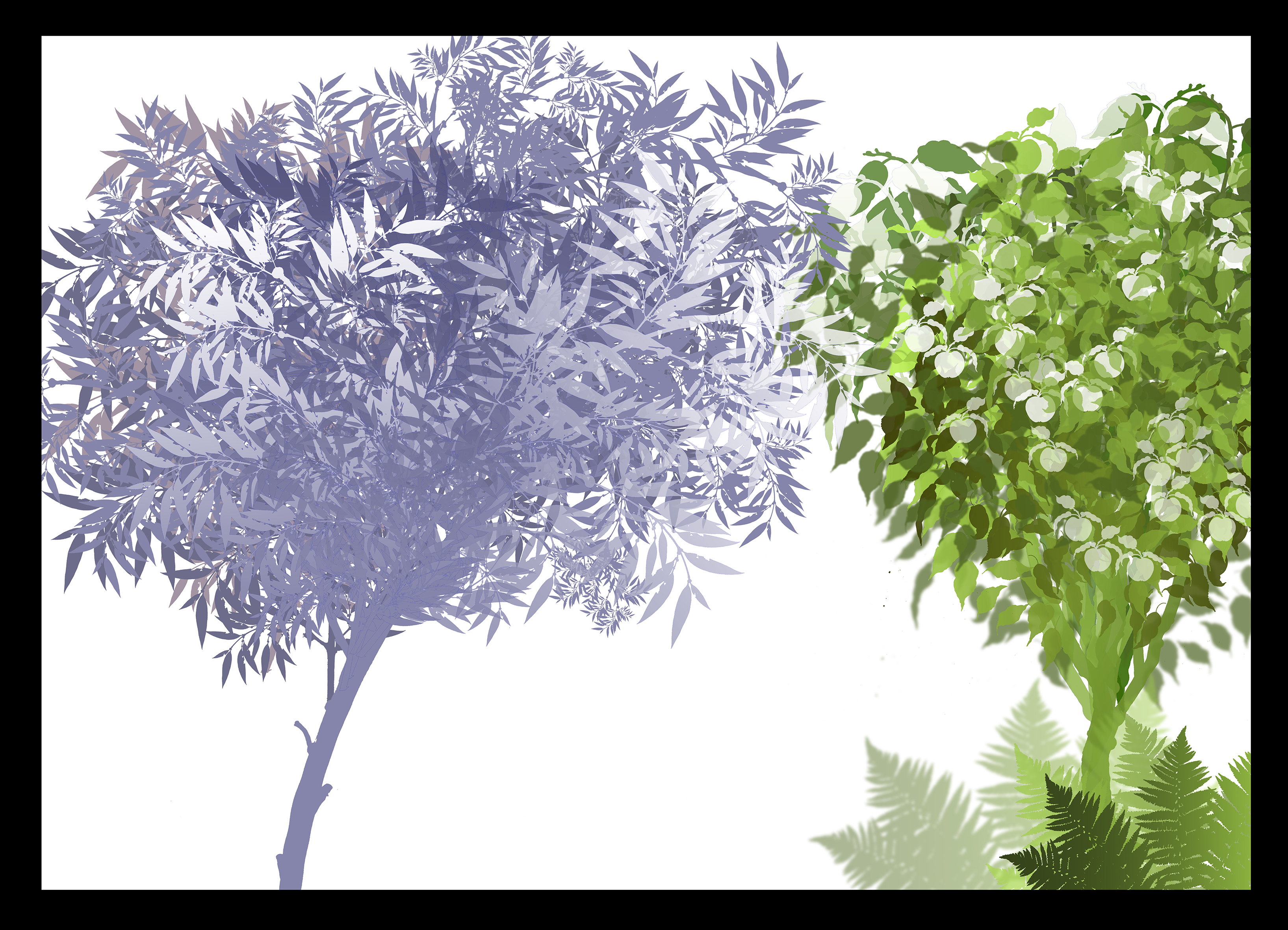
Draft Print 3 – Each tree design was used for the Large Meeting Room. It will be paired with Draft Print 4Draft Print 4 – Each tree design was used in Ward Hubs B & C. Both trees will be paired with Draft Print 3
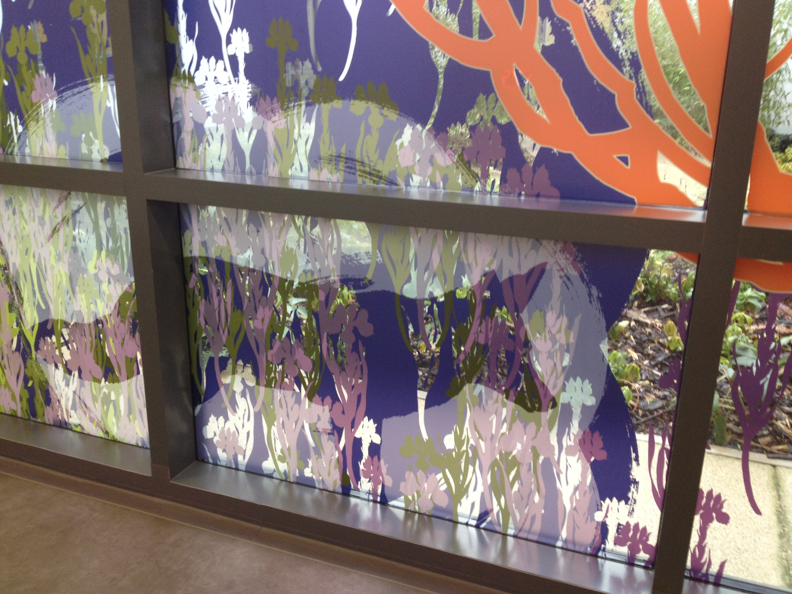
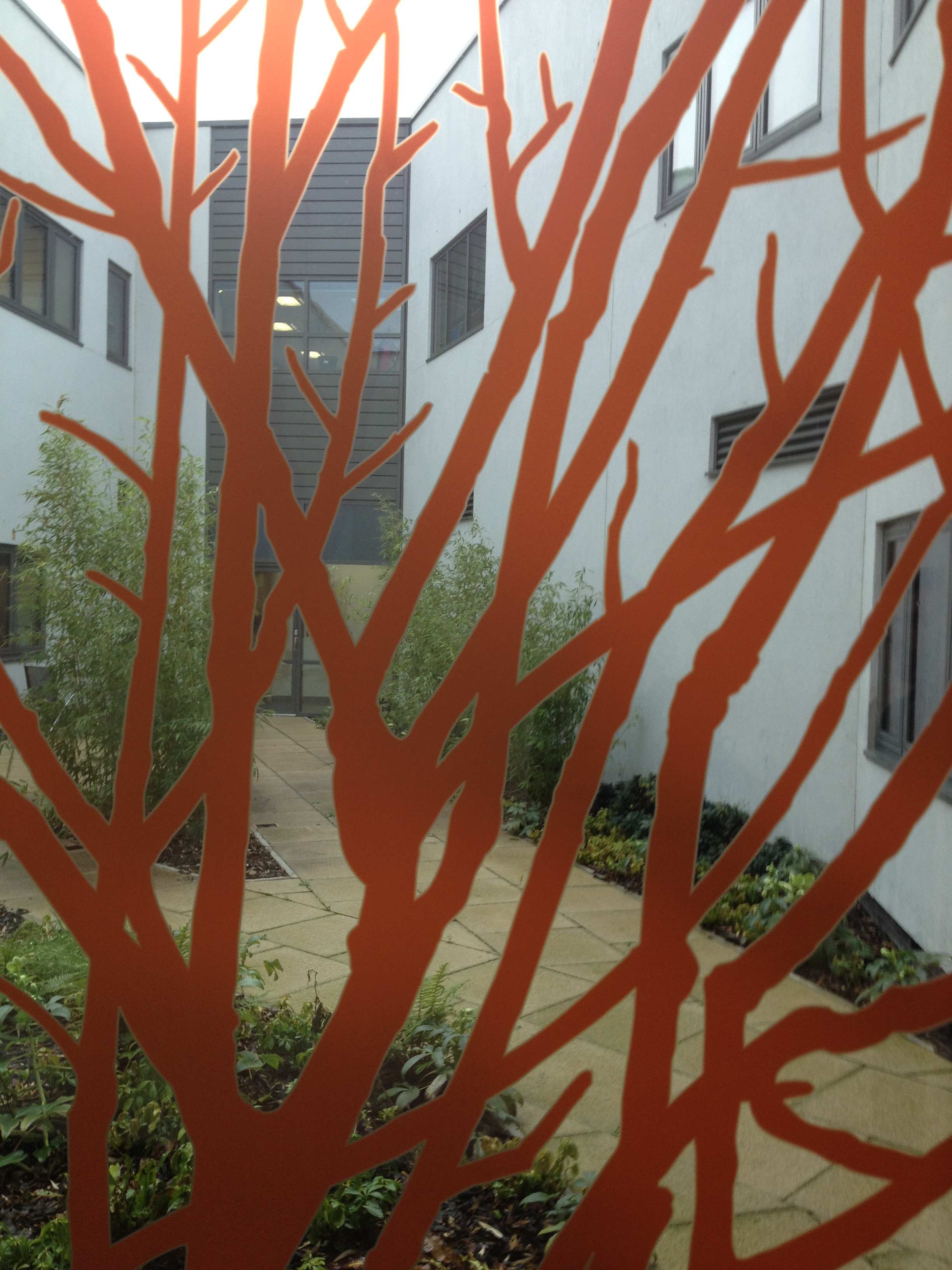
Draft – Street Trees 1. Image Christopher TippingDraft artwork for Whiteleaf Centre Glazed Screens. Christopher TippingWhiteleaf Centre, Aylesbury. Draft artwork for glazed screens. Christopher TippingWhiteleaf Centre, Aylesbury. Draft artwork for glazed screens Christopher TippingWhiteleaf Centre, Aylesbury. Draft artwork for glazed screens Christopher Tipping
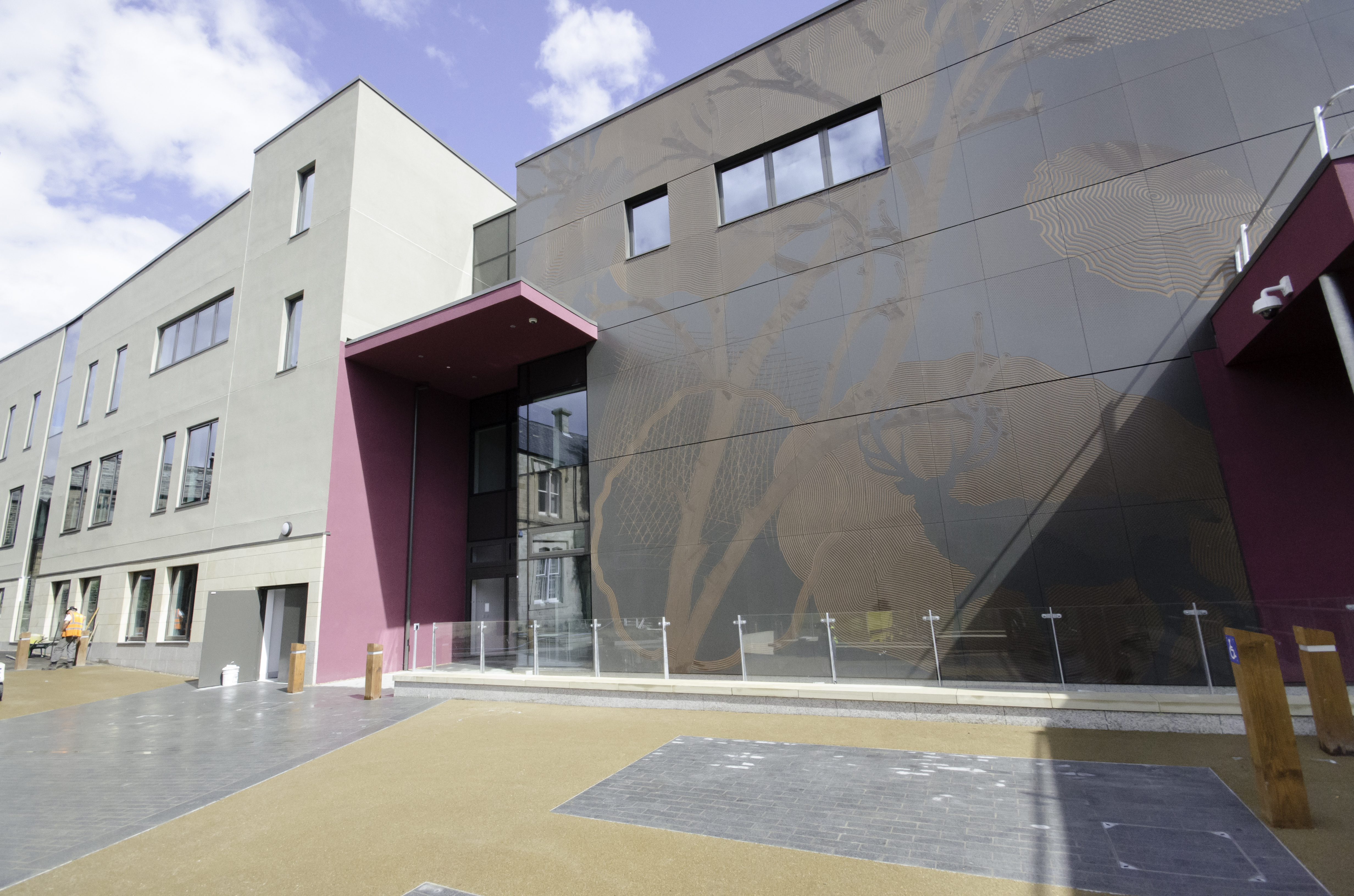
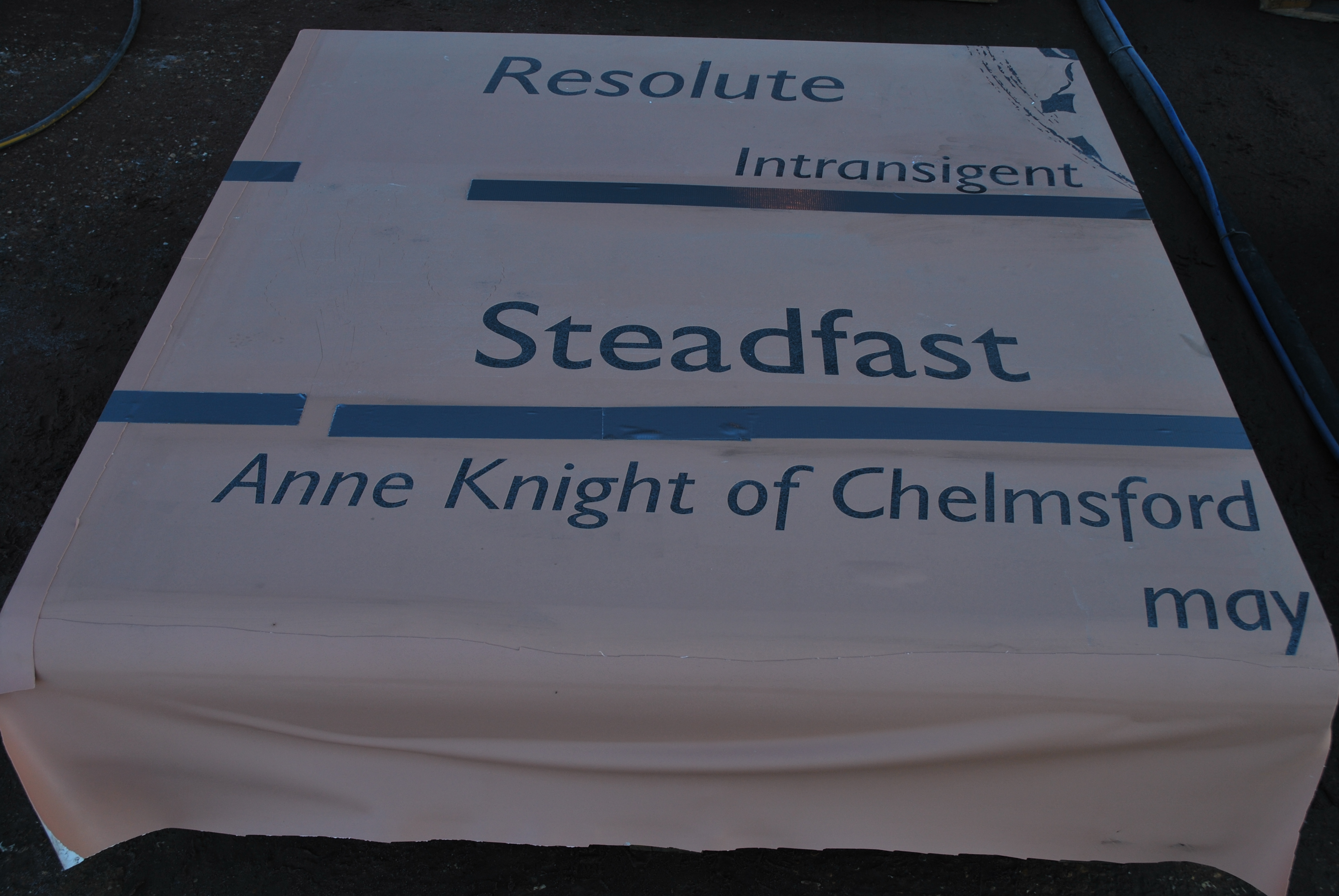
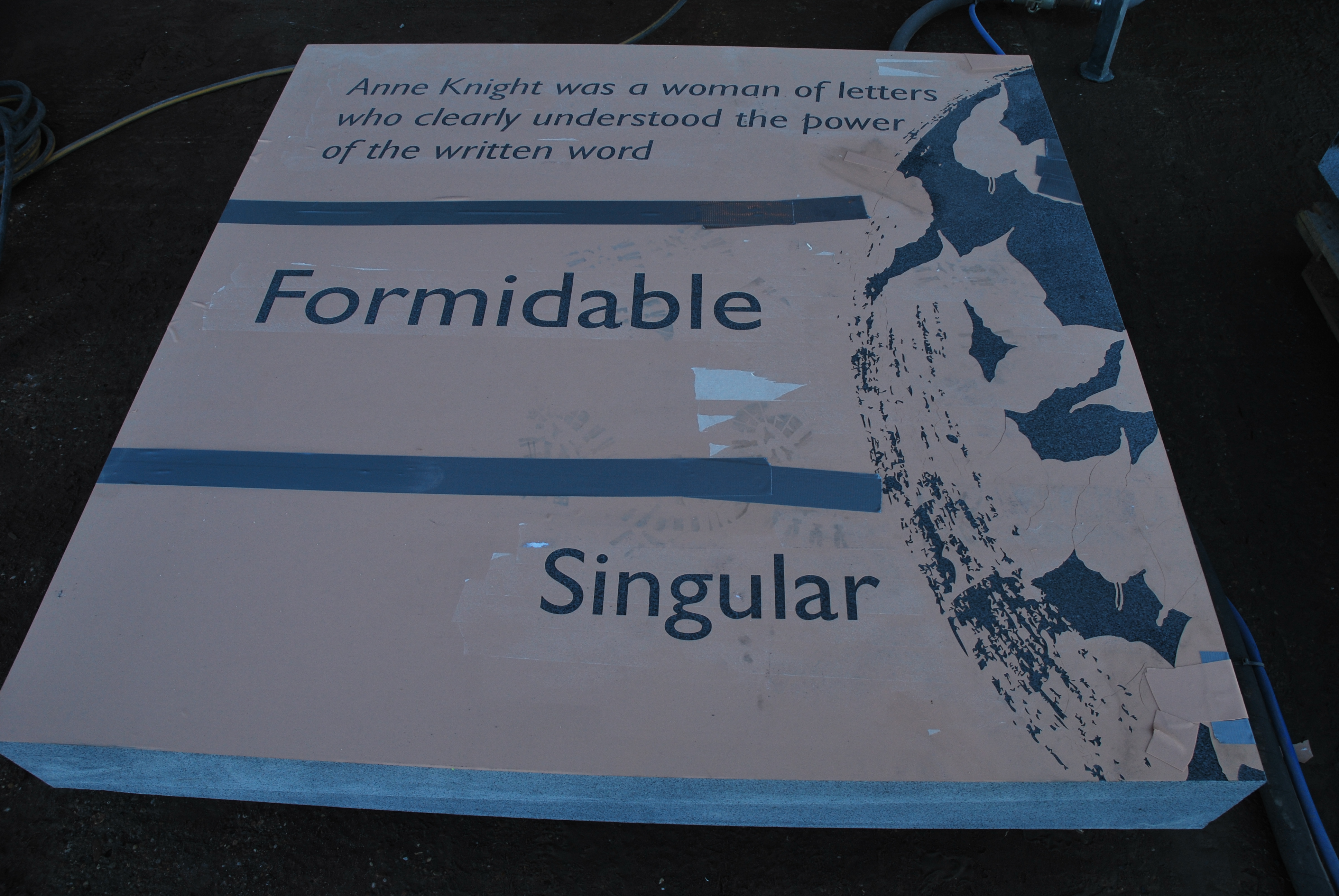
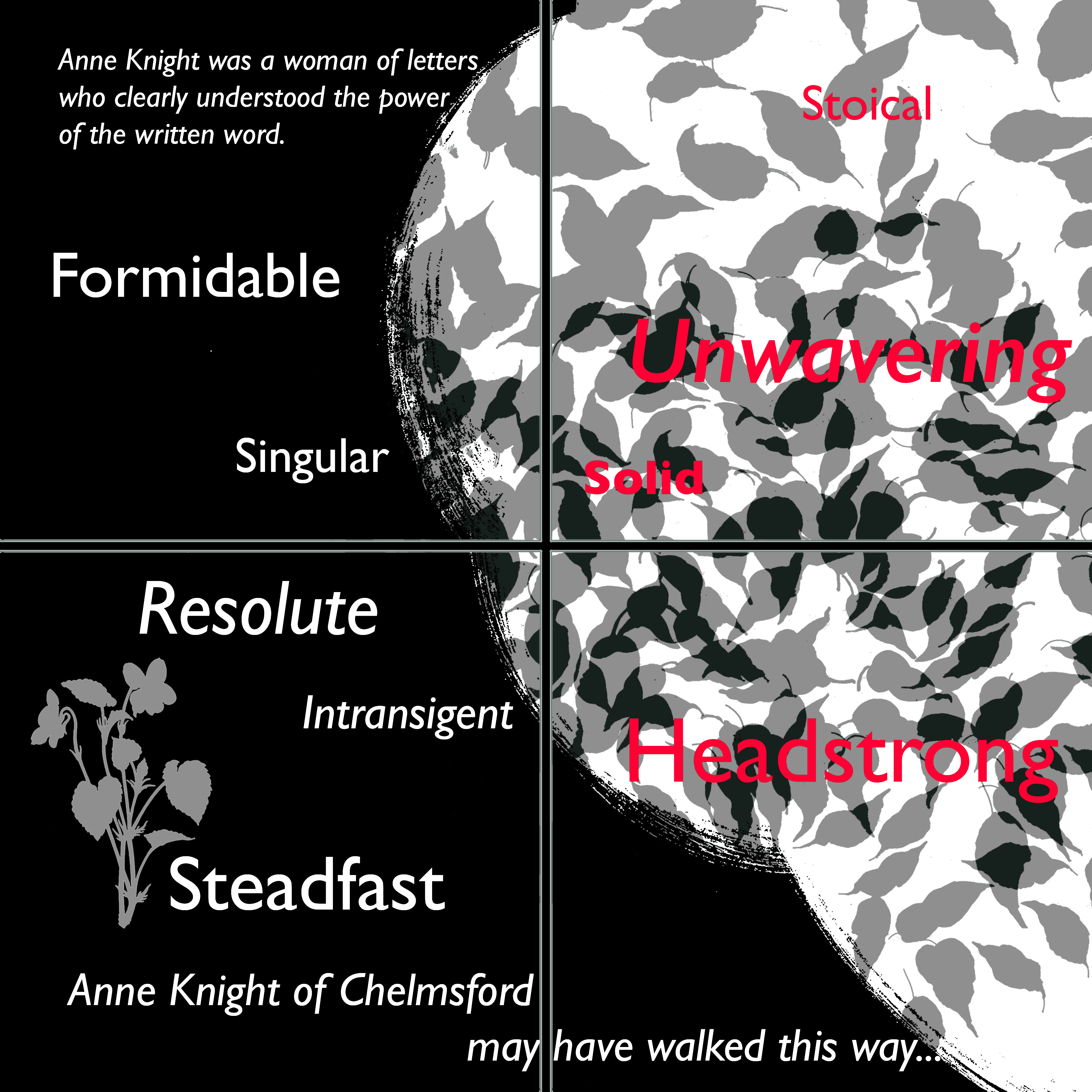
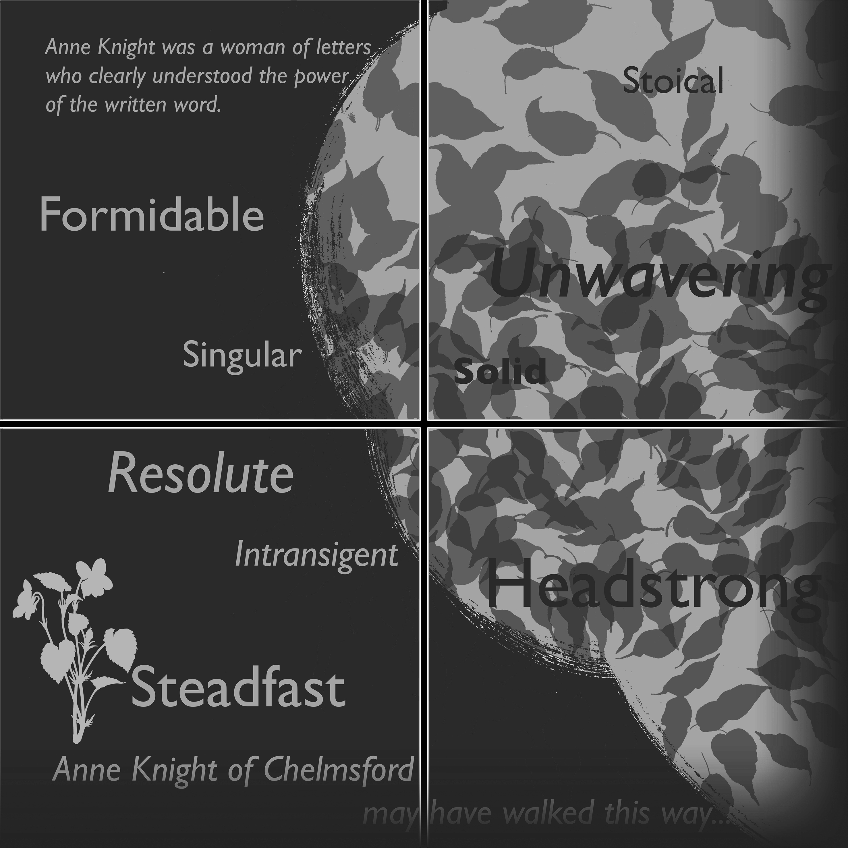
One of the most striking & singular elements of the interpretation project at Burgess Springs, Central Chelmsford is the large granite platform seat.
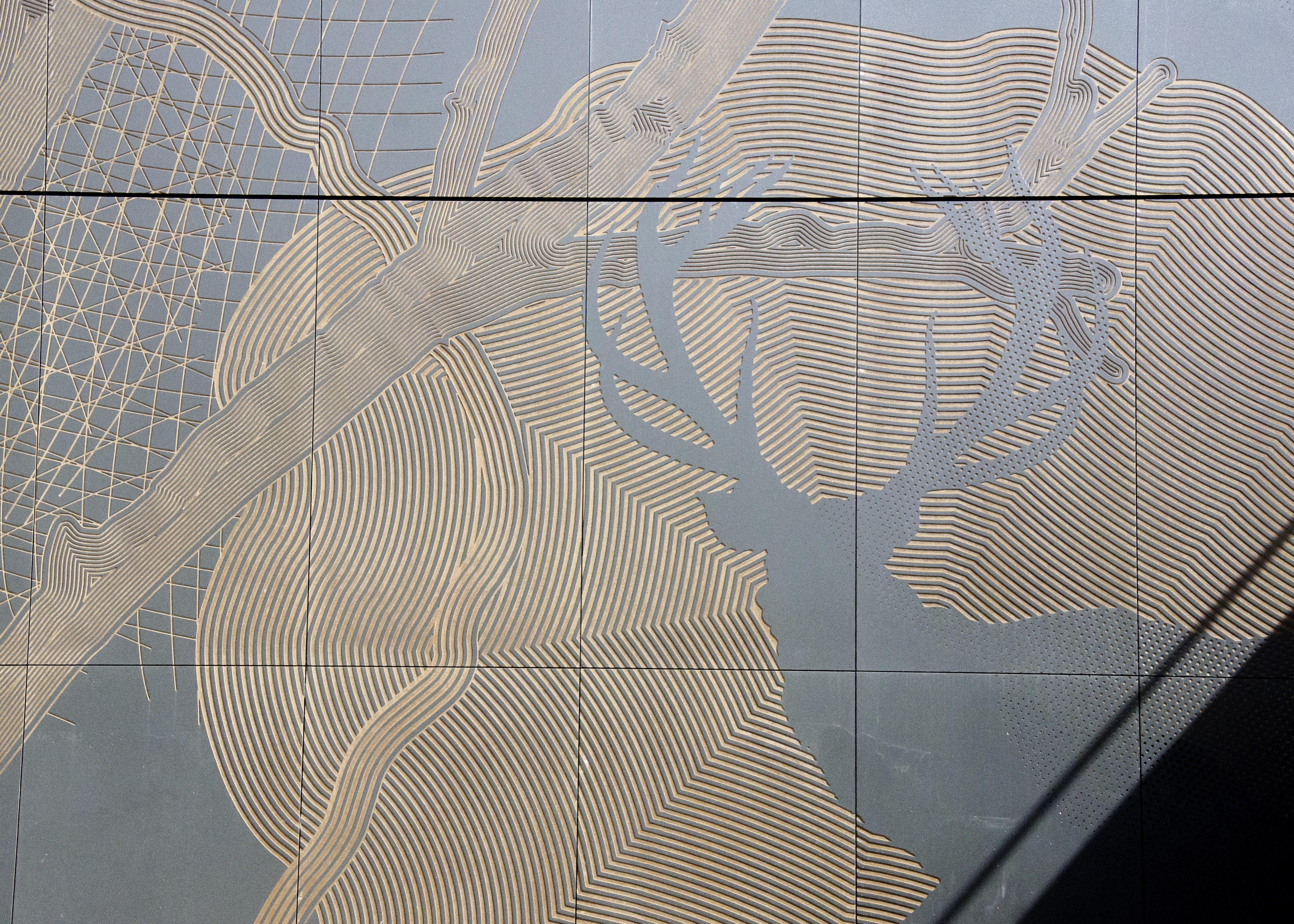
This feature is some 2.4m square & manufactured in 4 large units. The surface is being sandblasted with images and text, both inspired by the writing of Anne Knight of Chelmsford.
The granite artwork is being project managed by Nigel Hudson, Masonry Product Manager for Hardscape at their premises at Long Marston, Stratford Upon Avon. The sandblasting is being carried out by Masonry Manager, Vladimir Zonozicka. We have met several times to discuss and sample the process & the collaboration has in turn, resulted in a much more interesting peice of work.
The image shows the light coloured vinyl stencil applied to the granite surface. Some layers of sandblasting have already been achieved & these have the vinyl stripped away to reveal the sandblasted surface. The deepest blasting is no more than 2mm, but the effects can be striking, particularly when wet or in direct sunlight. Image: HardscapeThe work is manufactured from a grey granite with a honed finish. The early artworks suggest a green colour – which was influenced by the Royal Green granite used for some paving detailing – this is not the case. Christopher Tipping for Central ChelmsfordDraft artwork in black & white with some text highlighted in red for the attention of the manufacturer, Hardscape. Christopher Tipping for Central Chelmsford
Draft artwork in black & white with some text highlighted in red for the attention of the manufacturer, Hardscape. Christopher Tipping for Central Chelmsford
Granite slab awaiting sandblasting by Hardscape. Christopher Tipping for Central Chelmsford
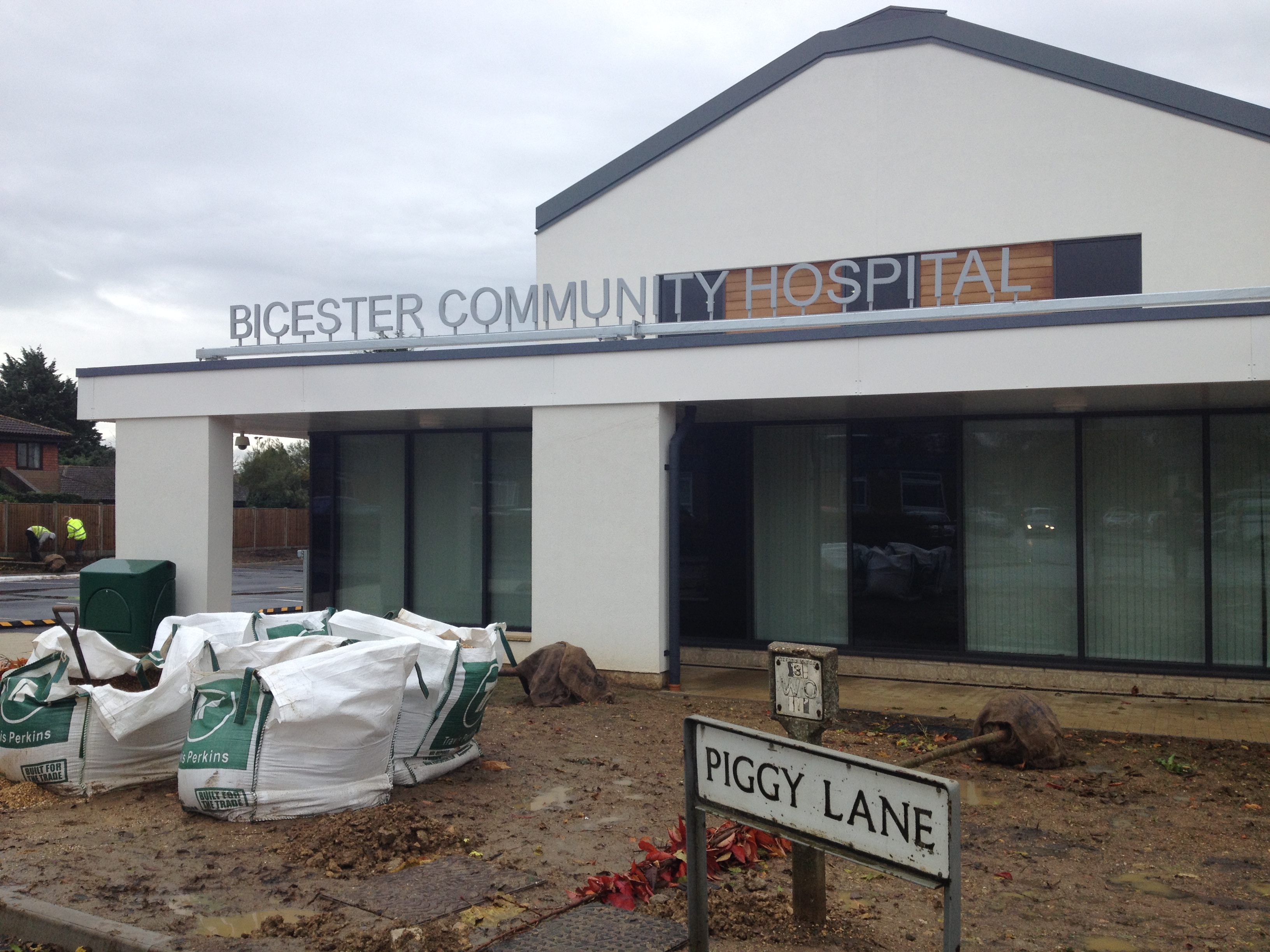
The art project is now completed on site with all the digitally printed panels installed.
I visited on Friday 14th November to review progress & the following images are taken from that visit.
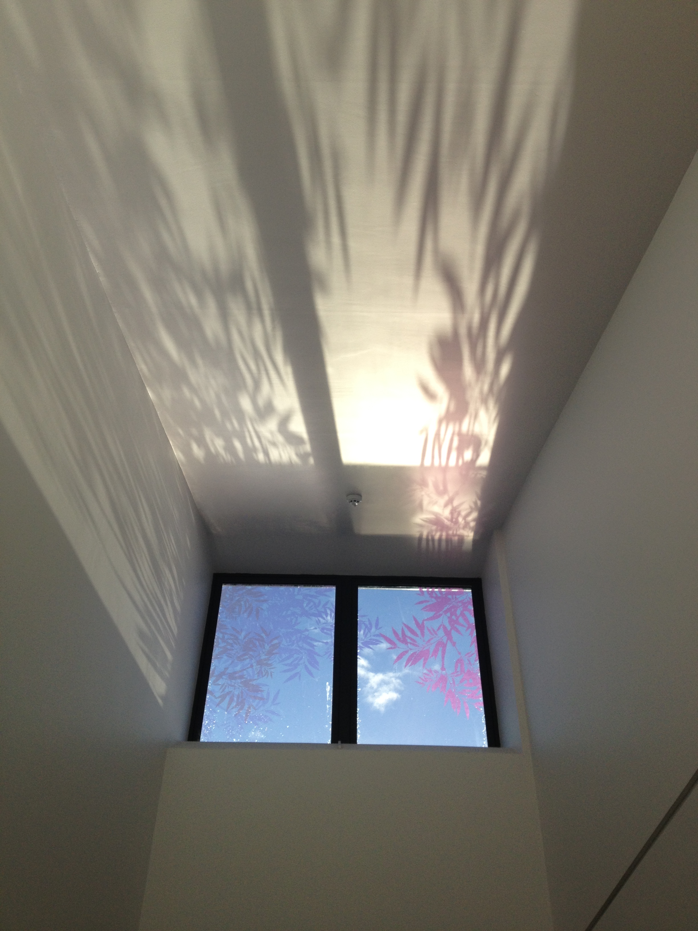
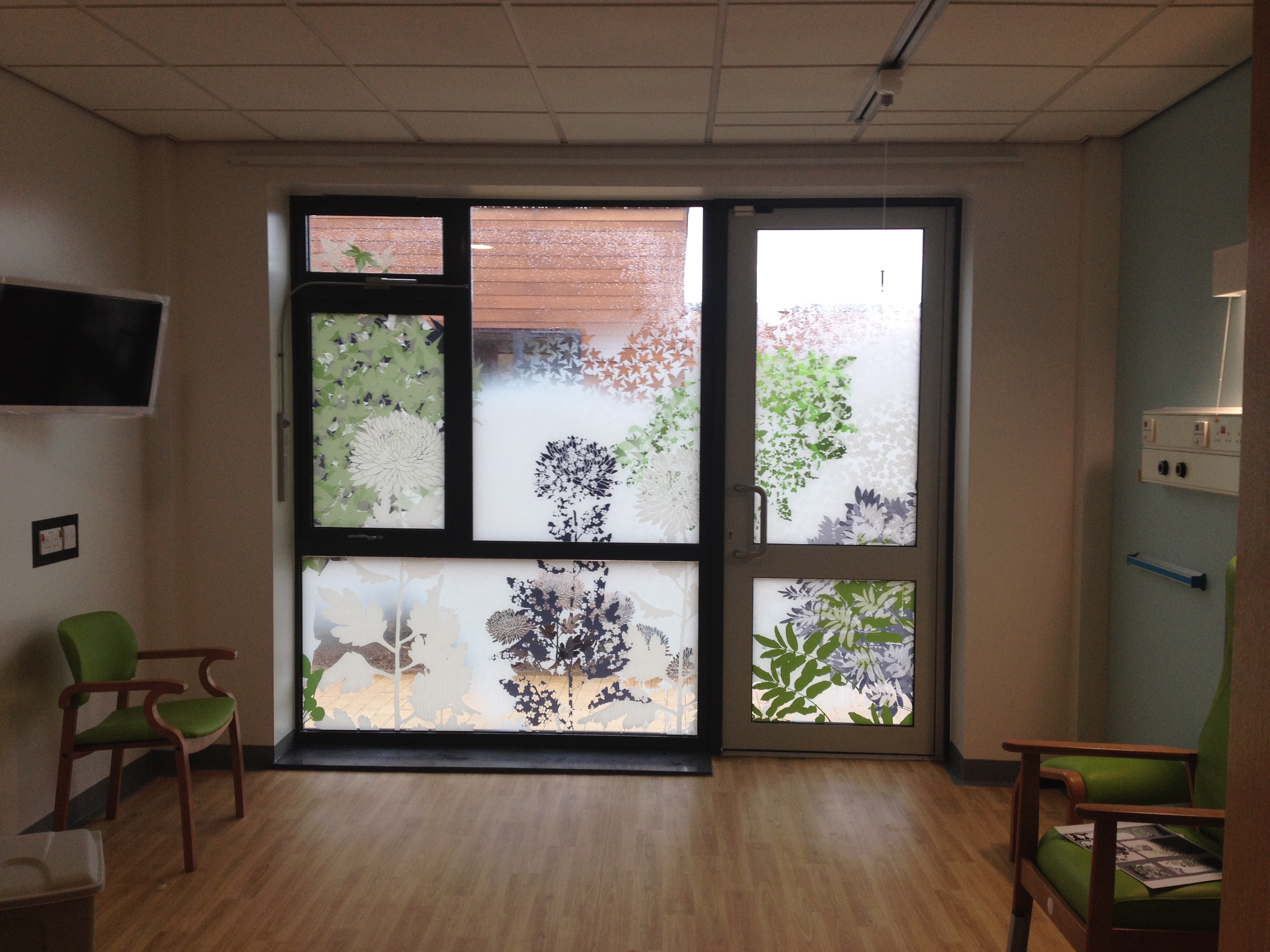
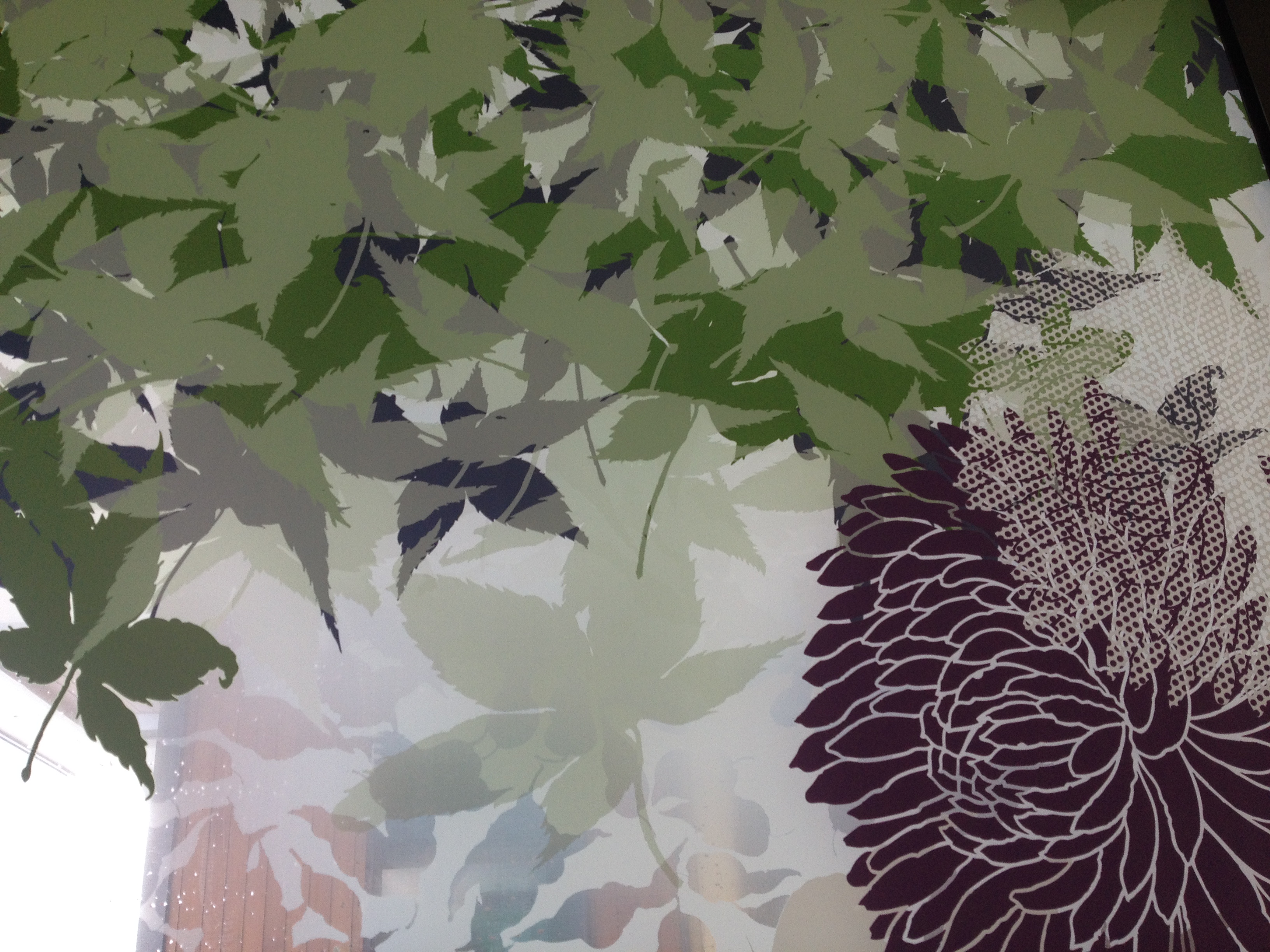
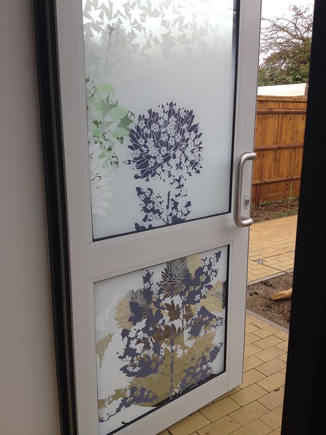
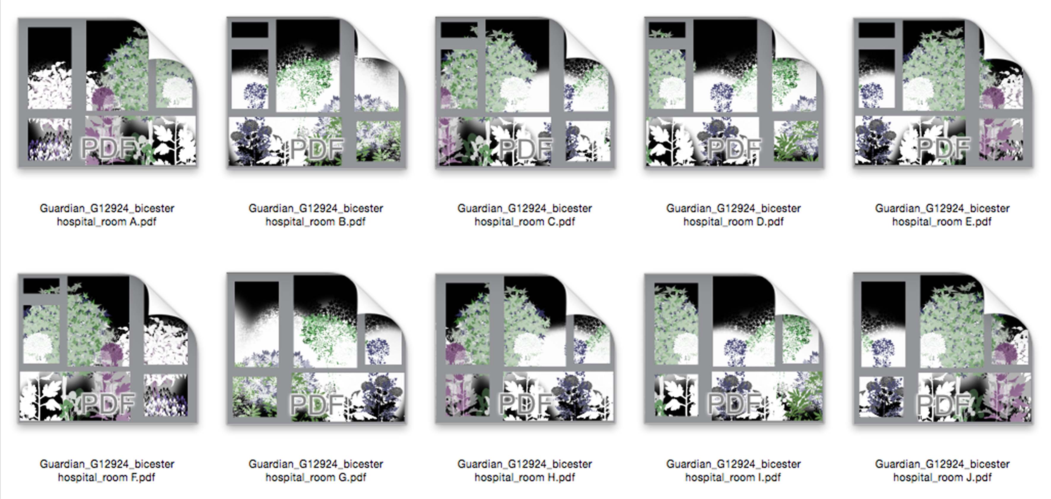
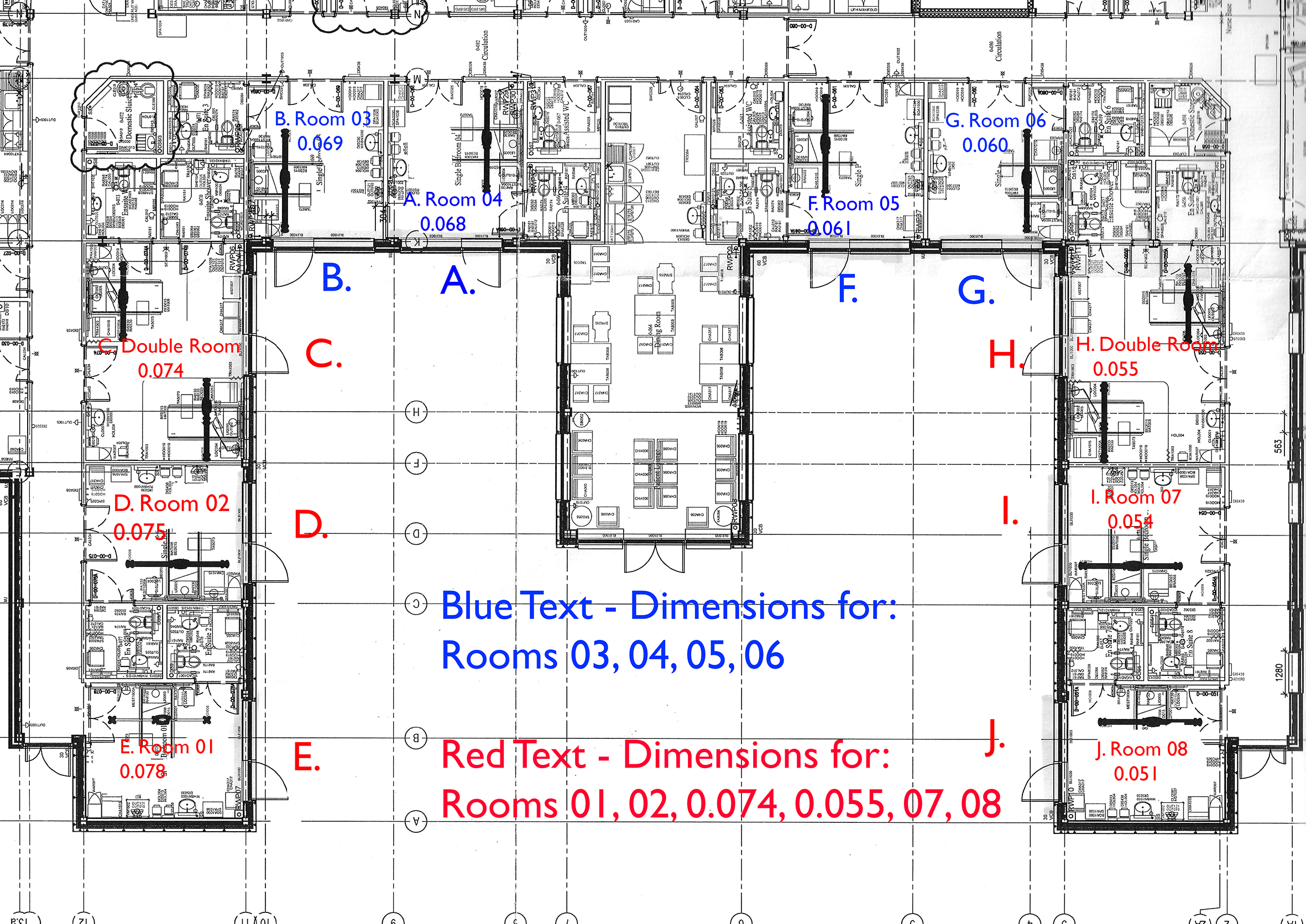
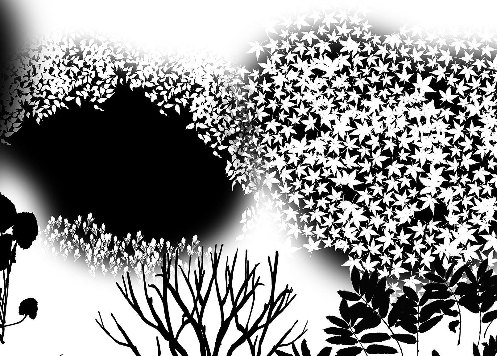
External Landscape of the hospital – in progressEach of the 10 ward rooms has a variation upon a single design. This was achieved for both economy & to meet a very tight deadline.
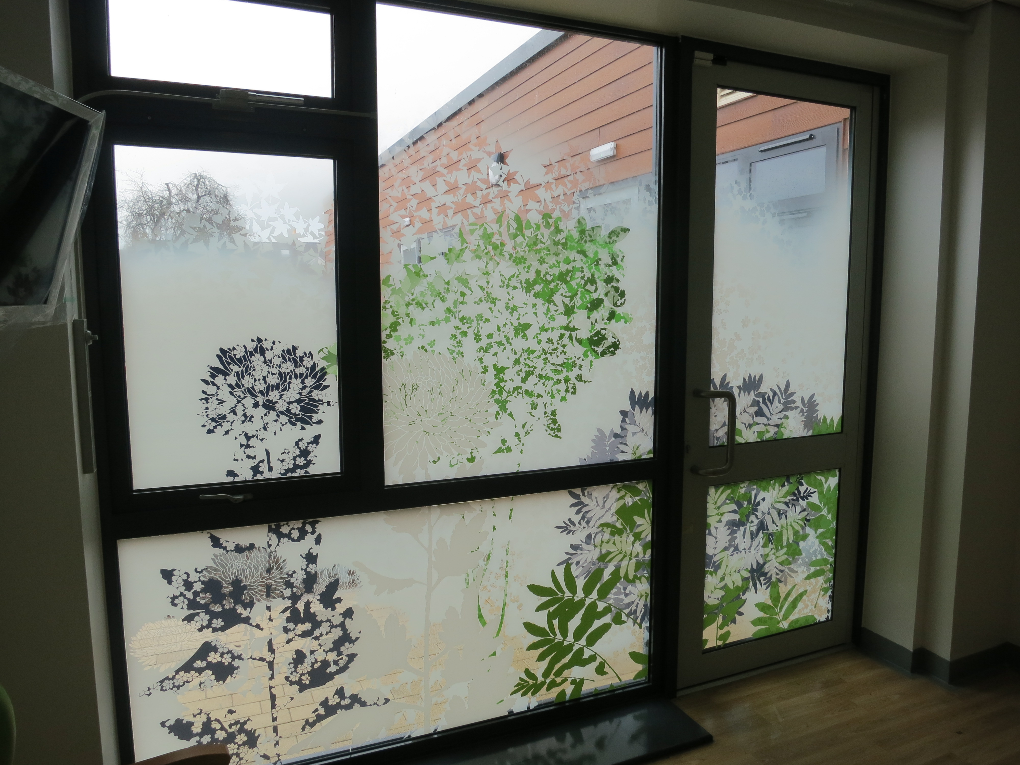
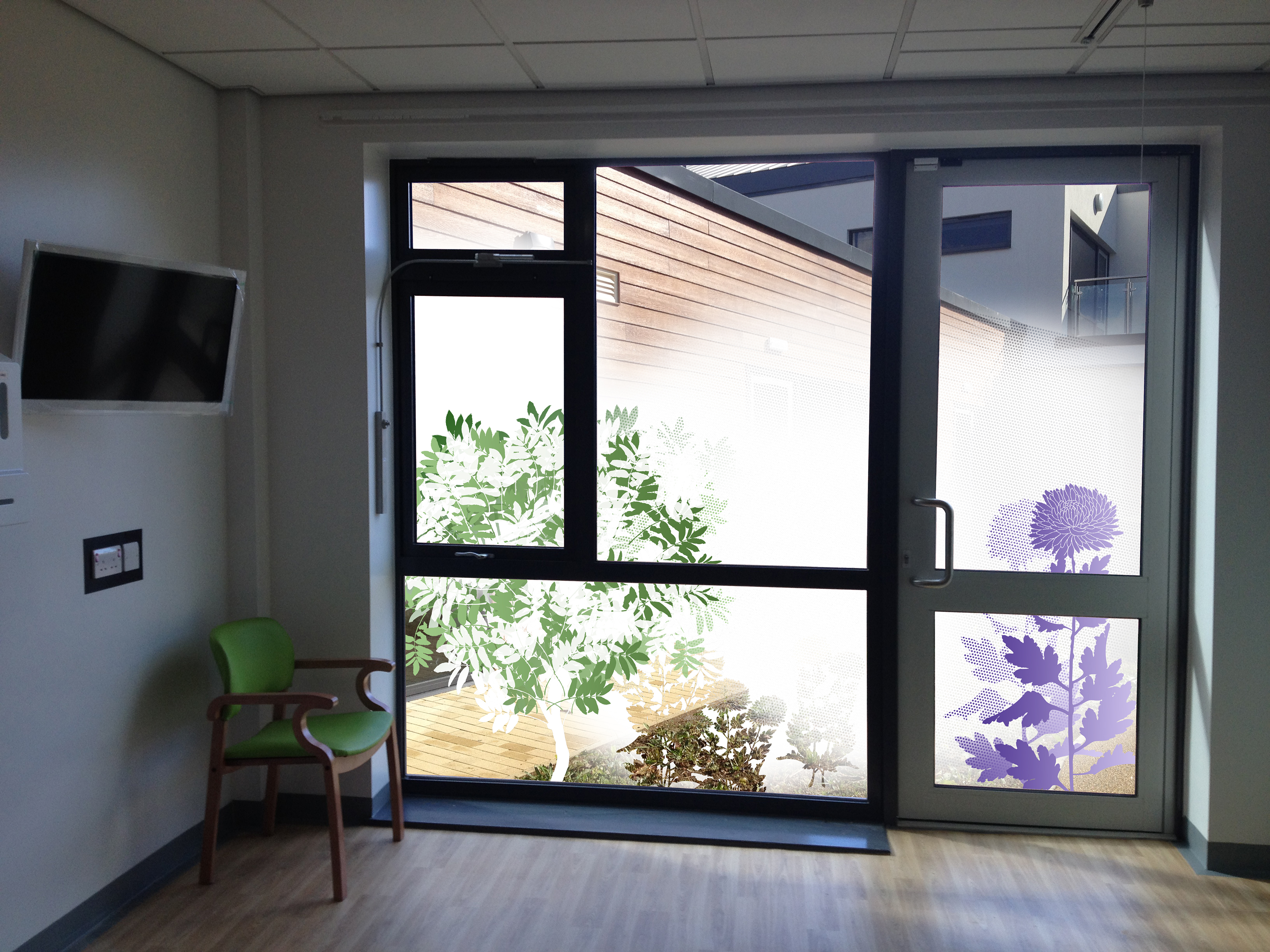
The brief was built around the need for privacy in the rooms. Large glazed screens open up onto a landscaped courtyard. Although these spaces are being planted with trees and some small shrubs, most of the space would be turfed. Patients, staff & visitors can still see out from the windows in the knowledge that their privacy was being maintained. Opaque and transparent layers with drawn & cut out detailing were created to provide some variation & changeability in the surface.
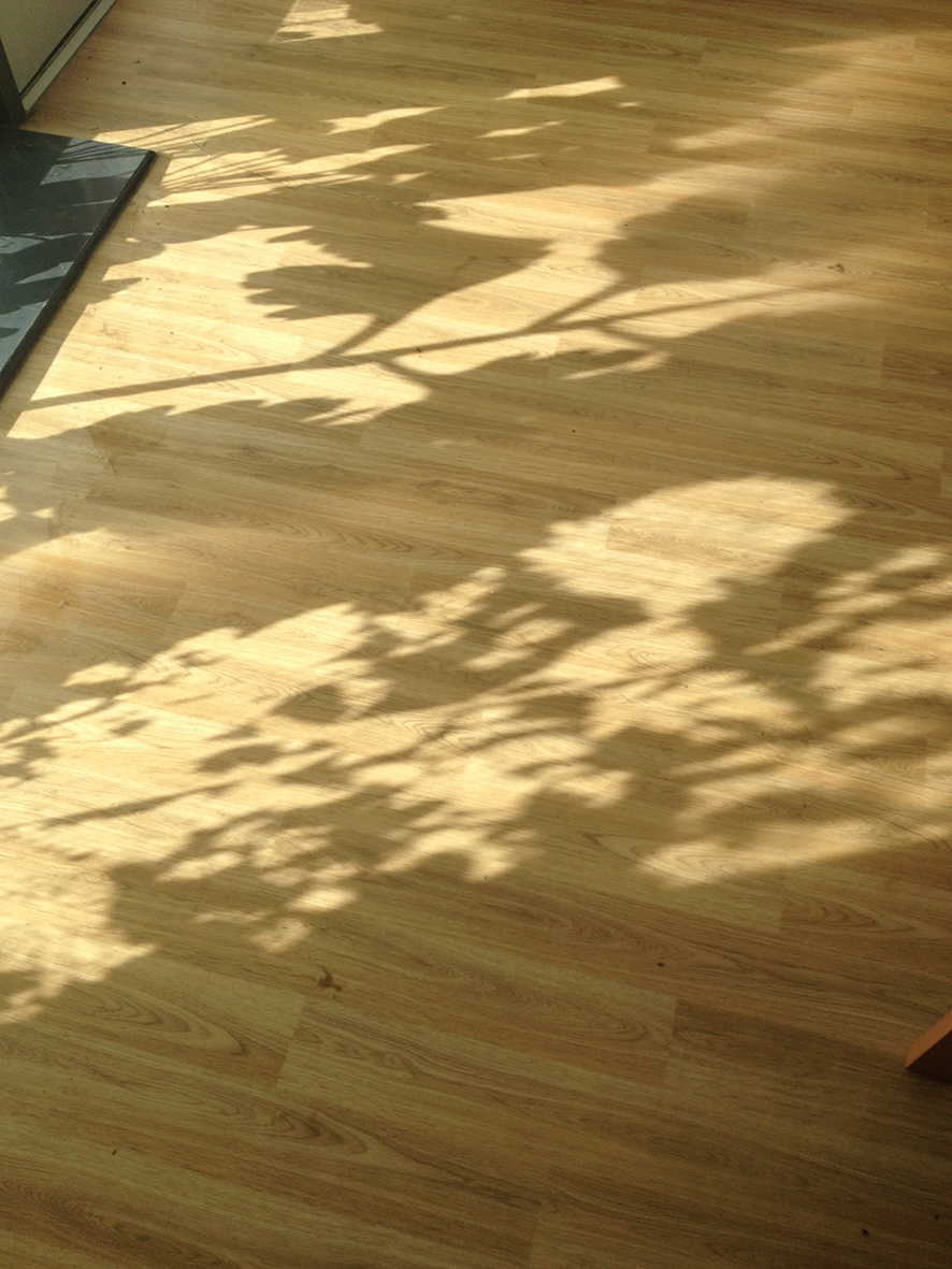
When the sun comes out, the shadows follow.
Detail: Section of digitally printed glazing vinyl installed.
The project was approved last week and the files went to print earlier this week. The last two days have seen most of the digitally printed vinyl installed.
Final Artwork – all black areas will print as clearFinal Artwork – draft with production marks –Drawing / Model – Draft room plan and applied manifestationsDetail: single panel installed – Image: Tom Cox, Artscape
Image: Tom Cox, Artscape
Image: Tom Cox, ArtscapeImage: Tom Cox, ArtscapeImage: Tom Cox, Artscape
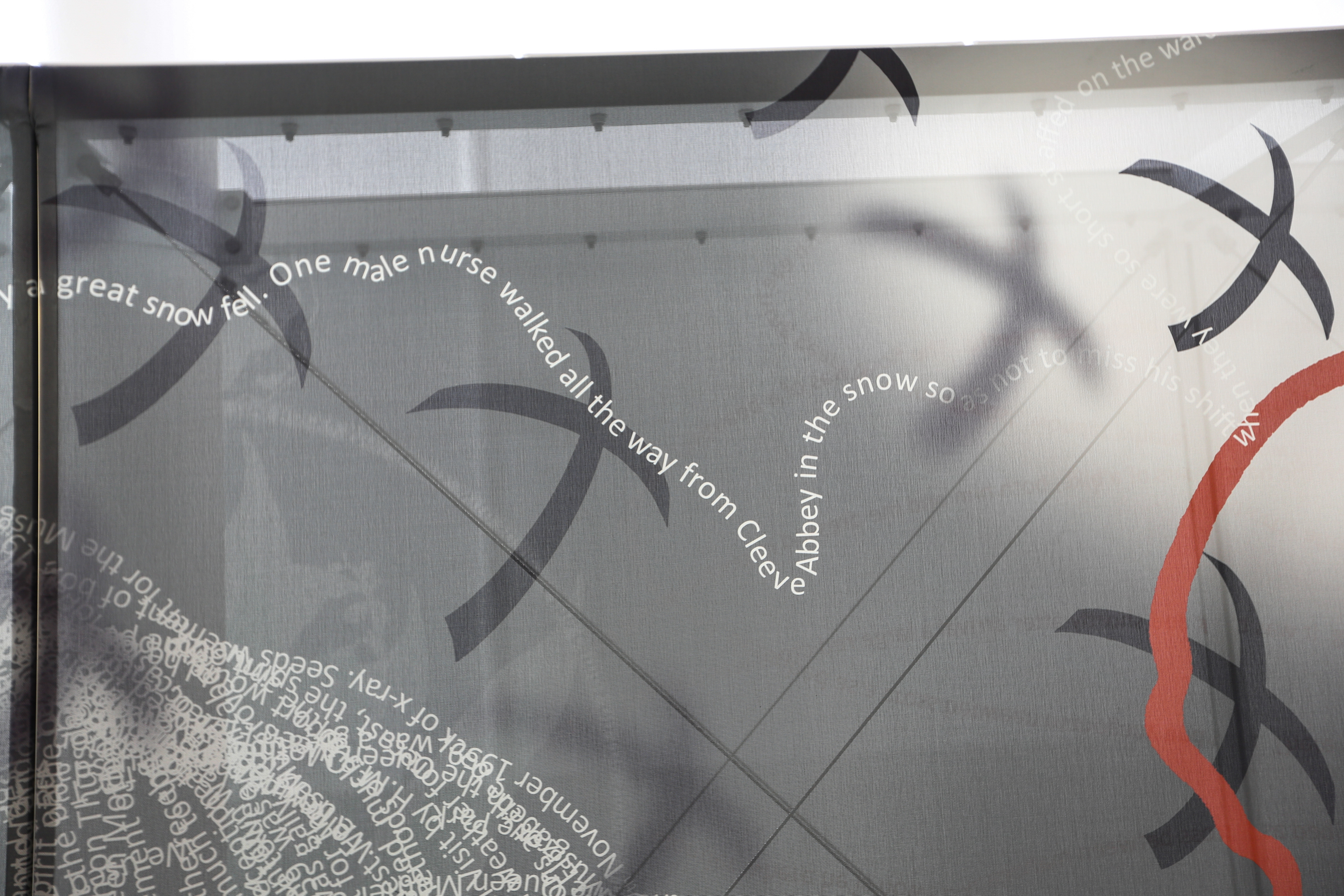
’70 years on…’ CENTRAL CONCOURSE SCREEN FOR THE JUBILEE BUILDING, MUSGROVE PARK HOSPITAL
I recently came across the work of the photographer, John Seaman, who had been commissioned by the main contractor for the Jubilee Building BAM to make a photographic record. Very lucky for me, that he has a great eye for catching the spirit & intent of the tensile artwork and its relationship to the building and interior space. ’70 years on…’ was a collaboration with Architen Landrell & VGL Vinyl Graphics & was commissioned by Musgrove Park Hospital Capital Projects Office & Art for Life
’70 years on…’ Tensile Artwork, Central Concourse, Jubilee Building. Image: John Seaman PhotographImage: John Seaman PhotographyDetail of transparent layering of the tensile screen. Image: John Seaman Photograph
The Central Concourse Screen ’70 years on…’ was created to celebrate the delivery of the Jubilee Surgical Building & the 70th Anniversary of Musgrove Park Hospital. The project was Heritage Lottery funded.
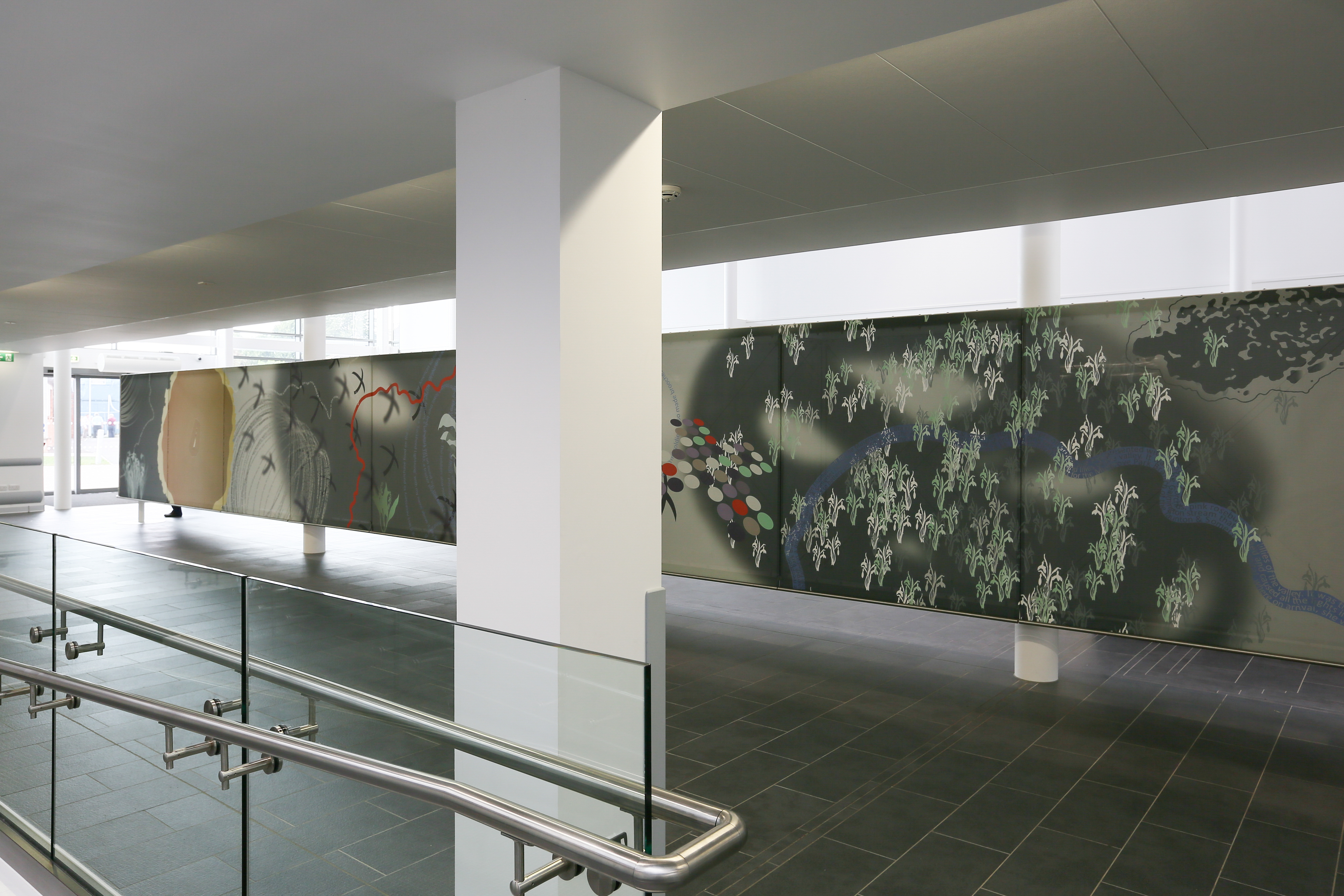
The work is presented as a digitally printed tensile fabric screen made of 26 individually printed panels. It is supported by a bespoke lightweight aluminium & stainless steel double-sided ladder frame 21m x 1.8m, which is itself hung from 3 steel supporting columns of the Central Concourse building. The design & manufacture of the tensile screen and its method of digital printing balance well with the content of the work & its evocation of the past to present a contemporary artwork in a 21st Century Hospital.
The artwork is presented as a landscape, which, other than at each end, where curved steel panels protect the structure, the artwork can be viewed as a continual narrative sequence. However, this is not a timeline or a linear narrative, which has to be viewed in a particular way or from a particular viewpoint. The observer can simply roll up at any point along its 42m length and begin a journey or their own.
Text was employed in the design as both an aid to the visual narrative & to emphasize the importance of the hospital’s archive collection in this 70th Anniversary year. It also recalls individual and collective voices from the last 70 years. The work done by Louise Donovan, an archivist working with staff and patients past and present to recall their experiences working here has been included in “Sensing our Past”. 70 years of Musgrove Park Hospital’, published in 2012
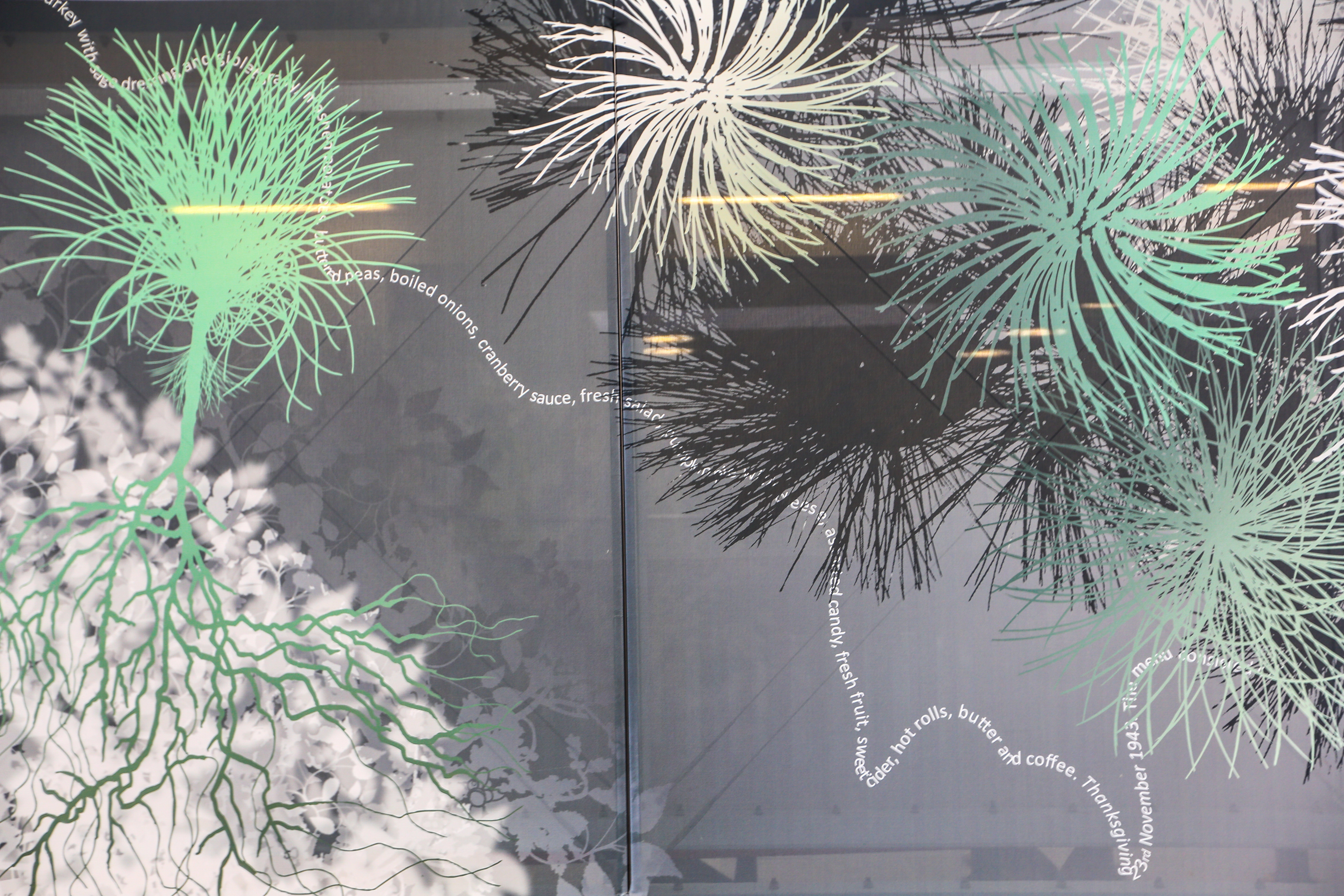
Words have been used to draw with, or to conjure up the dynamic energy of the hospital. It is presented in a variety of ways, for example, following the line of the Galmington Stream, which runs along the boundary of the Hospital, or as a gestural expression, such as the whirlwind vortex drawing, or a simple circle of fine white text.
They are an eclectic and often mis-matched set of words, evocative of half remembered memories, anecdotes and stories, (as opposed to reproducing hard facts and figures within a fixed timeline). There are perhaps more ‘distant’ voices from early in the life of the hospital, particularly from it’s wartime experience, but I feel this is the way with memory – recall is distant and suggestive of the ‘good old days’.
Some elements within the artwork are obviously and easily recognizable, such as the iconic Eisenhower Tree & Galmington Stream, whilst others are abstract and elusive. A great number of the references are archival in origin, such as the colours, which were influenced by boxes of medical artifacts, some in the original packaging.
Bunches of flowers appear from between the seam joints, which evoke the Lily of the Valley presented to HM The Queen Mother or flowers given by visitors, which were held in vases attached to columns in the Nightingale wards.
The photographic archive too, which contains hundreds of images of staff at work and celebrating events such as Christmas & retirements, as well as visits by Royalty, or the American World Heavyweight Boxer, Joe Louis and the entertainer Bob Hope, who both visited the Hospital during World War II.
My own personal experience of being a part of this Hospital community since 2005, when I was appointed Lead Artist on the 10 year Hospital development programme is also evident in magery influenced by past projects undertaken here.
Image: John Seaman PhotographImage: John Seaman PhotographyImage: John Seaman PhotographyImage: John Seaman PhotographImage: John Seaman PhotographImage: John Seaman PhotographImage: John Seaman PhotographImage: John Seaman PhotographyImage: John Seama
We now have a schedule agreed and are working to issue draft artwork for comment and hopefully, approval by this time next week.
Detail: draft artwork –
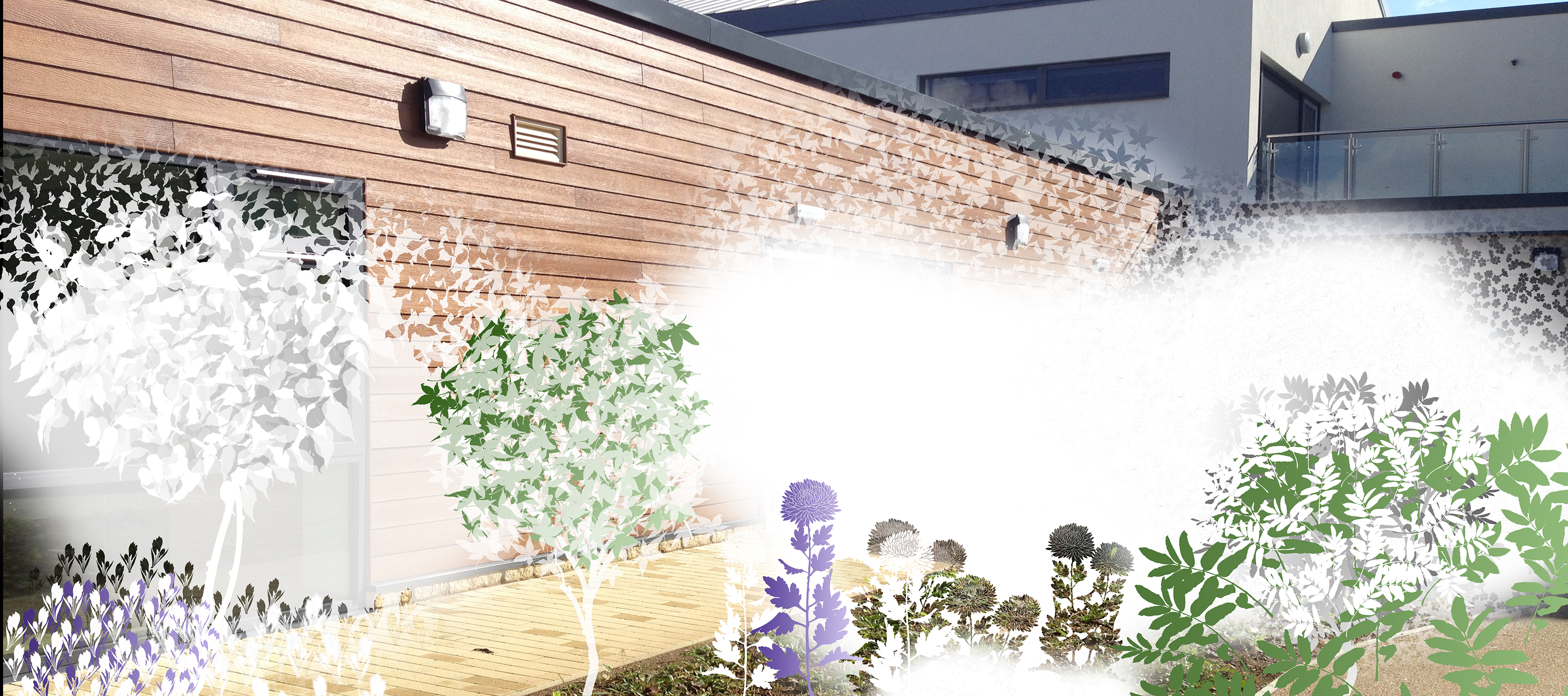
It was agreed that the principle we should follow is to develop a highly visual & primarily figurative narrative, which also provides a privacy screen between the users of the ward rooms and the external courtyards. The courtyard landscapes are brand new, with ground level put to grass and no planting at height to provide cover or privacy screening. This has however provided the opportunity to create a new and imaginary landscape, which bridges the gap between figurative and recognisable details and structures from the external landscape, alongside abstract and original forms and patterns found within the artwork.
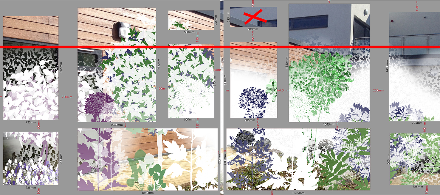
The works are to be digitally printed onto optically clear vinyl in layers of opaque and transparent white, with some added colour. The attention to detail will be focussed on a horizontal band across the mid section of the glazing screen to provide privacy. The top section will be left clear, so that uninterrupted views of the sky can be had. We are working closely with Guardian Window Film to manufacture & install the work.
Detail: draft artwork development –
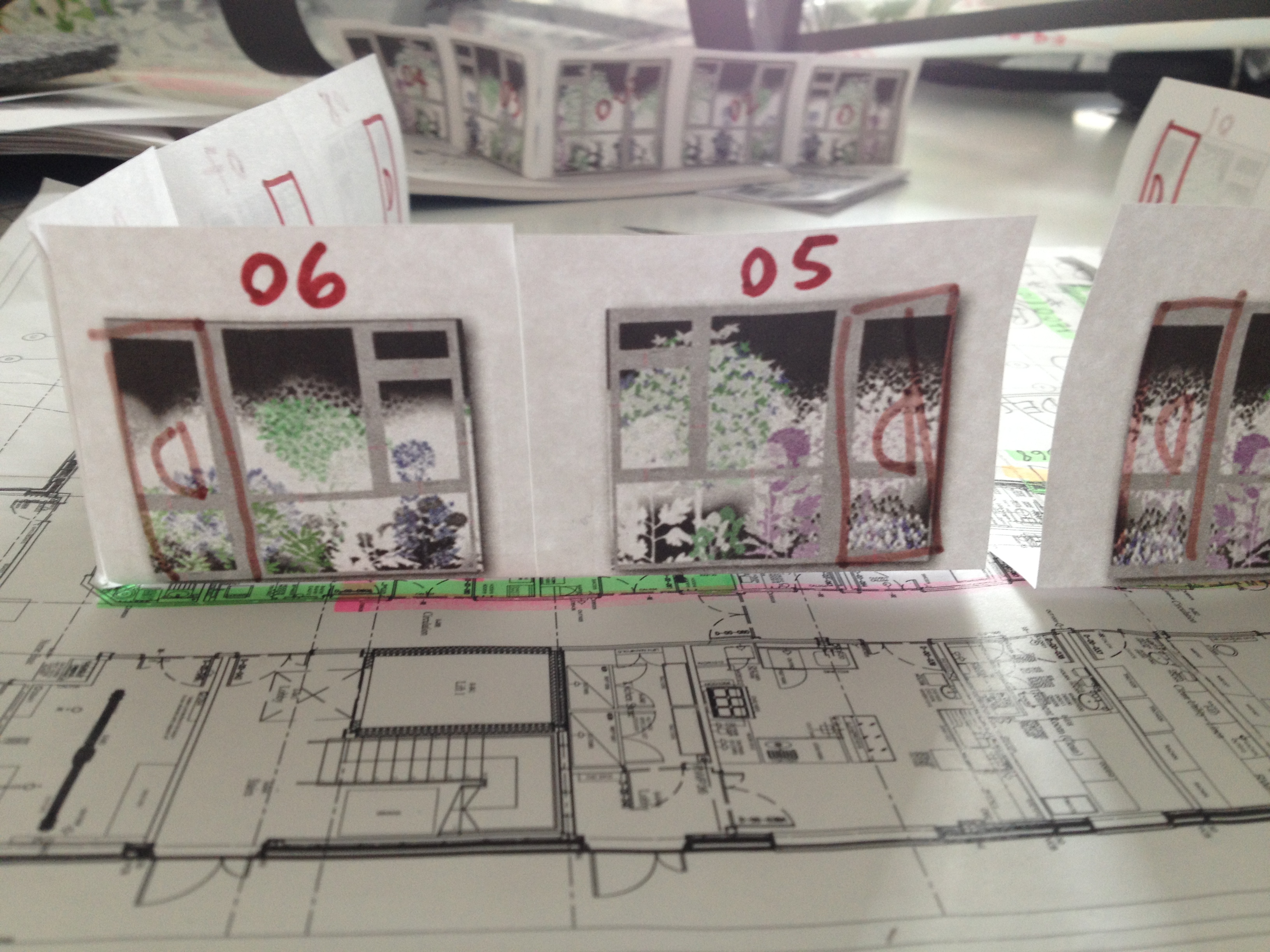
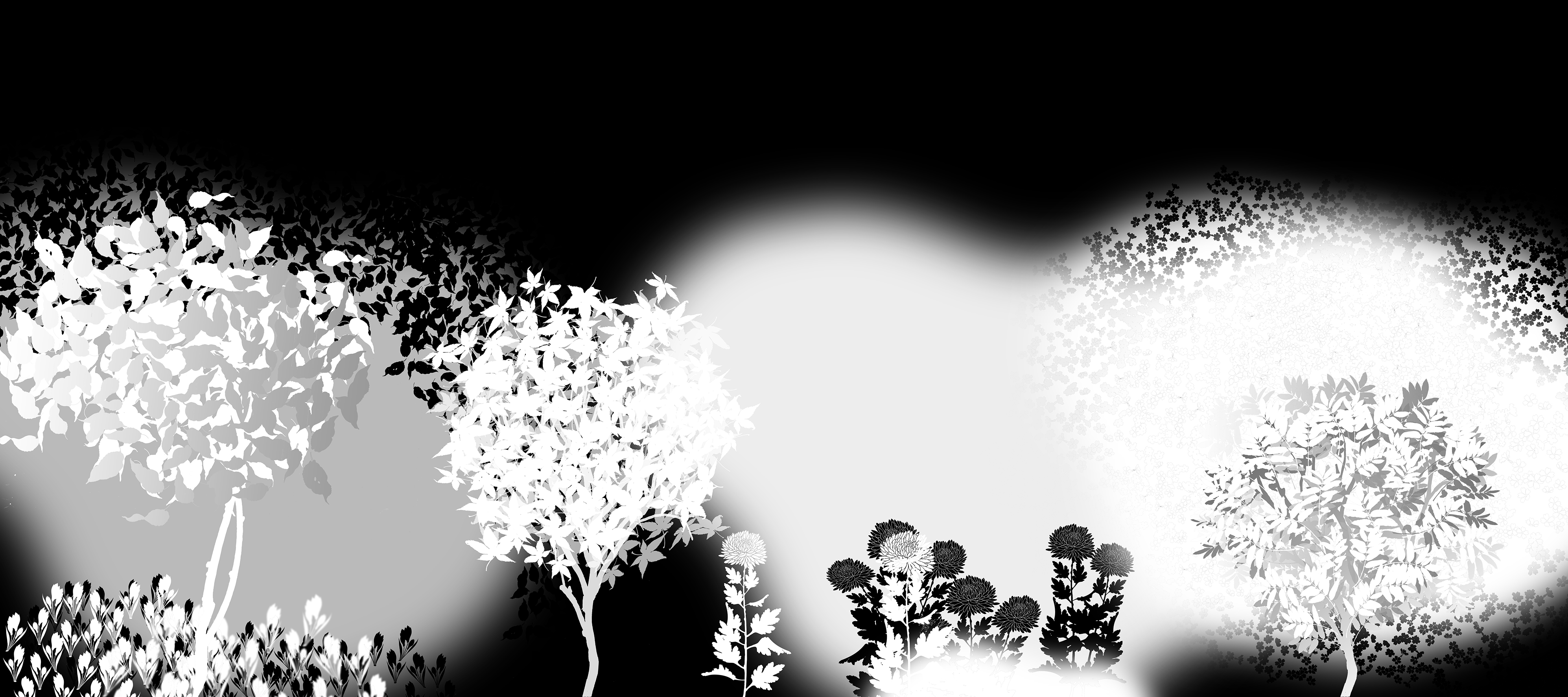
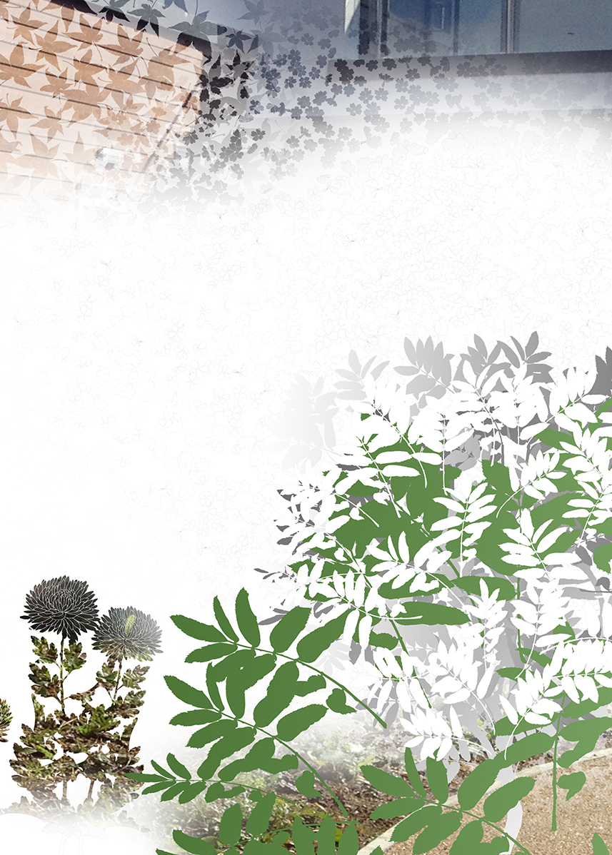
These images are simply the first steps in creating a visual language and narrative for the project. The artwork is being developed as a long rectangular landscape – as a view through a window – . Each of the 10 ward rooms – each with a window, will be detailed with a section of this work, to give the appearance that each room has a unique identity and view of its own.
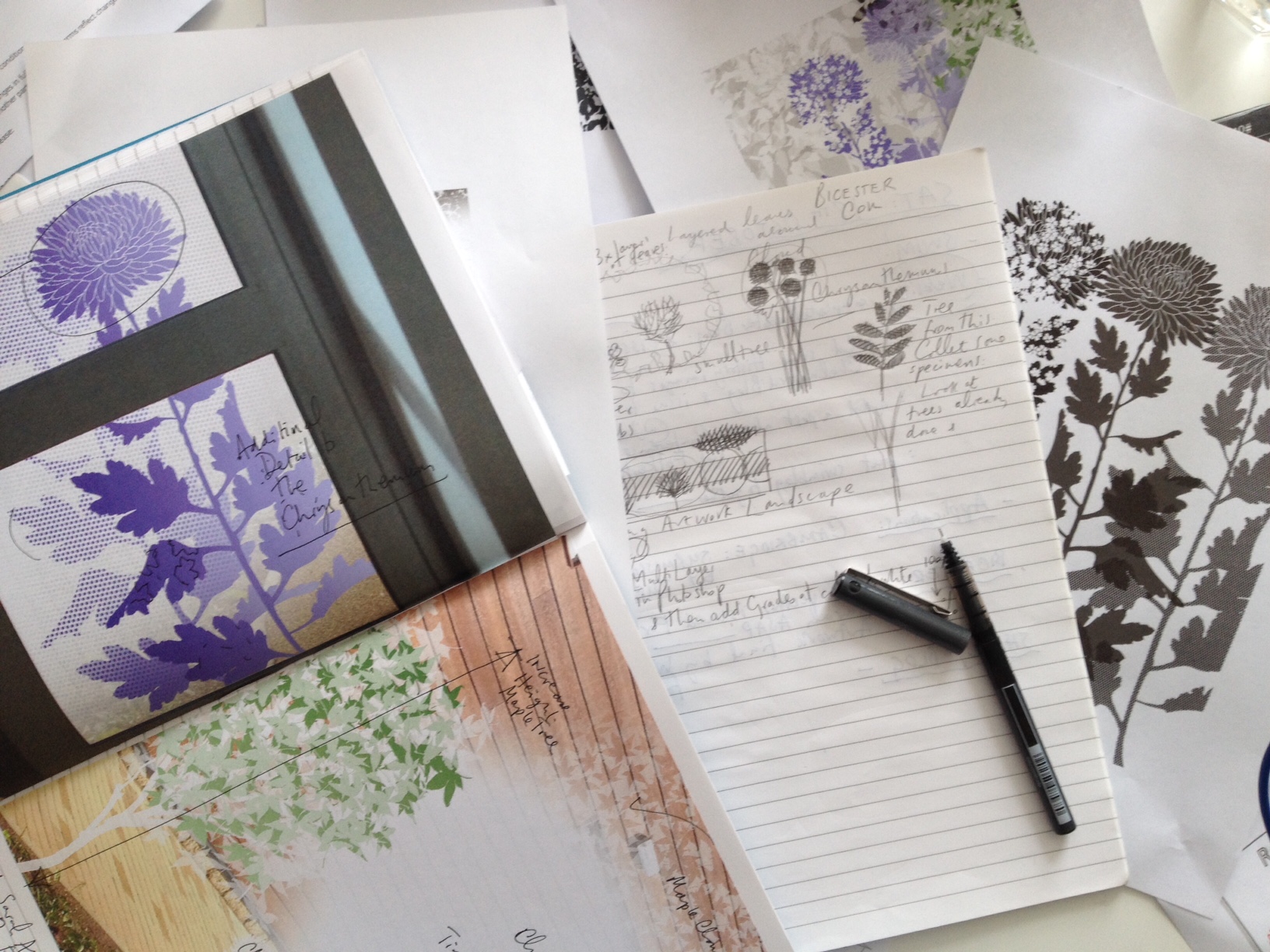
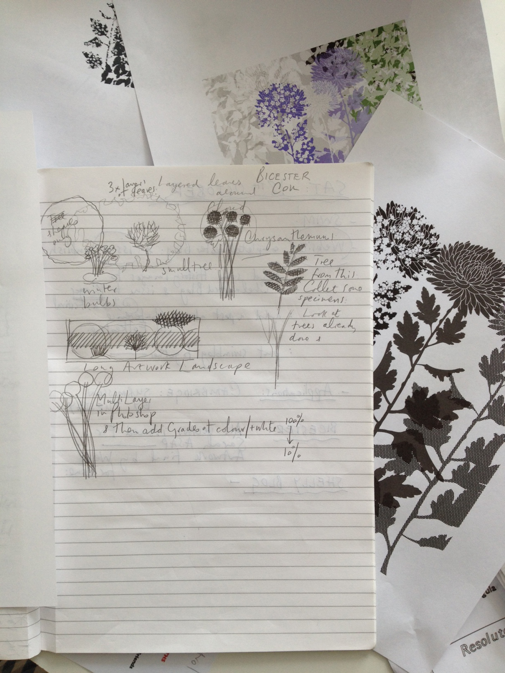
Detail from sketchbooksDetail form sketchbooksDetail: draft artwork in black & white
The artwork draft above shows the printed artwork as shades and layers of opaque white. The black areas will show as clear glass in the final works.
Detail: draft artwork – Mock up of vinyl application on the glazing screen in one of the ward rooms.
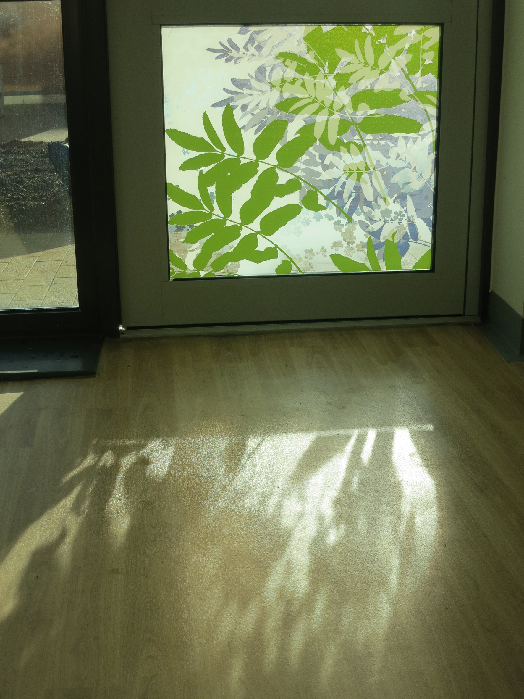
There are 10 small one & two bed ward rooms arranged in two ward blocks within the new hospital by Nightingale Architects. The rooms are full of natural light and the interior colour schemes are muted and calm, with the odd spot of brighter colour, such as the chair. The artwork manifestation will respond to this scheme. The views through the windows are now partially obscured, providing a degree of privacy for the user, whilst also maintaining sufficient clear glass to allow natural light and changing weather conditions to be seen.
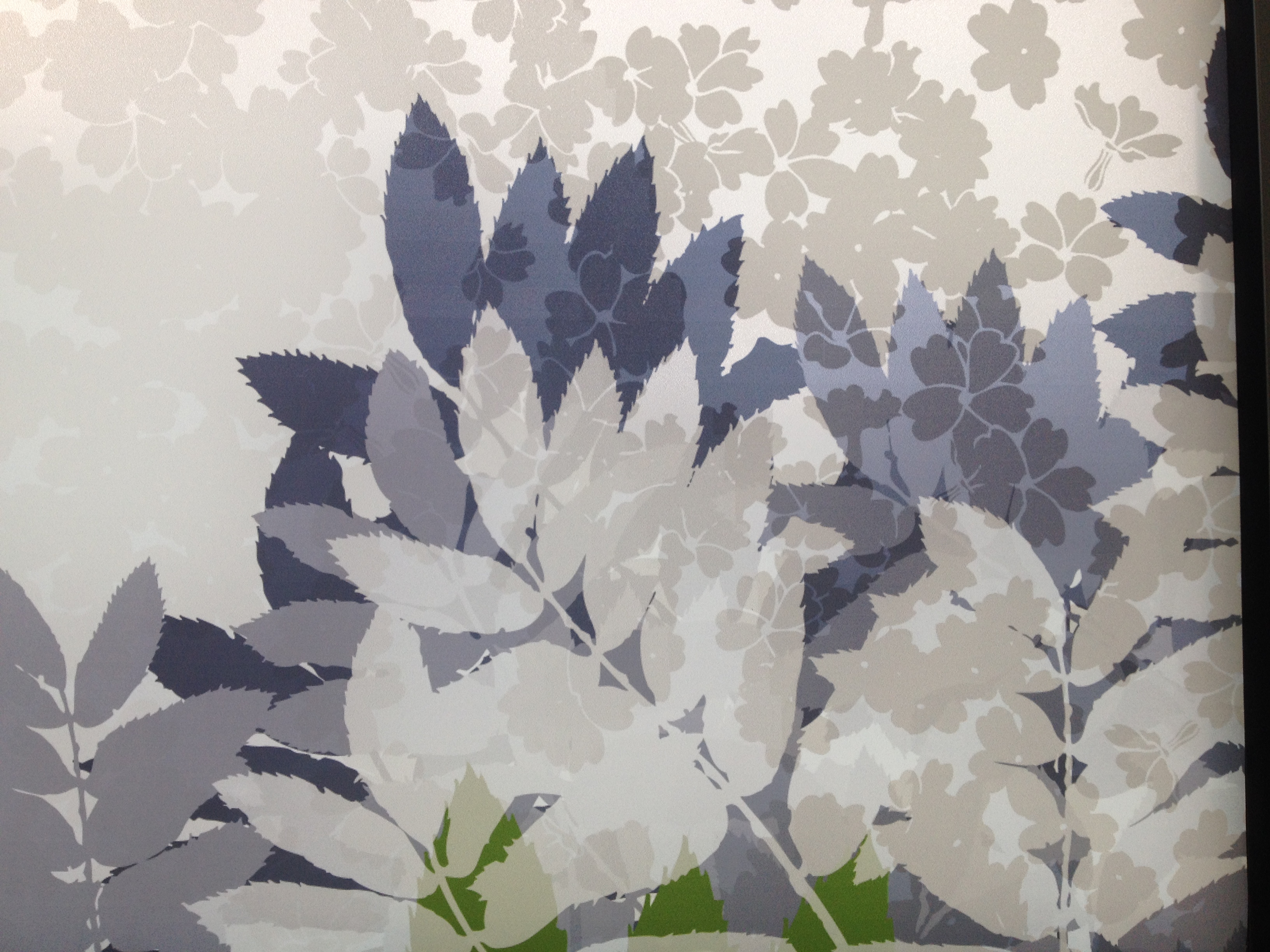
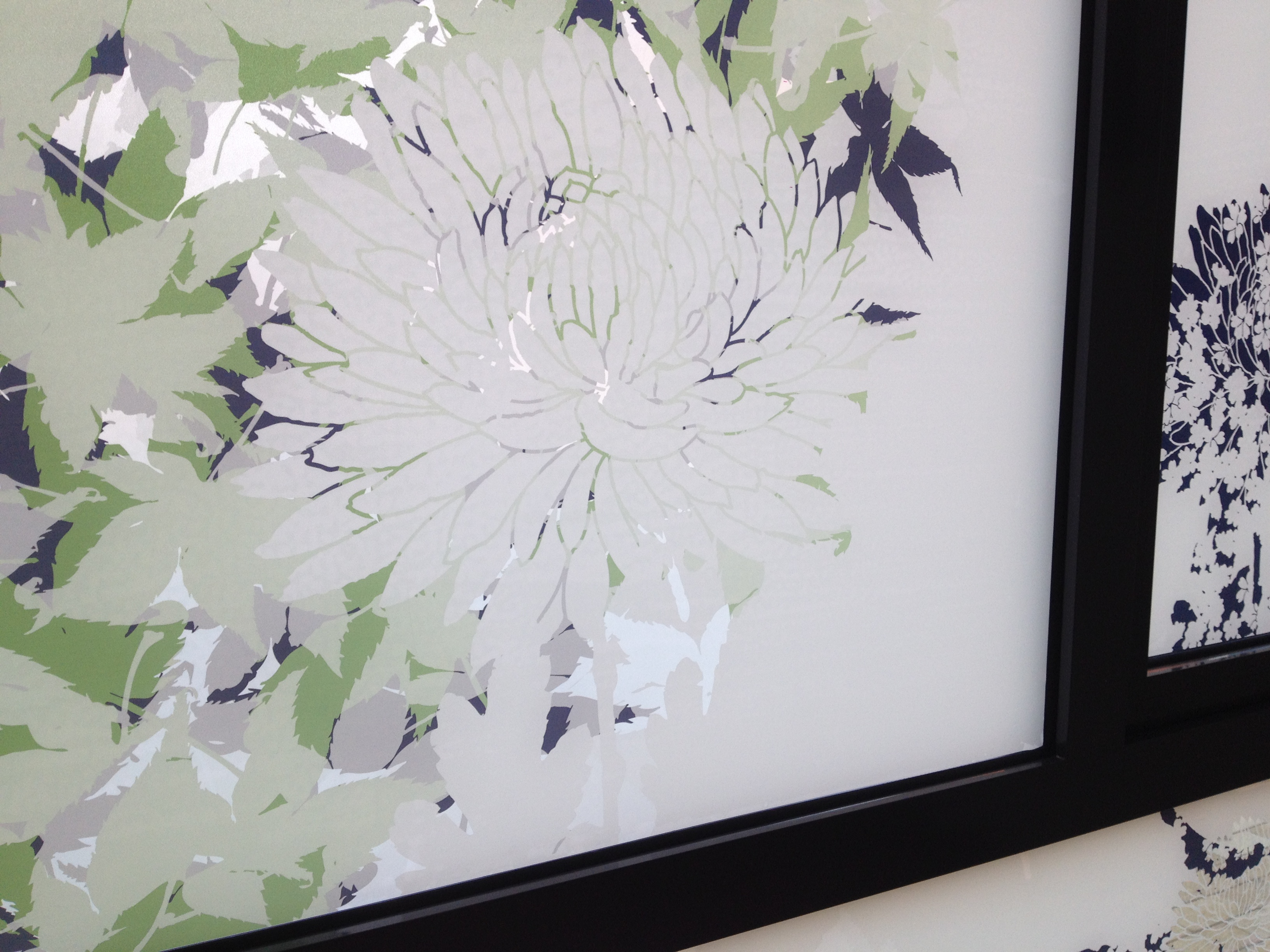
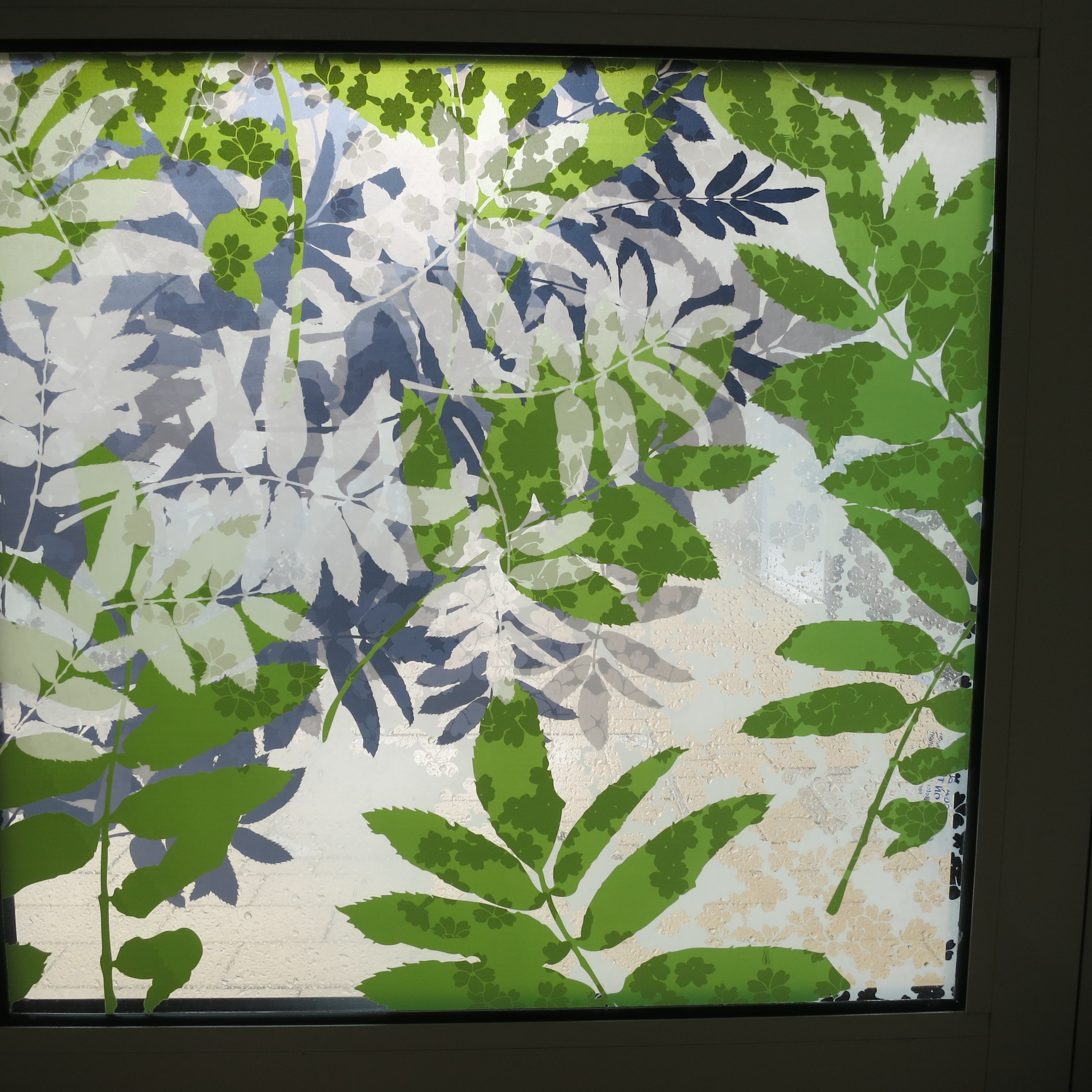
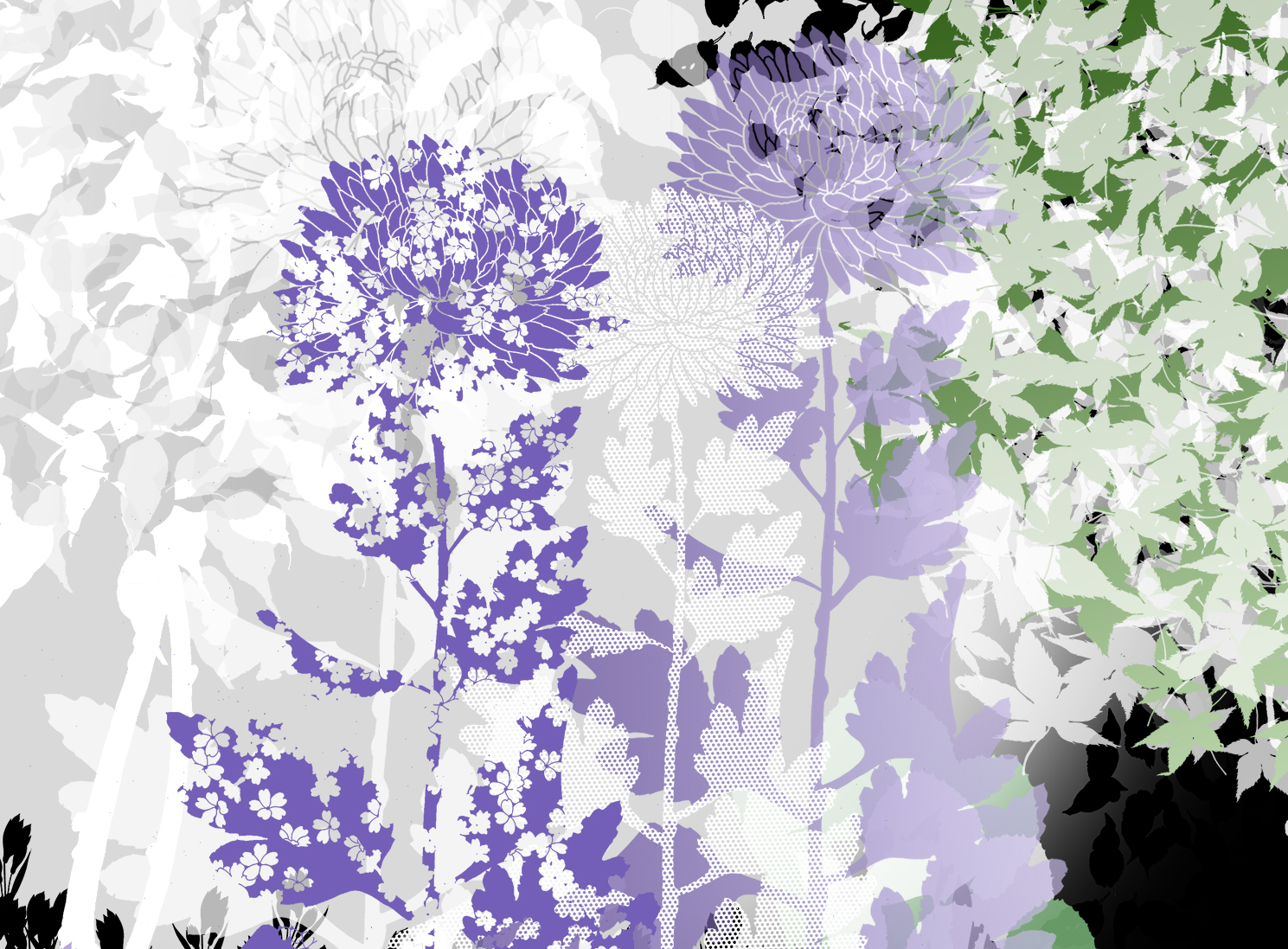
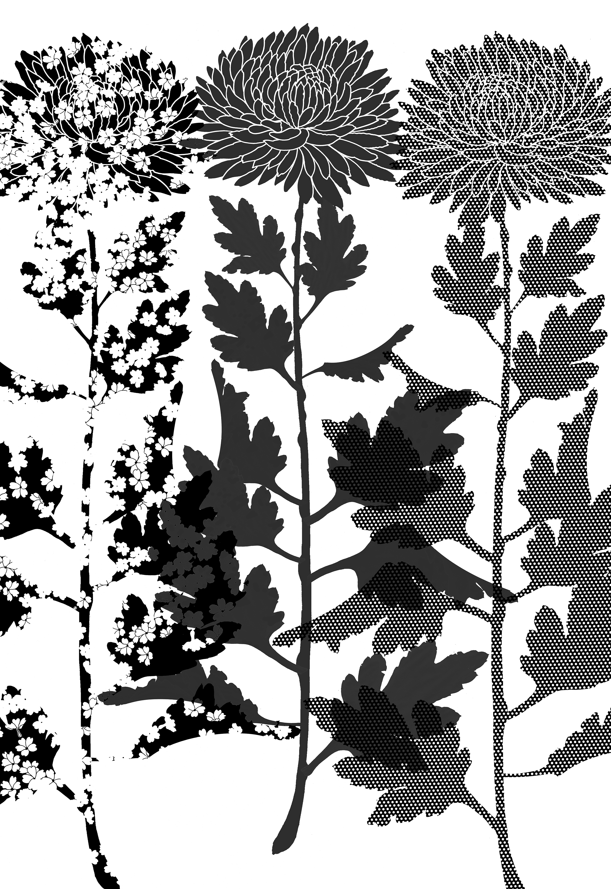
Detail: Draft ArtworkDetail: Iconography has been developed for the project using drawings of leaves and branching structures to create original & imagined plants. These are not botanical illustrations, rather, an impression of a landscape imagined.Detail: IconographyDetail: IconographyDetail: Draft artwork for 3 x Chrysanthemums – various textures and transparenciesDetail: draft artwork