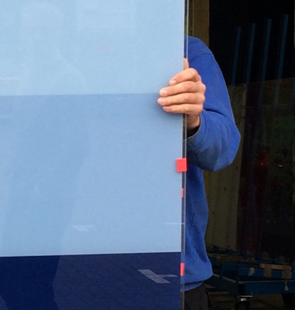
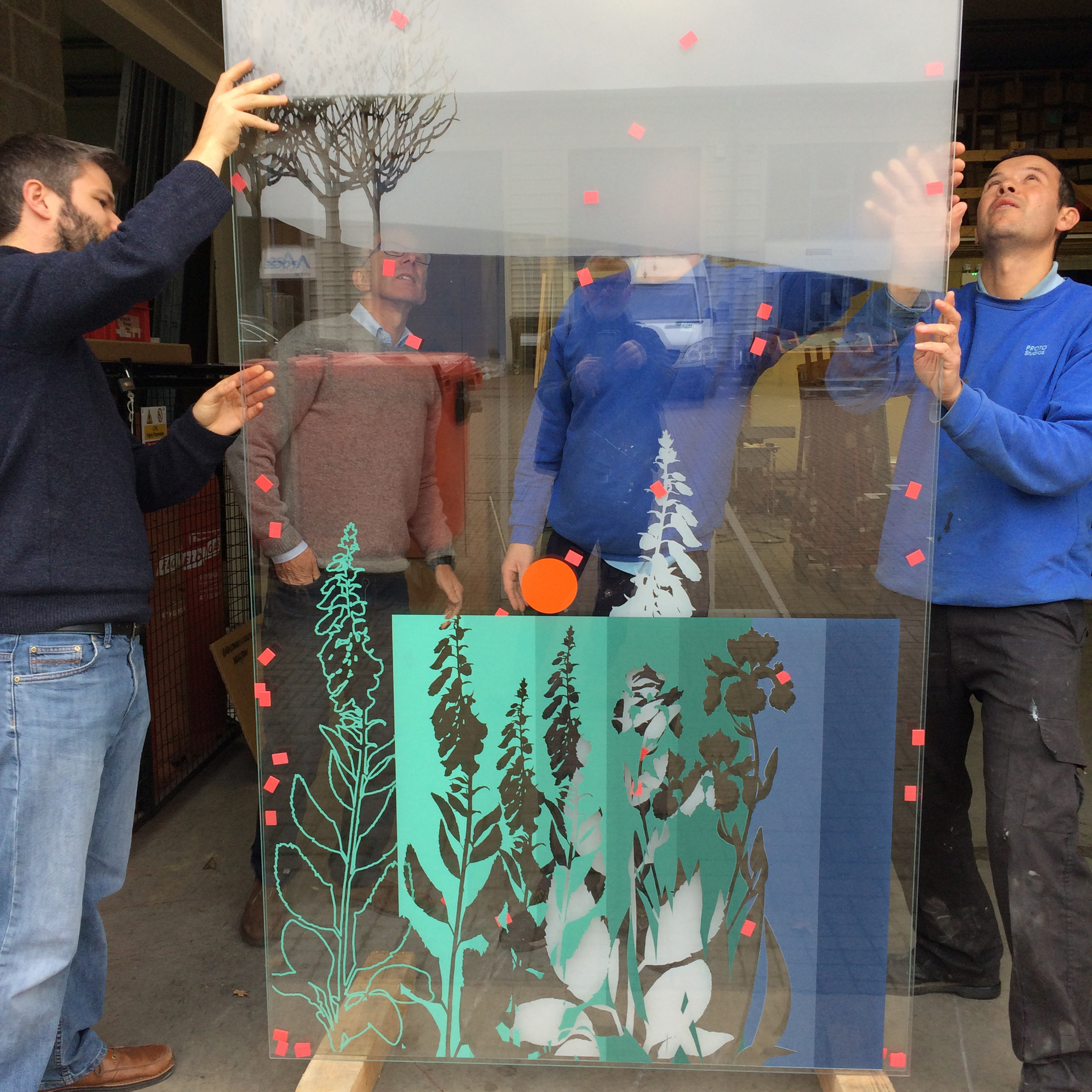
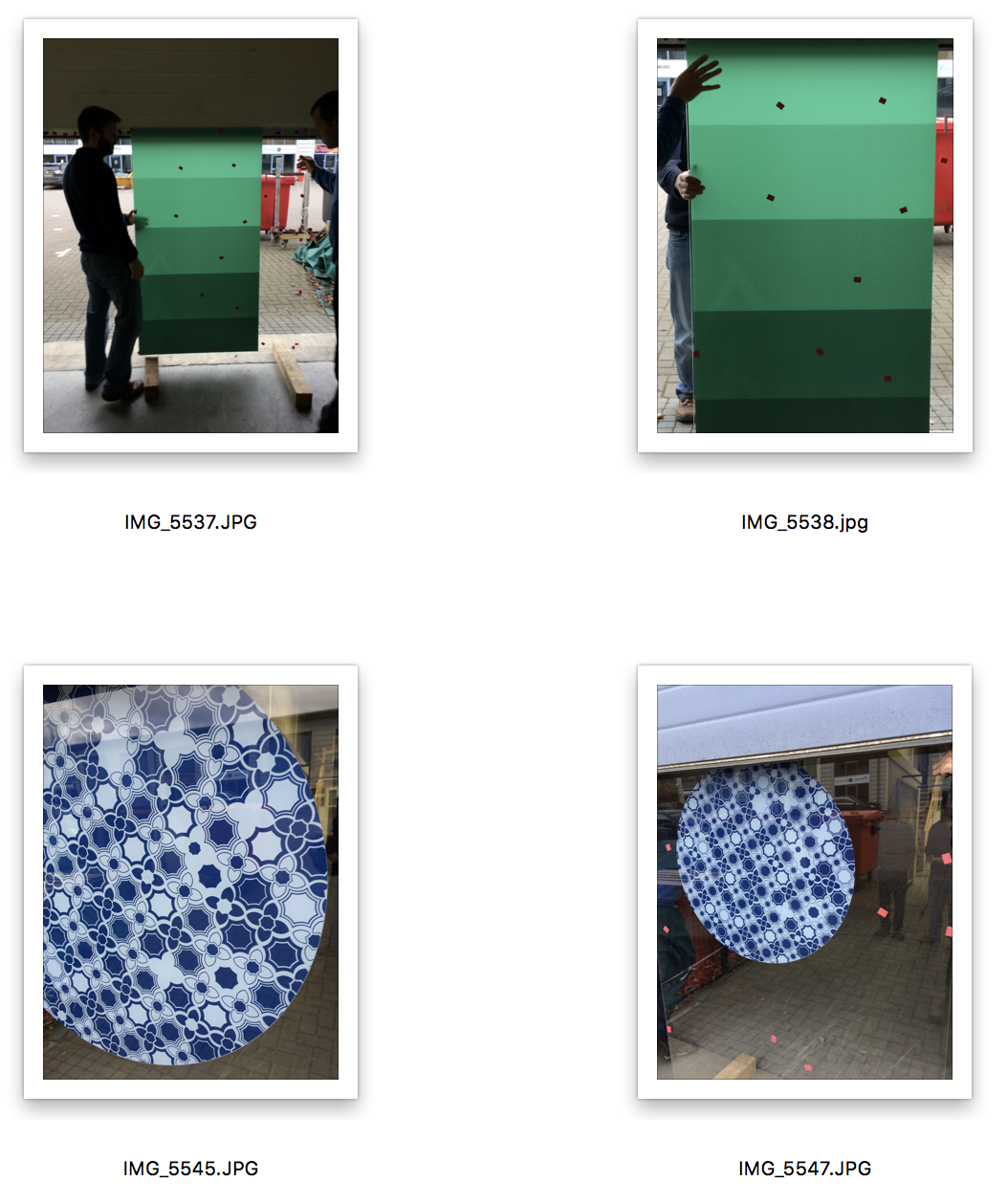
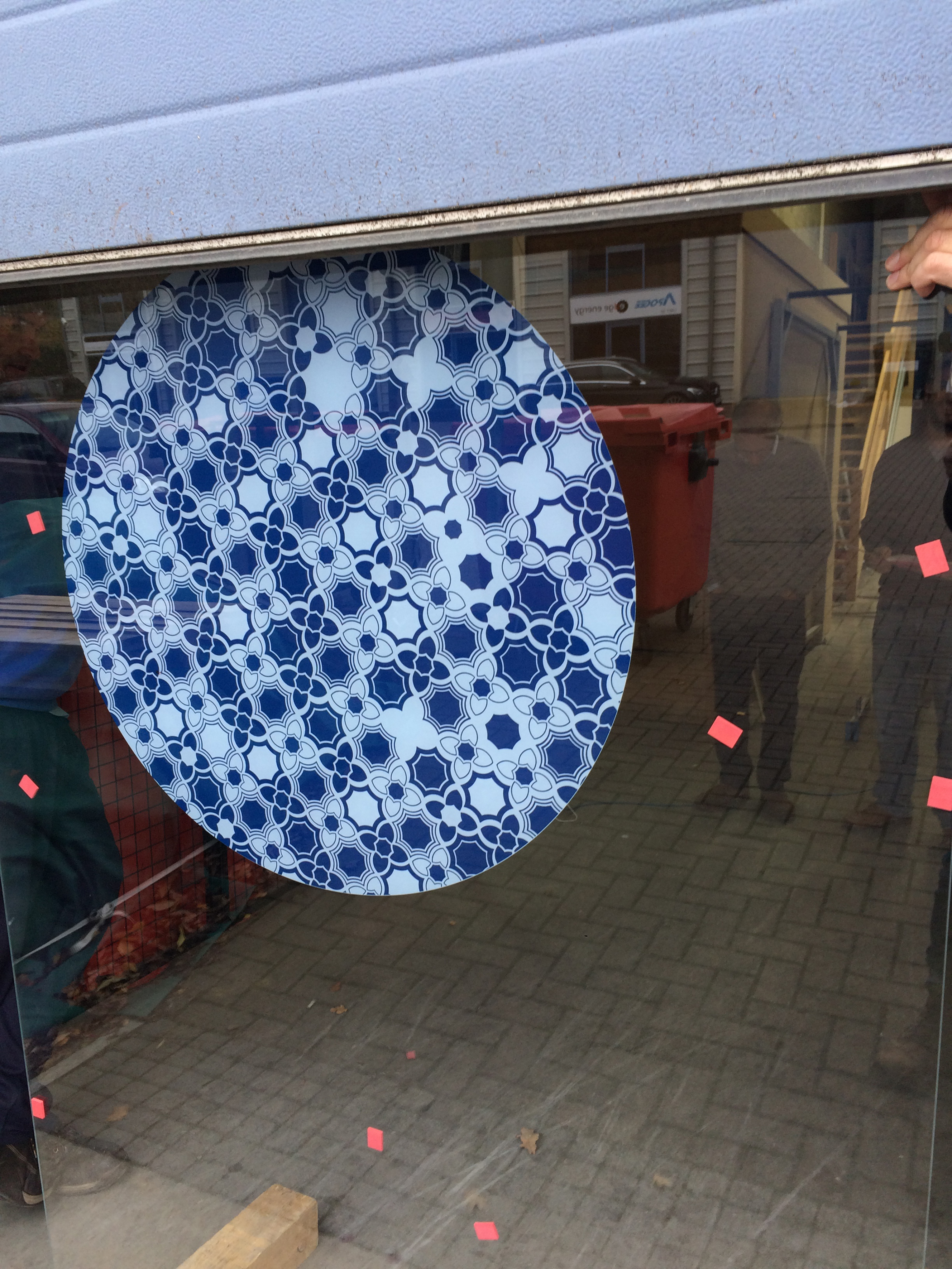
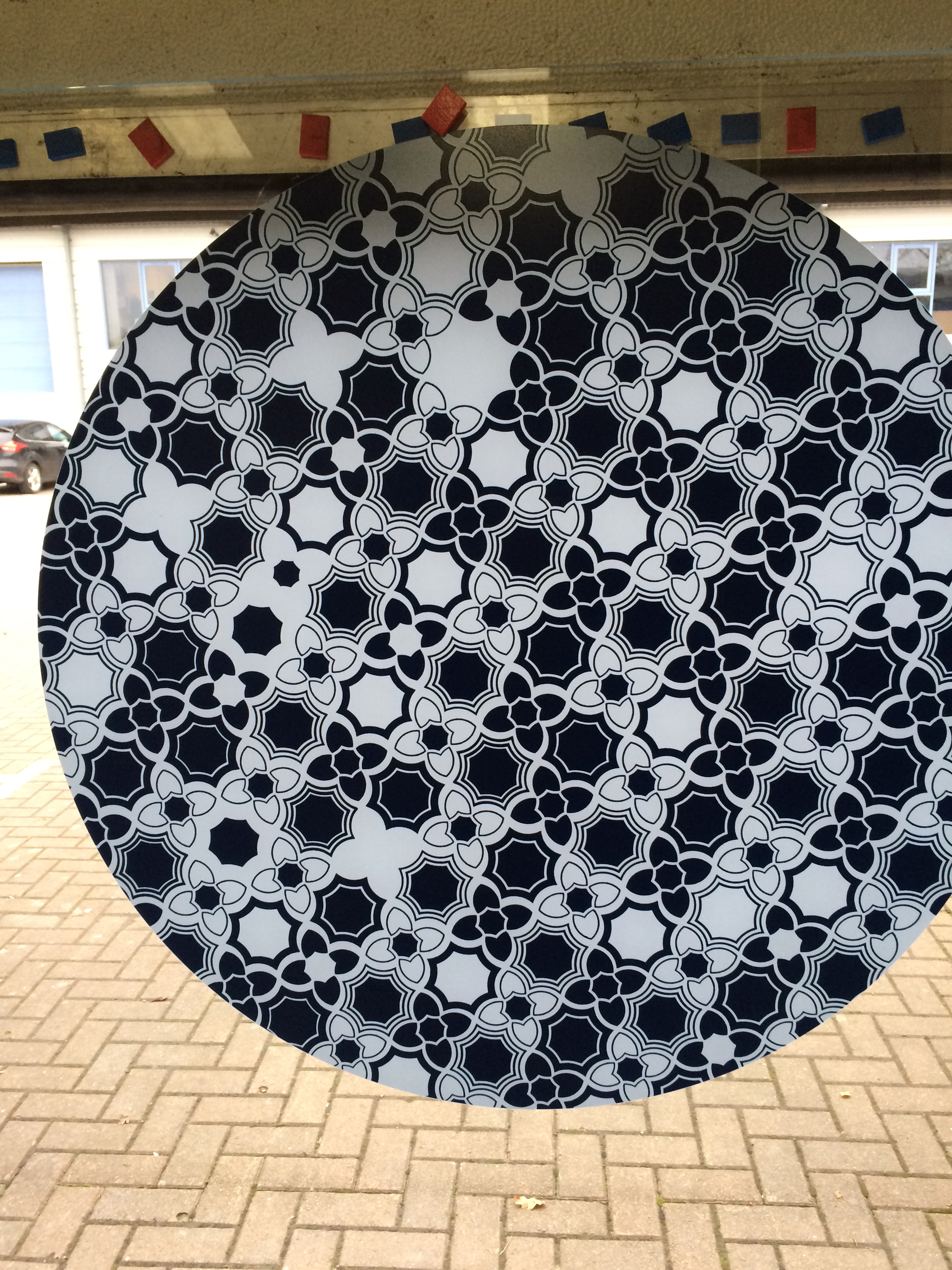
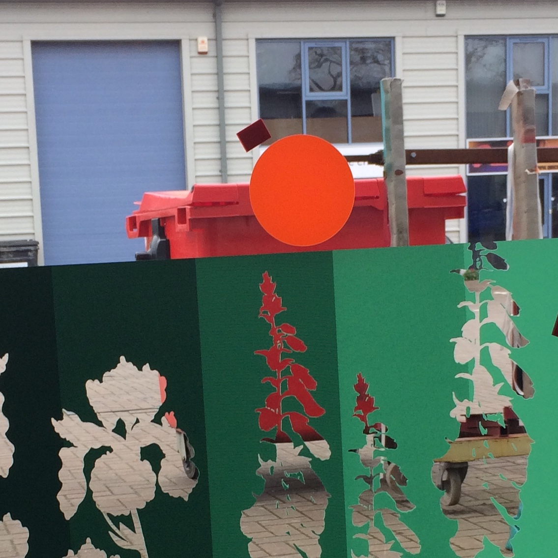
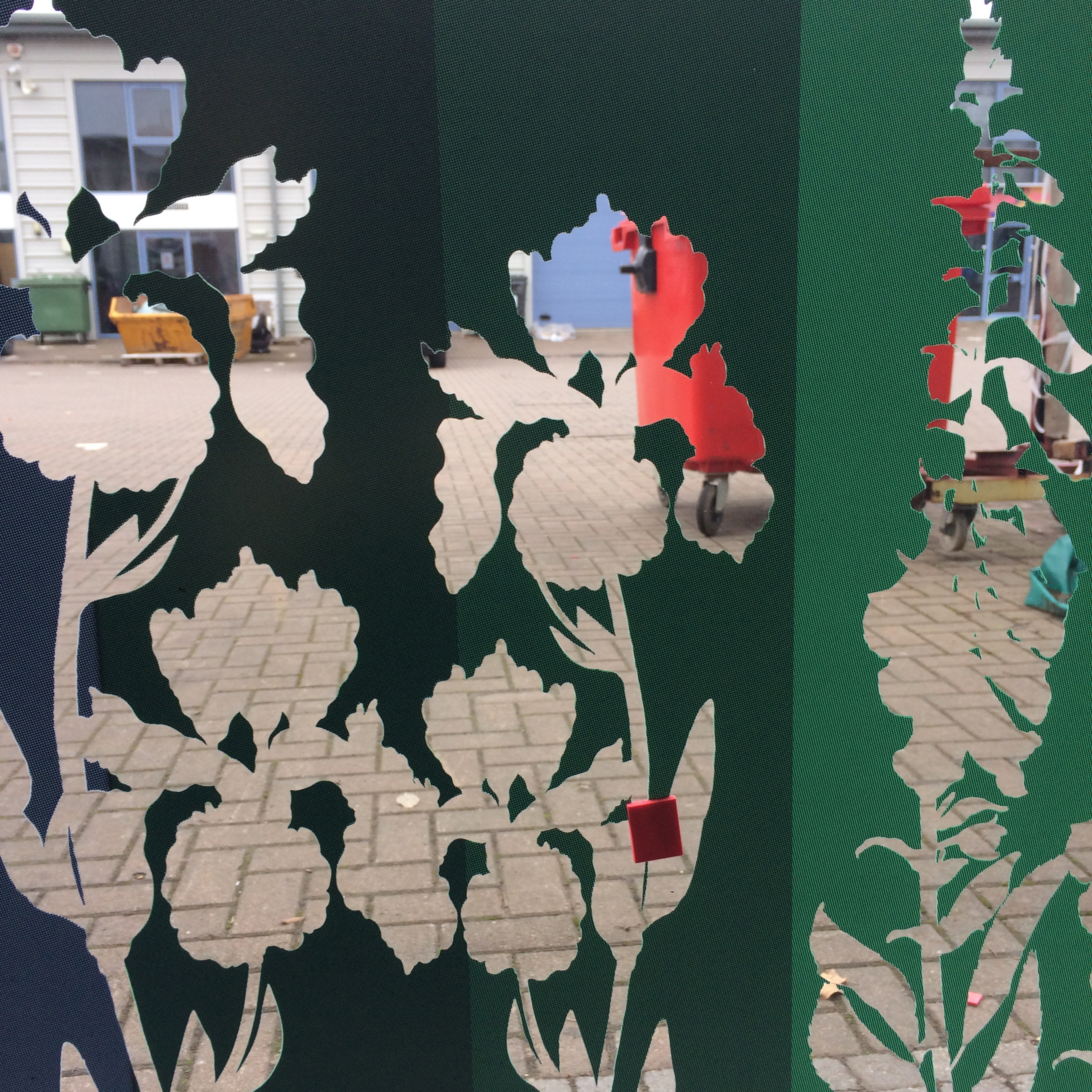
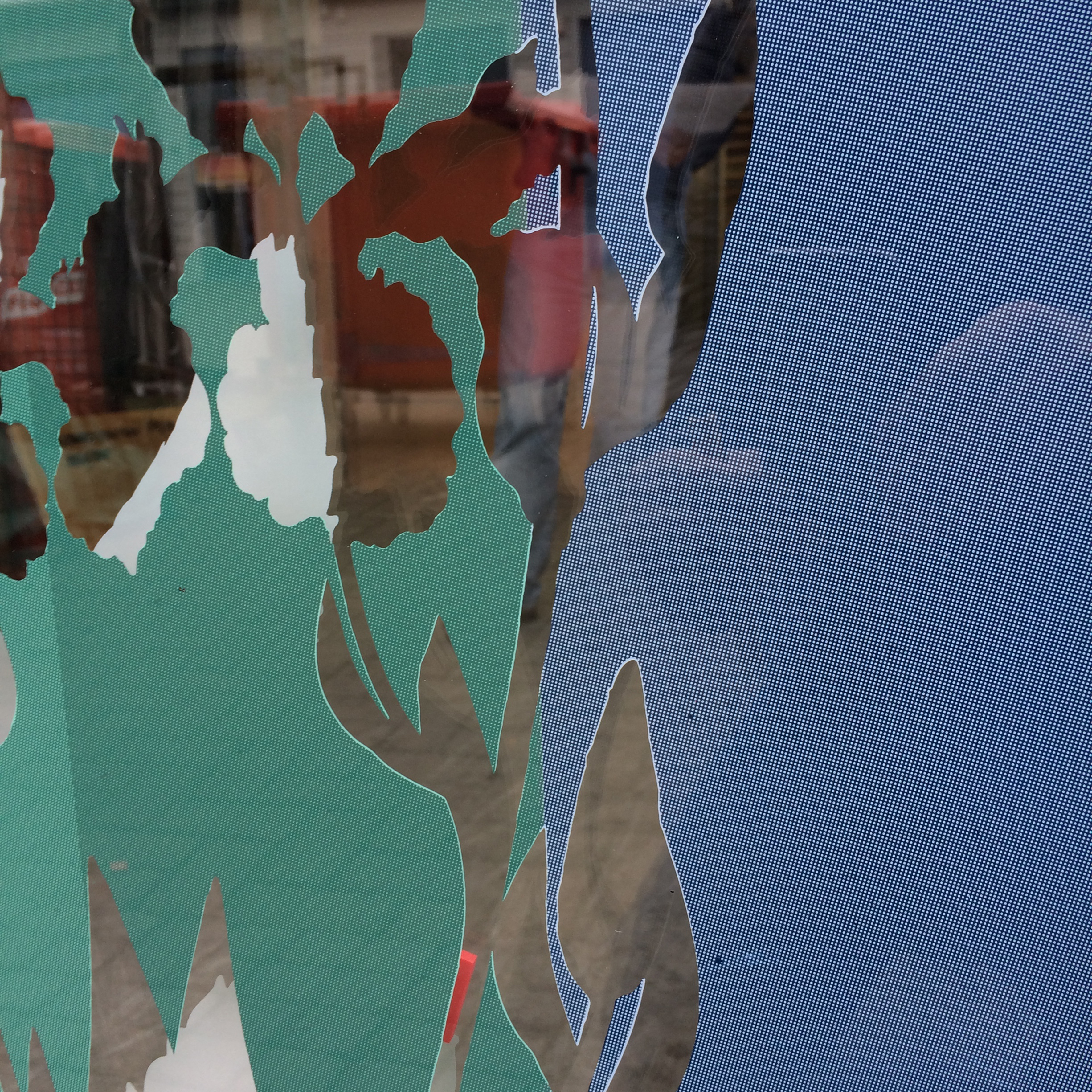
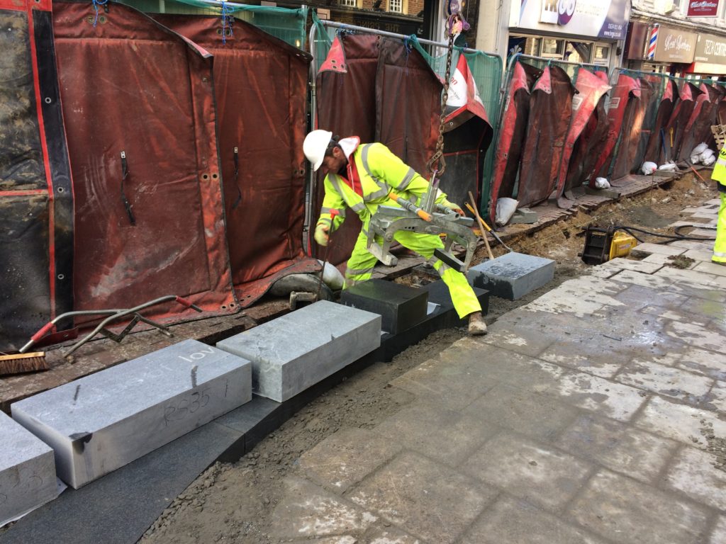
Production at Proto Studios. Image: Christopher TippingProduction at Proto Studios. Image: Christopher Tipping
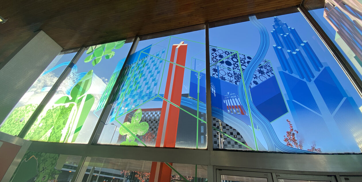
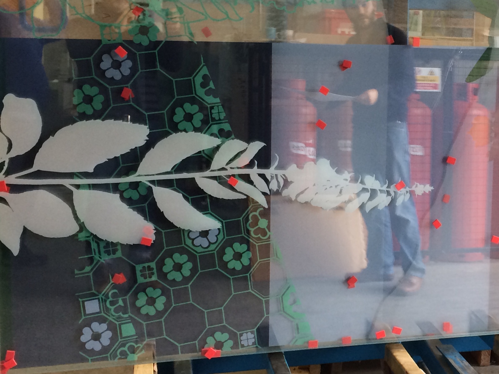
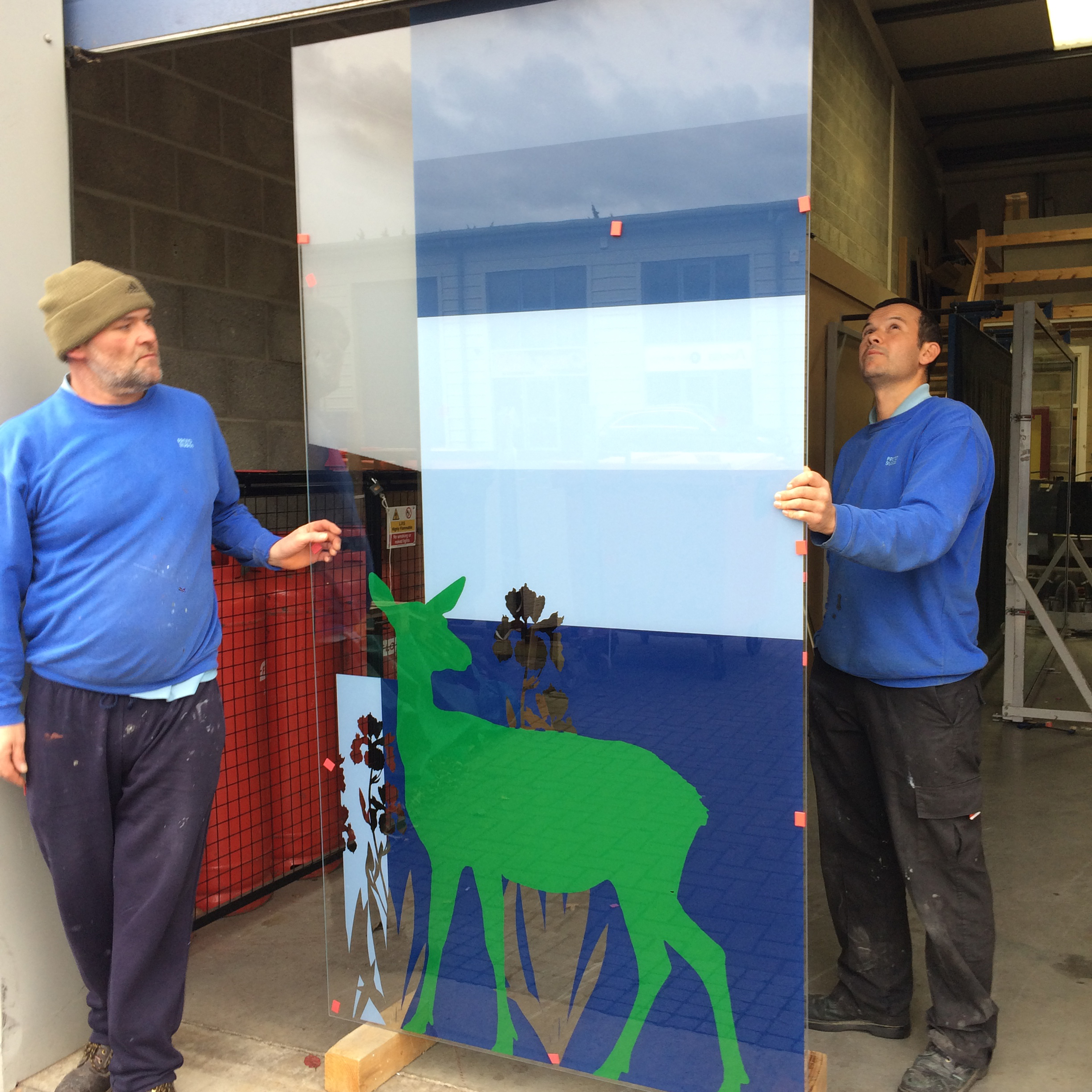
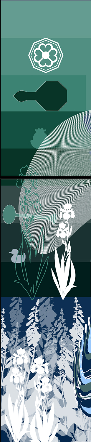
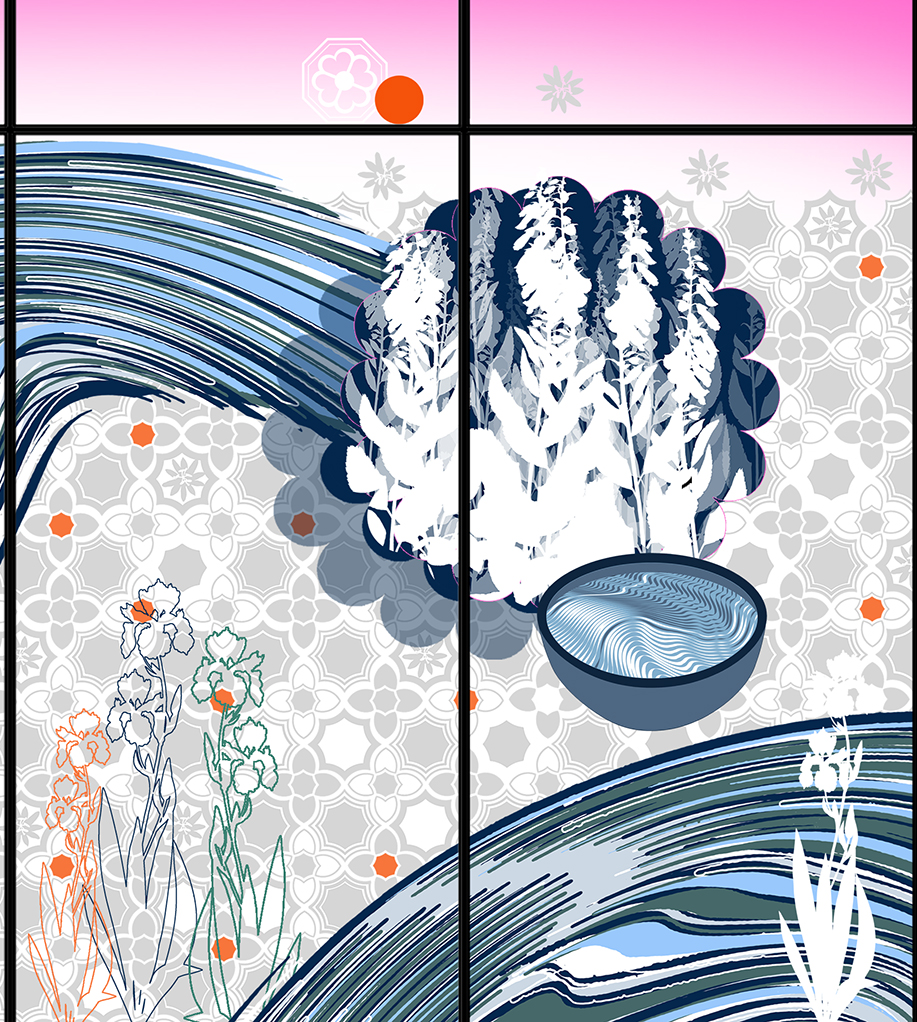
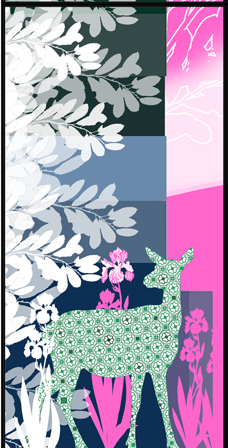
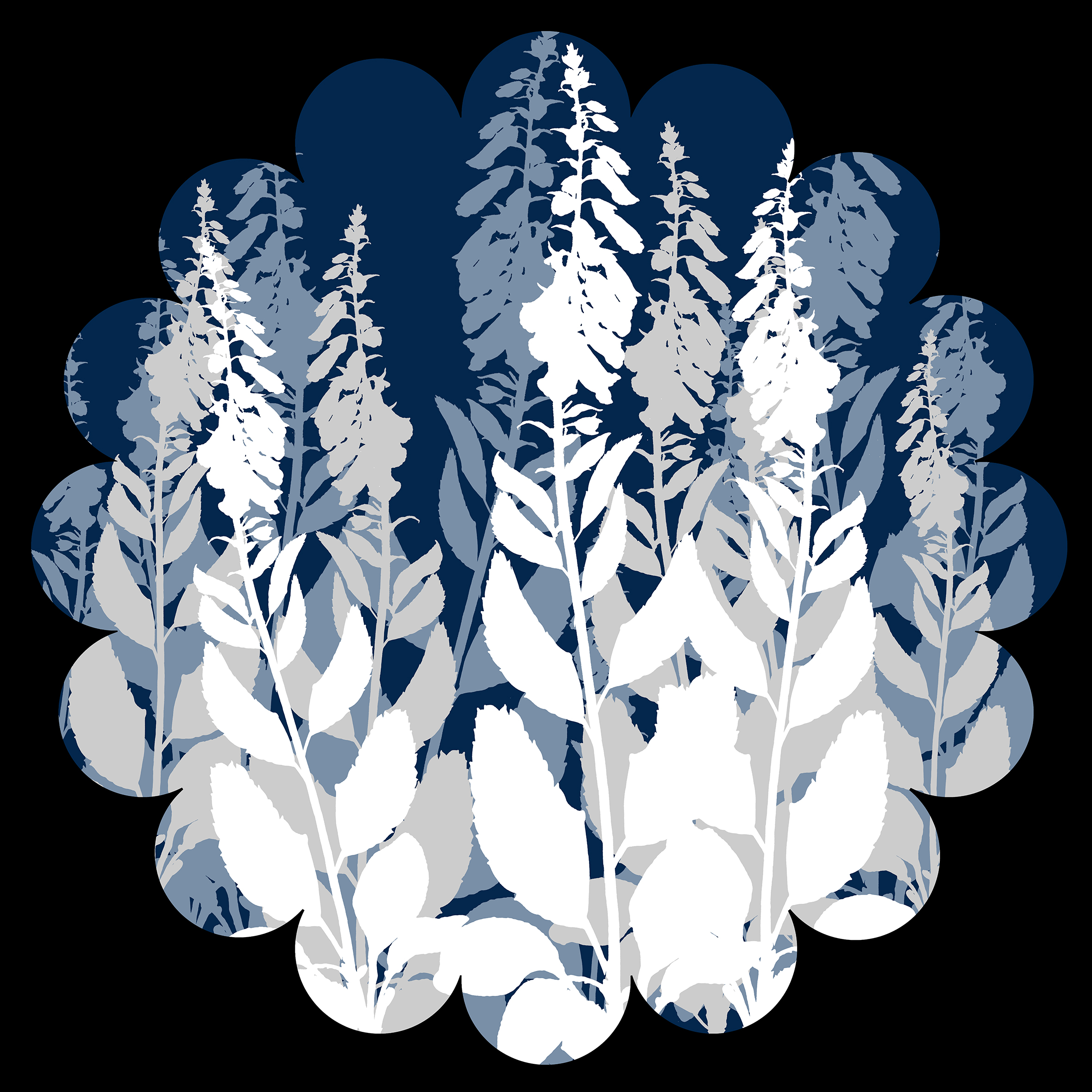
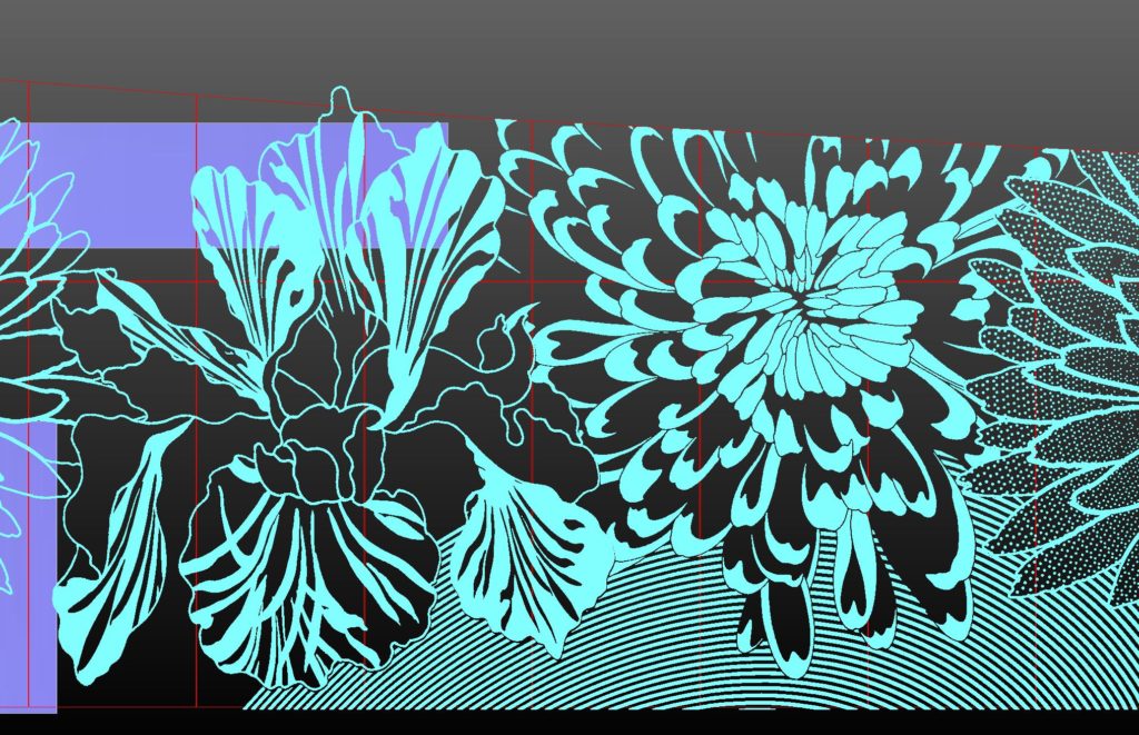
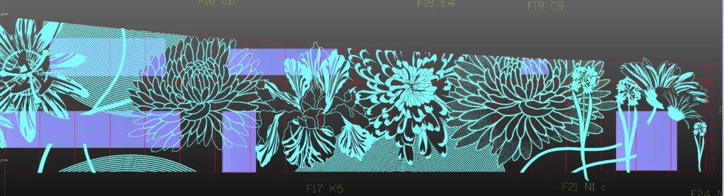
Work is now in progress at the brilliant Proto Glass Studios on the first stage of screen printing ceramic colour for of the NORTH SCREEN. We are collaborating with Proto Studios, specialist Architectural Glass Decorators on the production of 46sqm of screen printed, sandblasted & etched architectural glass screens for the new Hydrotherapy Pool & Therapies Unit for the RUH and RNHRD in Bath commissioned by Art at the Heart. The artwork is presented as an abstracted landscape running over both the North & the East Screens of the Pool Room – a way of encapsulating all disparate elements that have inspired my work into something engaging for the viewer, which will changes throughout the day in response to levels of daylight and direct sun.
Both the RUH & RNHRD Hospital sites were originally set in, and adjacent to open fields and expansive views of countryside. Easy to imagine then how beneficial this must have been to those patients and staff who experienced this.
It is now commonly understood that exposure to natural spaces, planting and nature within medical and healing environments is of great benefit and assists in the recovery and positive experience of patients and staff alike .
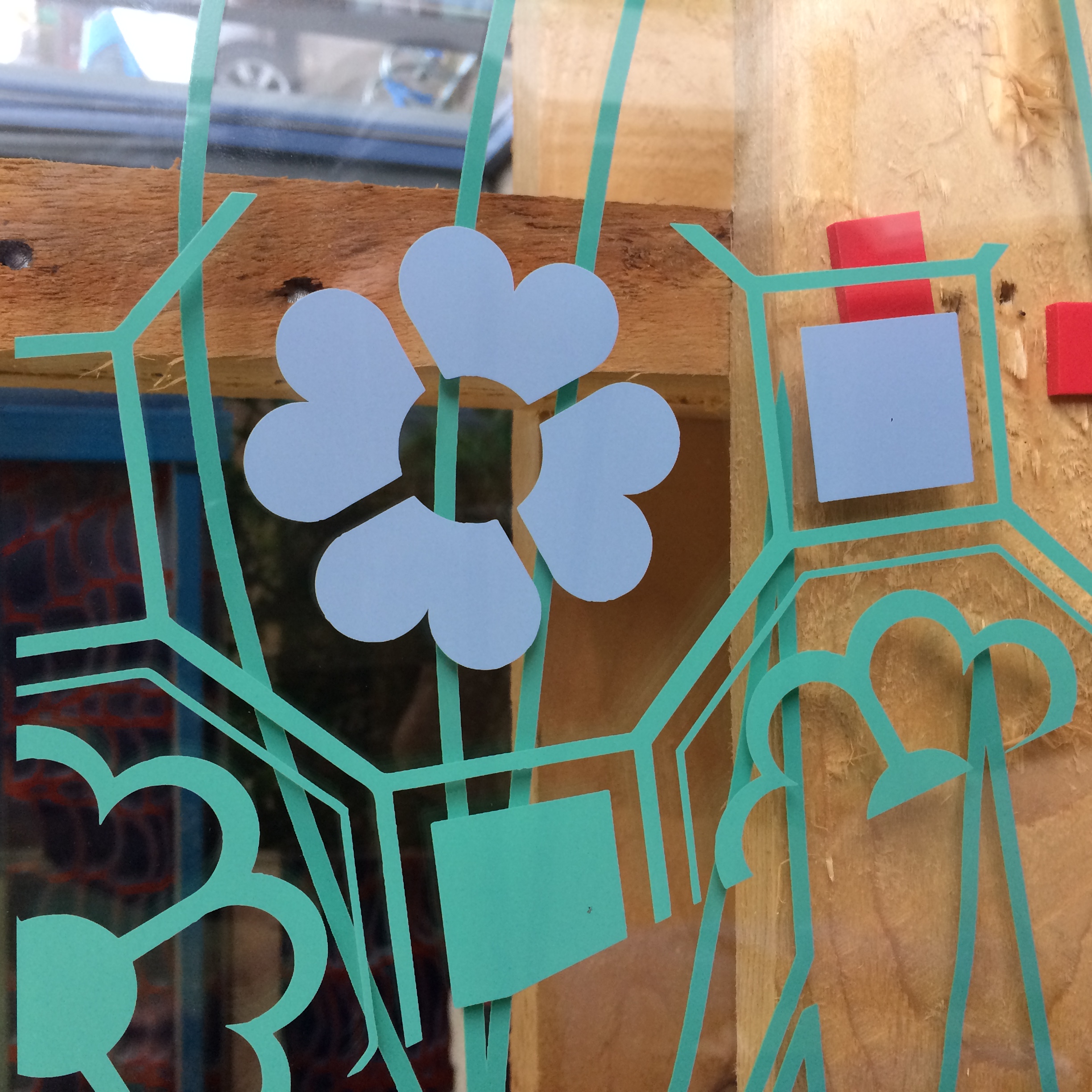
This landscape is populated with recognisable motifs, such as flowers, deer and trees, woven together with abstracted forms and simple repeating patterns. Local landmarks such as Kelston Round Hill also feature, as do references to the architectural decoration and built heritage of The Min and its archaic Roman Mosaics. However, the most visible motif perhaps is water, and more explicitly, the gestural movement of water as shaped by those taking treatment in the Hydrotherapy Pool. A shape made in water informed by the movement of a hand or leg. Abstractions of steam or mist appear to hover in this landscape. Water is contained within a bowl or pool. An elegant but dynamic abstract splash of water drifts across the whole of the East Screen. The connection to hot springs and flowing waters has shaped Bath into the World Heritage Site we see today.
Production at Proto Studios. Image: Christopher TippingProduction at Proto Studios. Image: Christopher TippingProduction at Proto Studios. Image: Christopher TippingProduction at Proto Studios. Image: Christopher TippingProduction at Proto Studios. Image: Christopher TippingProduction at Proto Studios. Image: Christopher TippingProduction at Proto Studios. Image: Christopher TippingProduction at Proto Studios. Image: Christopher TippingProduction at Proto Studios. Image: Christopher TippingProduction at Proto Studios. Image: Christopher TippingProduction at Proto Studios. Image: Christopher TippingProduction at Proto Studios. Image: Christopher TippingProduction at Proto Studios. Image: Christopher TippingProduction at Proto Studios. Image: Christopher Tipping
I imagined an abstracted landscape as a positive way of encapsulating all that has inspired my commission for the Hydrotherapy Pool glazed screens. (There are approximately 46sqm of glass combined in both screens).
Both Hospital sites were originally set in and adjacent to open fields and expansive views of countryside. Easy to imagine then how beneficial this must have been to those patients and staff who experienced this.
It is now commonly understood that exposure to natural spaces, planting and nature within medical and healing environments is of great benefit and assists in the recovery and positive experience of patients and staff alike.
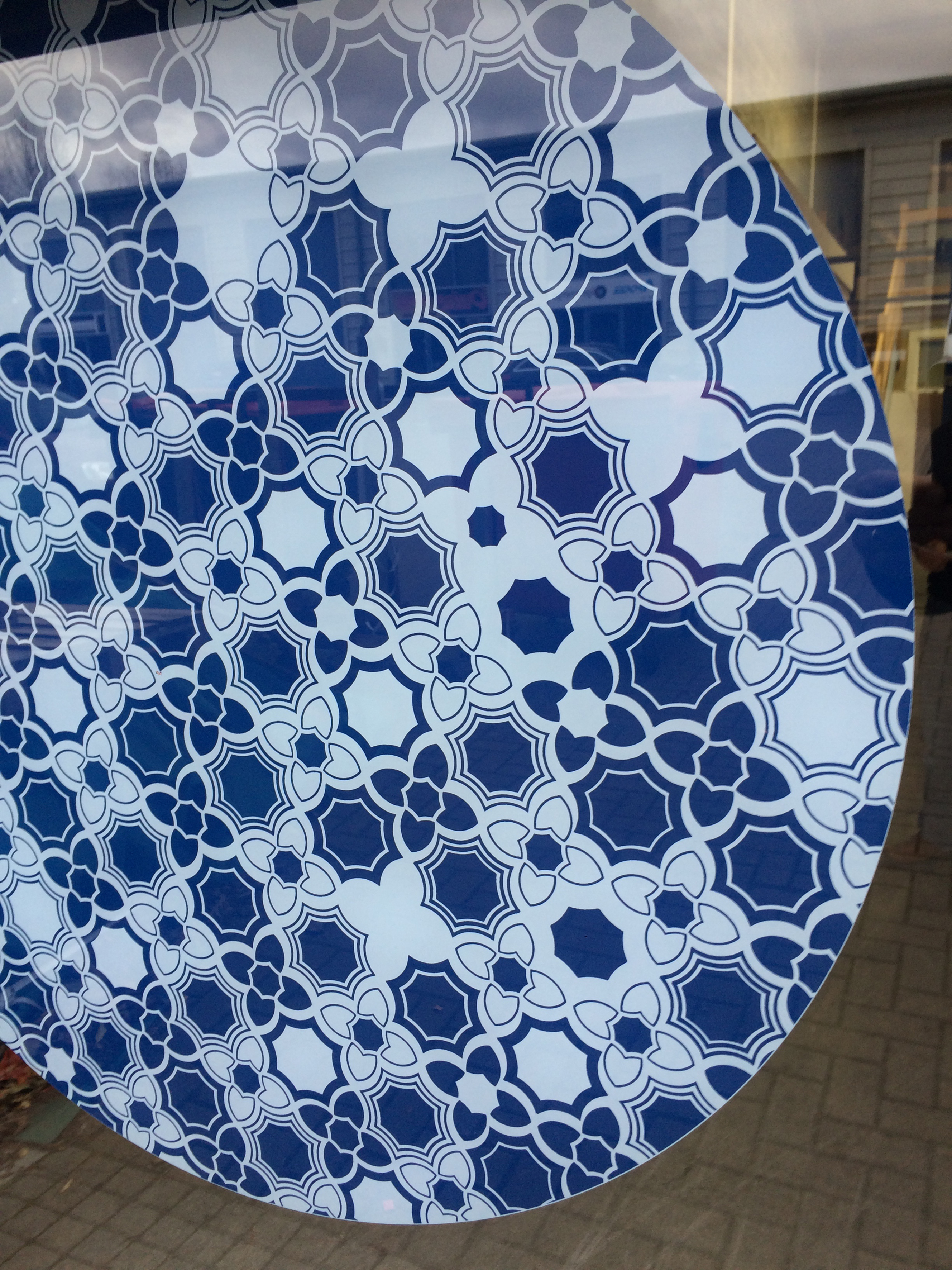
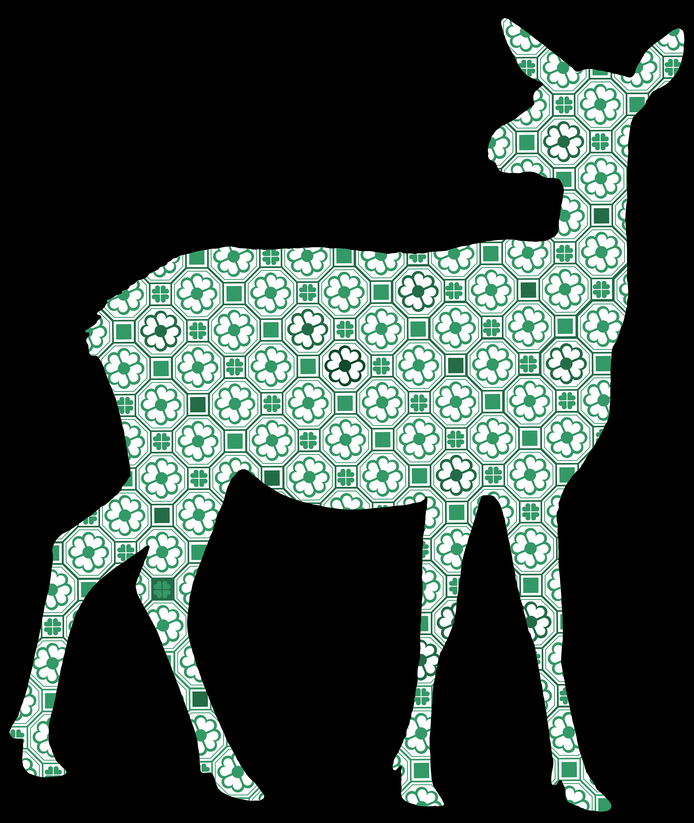
Deer with Roman pattern. Research Images developing patterns from research at the RNHRD, including The Min Chapel. Artist: Christopher Tipping
This glass landscape is populated with recognisable motifs, such as flowers, deer and trees, woven together with abstract forms and repeating patterns. Local landmarks such asKelston Round Hillalso feature, as do references to the architectural decoration and built heritage of The Minand its archaic Roman Mosaics. However, the most visible motif perhaps is water, and more explicitly, the gestural movement of water as shaped by those taking treatment in the Hydrotherapy Pool. A shape made in water informed by the movement of a hand or leg. Abstractions of steam or mist appear to hover in this landscape. Water is contained within a bowl or pool. An elegant but dynamic abstract splash of water drifts across the whole of the East Screen. The connection to hot springs and flowing waters has shaped Bath into the World Heritage Site we see today.
I have been so impressed with the positivity and care of the medical staff delivering these services, I wanted to evoke this caring nature with visual clues within the work, which may express this. Growing flowers and creating gardens is a nurturing vocation. Water is an elemental part of this. Historically, The Min was built upon the grounds of the first Theatre in Bath, and the later extension built upon the formal gardens of Rectory House. Adjacent to the ChapeI at the rear of The Min is a small but lovely garden. Also in Bath, Gibbes Garden was a 15th Century apothecary garden growing medicinal herbs.
Combe Park had formerly been the site of the Bath War Hospital built in 1916 to provide beds and medical services for WW1 Casualties. There was a small pond and a stream ran nearby. Patients and staff were encouraged to grow and maintain flower gardens & were rewarded with prizes.
I was offered a session at the Hydrotherapy Pool at The Min as a way of understanding a little more about the impact of water as a treatment. I am not a patient – I cannot experience this as many do on a daily basis, not I am I in the process of healing or tempering acute conditions. Patients vary from those with lifelong conditions, such as Ankylosing spondylitis and others suffering from chronic pain, to physiotherapy in the pool following operations or broken limbs. All I can aim for is to add to the interior space with something visually interesting / beautiful / stimulating to this brand-new environment, which makes the experience for both staff and patients a pleasant and perhaps an intriguing one.
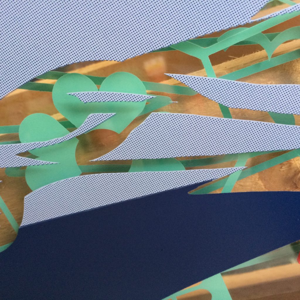
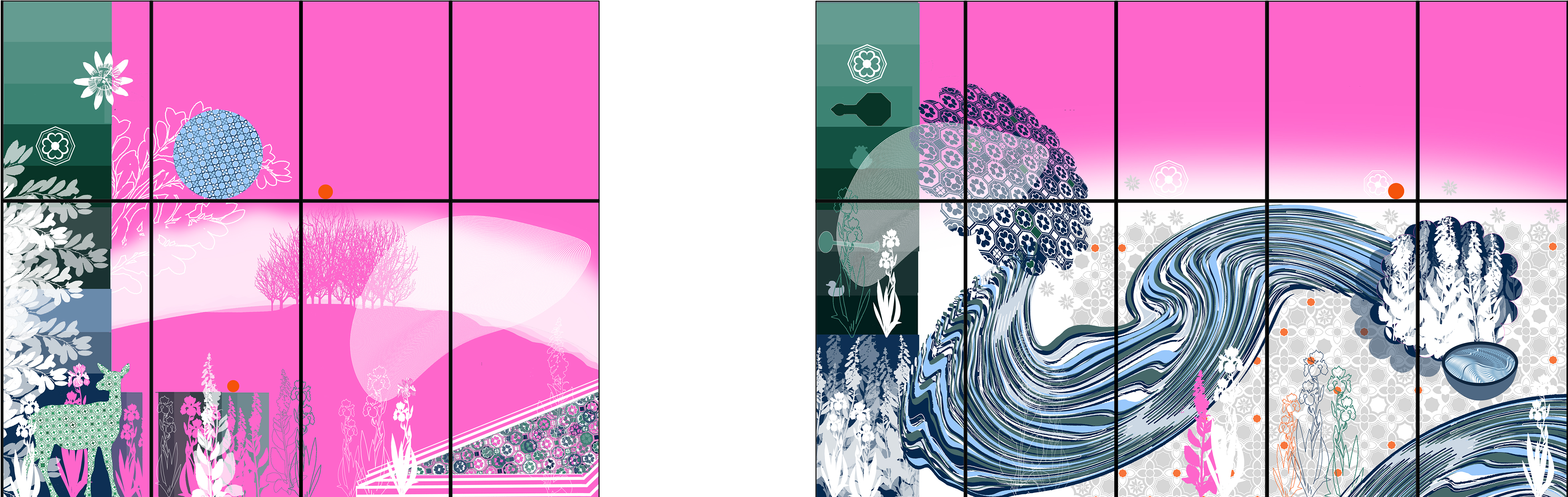
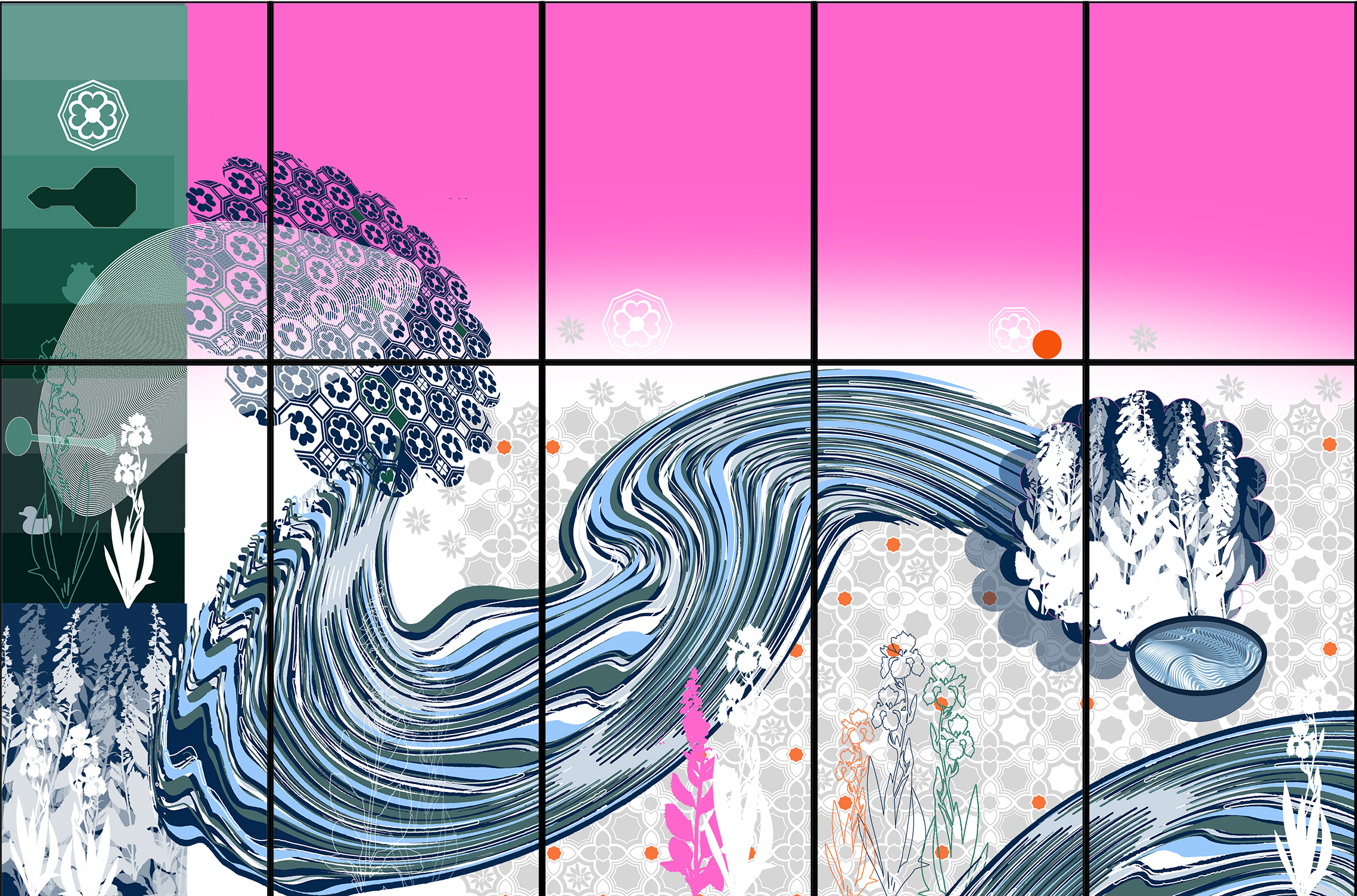
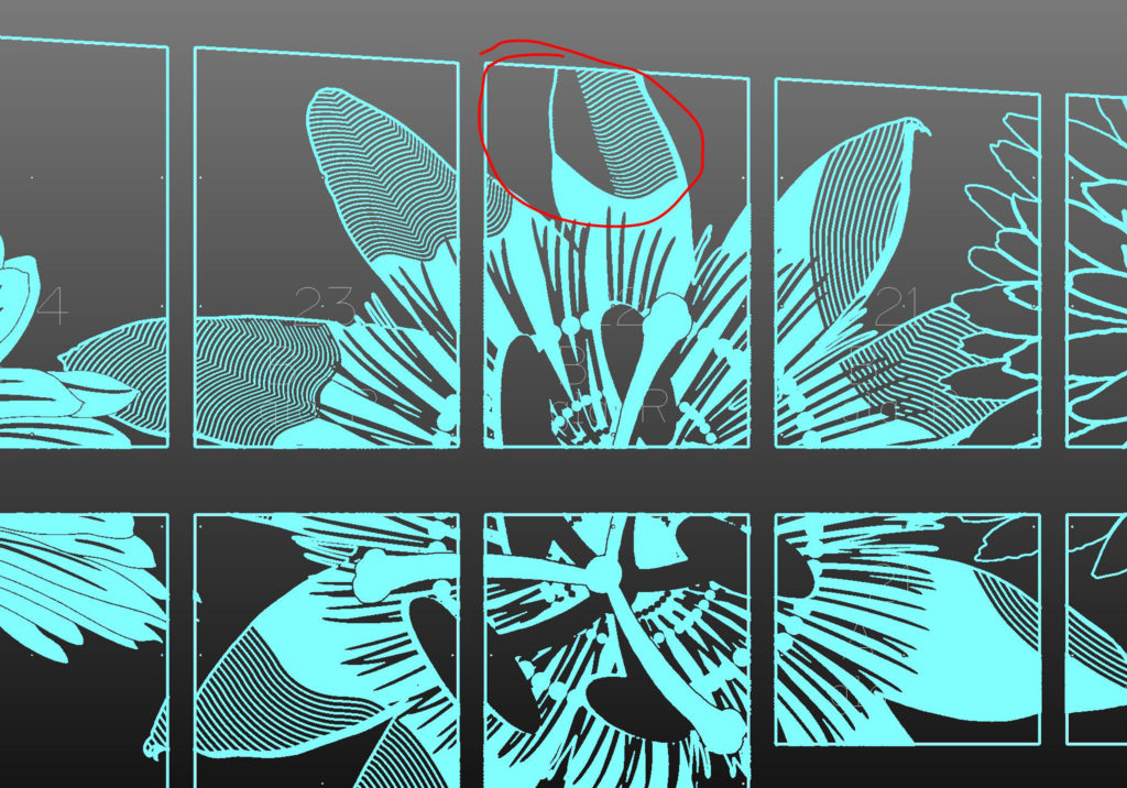
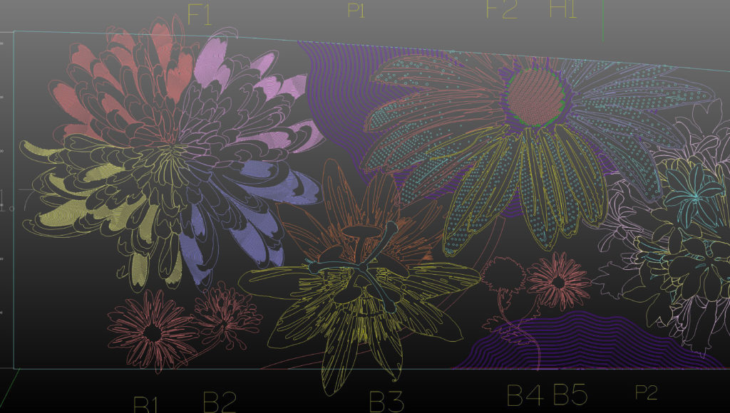
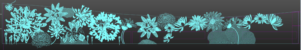
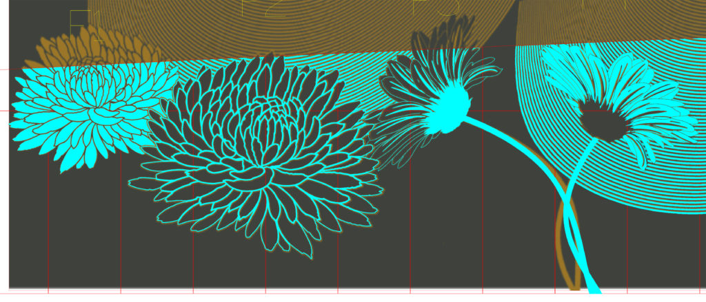
The following images make up the final draft artwork approved for production by the RUH. The Magenta/Pink colour is used to indicate clear/fully transparent glazing with no artwork. White represents sandblasting and / or Ceramic Etch techniques. All other colour is created using Screen-printed Ceramic Colour fired onto the glass. The artwork is applied to the two inner faces of a double glazed sealed unit. There is a subtle overlaying of motifs, which means that the artwork is slightly different as seen from the interior, than the exterior. These drafts are created initially via hand drawing and assembled and finished in Adobe Photoshop and Illustrator.
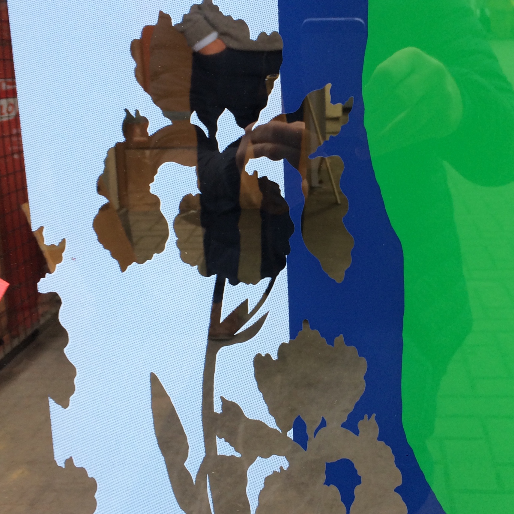
Final Master Draft for the North and East Glazed Screens. Artist: Christopher TippingResearch Images developing patterns from research at the RNHRD, including The Min Chapel. Artist: Christopher TippingResearch Images developing colour & patterns from research at the RNHRD, including The Min Chapel. Artist: Christopher TippingFinal Master Draft for the East Glazed Screen. Artist: Christopher TippingFinal Master Draft for the East Glazed Screen detail 4. Artist: Christopher TippingFinal Master Draft for the East Glazed Screen detail 3. Artist: Christopher TippingIris drawing. Research drawings developing motifs and patterns from research at the RNHRD, including The Min Chapel. Artist: Christopher TippingFinal Master Draft for the East Glazed Screen detail 2. Artist: Christopher TippingDraft Donkey with pattern. Research Images developing motifs & patterns from research at the RNHRD, including The Min Chapel. Artist: Christopher TippingOrange. Research Images developing motifs, patterns & colours from research at the RNHRD, including The Min Chapel. Artist: Christopher TippingFinal Master Draft for the North Glazed Screen detail 1. Artist: Christopher TippingFinal Master Draft for the North Glazed Screen detail 2. Artist: Christopher TippingFinal Master Draft for the North Glazed Screen detail 3. Artist: Christopher TippingDraft 16 Foil shape with Foxgloves. Research drawings developing motifs & patterns from research at the RNHRD, including The Min Chapel. Artist: Christopher Tipping
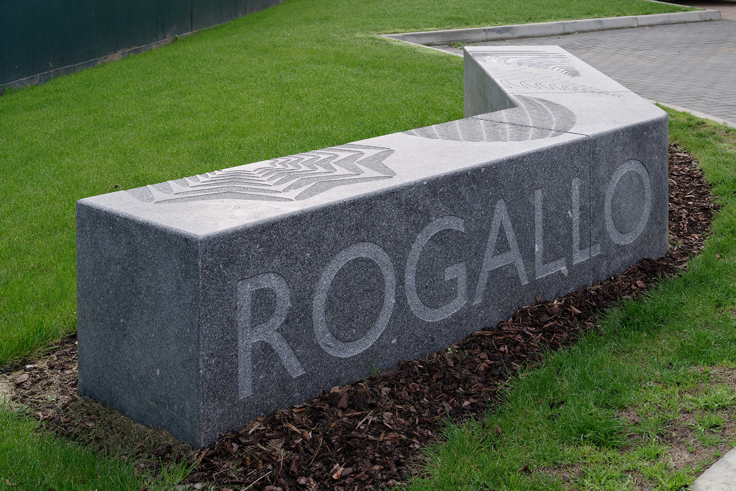
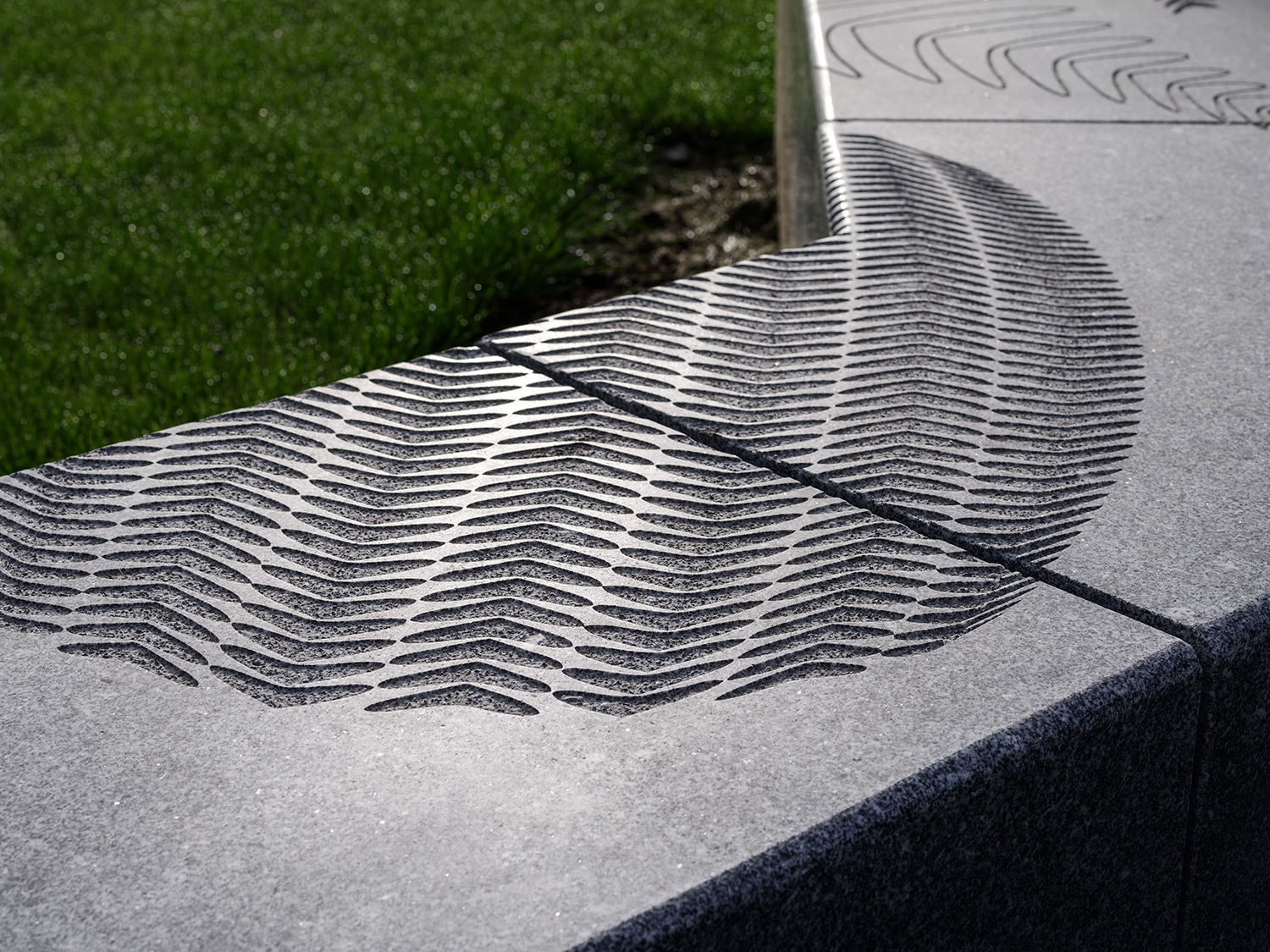
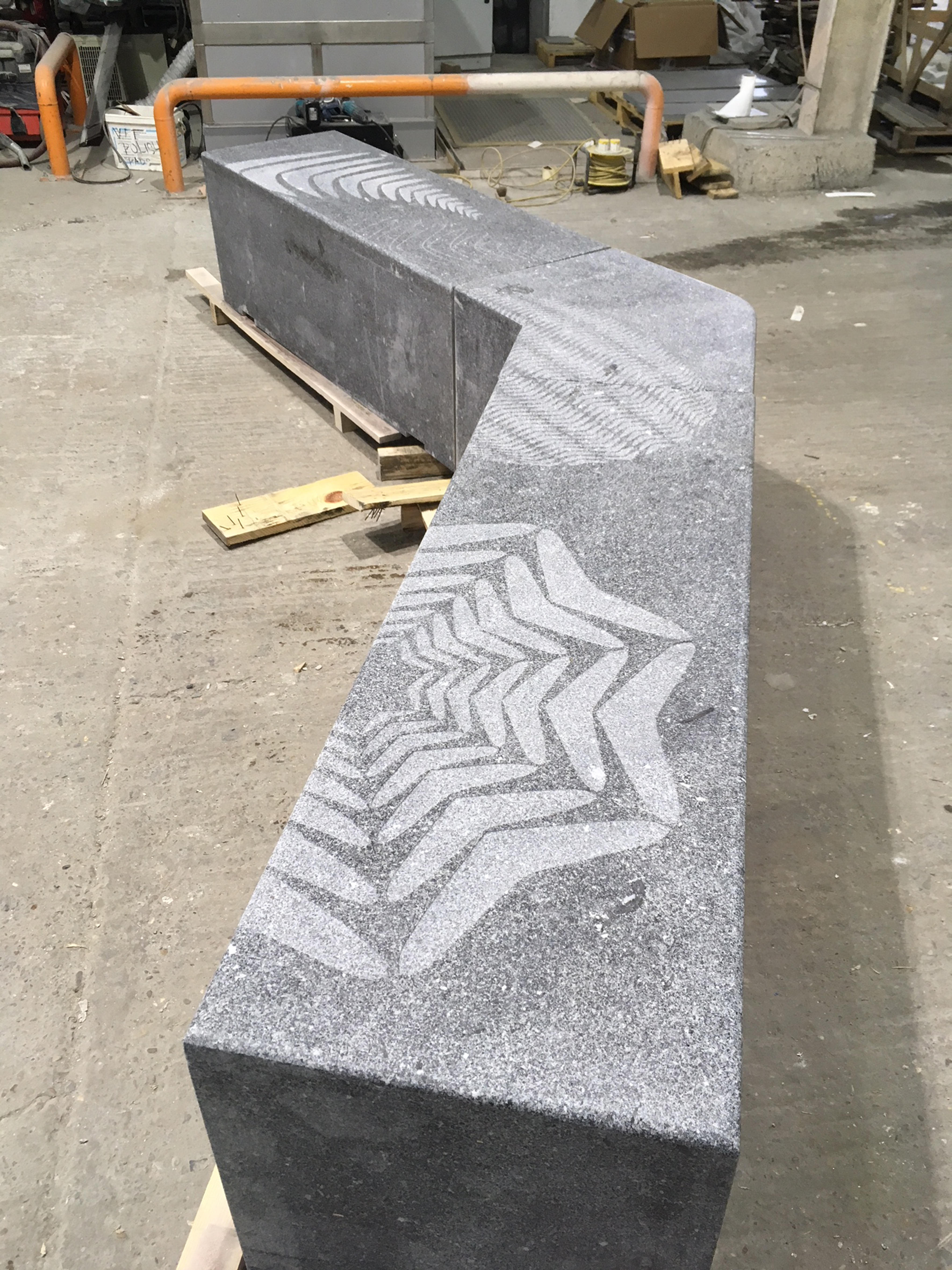
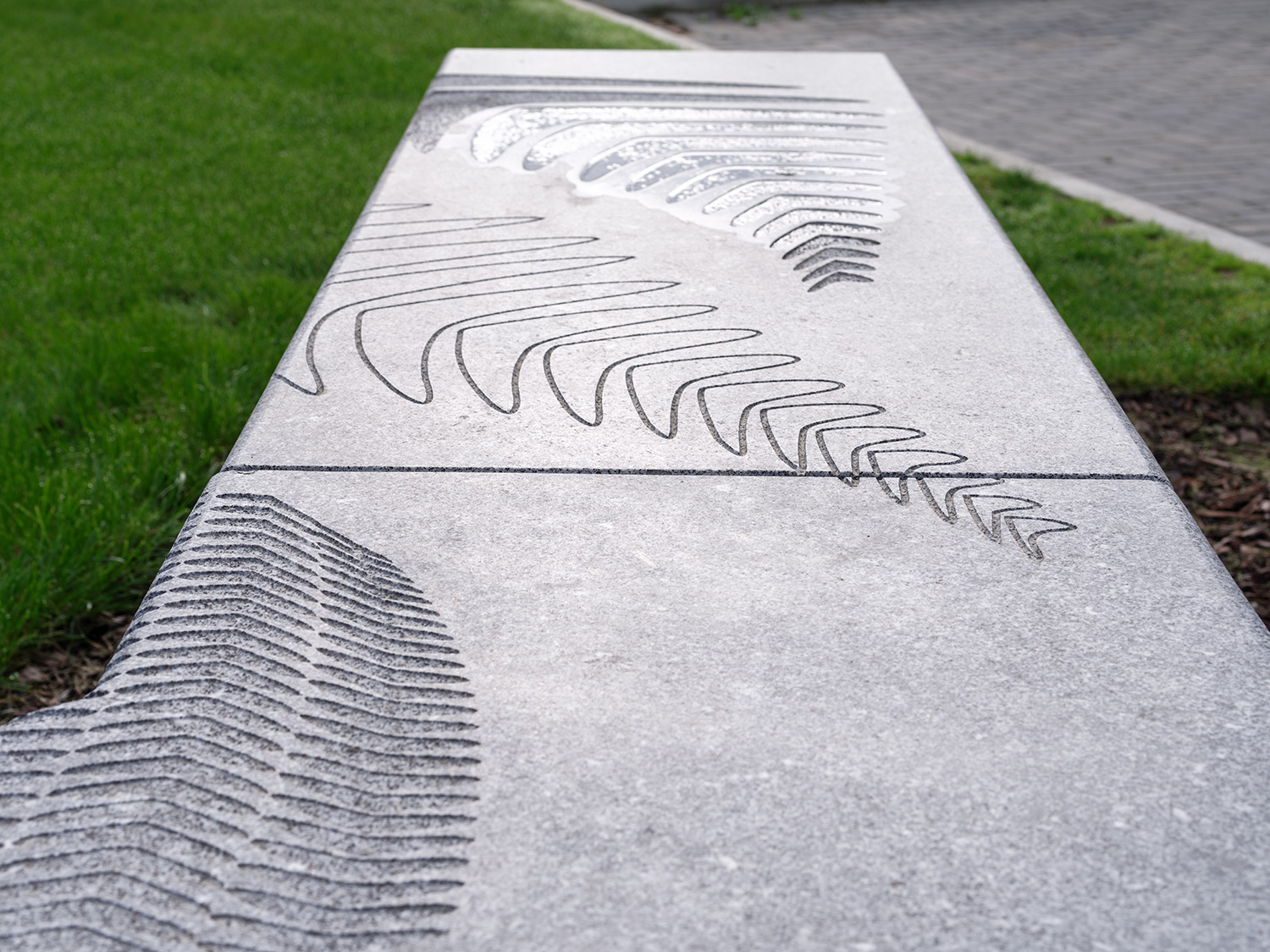
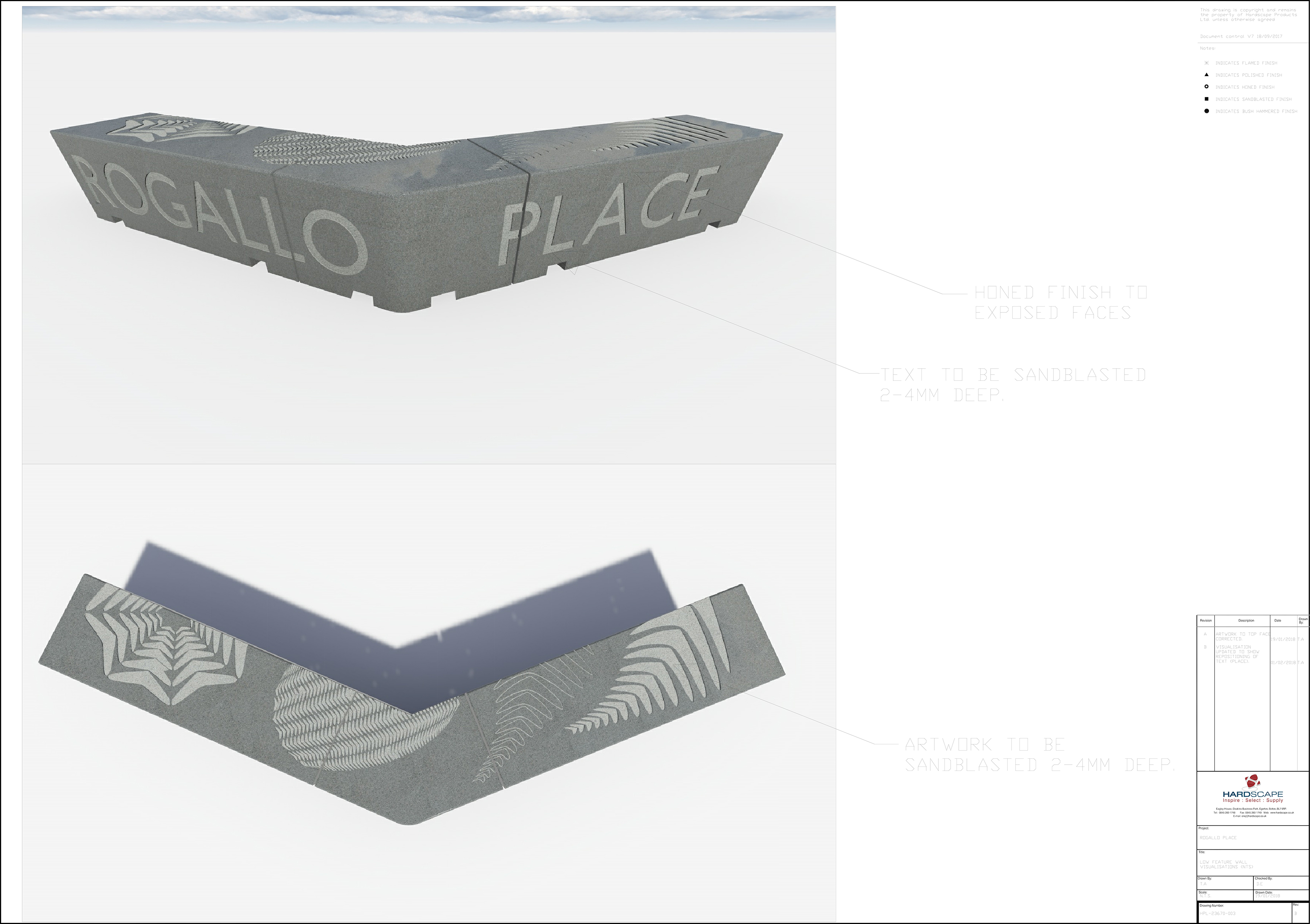
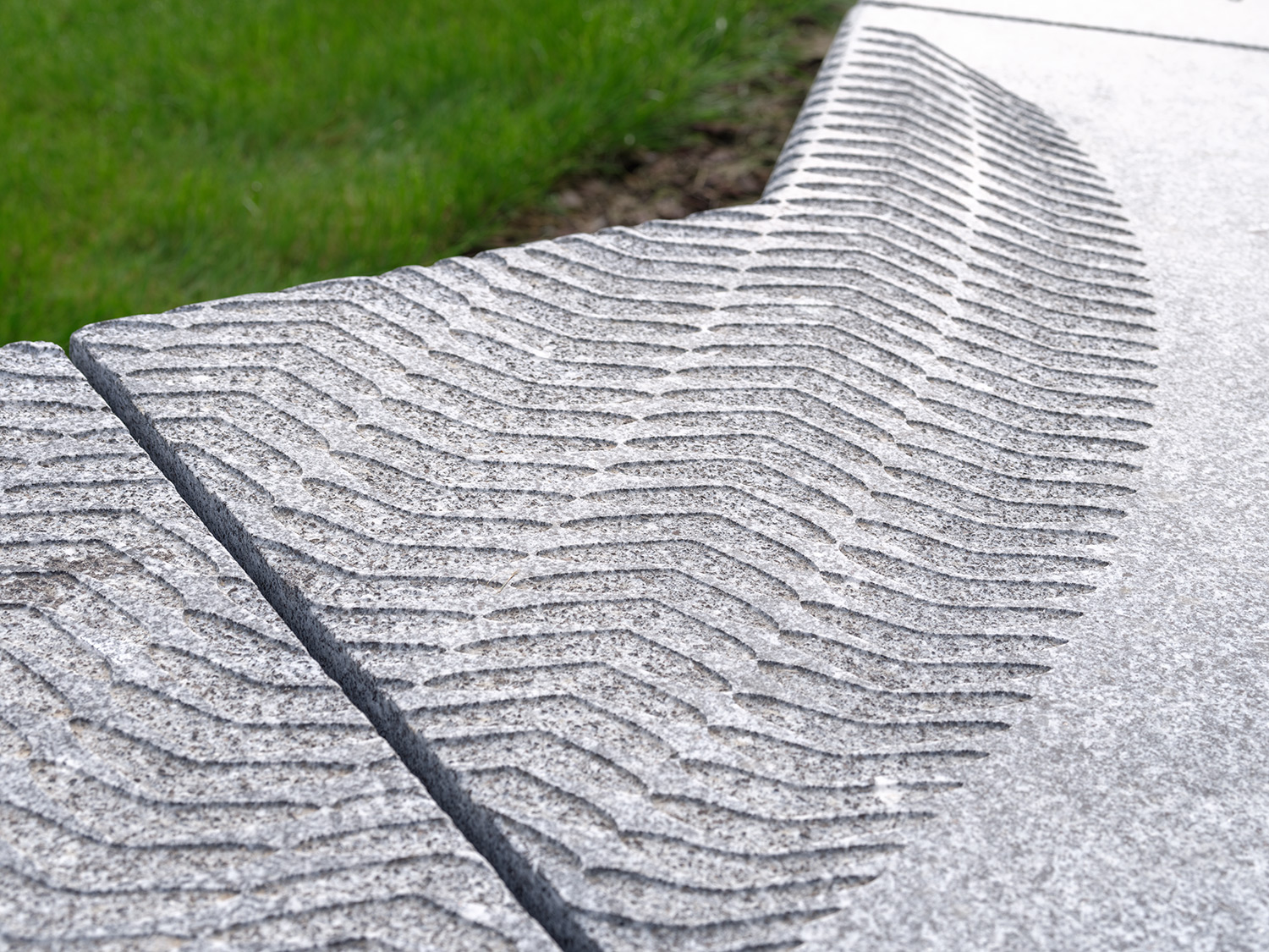
Rogallo Place Granite Bench by Artist Christopher Tipping. Image: Richard Gooding
A simple monolithic granite bench was also commissioned for Rogallo Place by Optivo Homes. A beautiful honed finish is sandblasted with the name of the building alongside detailed motifs reflecting the glazing vinyls of the building’s interior.
The bench was manufactured and supplied in collaboration withHardscape,as ever, great to work with.
Rogallo Place Granite Bench by Artist Christopher Tipping. Image: Richard GoodingRogallo Place Granite Bench by Artist Christopher Tipping. Image: Richard GoodingRogallo Place Granite Bench by Artist Christopher Tipping. Image: Hardscape
The image above was taken during production at Hardscape’s Facility at Long Marston, near Stratford Upon Avon.
Rogallo Place Granite Bench by Artist Christopher Tipping. Image: HardscapeRogallo Place Granite Bench by Artist Christopher Tipping. Image: Richard GoodingRogallo Place Granite Bench Drawings by Hardscape for Artist Christopher Tipping. Image: HardscapeRogallo Place Granite Bench by Artist Christopher Tipping. Image: Richard GoodingRogallo Place Granite Bench by Artist Christopher Tipping. Image: Richard GoodingRogallo Place Granite Bench by Artist Christopher Tipping. Image: Francis Knight Art Consultants
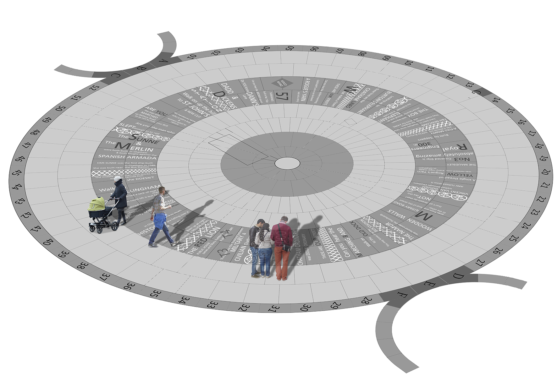
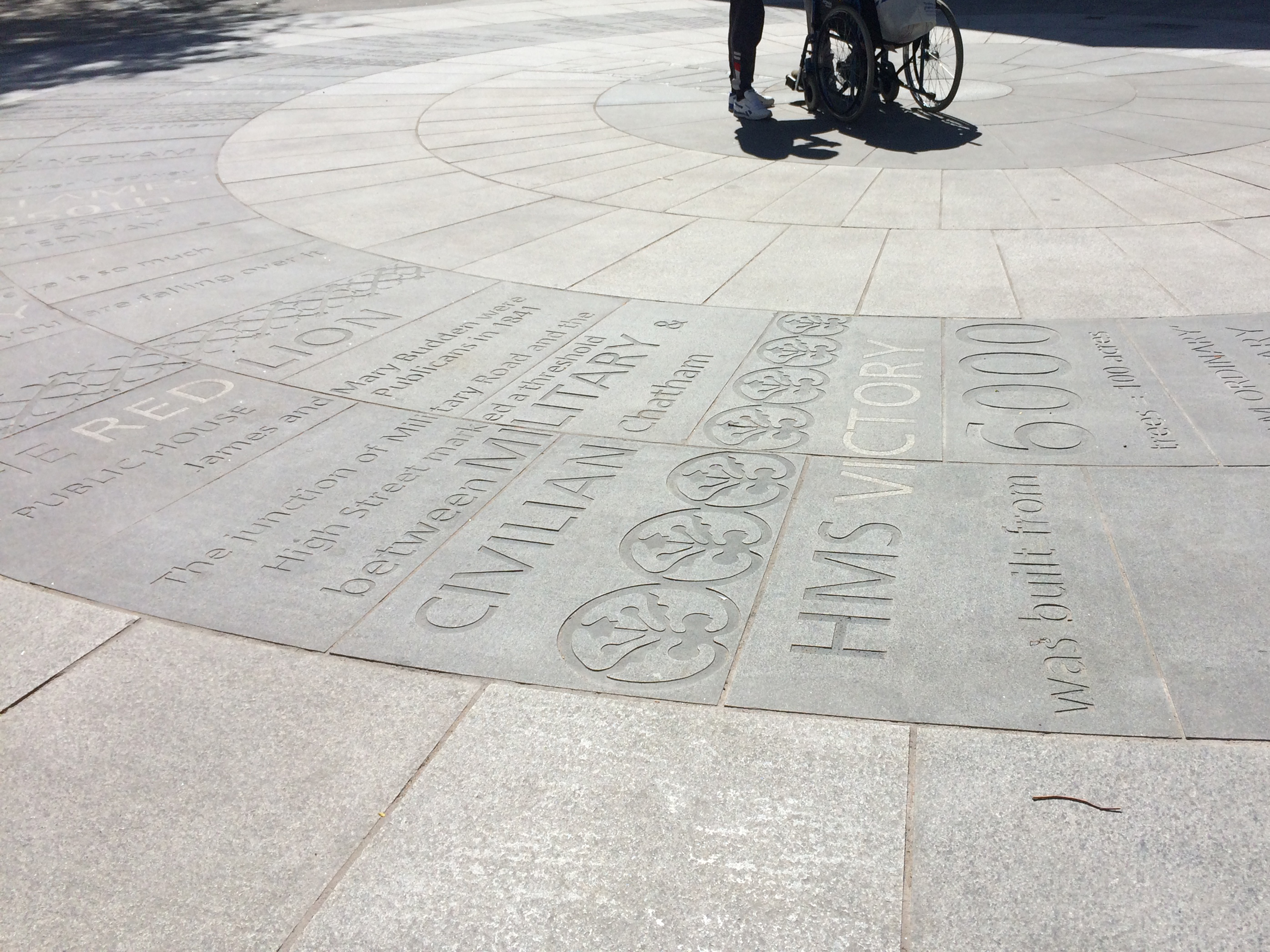
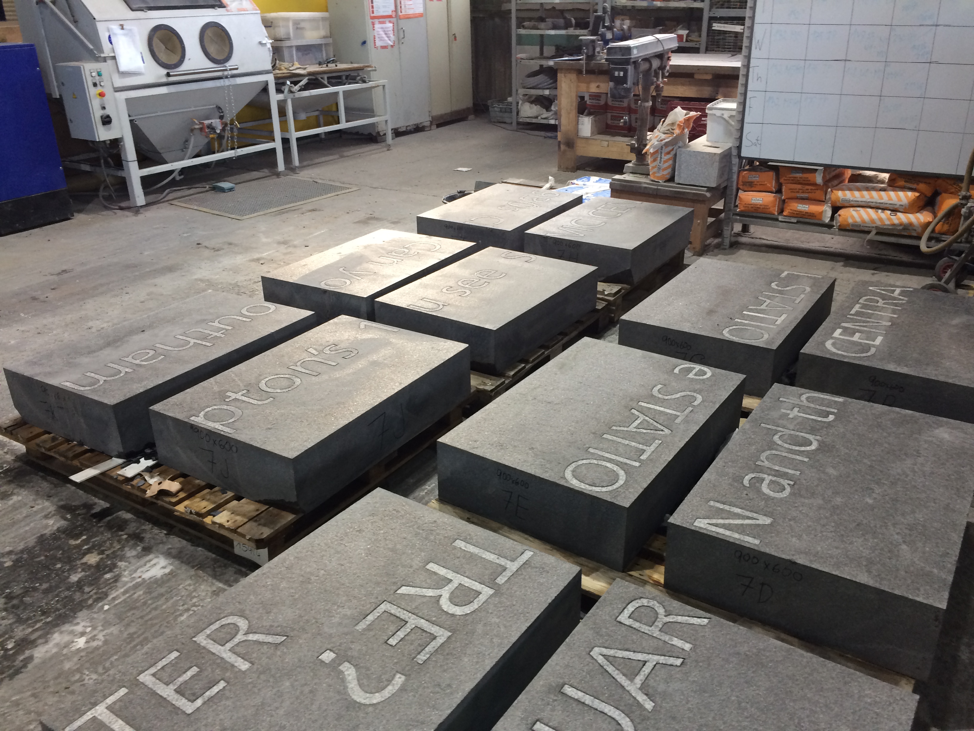
The regeneration and public realm works in Military Square, Chatham have very nearly been completed. This involves the installation of 400 bespoke radius-cut monolithic blocks of granite set into 17m diameter circle, putting a circle of words at the centre of a Military Square!
154 of the granite blocks have words, numbers & patterns sandblasted or inset into the surface. Just over 400 words are included –
Local school children & people working in local businesses were asked for their comments.
We listened to them & heard their stories. We listened to the sound of their lives.
There is an overwhelming sense of common ownership in this project.
These words are not ours. They belong to Chatham.
Military Square, Chatham. Image: Christopher TippingDraft Artwork for Military Square, Chatham. Image: Christopher TippingMilitary Square, Chatham. Image: Christopher TippingGranite blocks awaiting installation in Military Square, Chatham. Image: Christopher Tipping
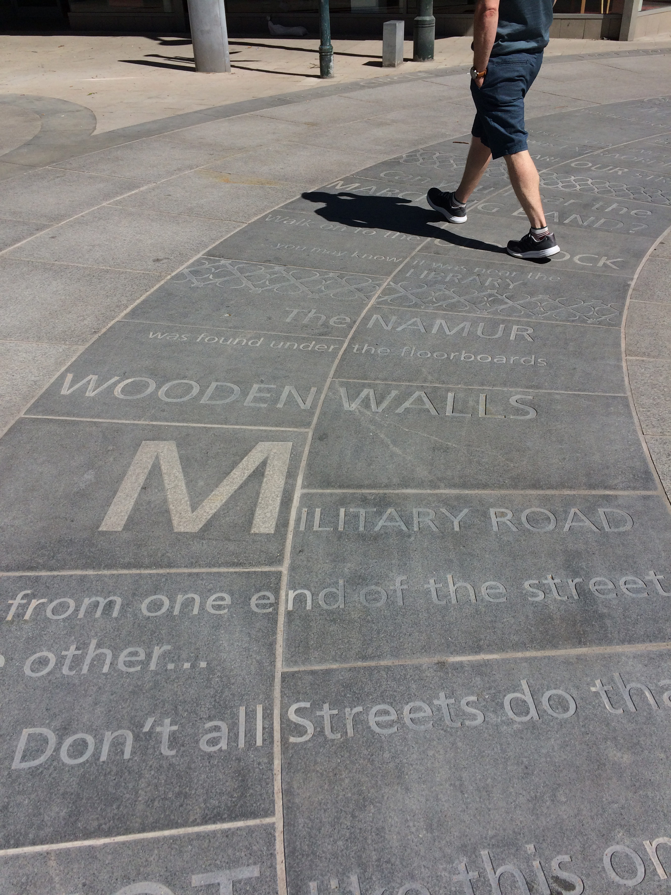
You may know that the aim of this public realm project was to upgrade the route from Chatham Station to the Waterfront. This includes pedestrian and cycle routes as well as crossing points, upgrading paving materials, improving steps and ramps, opening up the public realm and streamlining access and pedestrian permeability.
Francis Knight, Public Art Consultants, managed the Public Art Project. Our project collaborators and consultants to Medway Council were LDA Design and Project Centre.
We have worked within these parameters, using the language of public realm and materials, which are robust and stand the test of time. We have created a quiet ‘narrative’ thread – a story about Chatham– & more specifically about events and places along this route.
We wanted the streets to speak quietly, confidently & with good humour about Chatham…WHAT MAKES A TOWN? …THESE ARE OUR STREETS…part memorial, part living voice…but mostly a celebration of the rich heritage and community of Chatham.
As an artist and designer of public spaces, this project has been an opportunity to influence our surroundings in a way that ‘speaks’ of Chatham and its people. We mostly take our pavements for granted, but these spaces have often developed from historic pathways and tracks linking communities and towns across the wider region. They have a resonance and a ‘voice’, …and echo with history.
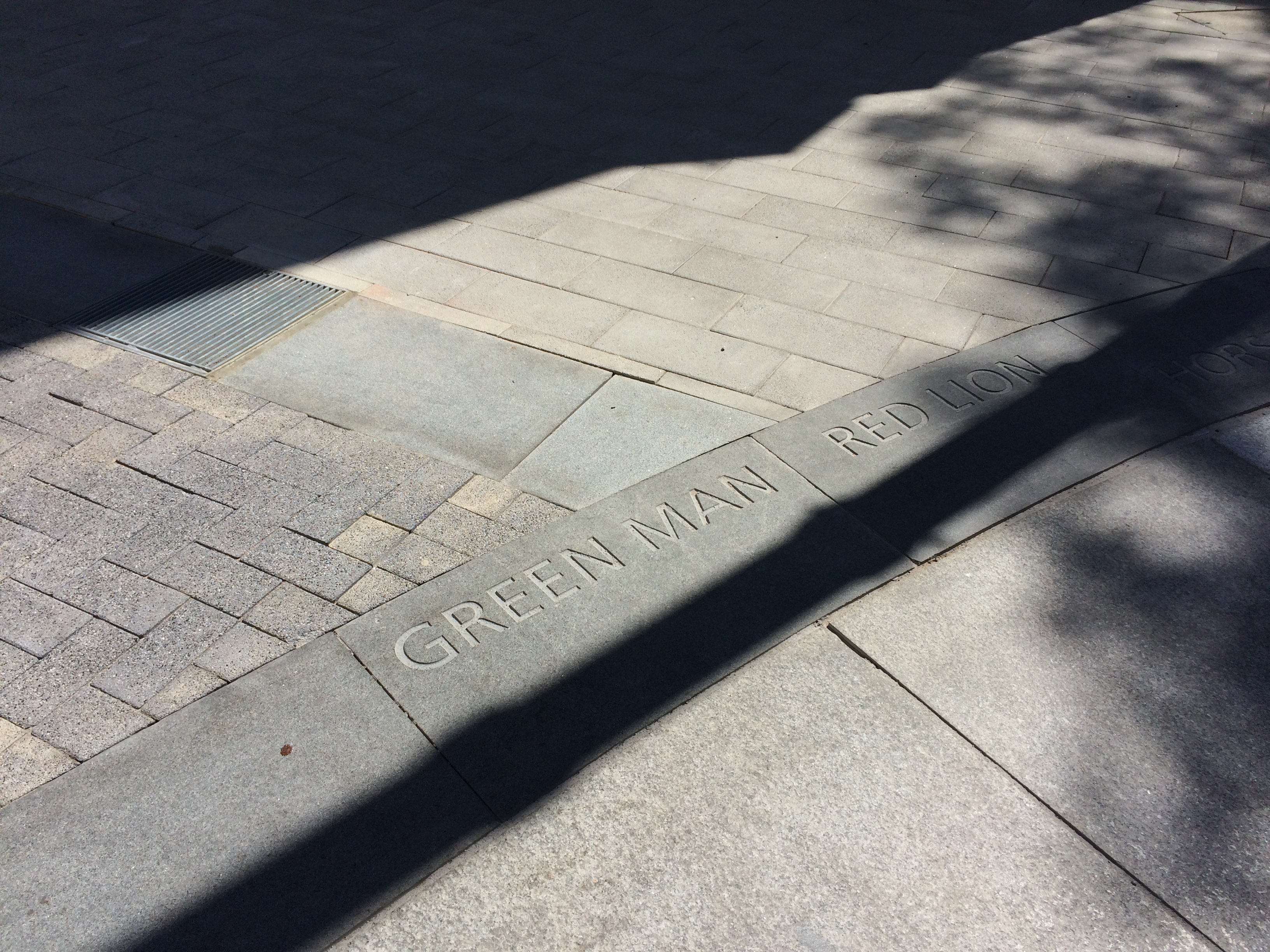
The route from the Station to the Waterfront takes us down Railways Street & Military Road – in doing so we pass several key places, such as New Cut (a former farmyard), St John’s (a Grade II Listed Waterloo Church) – Military Square, considered the Heart of the Town. At these important sites, we have made interventions to articulate the granite kerb in ways, which are expressive and of interest, whilst still maintaining functionality.
Military Square, Chatham. Image: Christopher TippingMilitary Square, Chatham. Image: Christopher TippingMilitary Square, Chatham. Image: Christopher TippingMilitary Square, Chatham. Image: Christopher TippingMilitary Square, Chatham. Image: Christopher TippingMilitary Square, Chatham. Image: Christopher TippingMilitary Square, Chatham. Image: Christopher TippingMilitary Square, Chatham. Image: Christopher Tipping
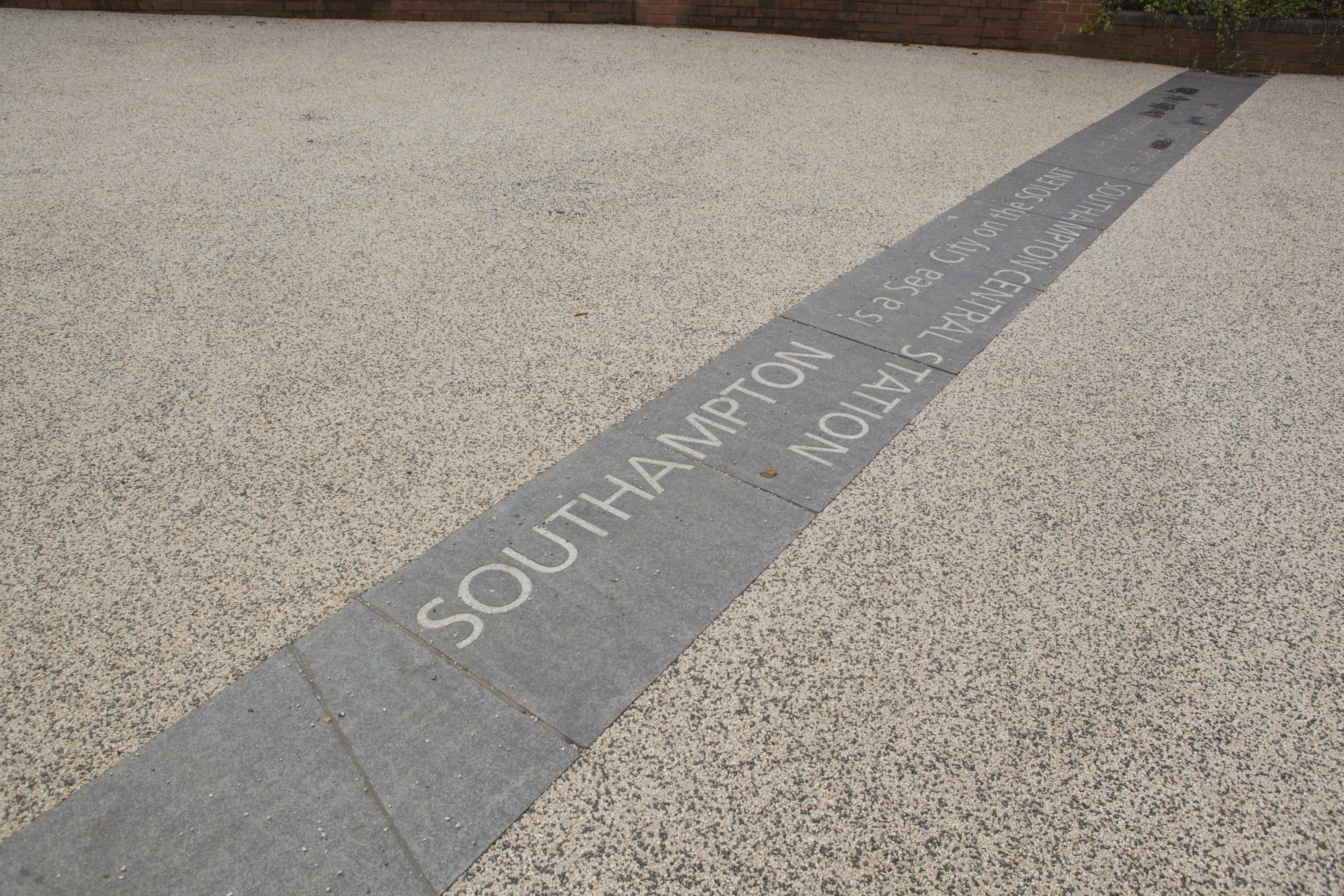
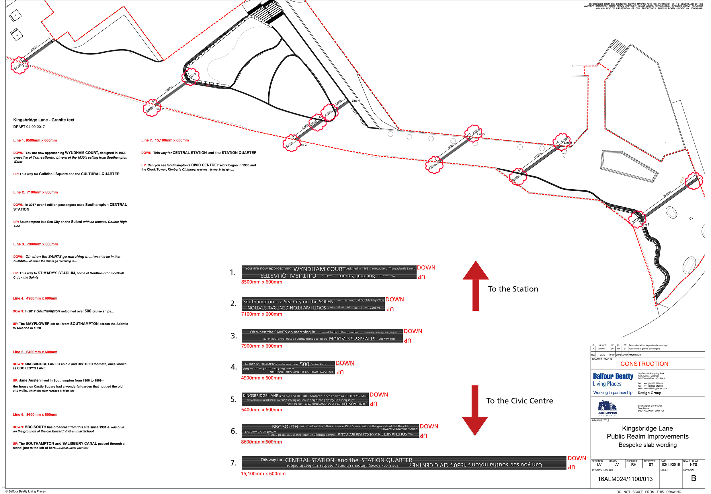
‘The SOUTHAMPTON and SALISBURY CANAL passed through a tunnel just to the left of here…almost under your feet’
Kingsbridge Lane with Civic Centre and Clocktower. Image: Massie Wilson
‘Can you see Southampton’s 1930s CIVIC CENTRE? The Clock Tower, Kimber’s Chimney, reaches 156 feet in height…’
Text – white granite inset into contrasting black granite.
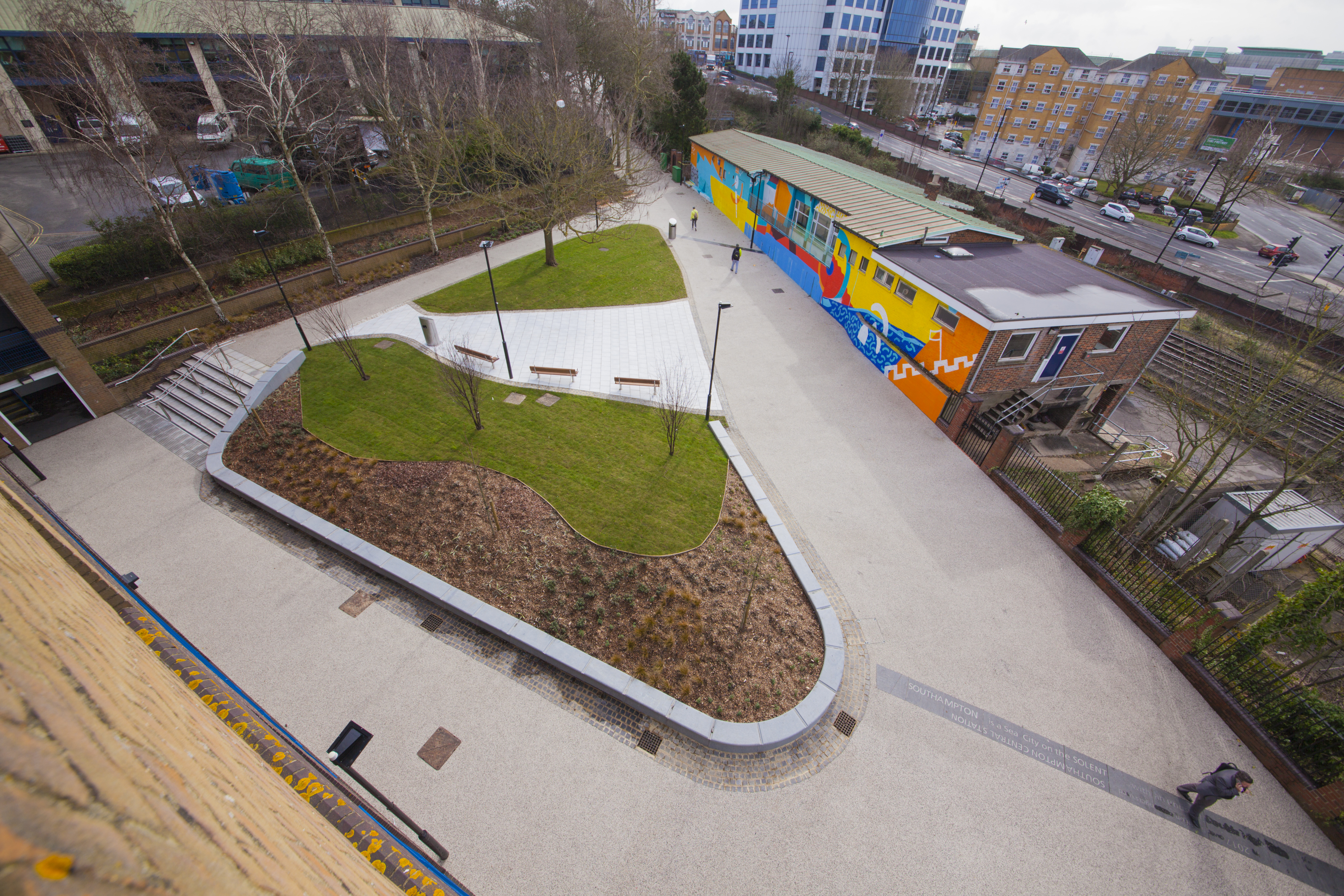
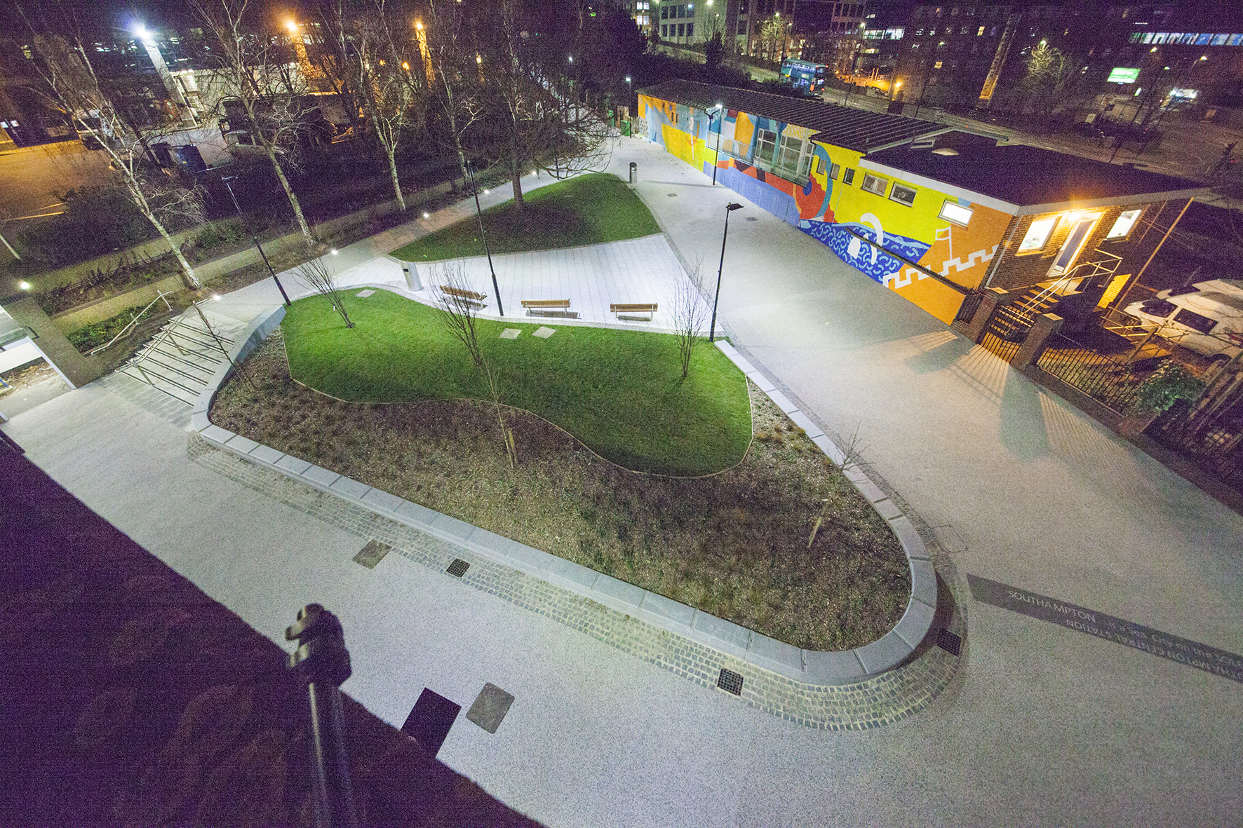
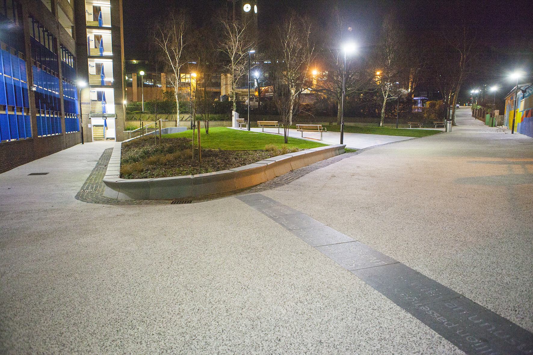
Kingsbridge Lane in Southampton is a historically important and longstanding pedestrian-only route with no vehicular access. This makes the site significant to Southampton. It is a long surviving link to the western route in and out of Southampton along the coastal strand, which formed the northern shore of the River Test Estuary until the early 20thCentury. The footpath runs along a narrow strip of land between the existing railway tunnel and the historic and long abandoned tunnel of the Southampton to Salisbury Canal, which ran along what is now Blechynden Terrace, linking Central Station to the Guildhall Square &Cultural Quarter. My role within this project was to develop a contextual response to the site, which would, hopefully, influence the landscape design and regenerative design process in collaboration Simon Taylor of Balfour Beatty Living Places , Southampton City Council and Hardscape.
Kingsbridge Lane, Southampton. Image: Massie WilsonKingsbridge Lane, Southampton. 14 lines of text – Image: Balfour Beatty
‘SOUTHAMPTON is a Sea City on the SOLENT …with and unusual Double High Tide’.
Text – white granite inset into contrasting black granite.
Aerial view of Kingsbridge Lane, Southampton. Image: Massie Wilson
‘Oh when the SAINTS go marching in …I want to be in that number… oh when the Saints go marching in…’
Nighttime aerial view of Kingsbridge Lane, Southampton. Image: Massie Wilson
‘In 2017 over 6 million passengers used Southampton CENTRAL STATION’
Kingsbridge Lane, Southampton. Nighttime view. Image: Massie Wilson
‘SOUTHAMPTON is a Sea City on the SOLENT …with and unusual Double High Tide’.
Basalt Slabs with inset text at Hardscape for Kingsbridge Lane, Southampton. Image: Christopher Tipping
Kingsbridge Lane, Southampton. Image: Massie Wilson
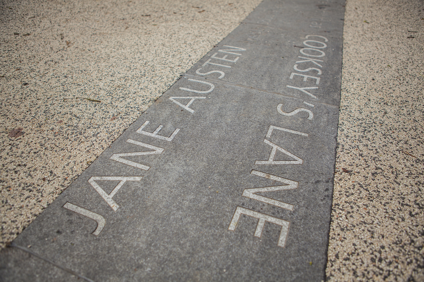
‘Jane Austen lived in Southampton from 1806 to 1809 … her house on Castle Square had a wonderful garden that hugged the old city walls’
Kingsbridge Lane, Southampton. Image: Massie Wilson
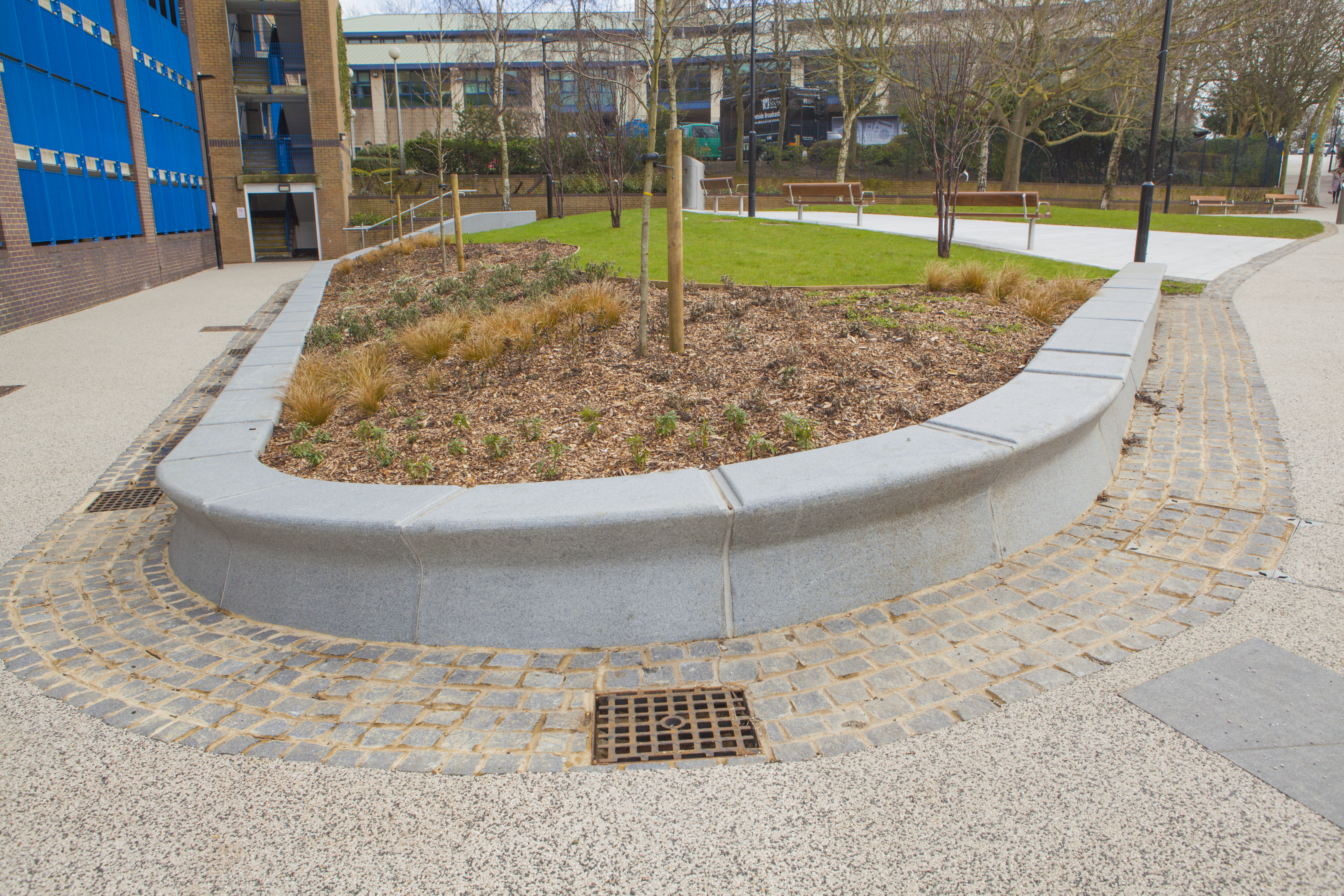
The granite seating and retaining walls by Hardscape are undercut along the front edge suggesting the movement of water throughout the site.
‘The MAYFLOWER set sail from SOUTHAMPTON across the Atlantic to America in 1620′
Aerial view of Kingsbridge Lane at the junction with Blechynden Terrace and West Park Rd, Southampton. Image: Massie Wilson
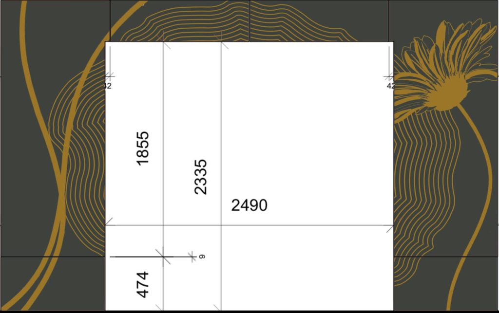
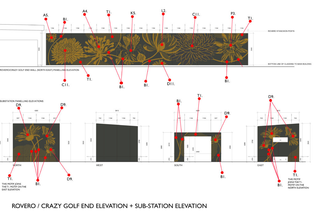
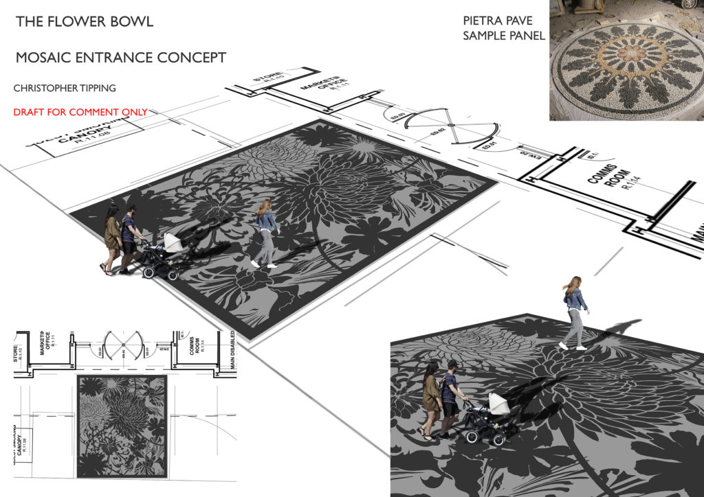
The last 2 elevations are now in progress, having signed off the artwork for the Elevations 7 & 8, the Sub-Station Building and Rovero End. My work is now pretty much done here. Going to site to see it installed is now a priority.
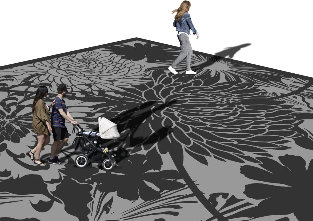
The Flower Bowl. Draft for Elevation 8 – Sub Station and Rovero. Image: Christopher TippingThe Flower Bowl. Draft for Elevation 8 – Sub Station and Rovero. Image: Christopher TippingThe Flower Bowl. Draft for Elevation 8 – Sub Station and Rovero. Image: Christopher TippingThe Flower Bowl. Draft for Elevation 8 – Sub Station and Rovero. Image: Christopher Tipping
The last pieces of production artwork have now been signed off. Most of the front elevation of the building has now been installed. Weirdly I’ve not yet been up to see it. Been pretty busy here in Ramsgate.
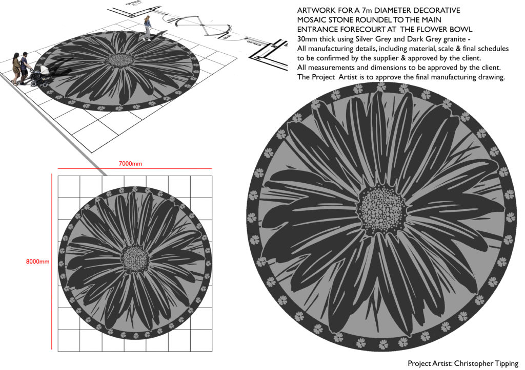
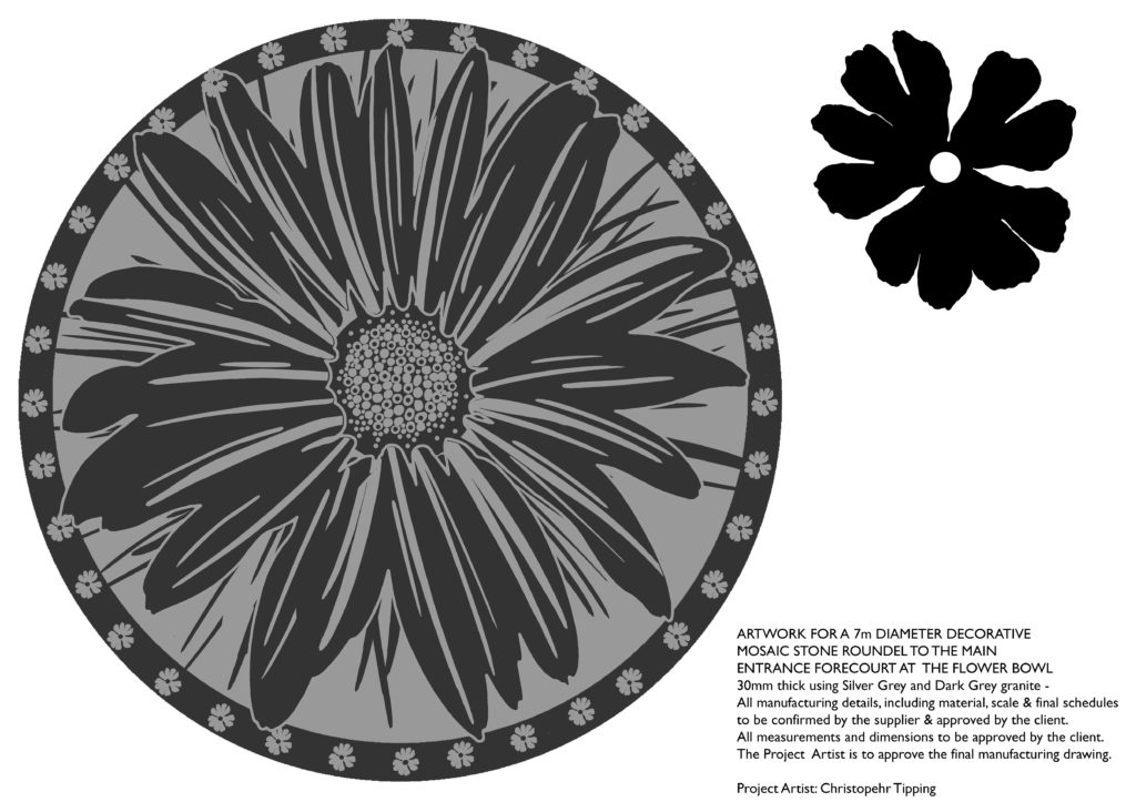
A good thing is that Guy Topping commissioned a further piece of work from me – a 7m diameter granite mosaic of a large flower for the main entrance threshold. The manufacturing work was commissioned from Bannister Hall Landscape Supplies and will be manufactured in China.
The Flower Bowl. Draft for granite mosaic paving entrance feature. Image: Christopher TippingThe Flower Bowl. Draft for granite mosaic paving entrance feature. Image: Christopher TippingThe Flower Bowl. Draft for granite mosaic paving entrance feature. Image: Christopher TippingThe Flower Bowl. Draft for granite mosaic paving entrance feature. Image: Christopher Tipping
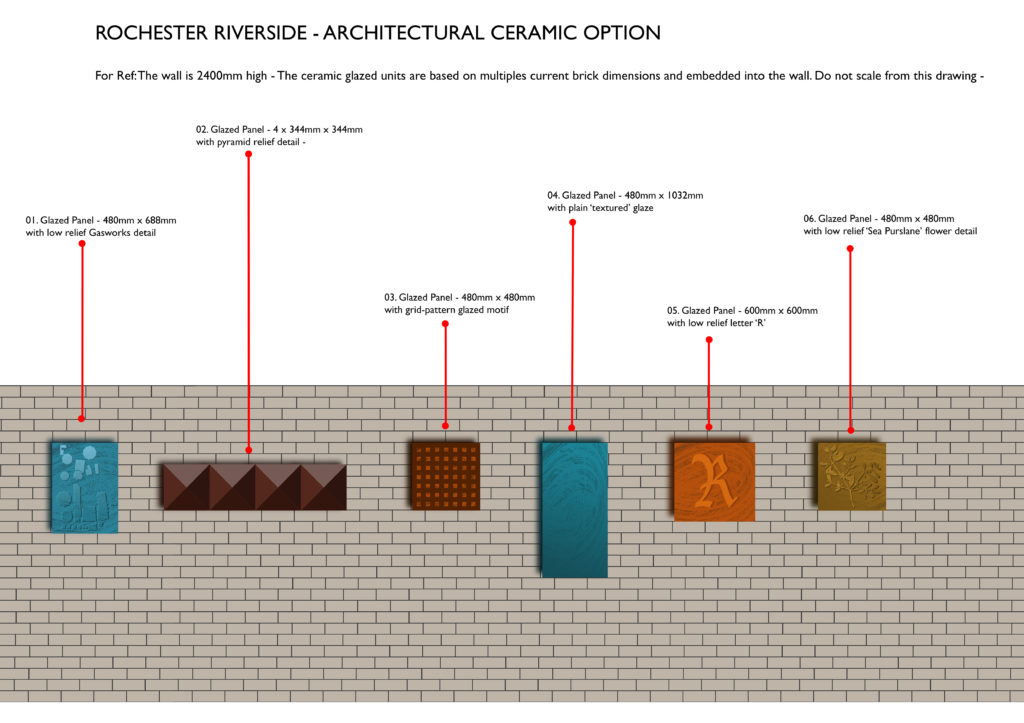
The Rochester Riverside development aims to deliver 489 homes in Phases 1, 2 & 3. The first show homes are scheduled to be ready by September 2018. I have been researching and developing ideas to embed some of the social & industrial legacy from this site into the new build homes and apartments & not forgetting a new community which is being delivered. The site has a treasure trove of layered history to uncover fed by its unique position between Rochester and River Medway.
Intertidal Salt Marsh
Tithe Lands
St Nicholas Parish Rochester
Livestock Grazing
Clay & Mud
Market Gardens
Oyster Fishery
Gas Works
Ship & Barge Building
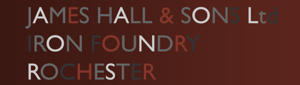
Iron Foundry
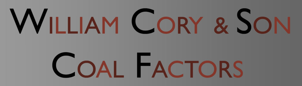
Coal Factors
Coal Depot
Railway Goods Yard
Scrap Metal Merchants
Wharfs
Cranes
Locomotives
Aggregates
Cement
By 2006 almost all the site had been cleared for re-development.
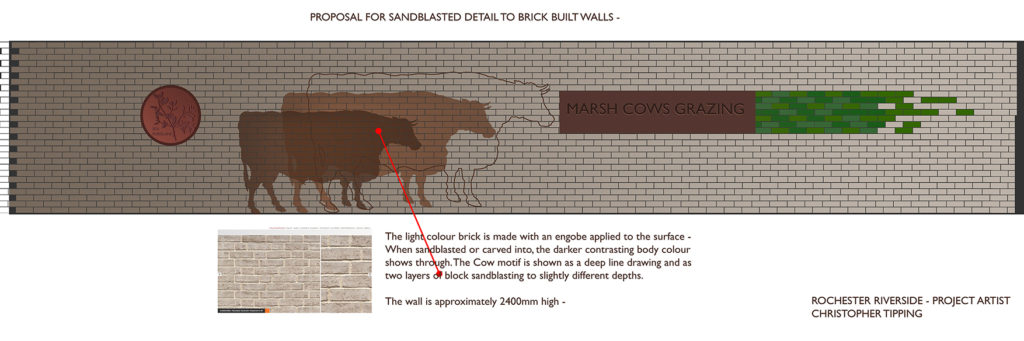
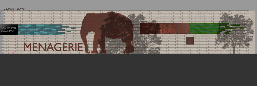
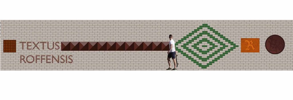
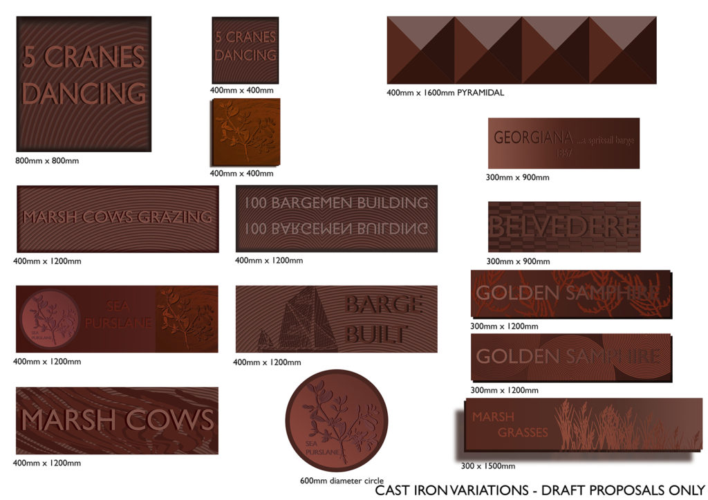
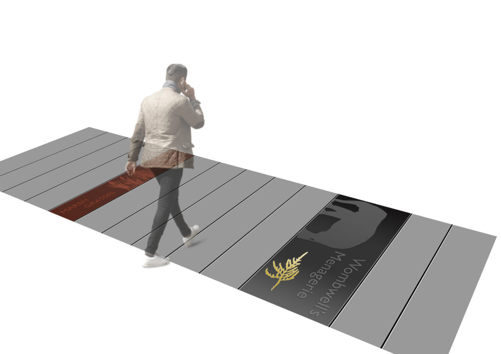
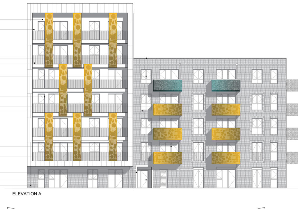
I have to find a way to be creative with the public art budget and to produce high quality, robust interventions, capable of withstanding the wear and tear of a contemporary urban space. My approach to this project has been to work with a series of 2.4m high brick walls, which form the entrances to parking courts on the Central Streets of Phase 1 & 2. I am also embedding work into the threshold entrances of six apartment blocks and numerous private houses throughout the site. Materials being investigated at this stage include granite, cast concrete, cast iron, architectural ceramic & brick. The concept drawings shown below are all subject to change, revision, omission – all the usual ups and downs of project development.
Rochester Riverside Artist Concept Draft proposals for brick walls. Image: Christopher TippingRochester Riverside Artist Concept Draft proposals for brick walls. Image: Christopher Tipping
These early concept drawings explore the various combinations of narrative elements which could be developed further. They are rather overstuffed with ideas at this stage – far too many to deliver – but are beginning to explore the legacy of the site via stories created by combining strands of research. Visiting menageries share space with Iron Foundry production and mud and clay trades carried out on the site. The elephant would be sandblasted into the brick surface, whilst adjacent panels of cast iron with relief detail and glazed brick units and polished granite are embedded into the brick structure.
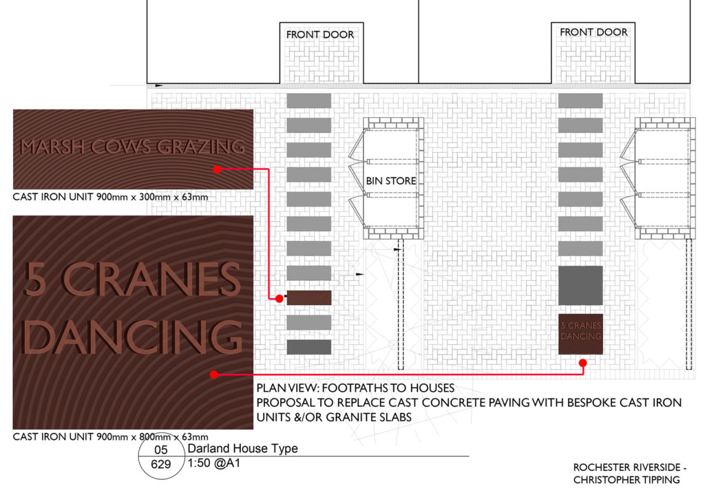
Rochester Riverside Artist Concept Draft proposals for brick walls. Image: Christopher TippingRochester Riverside. Artist Concept. Cast Iron Units to footpaths. Artwork Draft Image: Christopher Tipping
Cast Iron proposals are being developed in collaboration with Hargreaves Foundry in Halifax.
Rochester Riverside. Artist Concept. Cast Iron Unit to brick walls. Artwork Draft Image: Christopher TippingRochester Riverside. Artist Concept. Draft cast iron units to brick walls and paving. Artwork Drafts Only Image: Christopher TippingRochester Riverside Artist Concept Draft proposals for granite paving units with inset text. Image: Christopher TippingRochester Riverside Artist Concept Draft proposals for granite paving units with inset text. Image: Christopher Tipping
The proposals for granite paving units with inset granite text are being explored in collaboration with Hardscape.
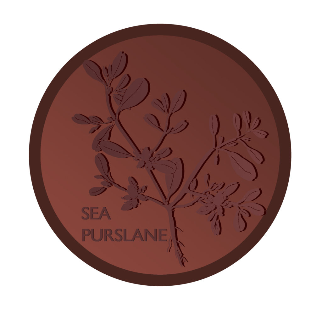
Rochester Riverside Artist Concept Draft proposals for architectural ceramic units with low relief text & pattern. Image: Christopher Tipping
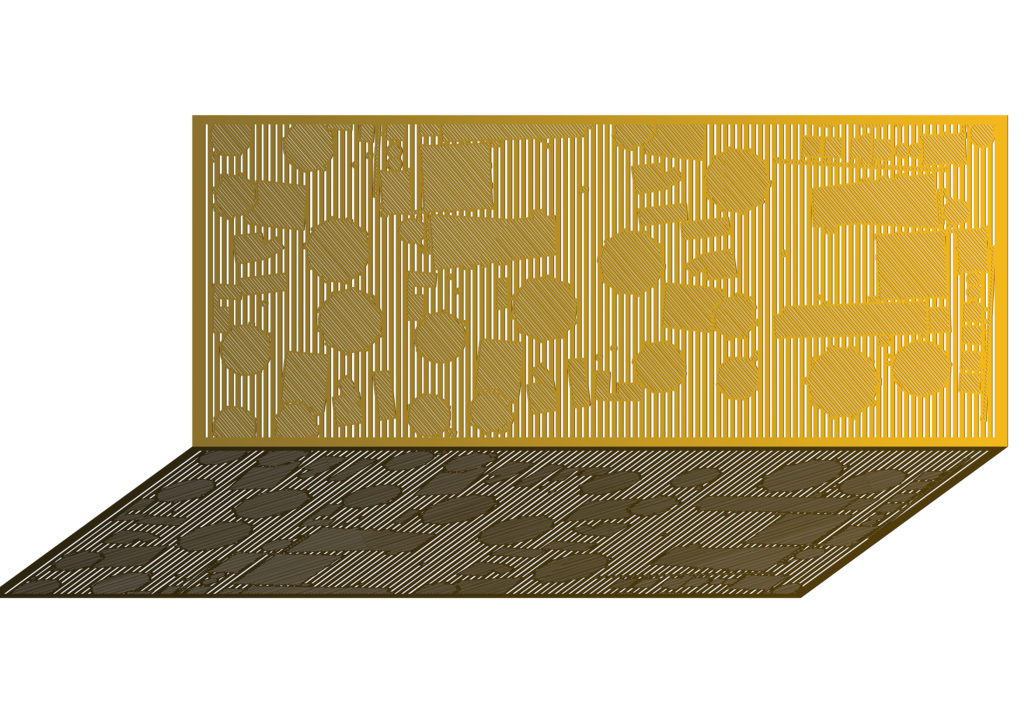
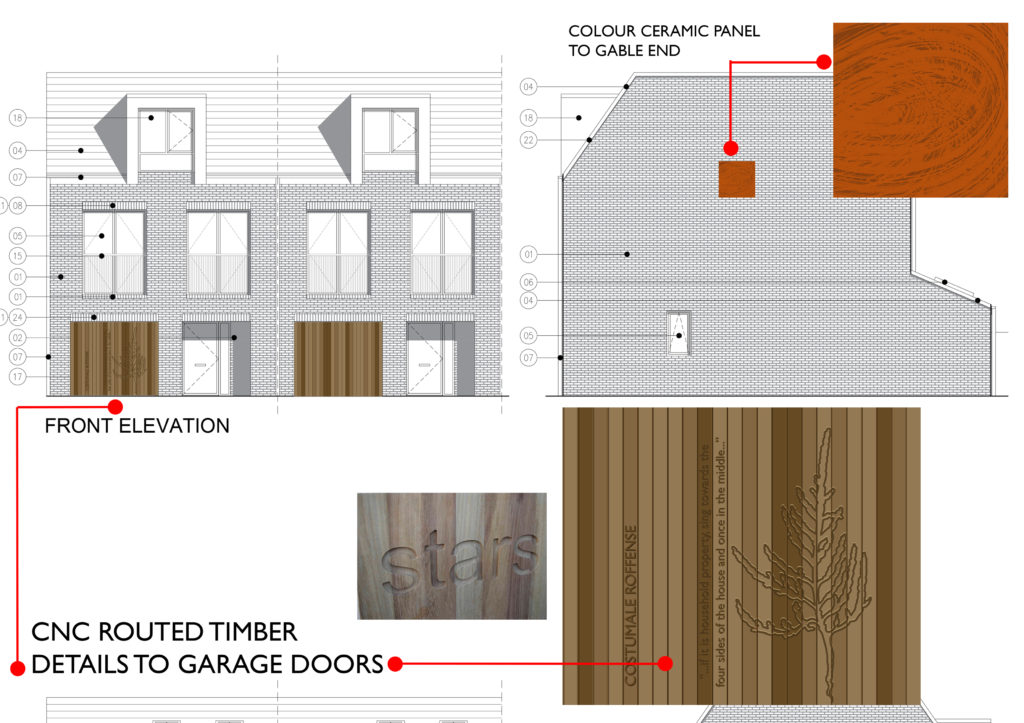
Rochester Riverside Artist Concept Draft proposals for granite & cast iron paving units with low relief text & pattern. Image: Christopher TippingRochester Riverside Artist Concept Draft proposals for granite & cast iron paving units with low relief text & pattern. Image: Christopher TippingRochester Riverside Artist Concept Draft proposals for bespoke balcony balustrade detail with pattern inspired by the Gas Works. Image: Christopher TippingRochester Riverside Artist Concept Draft proposals for bespoke balcony balustrade detail with pattern inspired by the Gas Works. Image: Christopher TippingRochester Riverside Artist Concept Draft proposals for bespoke Front Door & Garage Doors treatment. Image: Christopher TippingRochester Riverside Artist Concept Draft proposals for bespoke Front Door & Garage Doors treatment. Image: Christopher Tipping
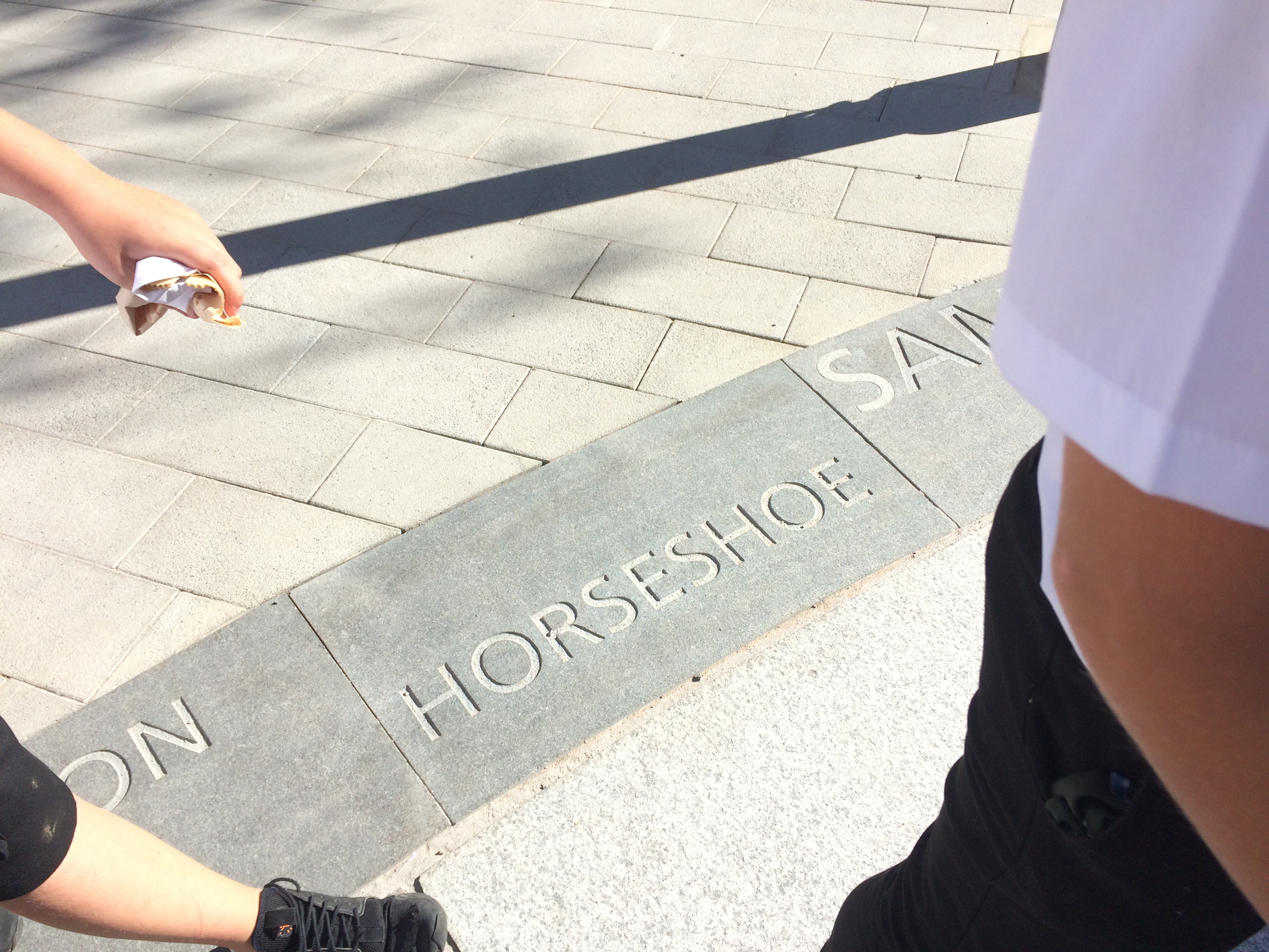
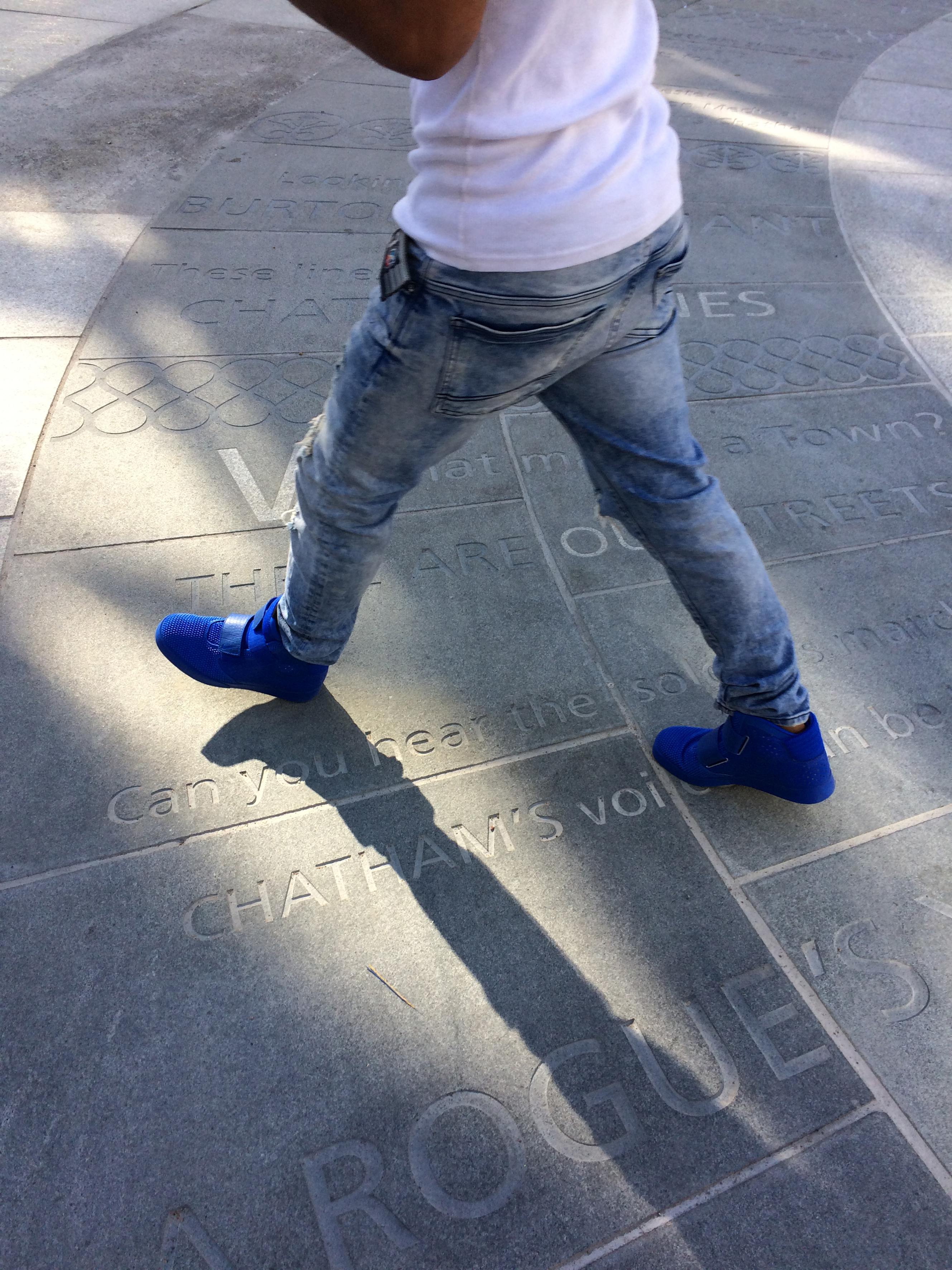
You may have seen some of our work embedded into the streetscape along Railway Street. Large scale granite kerbs contain words sandblasted or inlaid into the surface. You may wonder what these words mean, or how they relate to you. Here is a short explanation of how they came about.
We often talk about words having weight – of text being ‘set in stone’… or ’engraved in stone’…suggesting gravitas, importance, longevity, …we all like a funny ‘one liner’…colloquial, local…distinct Chatham voices…
Well, here in Chatham your words really are being set in stone…for all to read…for years to come –
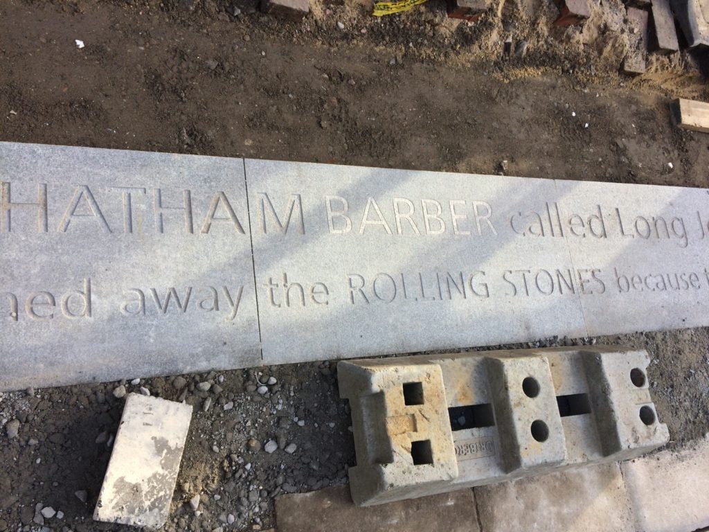
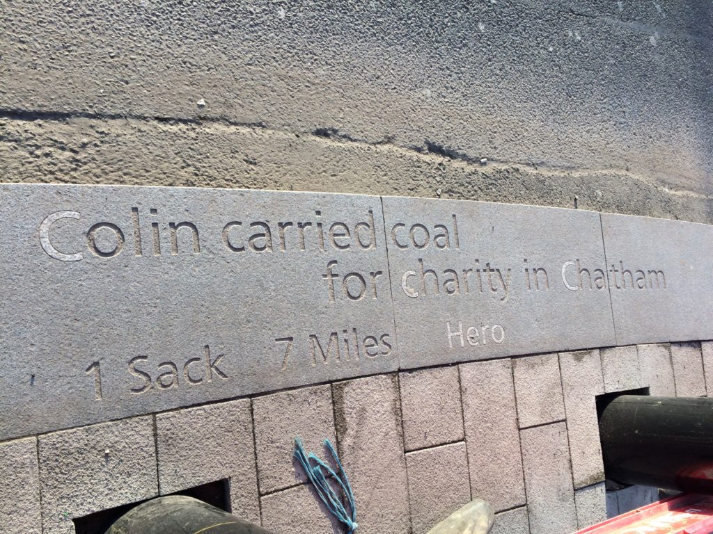
Chatham Placemaking Project. “A Chatham Barber called Long John…”. Image: Christopher TippingChatham Placemaking Project. “Colin carried coal…”. Image: Christopher Tipping. Words: Rob Young
You may know that the aim of this public realm project was to upgrade the route from Chatham Station to the Waterfront. This includes pedestrian and cycle routes as well as crossing points, upgrading paving materials, improving steps and ramps, opening up the public realm and streamlining access and pedestrian permeability. This work was driven by Francis Knight, Public Art Consultants & our project collaborators and consultants to Medway Council, LDA Design and Project Centre.
We have worked within these parameters, using the language of public realm and materials, which are robust and stand the test of time. We have created a quiet ‘narrative’ thread – a story about Chatham– & more specifically about events and places along this route.
We wanted the streets to speak quietly, confidently & with good humour about Chatham…WHAT MAKES A TOWN ?…THESE ARE OUR STREETS…part memorial, part living voice…but mostly a celebration of the rich heritage and community of Chatham.
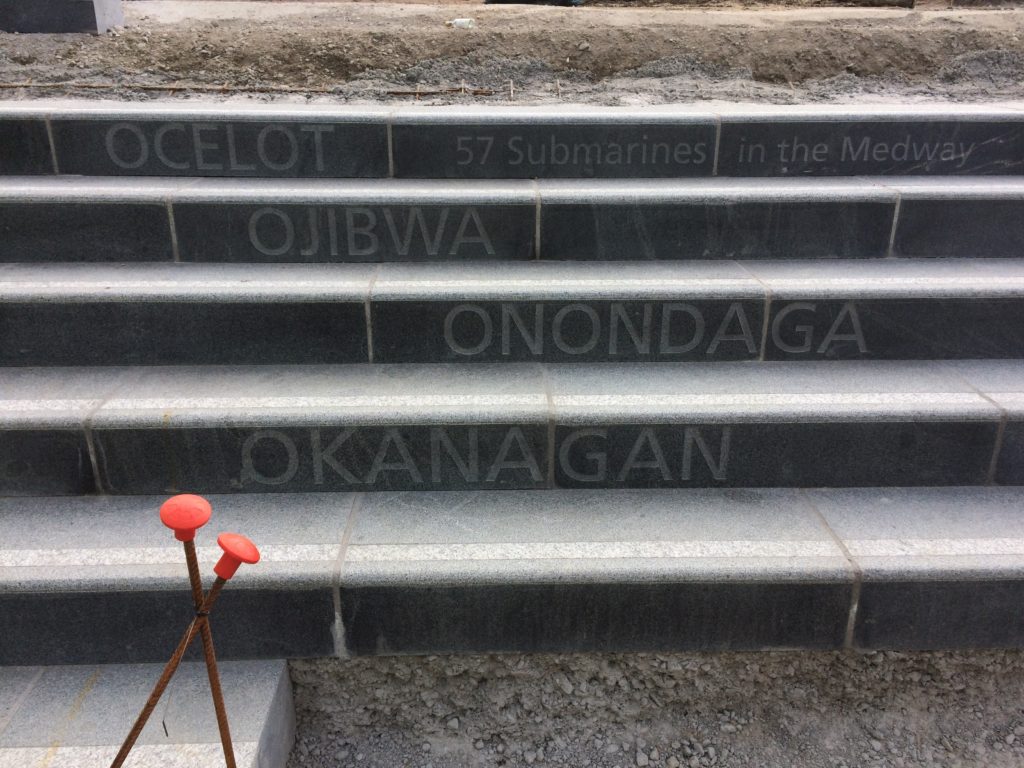
Chatham Placemaking Project. 57 Submarines. Image: Christopher Tipping.
As an artist and designer of public spaces, this project has been an opportunity to influence our surroundings in a way that ‘speaks’ of Chatham and its people. We mostly take our pavements for granted, but these spaces have often developed from historic pathways and tracks linking communities and towns across the wider region. They have a resonance and a ‘voice’, …and echo with history.
The route from the Station to the Waterfront takes us down Railways Street & Military Road – in doing so we pass several key places, such as New Cut ( a former farmyard), St John’s ( a Grade II Listed Waterloo Church) – Military Square, considered the Heart of the Town. At these important sites, we have made interventions to articulate the granite kerb in ways which are expressive and of interest, whilst still maintaining functionality.
We were keen to hear and to record everyday voices …words spoken by ordinary people – such as ‘the girl who cried when she lost her phone and then cried again when she found it’... ‘the lovey barmaid’ …or ‘Colin, the man who carried coal for charity’…these are the voices of people on the street, passers by, people shopping & passing the time of day. We engaged with people directly in conversation, we overheard the conversations of others, we wrote down and recorded stories and anecdotes we were told.
I was very fortunate to collaborate with other artists on this project. Filmmaker Simon Williams succinctly and with an understated eye for visual language and movement, cleverly framed our project parameters and vision in a series of short films, whilst printmaker Xtina Lamb rendered our architectural vision into graphic patterns & motifs used throughout the scheme. Both artists also live in Chatham, bringing their individual & unique perspectives to play. However, it was the award winning writer Rob Young, who contributed significantly to the embedded text. An astute, profound and funny wordsmith with an ability to engage anyone and everyone, turning their words into poetry along the way.
“The knitter. Whose name is Pearl.
The woman. Who uses the word ‘like?’ As like, punctuation?
The woman. Who said sorry. When you’re the one who pushed in.
The woman. Who draws breath. Then monologues. For an hour.
The waiter. Who had a fling. With a Bride. At her wedding.
The girl. Who cried. All day. When she lost her phone. Then cried again. When she found it.
The boy. Whose Mum. Made him take back the sweets. That he stole.
The man. Who says, I’m mad, me. Who isn’t mad, at all. Just lonely”. Rob Young 2016
Justin Coe, a poet and writer also contributed, animatedly performing his work directly to camera, whilst walking the route in a film by Simon Williams.
Film still image of Poet & Writer Justin Coe performing his work on Military Road, Chatham. Image: Simon Williams
“On his way to his first day of school on Rome Lane
(The name of this road – before the trains came)
And while we’re walking with Dickens – observe the new Church
They’ve called it St Johns. And it will soon be the first
Public building in Chatham lit by electricity!…
Though all the lights went out here by the end of last century…” Justin Coe 2016
Local school children & people working in local businesses were asked for their comments. We listened to them & heard their stories. We listened to the sound of their lives. There is an overwhelming sense of common ownership in this project. These words are not ours. They belong to Chatham.
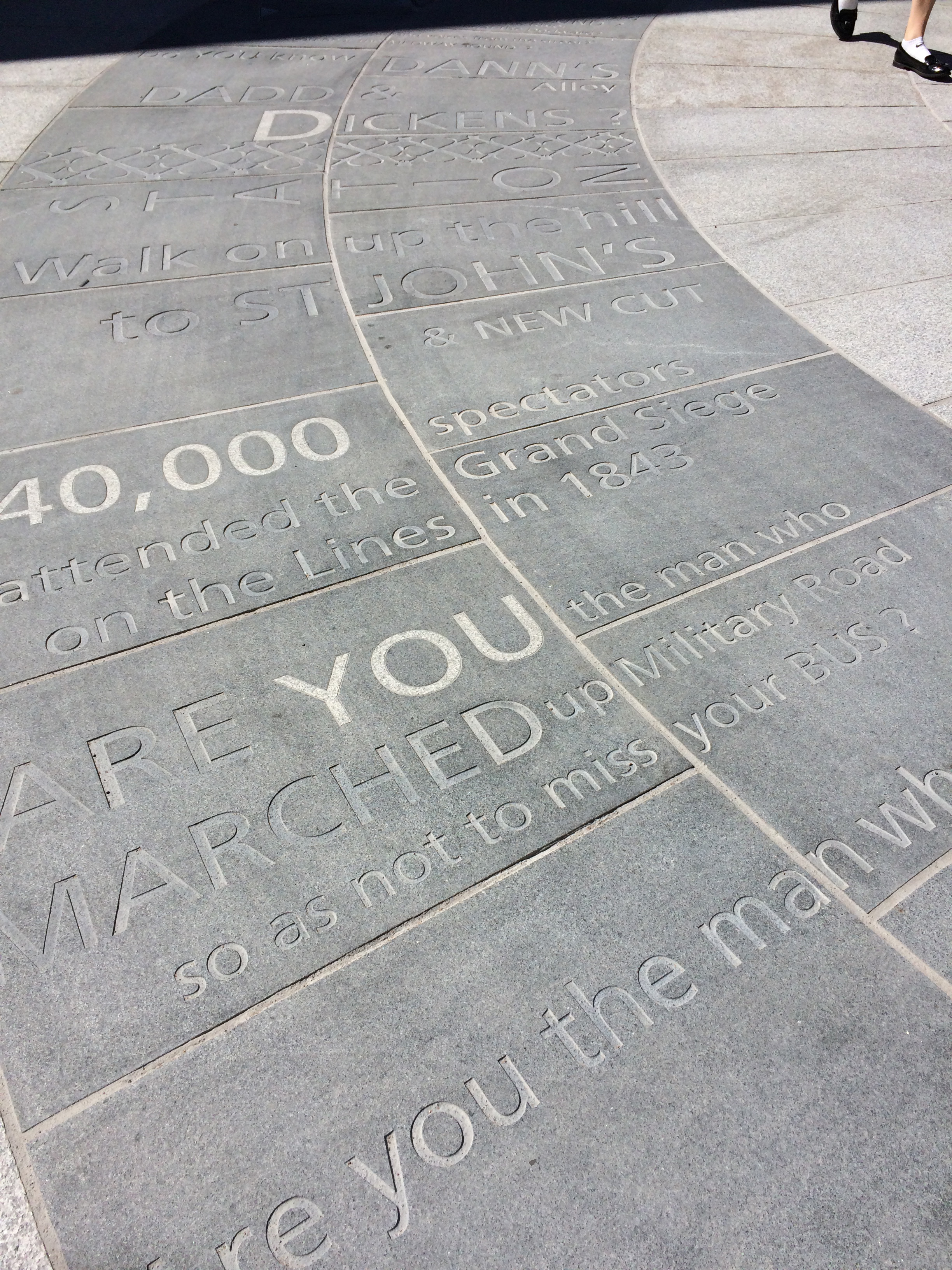
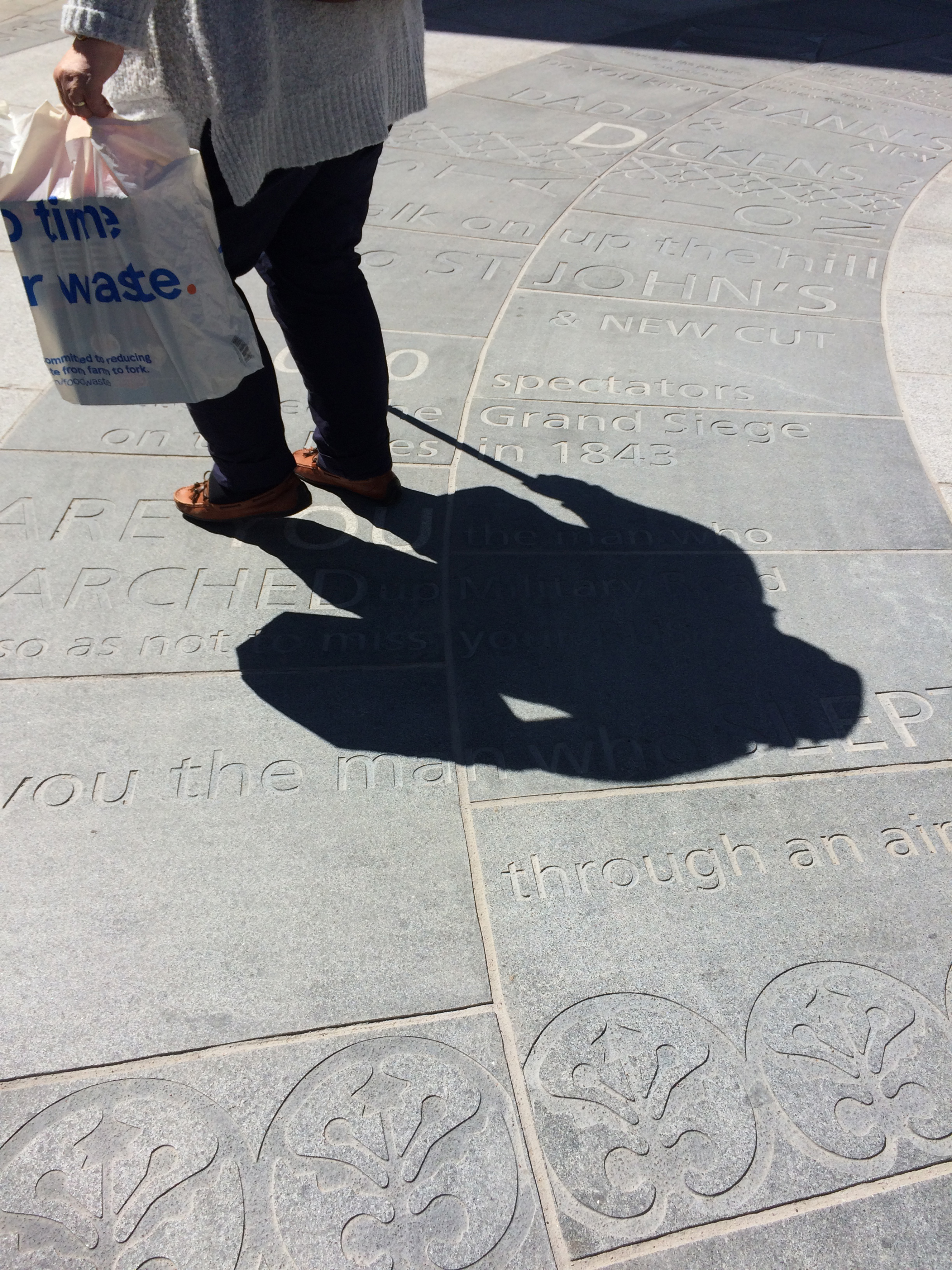
We referenced times past by collaborating with MALSC (Medway Archives and Local Studies Centre) and other local agencies in searching for site specific text, such as the words of famous visitors & local Luminaries such as Charles Dickens, reminiscing about ‘soldiers marching through the town in regimented rows …’
The oversized granite kerbs we have used here become a metaphor for the continuity of the local community – kerbs being critical in holding roads and pavements in place – they are physically important in maintaining the fabric of our environment –they could almost be described as ‘defensive structures’ maintaining the integrity and safety of our public spaces …reminiscent of the Chatham Lines – the historic defensive structures, forts and earthworks, which offered protection to the people of Medway & especially the Chatham Dockyard …
The granite kerb acts as a threshold between various states …of the pedestrian…and the driver, or moving fast or slow – perceptions of safety & danger…often the original granite kerb is often the only thing left in place when pavements and roads have been re-placed or modernised throughout recent history…the kerb maintains the parameters of how public spaces were managed and maintained. These lines of granite are also ‘our other Chatham Lines…’
More of the kerbstone lies buried beneath the surface than on top of it… and so it is also a rather poignant link between the past and the present…where times and events past lie buried beneath out feet –
Chatham Placemaking Project – granite kerbs being installed on Railway Street. Image: Christopher Tipping
Our work in Chatham set out to find and hear voices and words which quietly & evocatively create a sense of place associated with each of our stopping points on the route from the Station to the Paddock… the power of these voices is amplified by the weight and mass of the monolithic granite.
Left in place, these words will still be here in a hundred years from now…
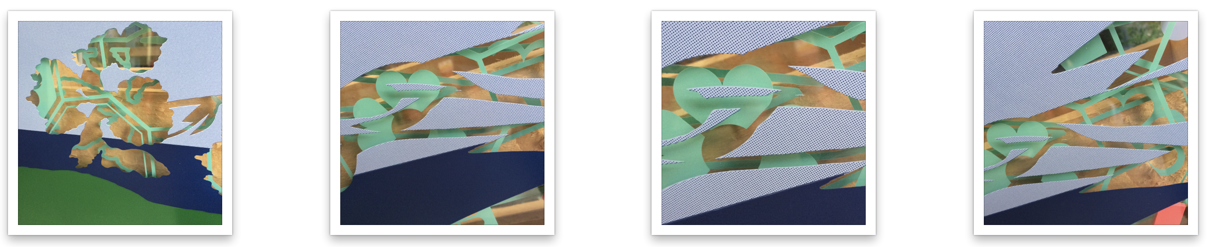
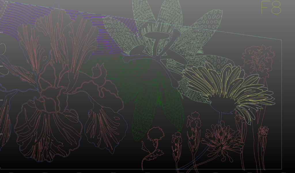
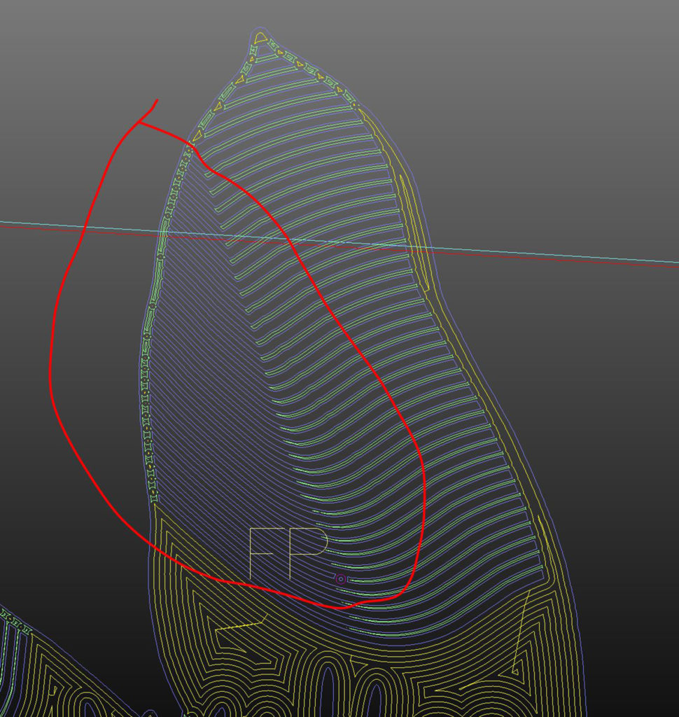
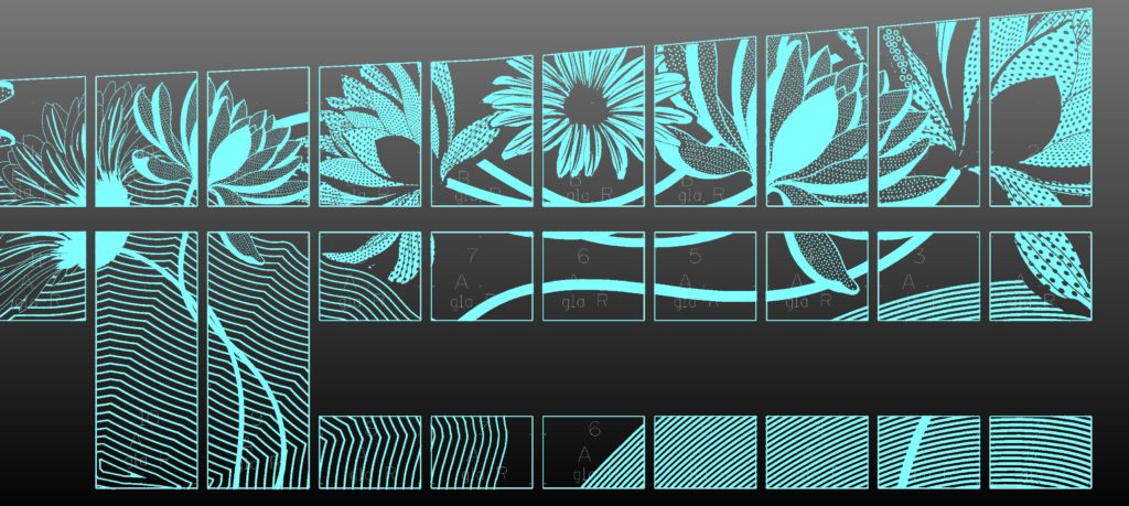
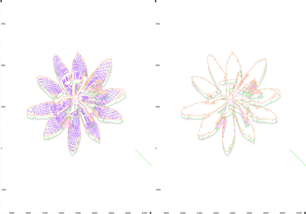
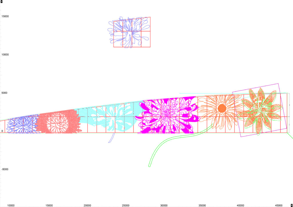
I have been incredibly lucky to collaborate once again with Mark Durey at The Cutting Room in Huntingdon. I worked with Mark on the cnc cut facade for the new Heart of the Campus Building at Sheffield Hallam University Collegiate Campus. I am indebted to him for bringing these projects to life in way I could not deliver on my own. My colleague Sarah Alldritt also deserves a big thanks for her work translating my original artwork into ai vectors. Mark imports these digital files and re-builds the artwork through an Alphacam CAD CAM softwareprogramme to create the work. That may seem a straightforward digital process created by clever software …let me tell you that it is not. The translation from my artwork to end product is anything but straightforward in this instance. Mark is the key here. He has a clear understanding of how the programmes work – but – more importantly he is prepared to go ‘off-road’ and put his experience to task, problem solving and bringing an entirely bespoke service into play to produce the outcomes you see. I am lucky to have him as a collaborator.
Mark has an individual methodology at play whilst creating the cutting files. He adds colour to enable him to plan the work and – indirectly, I find these images inspiring and creative in themselves. Probably annoyingly I am always asking for screenshots of particular details.
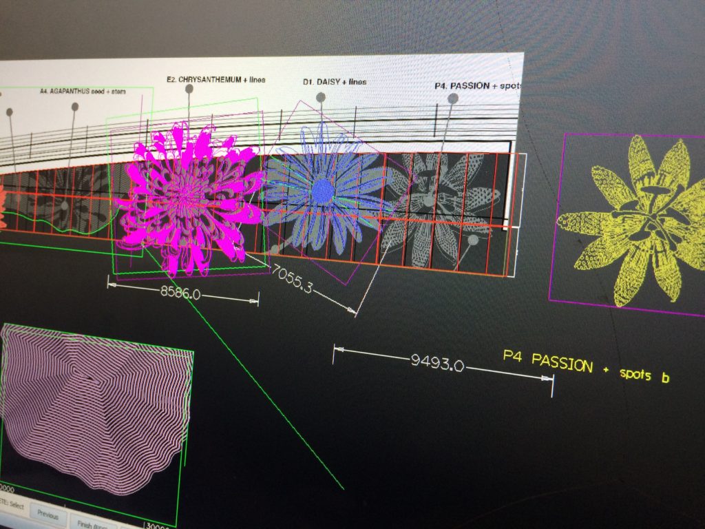
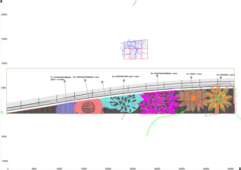
Manufacturing drawings for The Flower Bowl cnc routed elevations. Image: Mark DureyManufacturing drawings for The Flower Bowl cnc routed elevations. Image: Mark DureyManufacturing drawings for The Flower Bowl cnc routed elevations. Image: Mark DureyManufacturing drawings for The Flower Bowl cnc routed elevations. Image: Mark DureyManufacturing drawings for The Flower Bowl cnc routed elevations. Image: Mark DureyManufacturing drawings for The Flower Bowl cnc routed elevations. Image: Mark DureyManufacturing drawings for The Flower Bowl cnc routed elevations. Image: Mark DureyManufacturing drawings for The Flower Bowl cnc routed elevations. Image: Mark DureyManufacturing drawings for The Flower Bowl cnc routed elevations. Image: Mark DureyManufacturing drawings for The Flower Bowl cnc routed elevations. Image: Mark DureyManufacturing drawings for The Flower Bowl cnc routed elevations. Image: Mark DureyManufacturing drawings for The Flower Bowl cnc routed elevations. Image: Mark DureyManufacturing drawings for The Flower Bowl cnc routed elevations. Image: Mark Durey
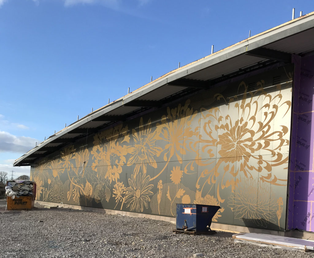
The latest image by the client Guy Topping – the left hand elevation for The Flower Bowl Main Entrance – but how did we get to this point?
Main Entrance Elevation in progress at The Flower Bowl. Image: Guy Topping