Covers all projects which involve healthcare and well-being, such as Private and NHS Hospitals, Mental Health Centres and related forms of care in the community.
Draft Artwork: Littlemore Mental Health Centre. Artist: Christopher Tipping
Draft artwork awaiting approval to go into production – we are working with our client team to review / comment and approve in the next few days so we can meet our install schedule.
Draft Artwork: Littlemore Mental Health Centre. Artist: Christopher Tipping
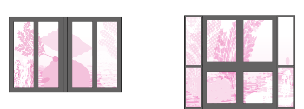
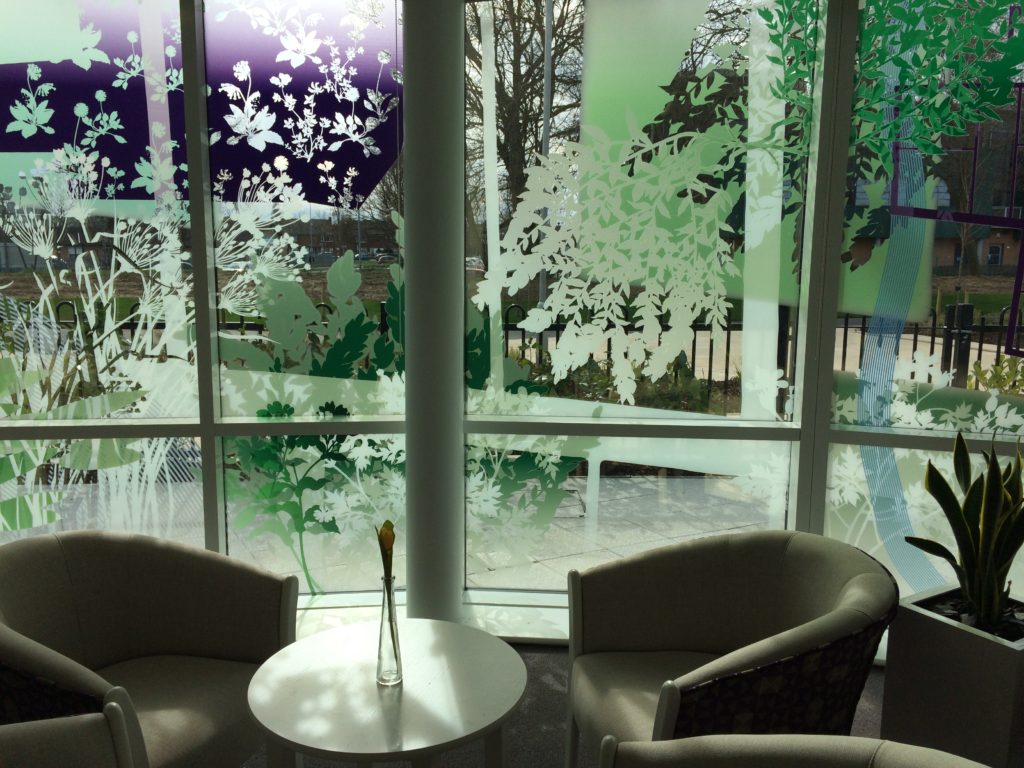
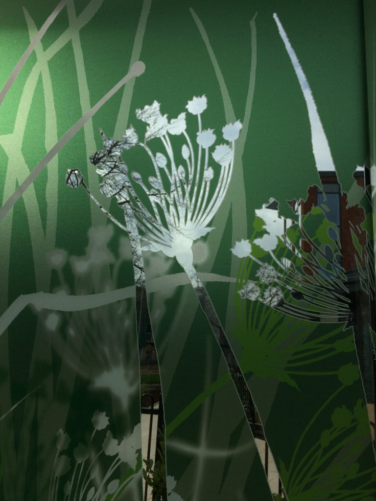
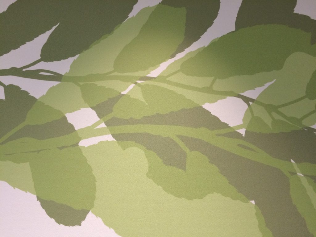
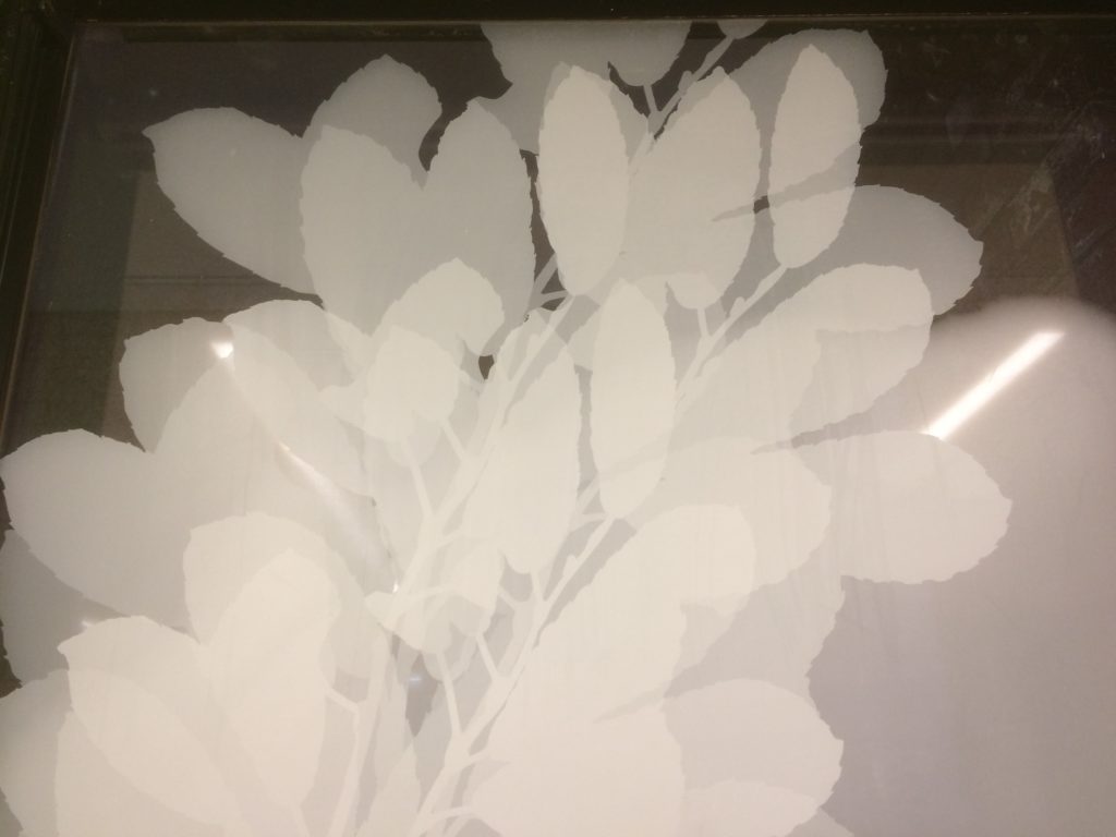
At this stage I set all the imagery against a black background – which actually indicates glazing with no printing – just clear glass.
This work will be digitally printed onto optically clear vinyl. The process allows for a layer of colour, followed by a layer of white and finally another layer of colour. The artwork can be read equally from both viewing sides – inside or outside the building. The production level artwork files, sampling and final digital printing and installation is done by my long-time collaborators, Vinyl Graphics Ltd.
Draft Artwork: Littlemore Mental Health Centre. Artist: Christopher TippingDraft Artwork: Littlemore Mental Health Centre. Artist: Christopher Tipping
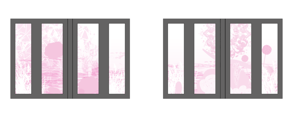
Various degrees of opacity and transparency are designed into the artwork. As a rule this is worked out via single colour files – in this case magenta – which clearly indicate degrees of opacity.
Draft Magenta Artwork: Littlemore Mental Health Centre. Artist: Christopher TippingDraft Magenta Artwork: Littlemore Mental Health Centre. Artist: Christopher TippingDraft Magenta Artwork: Littlemore Mental Health Centre. Artist: Christopher TippingDraft Artwork: Littlemore Mental Health Centre. Artist: Christopher TippingDraft Artwork: Littlemore Mental Health Centre. Artist: Christopher TippingDraft Artwork: Littlemore Mental Health Centre. Artist: Christopher Tipping
This new development of 64 Extra Care Apartments at Orchard Park, recently delivered in April this year by The Riverside Group is called ‘Harrison Park’, 100 years after Jack Harrison VC a former Hull FC Rugby League Star was killed at Oppy Wood, Arras, France in 1917 during the First World War.
Today – the 3rd May 2017 marks the day all four Hull Pals Battalions took part on the attack on Oppy Wood.
A Pinterest Board of research images about Orchard Park and its history, can be found here.
Hull is currently celebrating City of Culture 2017status, so there is much to do and see there ! –
Detail: Glazing Vinyl installation Harrison Park, Hall Rd, Hull Extra Care. Artist: Christopher TippingDetail: Glazing Vinyl installation Harrison Park, Hall Rd, Hull Extra Care. Artist: Christopher Tipping
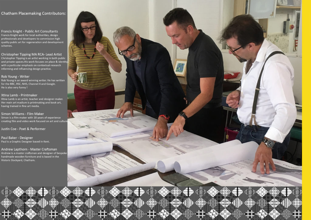
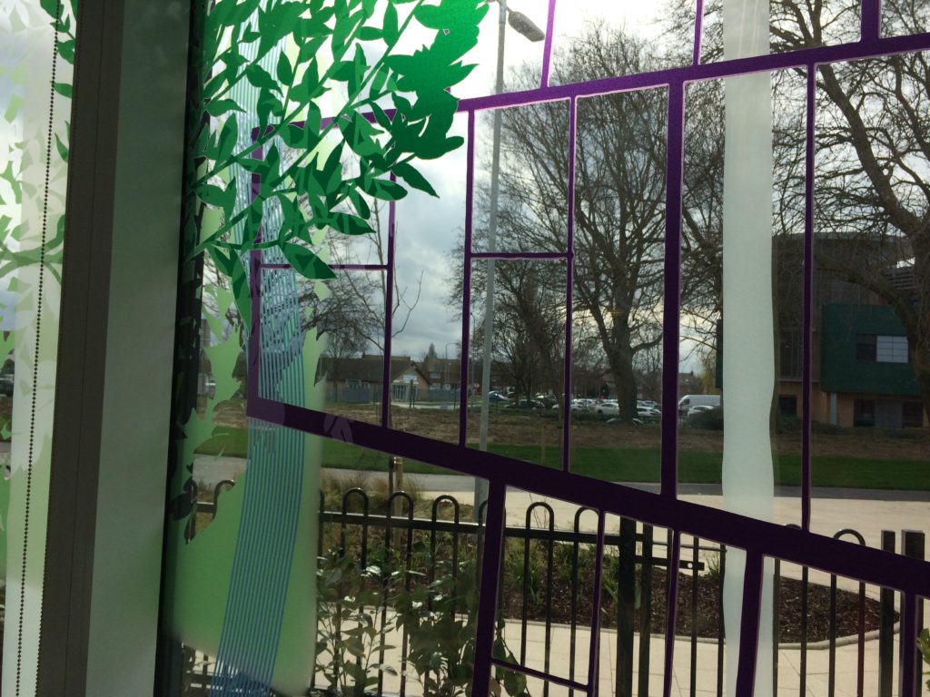
Chatham Placemaking Project – Left to Right – Project Artists: Xtina Lamb, Christopher Tipping, Simon Williams, Rob Young
A review of current and recently completed works –
I am an experienced Artist working in Public Realm, Urban Regeneration and Healthcare environments for Local Authorities, NHS Trusts and the Private Sector.
My projects exhibit contrasting variations in scale, budgets and delivery programmes. They illustrate how I can creatively collaborate within and successfully contribute to a variety of multi-disciplinary teams working in diverse locations and communities.
What underpins my approach to every project however, is a passion for contextually driven creative research and site analysis with which to inform, influence or drive a project forward. What actually delivers the project thereafter is an ability and a desire to collaborate from the outset, respectful of and creatively responsive to the contribution of all members of a client group.
I want to be involved in projects which create spaces and places which resonate with the people who will ultimately use them and which enhances their personal enjoyment and experience of it.
Click on the project titles for links to more detailed information.
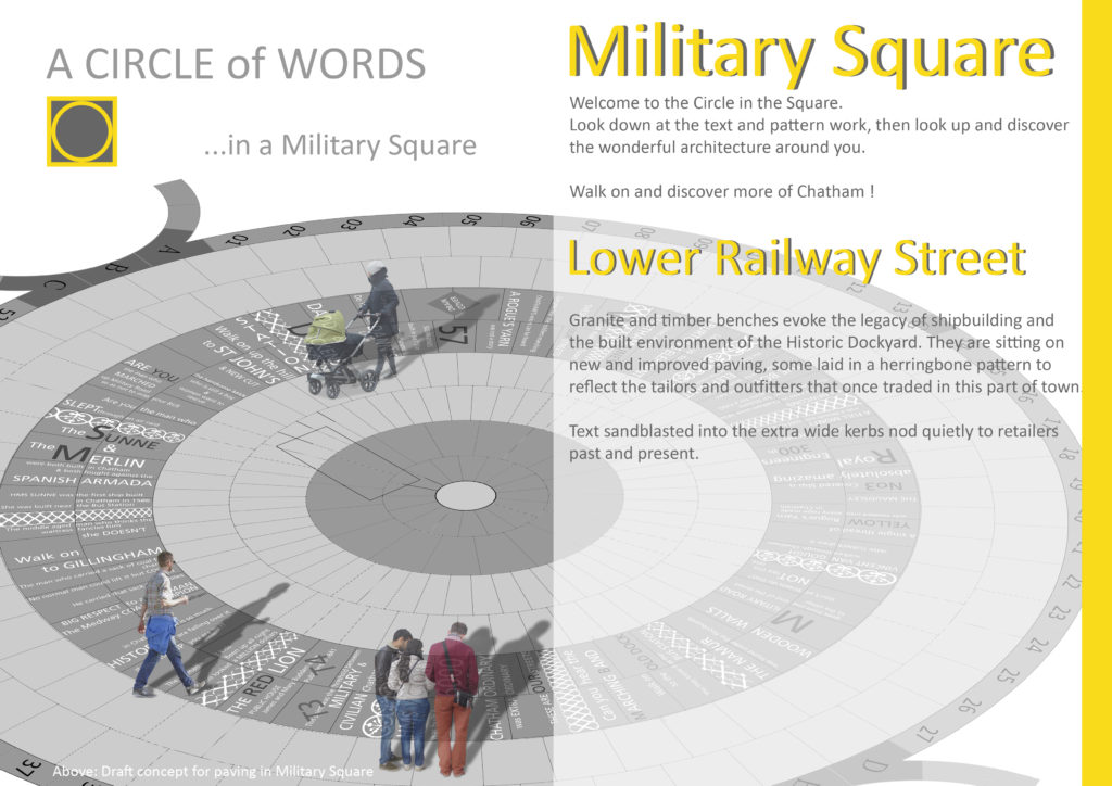
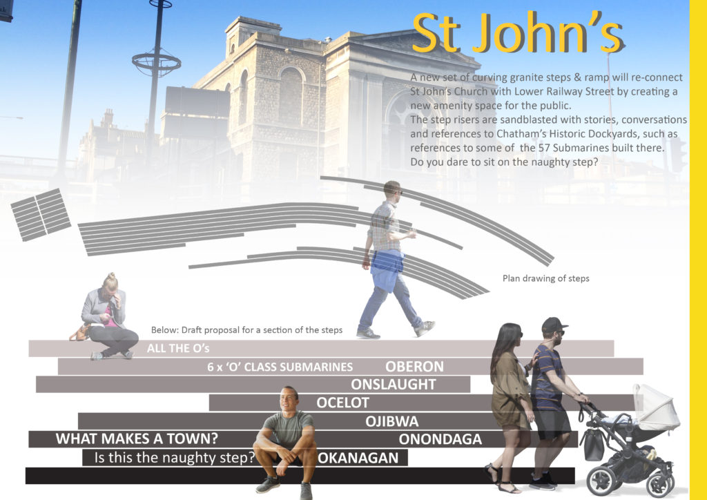
Chatham Placemaking Project. Draft Magazine page for ‘A Circle of Words in a Military Square’.Chatham Placemaking Project. Draft Magazine page for ‘St John’s Steps & Crossing’. Artist: Christopher Tipping
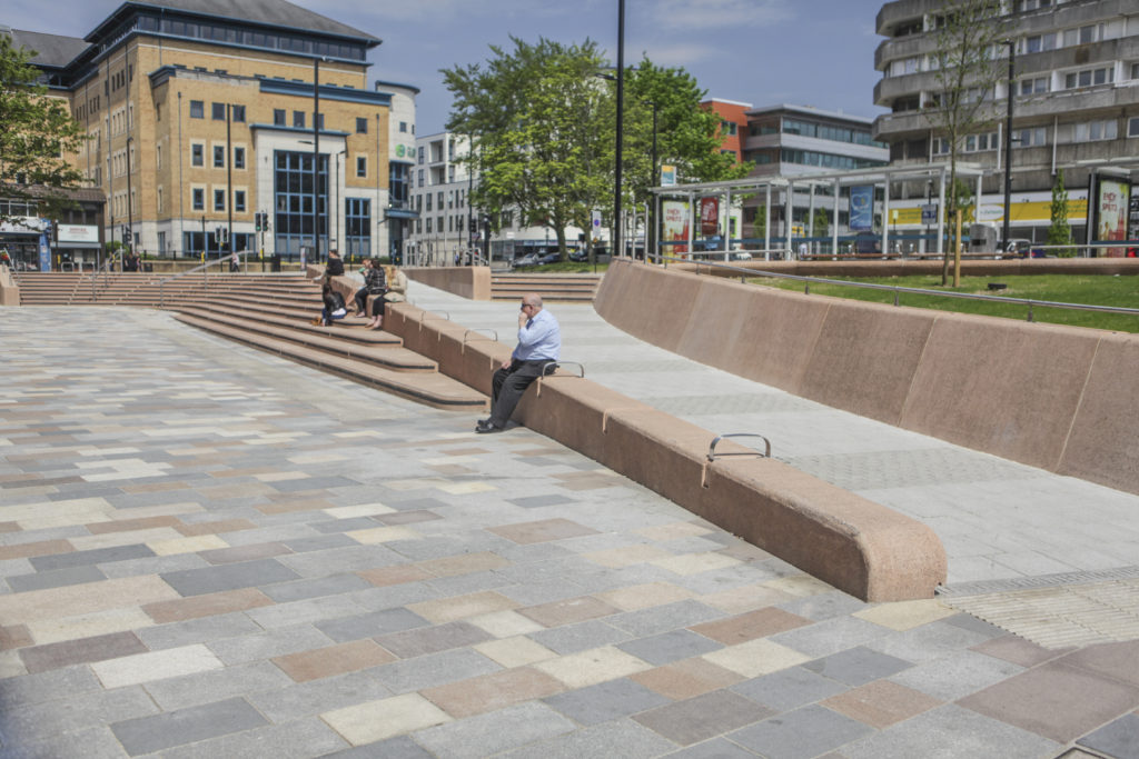
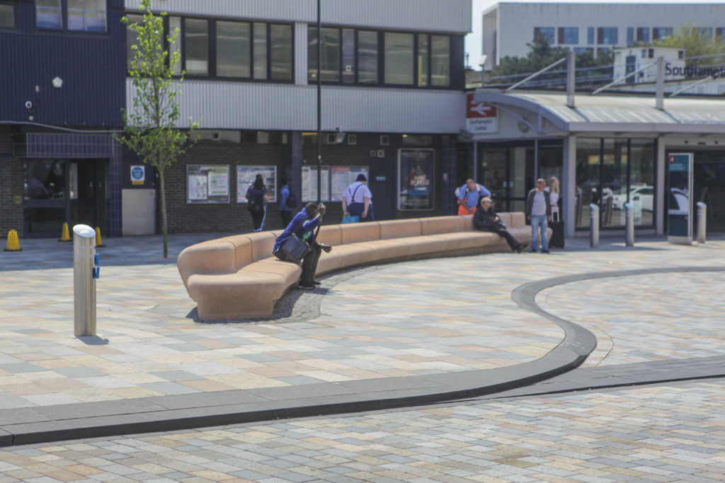
Southampton Station Quarter North – Frobisher House Forecourt. Image: Wilson Massie. Project Artist: Christopher TippingSouthampton Station Quarter North – Station Forecourt. Image: Wilson Massie. Project Artist: Christopher Tipping
HARRISON PARK, ORCHARD PARK, HULL – Extra Care Housing Scheme – digitally printed glazing vinyl and wall mounted work – Status: Ongoing
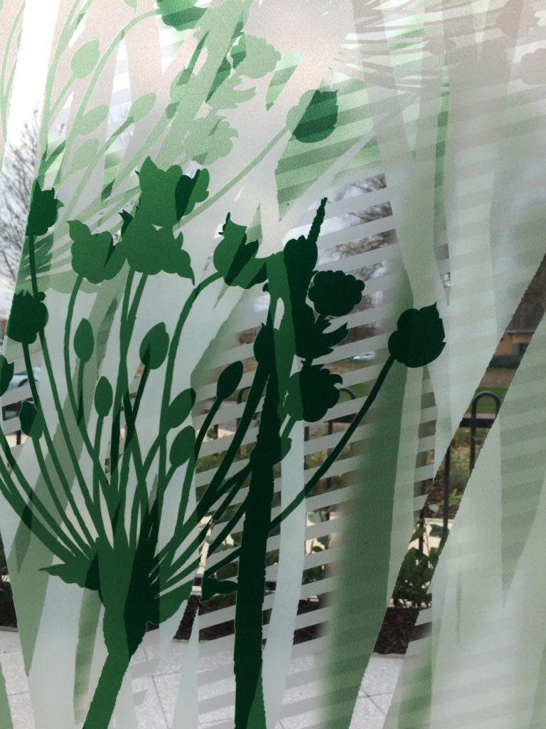
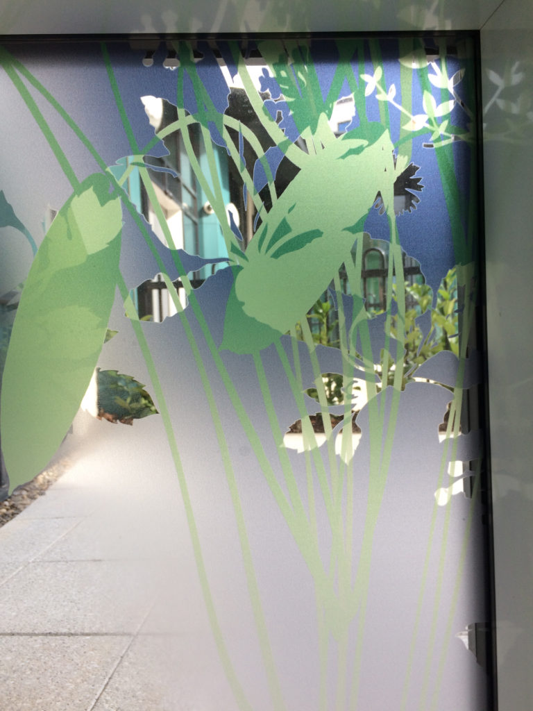
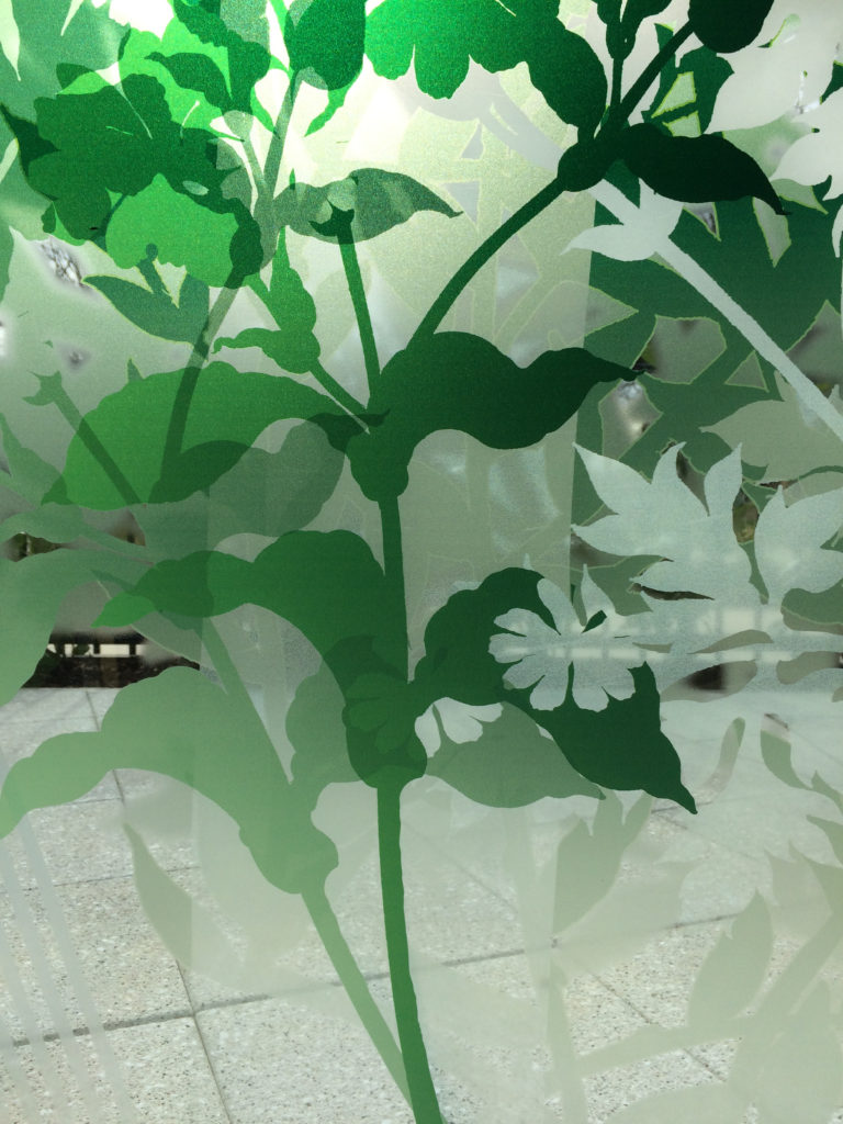
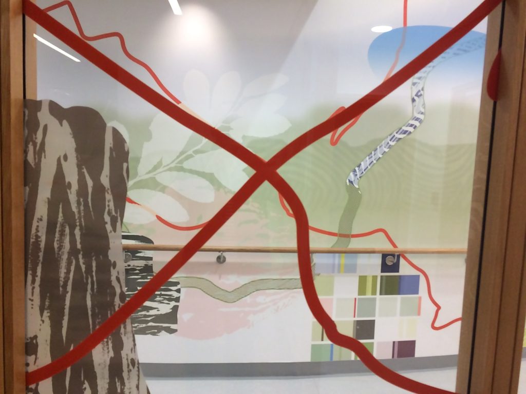
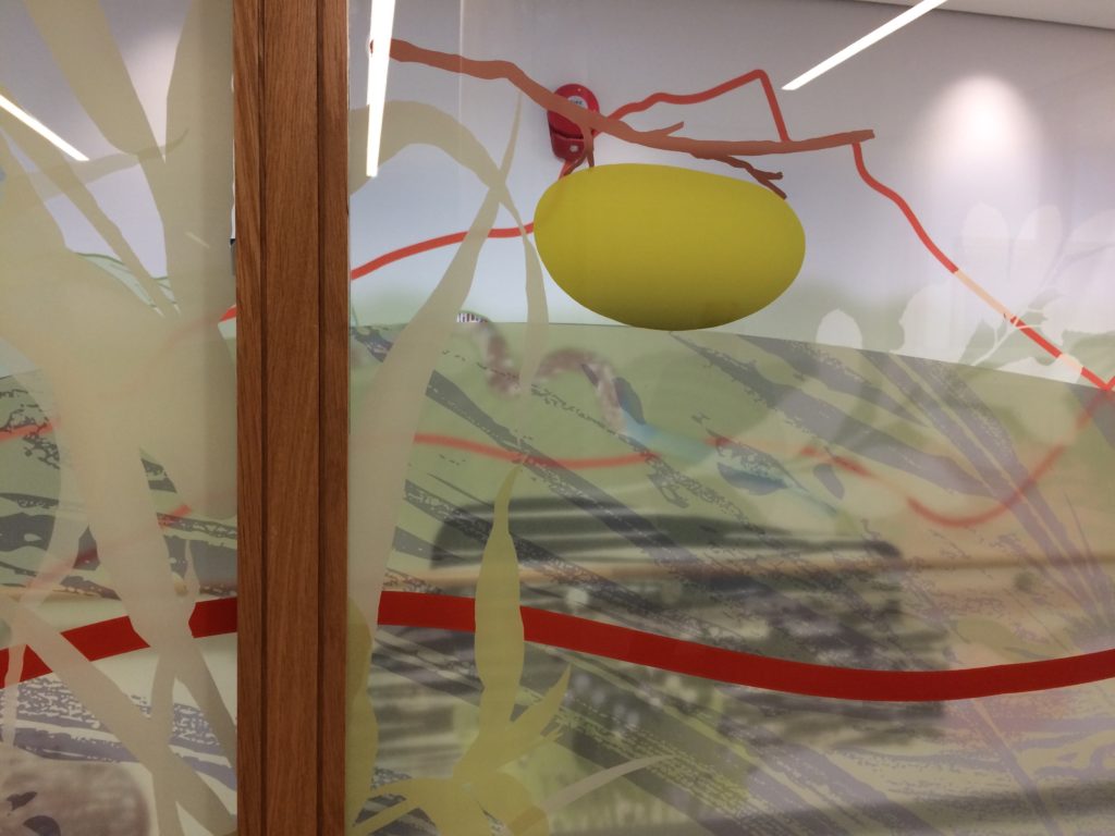
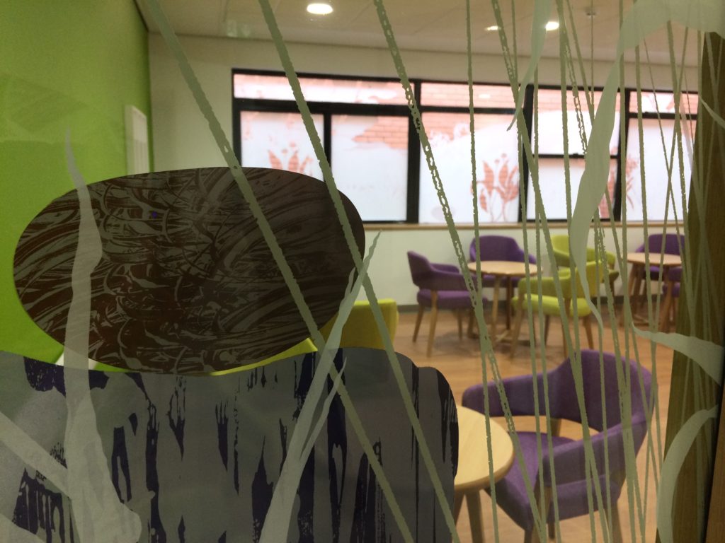
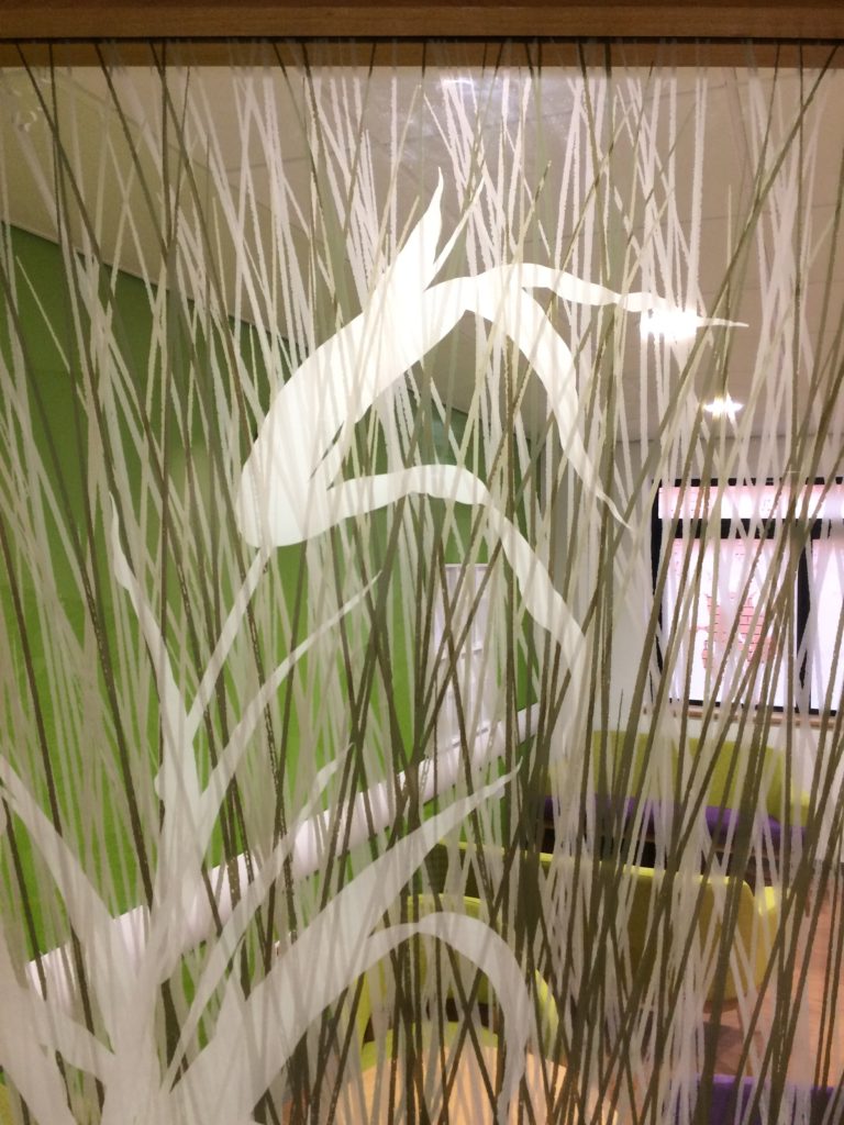
Detail: Glazing Vinyl installation Harrison Park, Hall Rd, Hull Extra Care. Artist: Christopher TippingDetail: Glazing Vinyl installation Harrison Park, Hall Rd, Hull Extra Care. Artist: Christopher Tipping
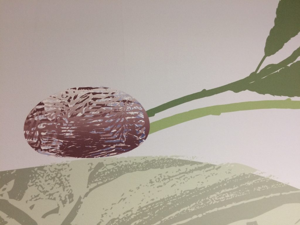
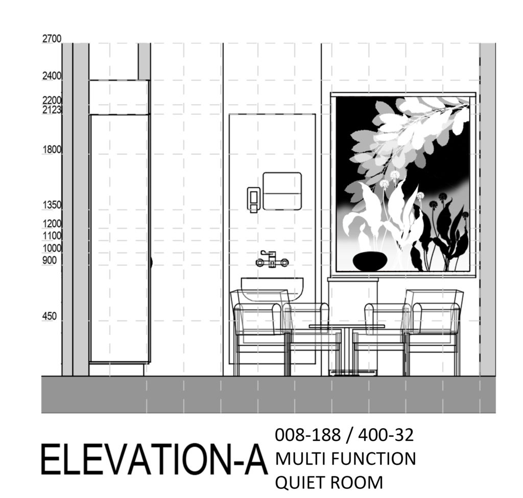
Draft Artwork for Wenric Ward, Littlemore Mental Health Unit, Oxford. Artist: Christopher TippingDraft Artwork for Wenric Ward, Littlemore Mental Health Unit, Oxford. Artist: Christopher Tipping
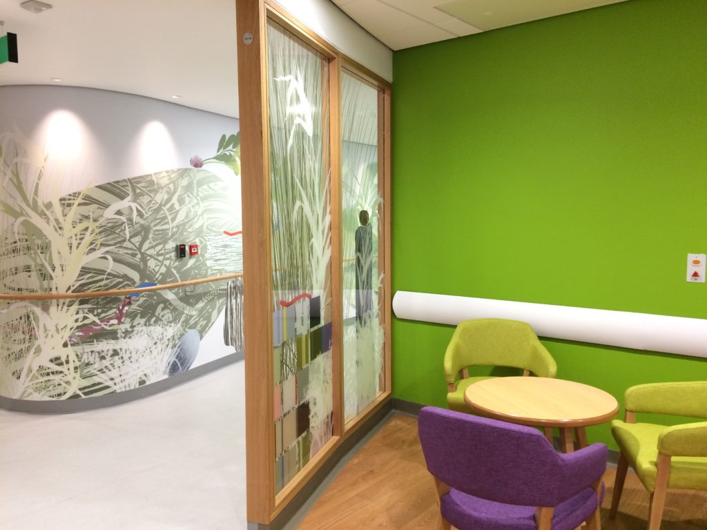
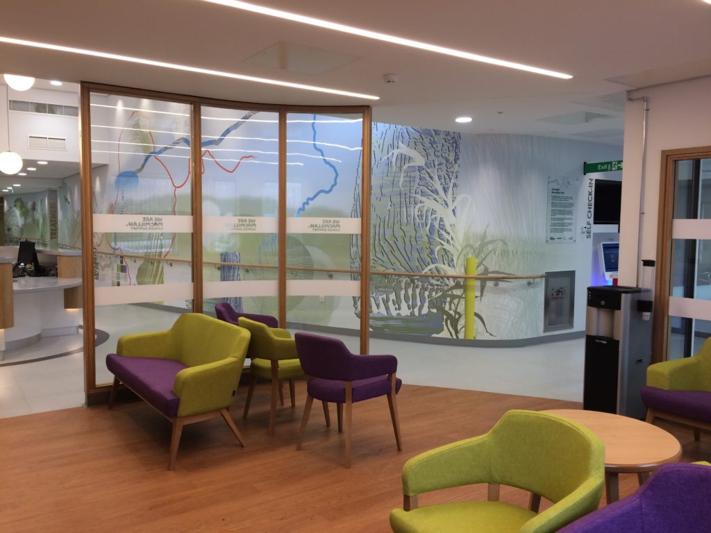
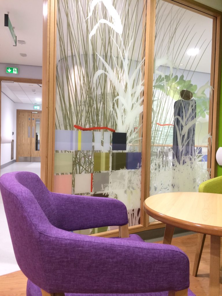
Interior of the New Macmillan Unit, showing a detail of the main corridor bespoke wall covering as seen through the laminated glazed screens. Project Artist: Christopher TippingInterior detail of the New Macmillan Unit at Tameside Hospital – Project Artist: Christopher Tipping
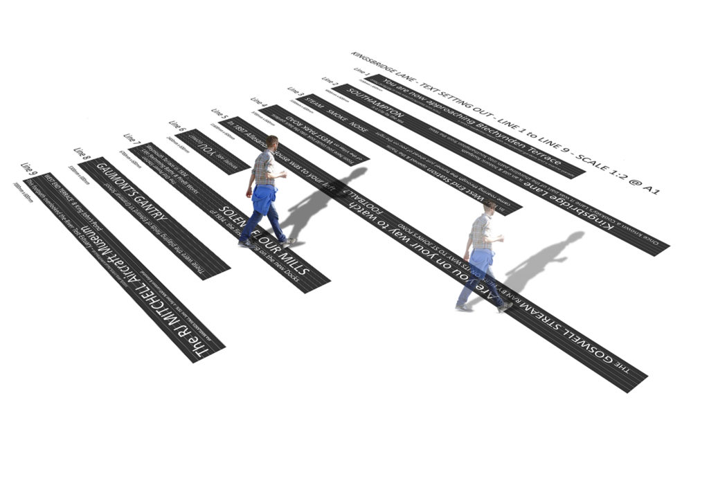
KINGSBRIDGE LANE, SOUTHAMPTON – Public Realm project currently in development. An extension of the Southampton Station Quarter North Project – Status: Ongoing
Friday 10th March 2017 – Final installation of the glazing vinyls at Harrison Park, Hull.
VGLhave done an amazing job – as ever – collaborating with me through detailed design / design for production / sampling / revisions / and final installation. A big thanks to them !
I have also been supported throughout the project by Andrew Knight of RKL Consultantswho developed and delivered the Arts Strategy for all three Extra Care Facilities being built in Hull.
Detail: Glazing Vinyl installation Harrison Park, Hall Rd, Hull Extra Care. Artist: Christopher TippingDetail: Glazing Vinyl installation Harrison Park, Hall Rd, Hull Extra Care. Artist: Christopher Tipping
Detail: Glazing Vinyl installation Harrison Park, Hall Rd, Hull Extra Care. Artist: Christopher TippingDetail: Glazing Vinyl installation Harrison Park, Hall Rd, Hull Extra Care. Artist: Christopher TippingDetail: Glazing Vinyl installation Harrison Park, Hall Rd, Hull Extra Care. Artist: Christopher TippingDetail: Glazing Vinyl installation Harrison Park, Hall Rd, Hull Extra Care. Artist: Christopher TippingDetail: Glazing Vinyl installation Harrison Park, Hall Rd, Hull Extra Care. Artist: Christopher TippingDetail: Glazing Vinyl installation Harrison Park, Hall Rd, Hull Extra Care. Artist: Christopher TippingDetail: Glazing Vinyl installation Harrison Park, Hall Rd, Hull Extra Care. Artist: Christopher TippingDetail: Glazing Vinyl installation Harrison Park, Hall Rd, Hull Extra Care. Artist: Christopher TippingDetail: Glazing Vinyl installation Harrison Park, Hall Rd, Hull Extra Care. Artist: Christopher TippingDetail: Glazing Vinyl installation Harrison Park, Hall Rd, Hull Extra Care. Artist: Christopher TippingDetail: Glazing Vinyl installation Harrison Park, Hall Rd, Hull Extra Care. Artist: Christopher TippingDetail: Glazing Vinyl installation Harrison Park, Hall Rd, Hull Extra Care. Artist: Christopher TippingDetail: Glazing Vinyl installation Harrison Park, Hall Rd, Hull Extra Care. Artist: Christopher TippingDetail: Glazing Vinyl installation Harrison Park, Hall Rd, Hull Extra Care. Artist: Christopher TippingDetail: Glazing Vinyl installation Harrison Park, Hall Rd, Hull Extra Care. Artist: Christopher TippingDetail: Glazing Vinyl installation Harrison Park, Hall Rd, Hull Extra Care. Artist: Christopher Tipping
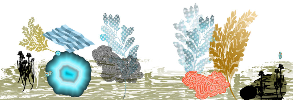
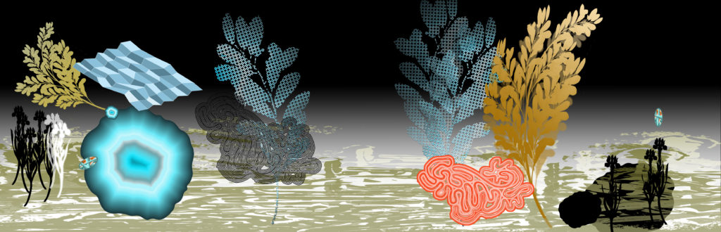
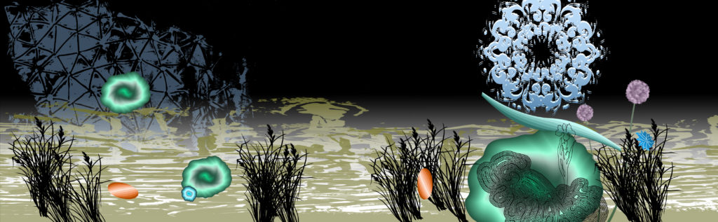
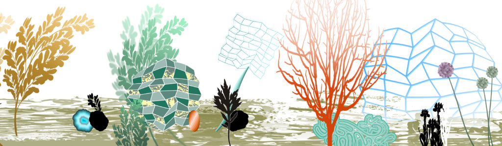
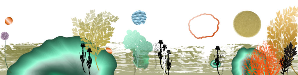
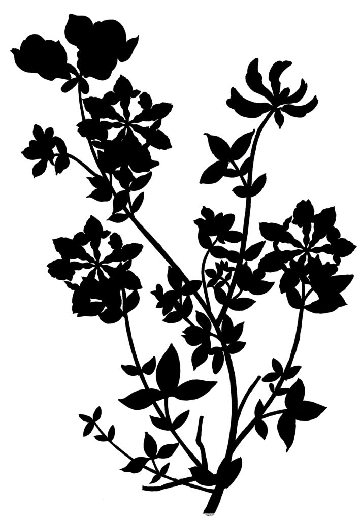
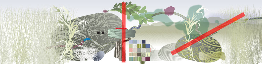
Each element used in the design starts as an ink sketch or line drawing. These are often drawn over-sized and larger than they will appear in the artwork to scale. The individual images are then scanned and saved as high res. jpegs allowing me to import into Photoshop.
Concept development – drawings of plants for Harrison Park, Extra Care Facility, Hull. Artist: Christopher TippingDouble Dyer – drawings of plants for Harrison Park, Extra Care Facility, Hull. Artist: Christopher TippingPotmus Lucens drawing for Harrison Park, Extra Care Facility, Hull. Artist: Christopher TippingBirds Foot Trefoil drawings for Harrison Park, Extra Care Facility, Hull. Artist: Christopher Tipping
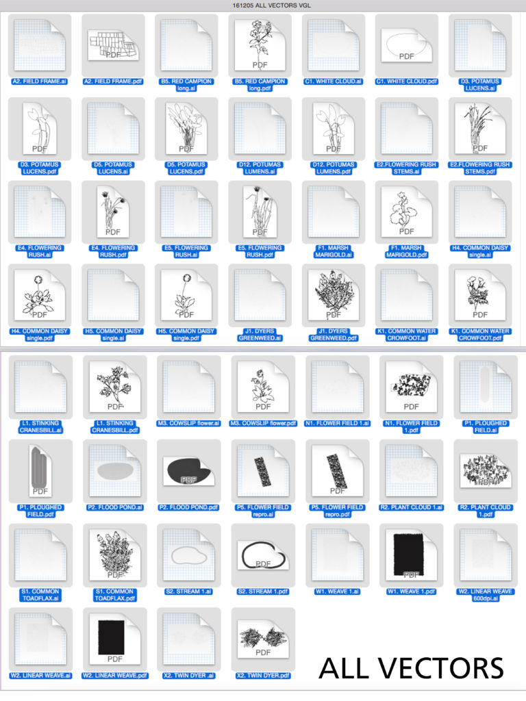
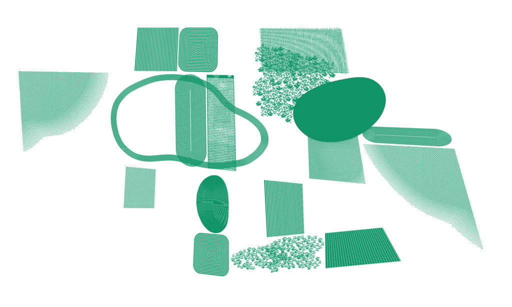
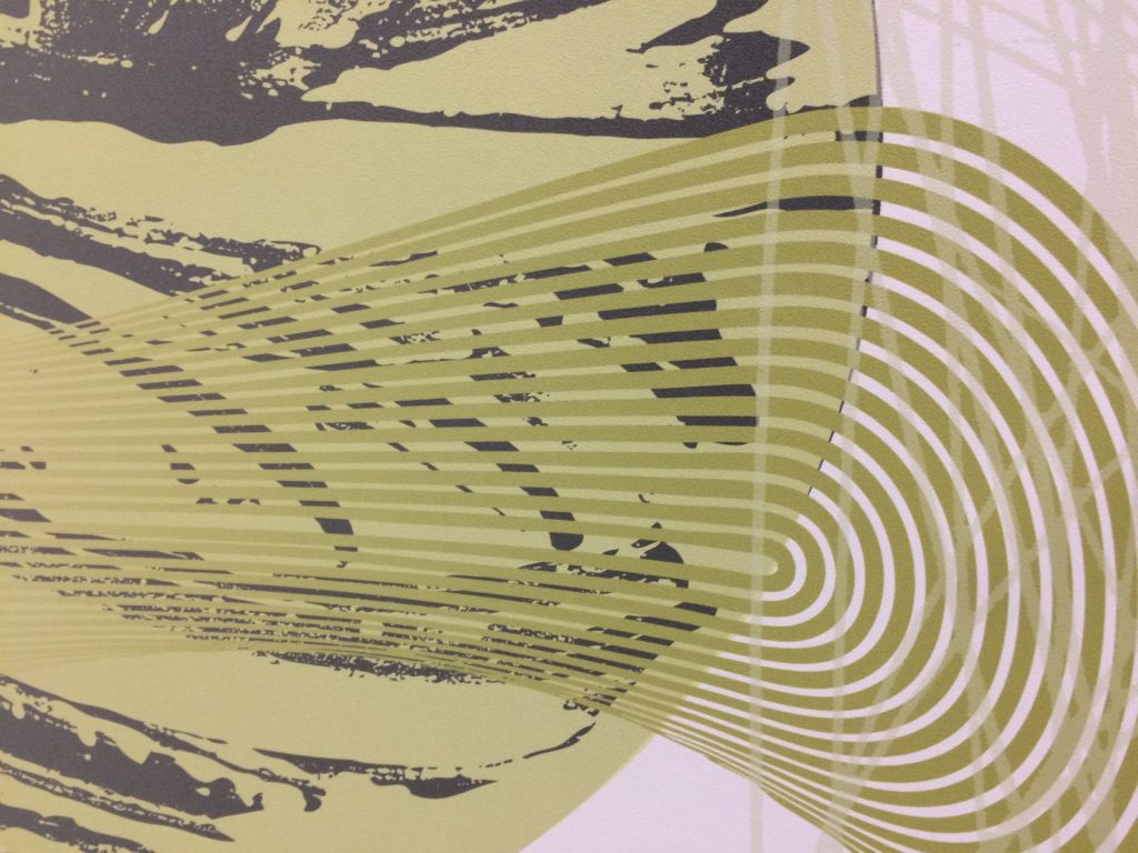
Artwork Development – Individual motifs and vectors used in the artwork for Harrison Park, Hull. Artist: Christopher TippingAbstract Field Pattern Motifs used as backgrounds in the glazing vinyl artworks for Harrison Park, Hull. Artist: Christopher TippingAbstract Field Pattern Motifs used as backgrounds in the glazing vinyl artworks for Harrison Park, Hull. Artist: Christopher Tipping
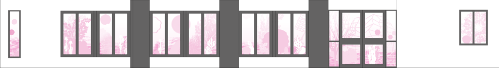
The following drafts were approved and signed off by the client team to develop into detailed design for production.
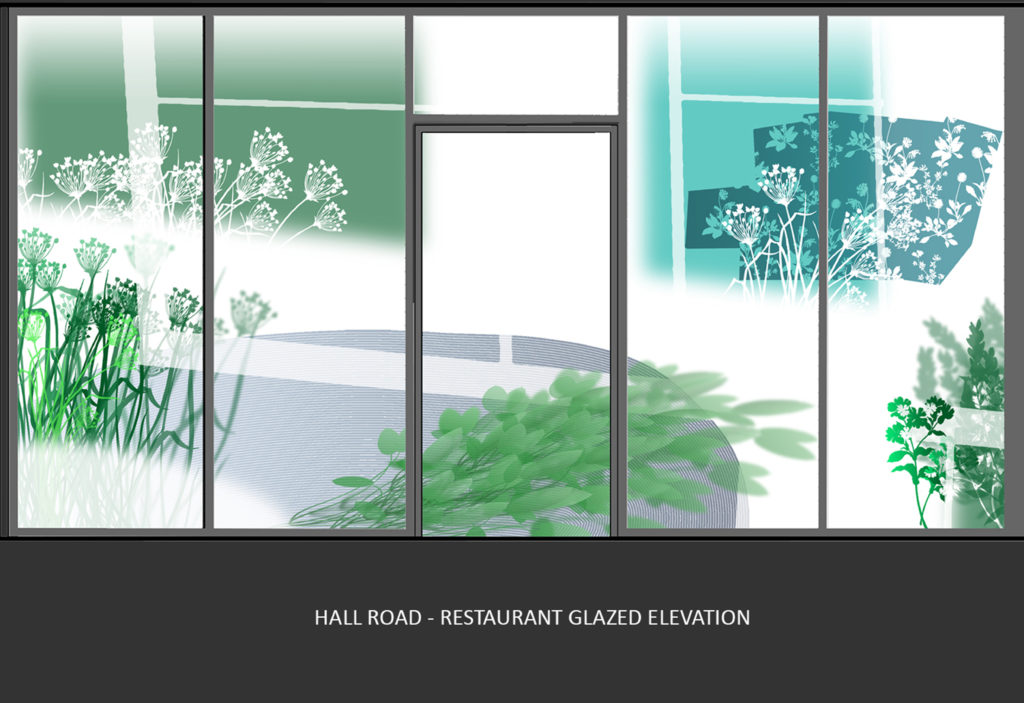
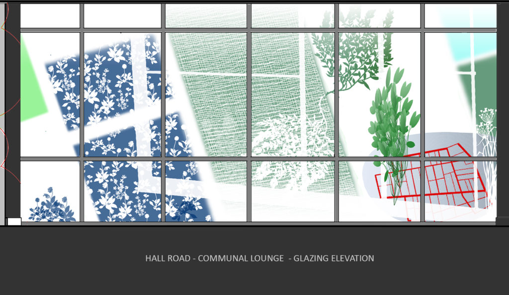
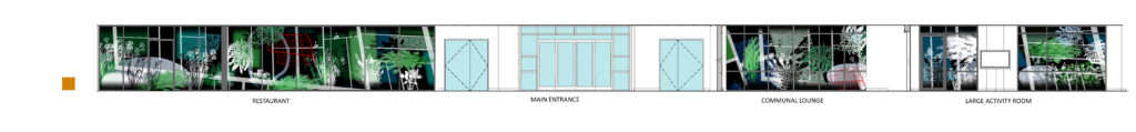
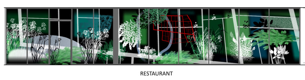
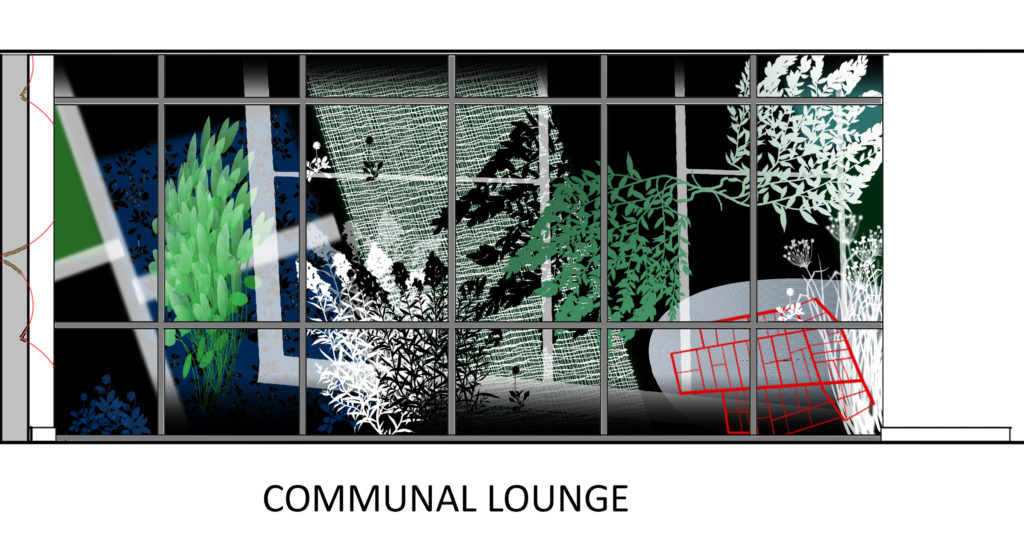
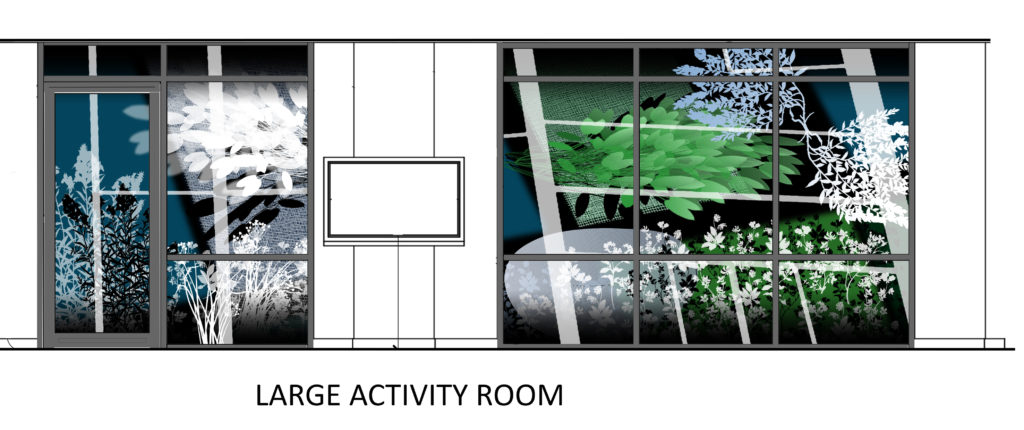
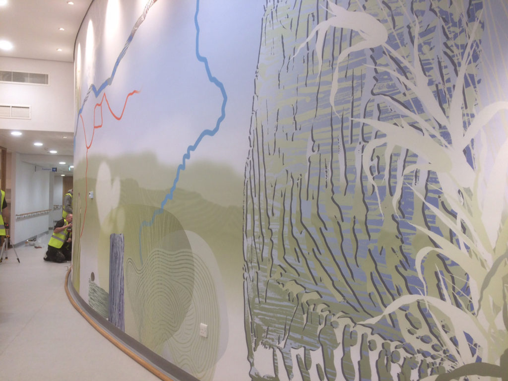
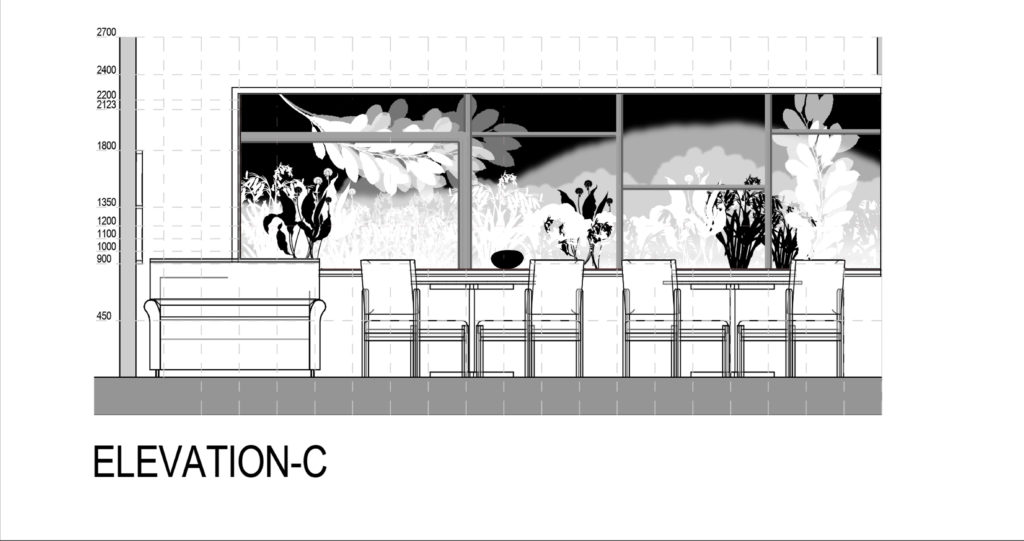
Early draft for complete elevation of glazing vinyl artworks for Harrison Park, Hull. Artist: Christopher TippingEarly draft for Restaurant glazing vinyl elevation for Harrison Park, Hull. Artist: Christopher TippingEarly draft for Restaurant glazing vinyl elevation for Harrison Park, Hull. Artist: Christopher TippingEarly draft for the Communal Lounge glazing vinyl elevation for Harrison Park, Hull. Artist: Christopher TippingDraft for whole elevation glazing vinyl for Harrison Park, Hull. Artist: Christopher Tipping
In the above draft artwork the optically clear vinyl, with no print colour is shown as black. This would appear as fully transparent glazing. The artwork presents various colour & opacity values, utilising print white techniques to great effect. VGLhave been excellent and creative collaborators on this project.
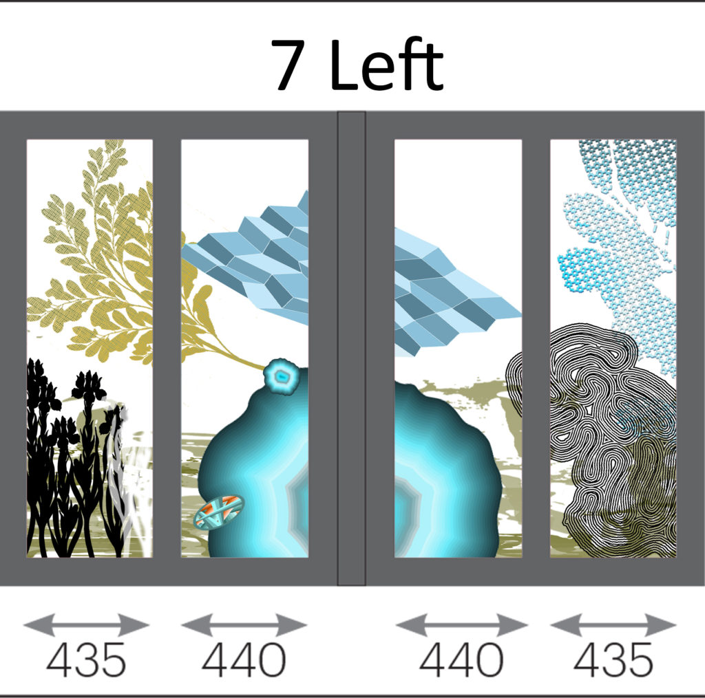
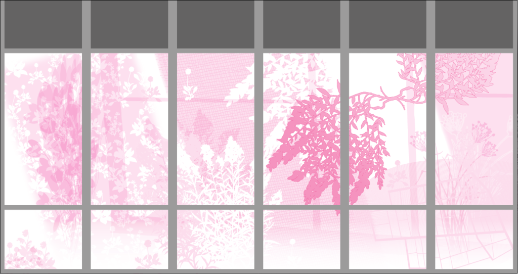
Below is a draft production file from VGL which shows – in tones of pink – the strength of opaque and translucent white which is printed in-between the colour layers.
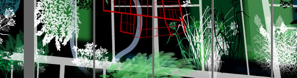
Production draft for the Communal Lounge glazing vinyl’s for Harrison Park, Hull. Artist: Christopher TippingDraft of the Restaurant glazing vinyl for Harrison Park, Hull. Artist: Christopher TippingDraft detail of the Restaurant elevation glazing vinyl for Harrison Park, Hull. Artist: Christopher TippingDraft for the Communal Lounge glazing vinyl’s for Harrison Park, Hull. Artist: Christopher TippingDraft for the Large Activity Room glazing vinyl’s for Harrison Park, Hull. Artist: Christopher Tipping
The trick with all these proposals is to get the right proportion of printed cover, clear glazing and translucency. All very well on paper – but once installed, there are views beyond the glazing to consider too. The movement of traffic, activity of people and the ever changing weather. These all impact considerably on how the installed artwork can be read and appreciated, both from at distance and from up close.
Full scale printed samples are the next item on the list.
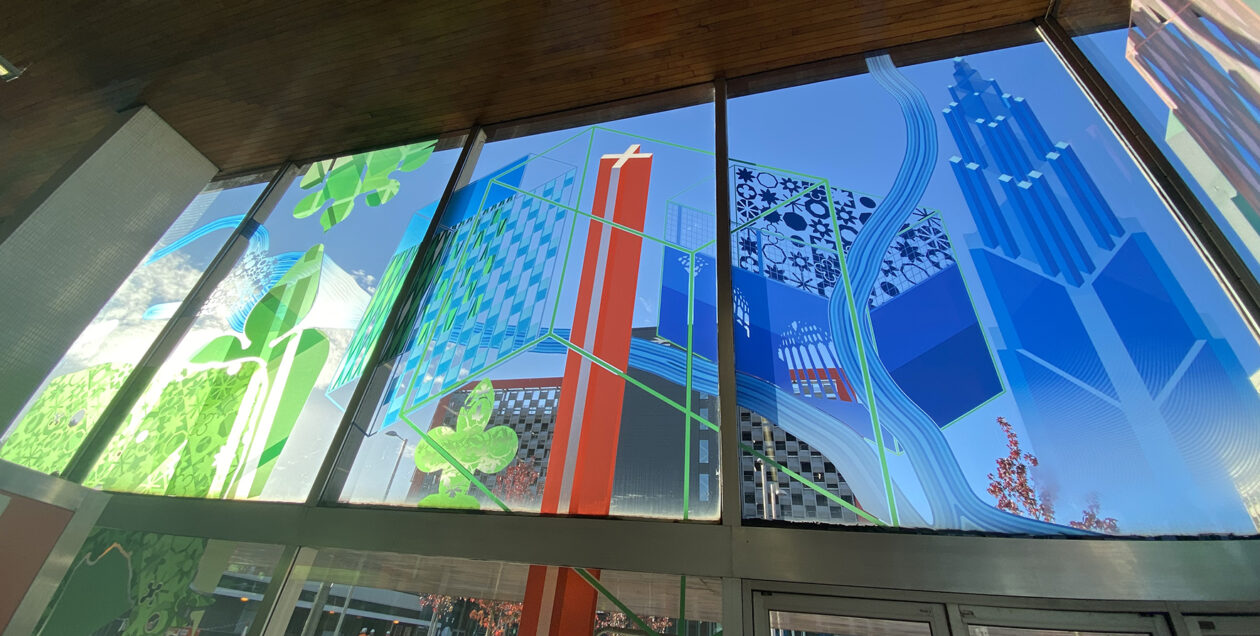
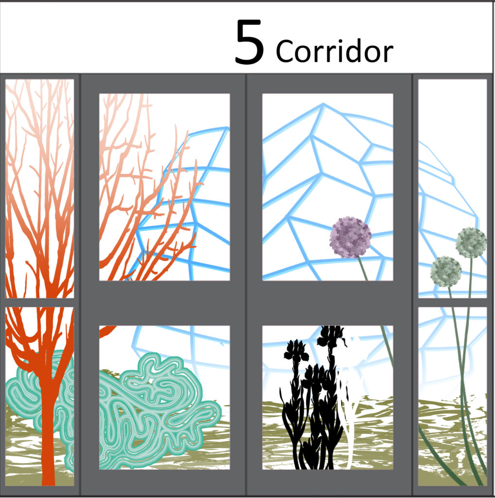
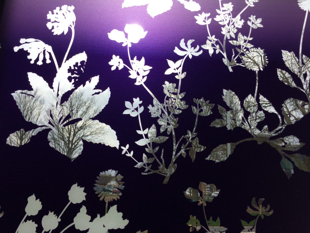
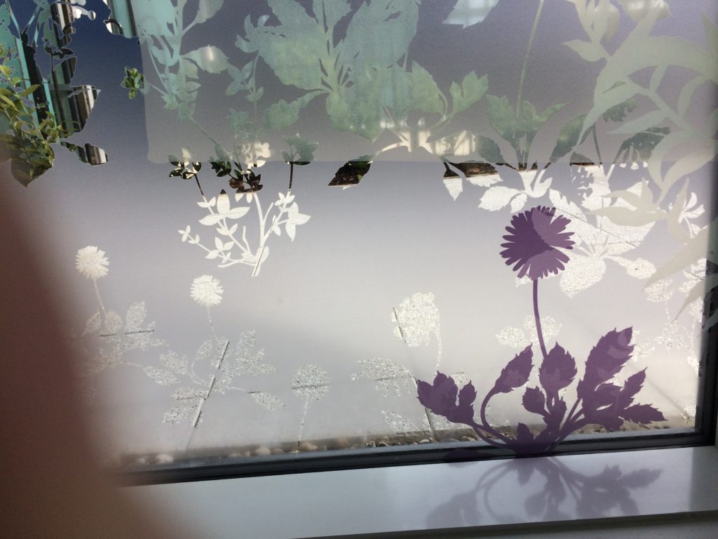
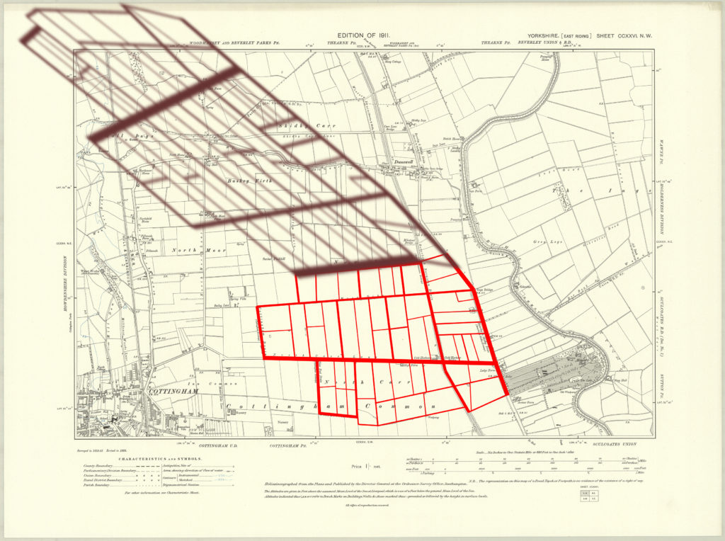
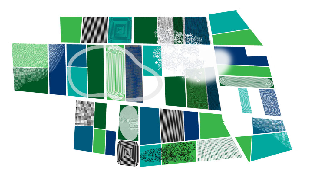
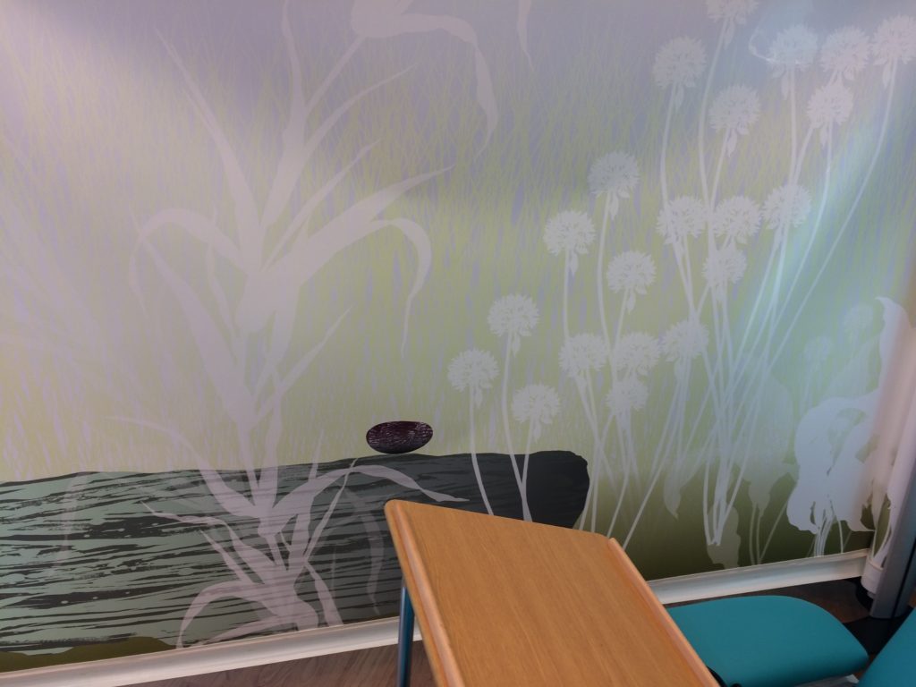
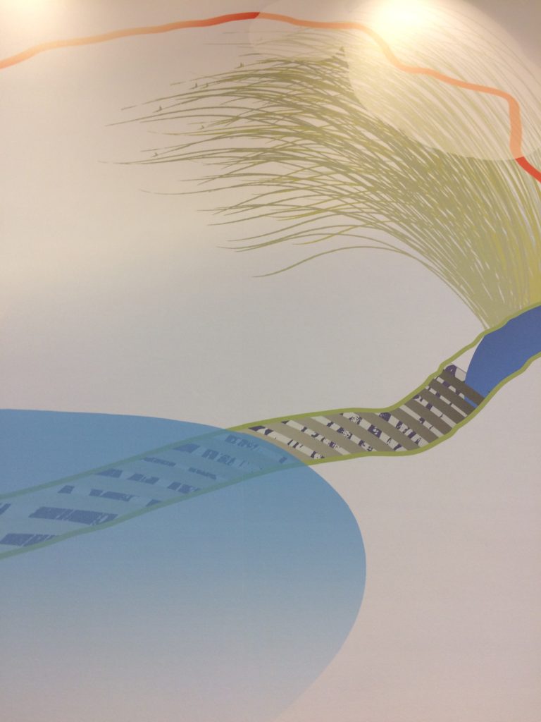
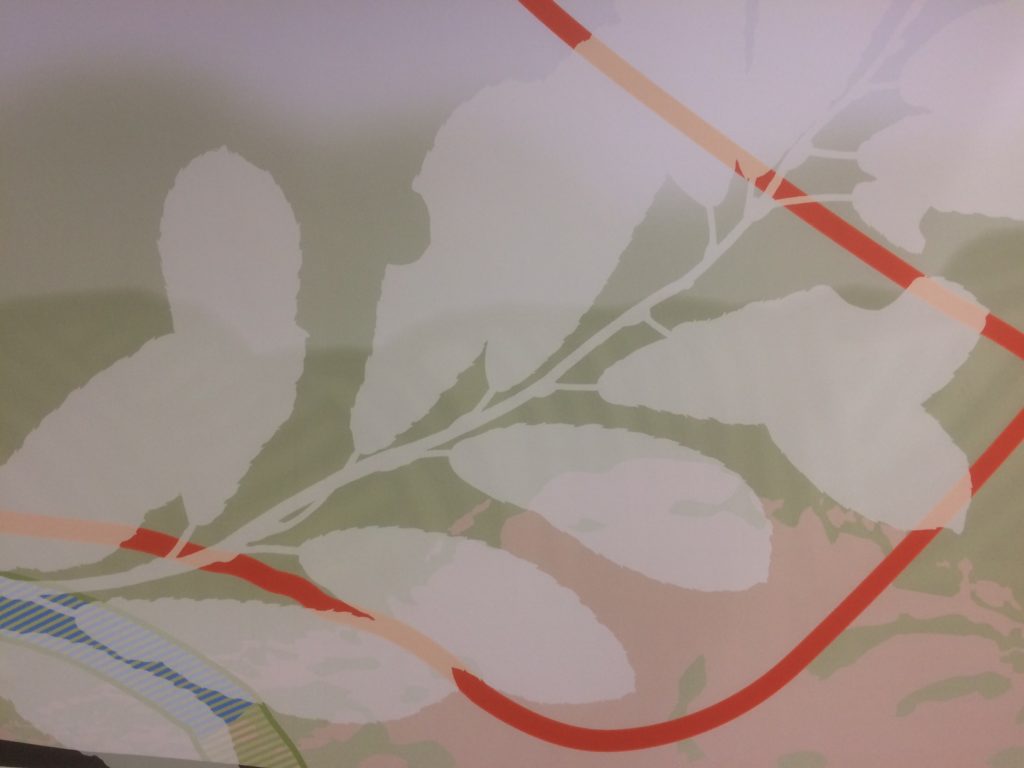
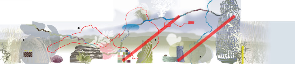
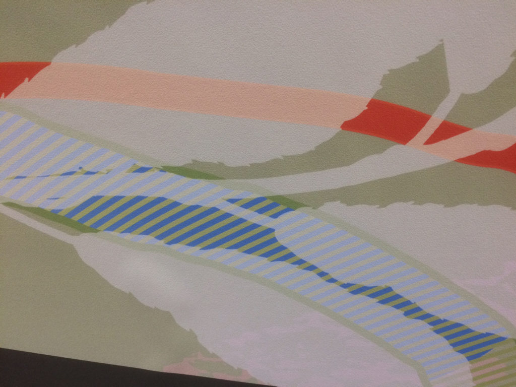
The Glazing Vinyl Artworks are presented as a series of abstract & figurative elements based upon a number of historic land maps, including the 1816 plan of Cottingham Common showing historic field patterns, each of which is annotated with the names of the individual landowner and /or tenant farmer.
The Inclosure Act of 1766 transformed this ill-drained common meadow and pasture, which was subject to seasonal flooding from the tidal River Hull, into a landscape of sluices, dykes, drains and ditches, the names of which, will be familiar to many of you now.
Concept development drawing for Harrison Park, Extra Care Facility, Hull. Image: National Library of Scotland OS Map of 1911 with Artist drawing overlaid. Artist: Christopher Tipping
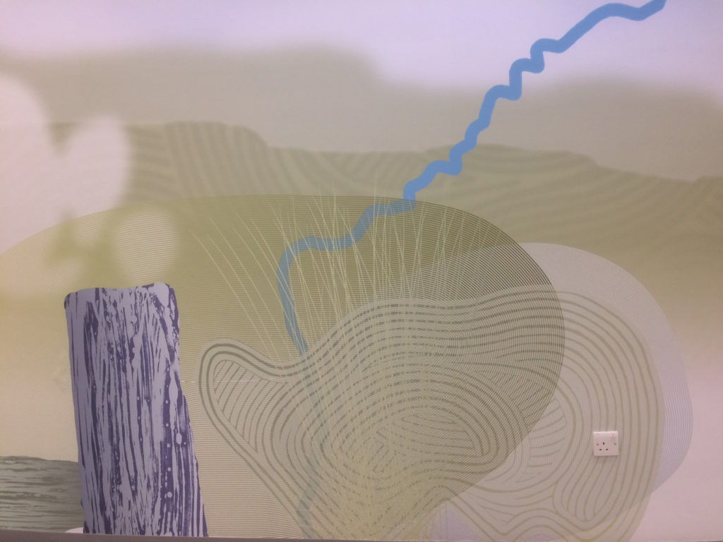
The 1886 hand drawn map of Coldharbour Farm, on North Carr Lane -now Orchard Park Road, in the collection of the Hull History Centre, shows the individual fields held by the tenant farmer, which were farmed until the new estate was built in 1963. This new building on Hall Road, part of the Orchard Park Estate, sits within the original boundary of the farm.
Concept development drawing for Harrison Park, Extra Care Facility, Hull. Image: Field Patterns & Textures. Artist: Christopher Tipping
It is this historic landscape and community which provides a ‘frame’ of support and a visual reference for the artworks, reflecting the fact that there has been a continuous system of land & water management and farming, in turn supporting a community on this site since medieval times.
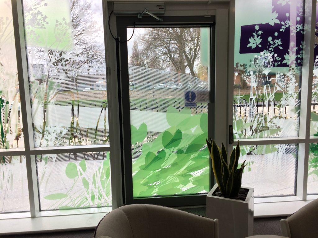
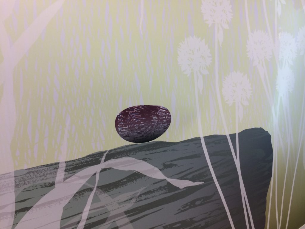
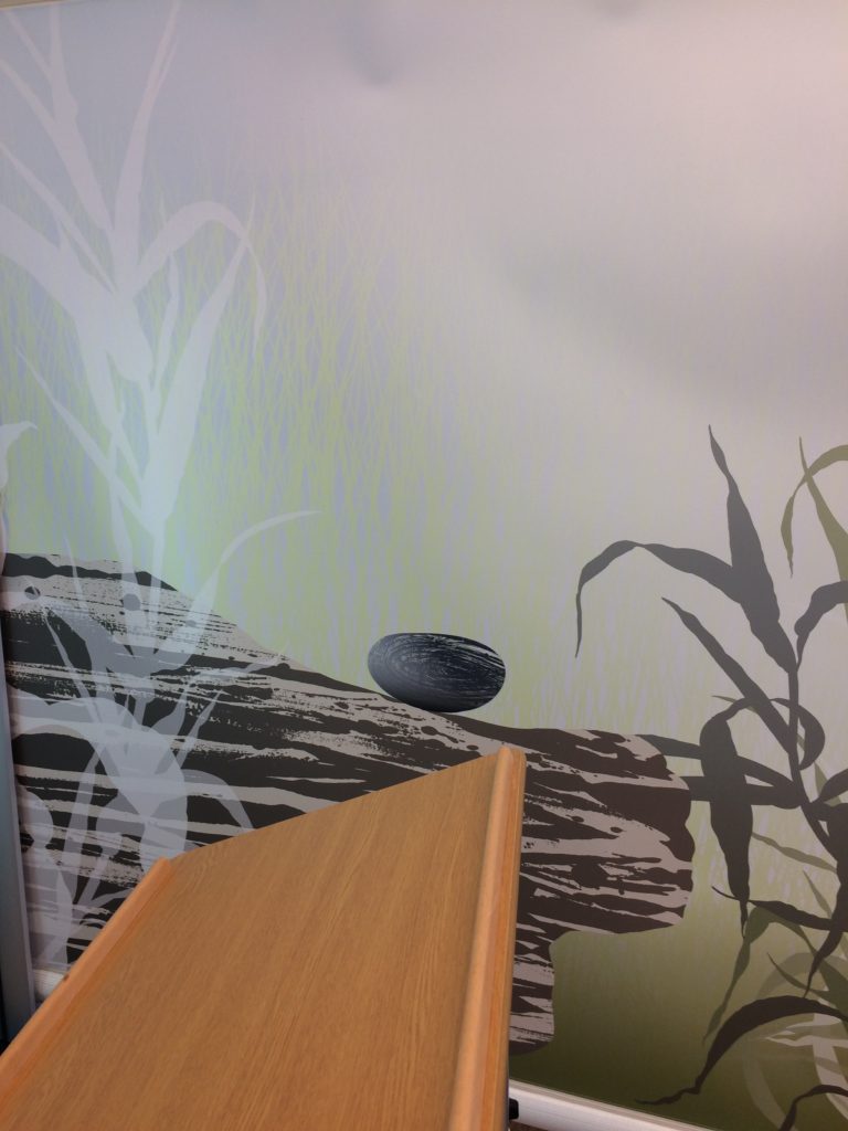
The artwork builds a bridge to the past and also acts as a threshold between the external and internal landscapes of the building. The outlines of plants, suggest those which may have grown in the waterways and fields of the area – Flowering Rush, Floating Pondweed,
Dyers Greenweed, Birds Foot Trefoil, Marsh Marigold, Cowslip, Common Daisy and Stinking Cranesbill. The Field Pattern geometry works as a scaffold device to hold these detailed drawings together, with its suggestion of green fields, ponds, clouds and textures.
The whole artwork is kept rigidly in place via the deep architectural window frames, which impose a vertical and horizontal symmetry to the view.
Concept development drawing for Harrison Park, Extra Care Facility, Hull. Image: Field Patterns & Textures. Artist: Christopher Tipping
The use of areas of clear, transparent glazing is very much a part of the intention of the work, allowing views both from and into the building, whilst further animating and providing a backdrop of external colour and texture to illuminate and make visible, the cut-out detailing of the artwork.
The Field Pattern is further used to inspire and give form to a wall-hung cabinet, to be known as the Field Cabinet, which can be used as an ordinary bookshelf as well as a cabinet of curiosity containing references to the history and locality of the new building.
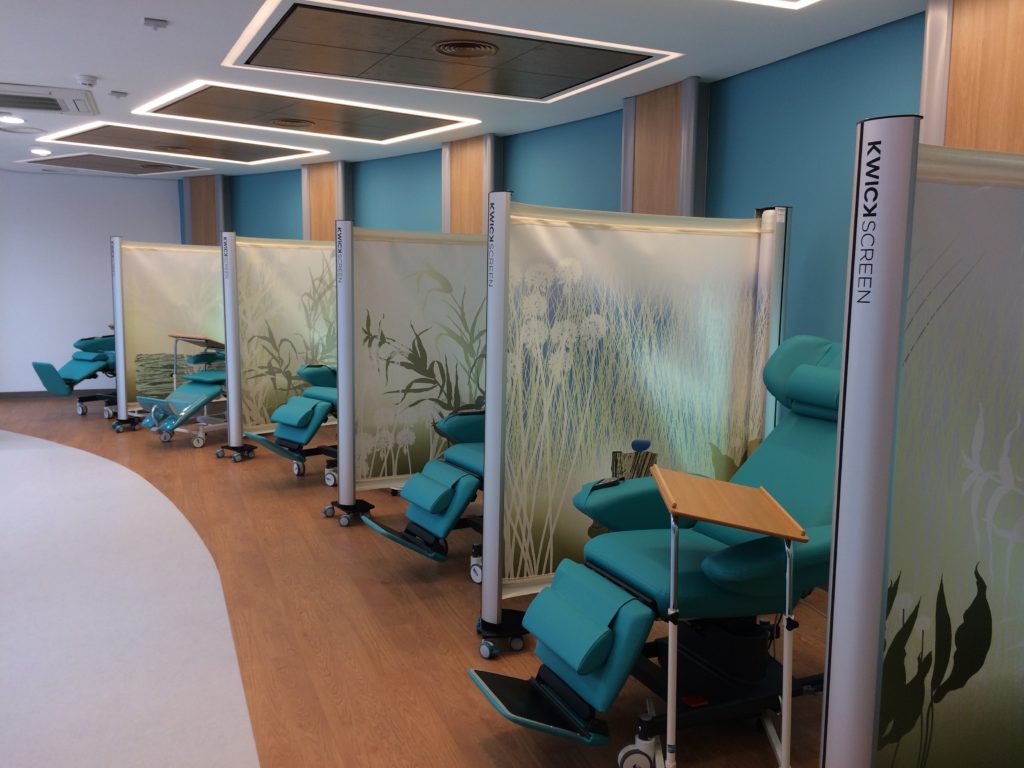
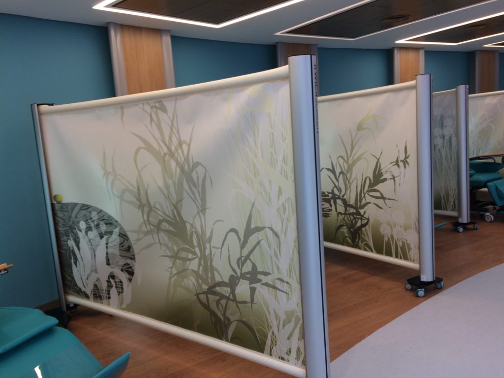
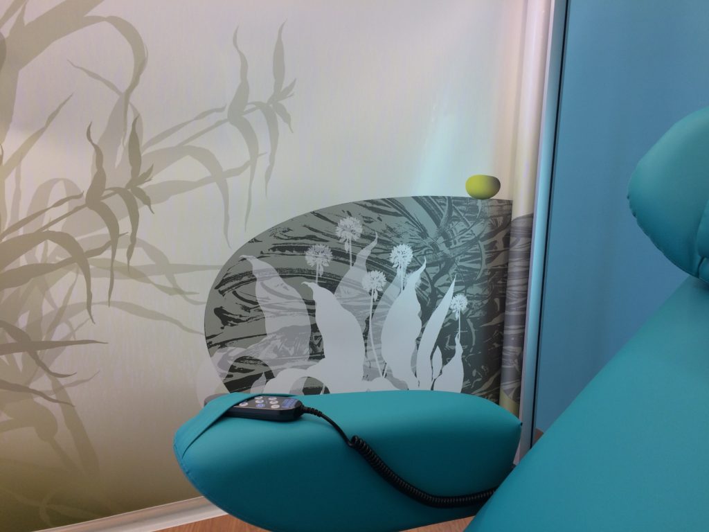
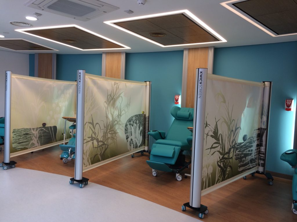
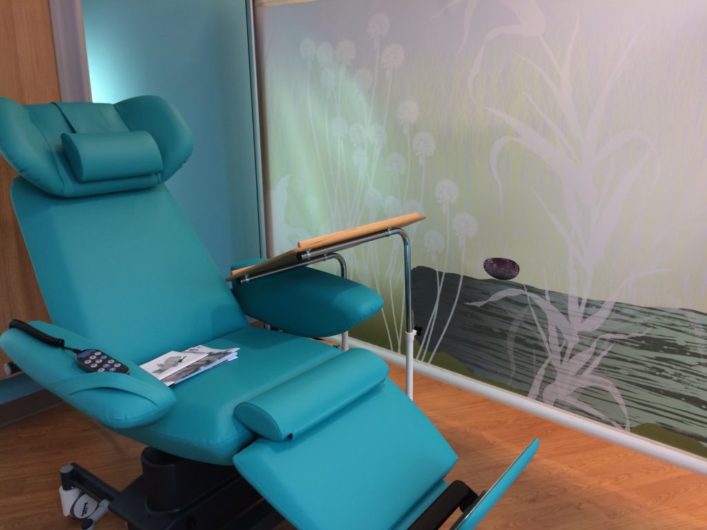
The Chemotherapy Treatment Room. During my last visit to site on 13th March 2017 – I was really interested to see how the creative concept for the project had been applied in the Chemotherapy Treatment Room – a state of the art, 6 chair Chemotherapy Suite.
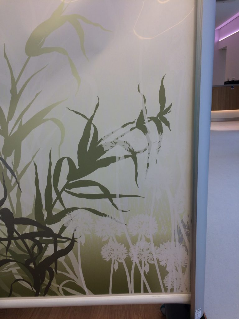
The artwork was to be applied to the adjustable privacy screens adjacent to each chair. The work forms a continuous landscape, divided into 6 sections, which will be continually re-arranged to present new combinations as the screens are used throughout the day.
These screens were manufactured and installed by Kwickscreen.
The Christie Hospital has also launched a 3 day a week chemotherapy service at the new £1.8m Macmillan Unit.
Interior of the Chemotherapy Suite at the New Macmillan Unit, showing artwork applied to the privacy screens. Project Artist: Christopher TippingInterior of the Chemotherapy Suite at the New Macmillan Unit, showing artwork applied to the privacy screens. Project Artist: Christopher TippingInterior of the Chemotherapy Suite at the New Macmillan Unit, showing artwork applied to the privacy screens. Project Artist: Christopher TippingInterior of the Chemotherapy Suite at the New Macmillan Unit, showing artwork applied to the privacy screens. Project Artist: Christopher TippingInterior of the Chemotherapy Suite at the New Macmillan Unit, showing artwork applied to the privacy screens. Project Artist: Christopher TippingInterior of the Chemotherapy Suite at the New Macmillan Unit, showing artwork applied to the privacy screens. Project Artist: Christopher TippingInterior of the Chemotherapy Suite at the New Macmillan Unit, showing artwork applied to the privacy screens. Project Artist: Christopher TippingInterior of the Chemotherapy Suite at the New Macmillan Unit, showing artwork applied to the privacy screens. Project Artist: Christopher TippingInterior of the Chemotherapy Suite at the New Macmillan Unit, showing artwork applied to the privacy screens. Project Artist: Christopher TippingInterior of the Chemotherapy Suite at the New Macmillan Unit, showing artwork applied to the privacy screens. Project Artist: Christopher TippingInterior of the Chemotherapy Suite at the New Macmillan Unit, showing artwork applied to the privacy screens. Project Artist: Christopher Tipping
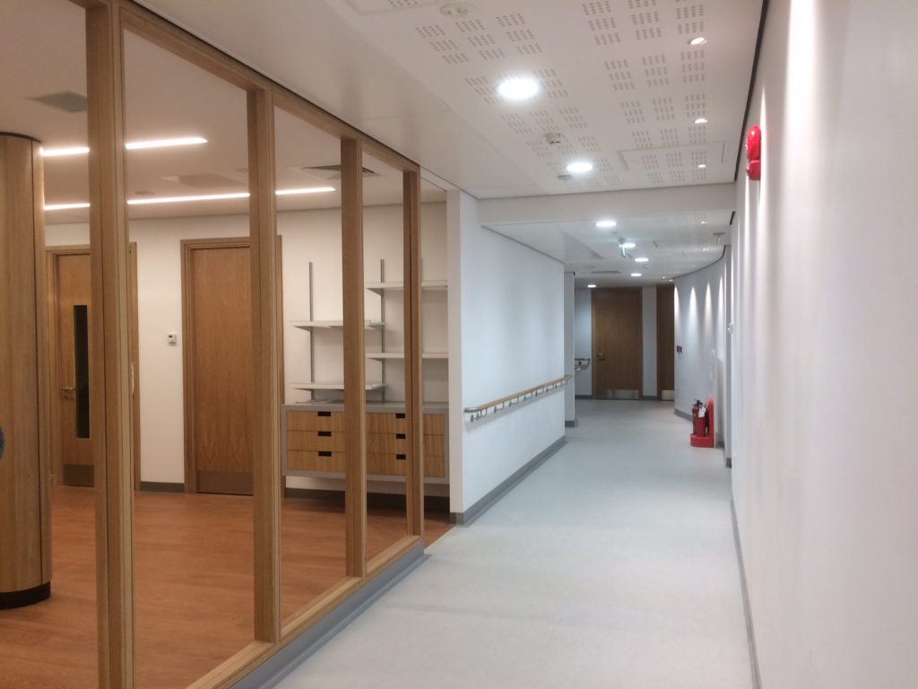
I made my last visit to site on 13th March 2017 – to see the artworks fully installed. The interiors throughout the new unit are all completed, fully furnished and operational and the first clinics were to be held the very next day. Tameside Macmillan Unit Willis Newson
No more words – only images –
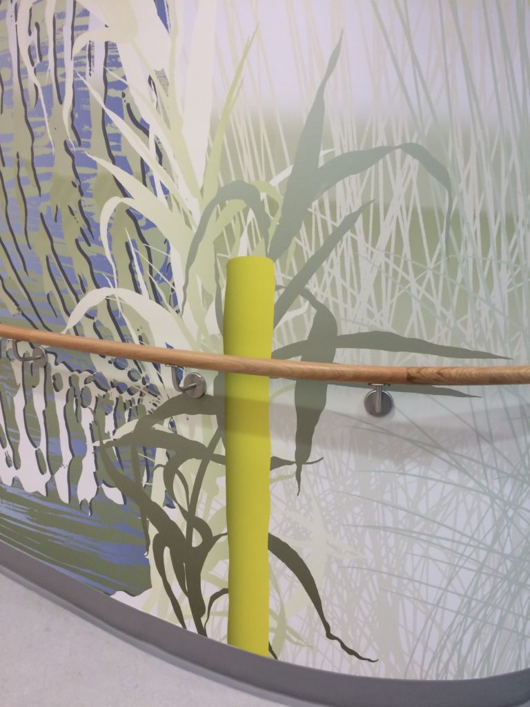
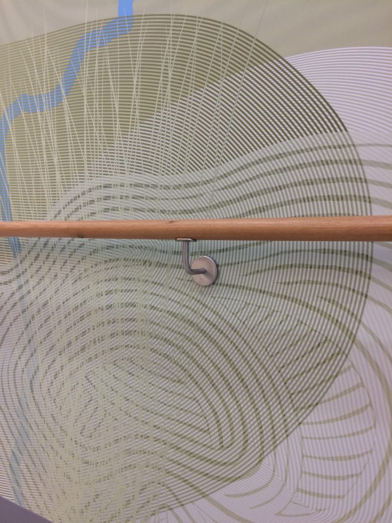
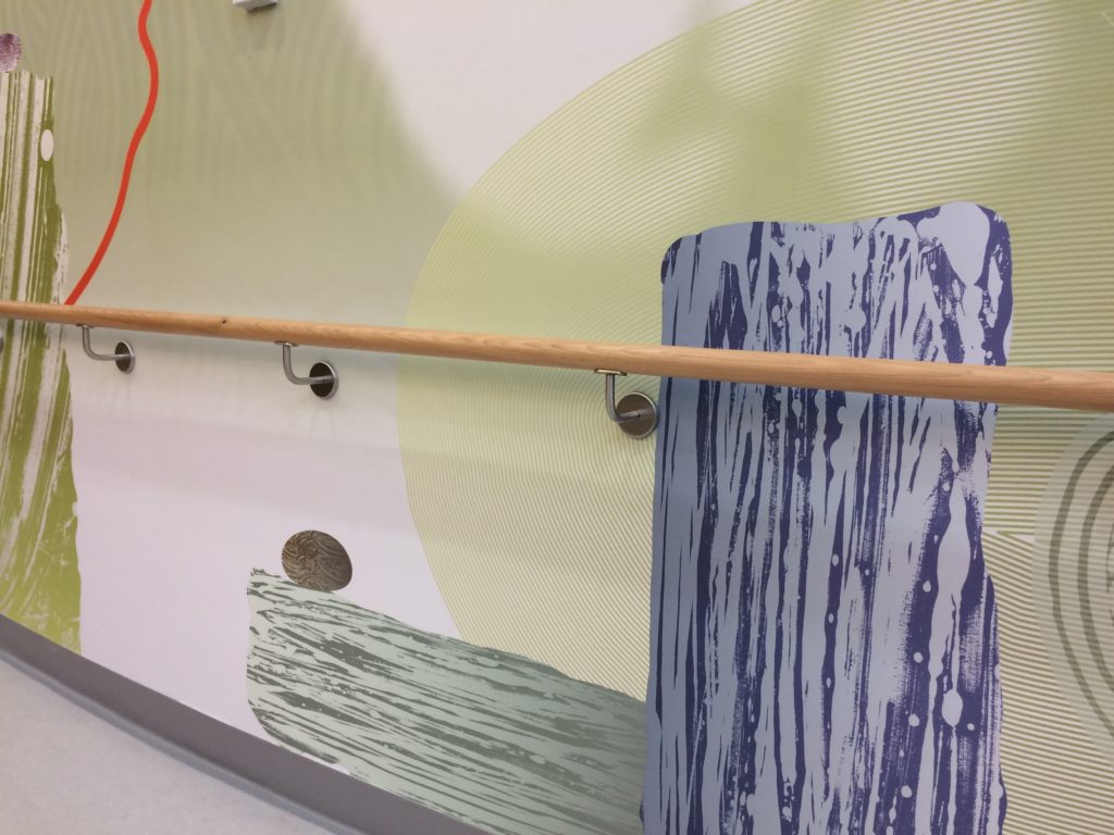
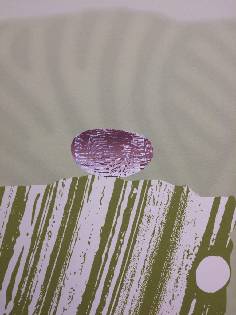
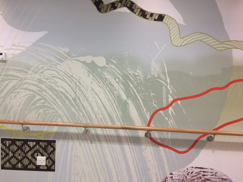
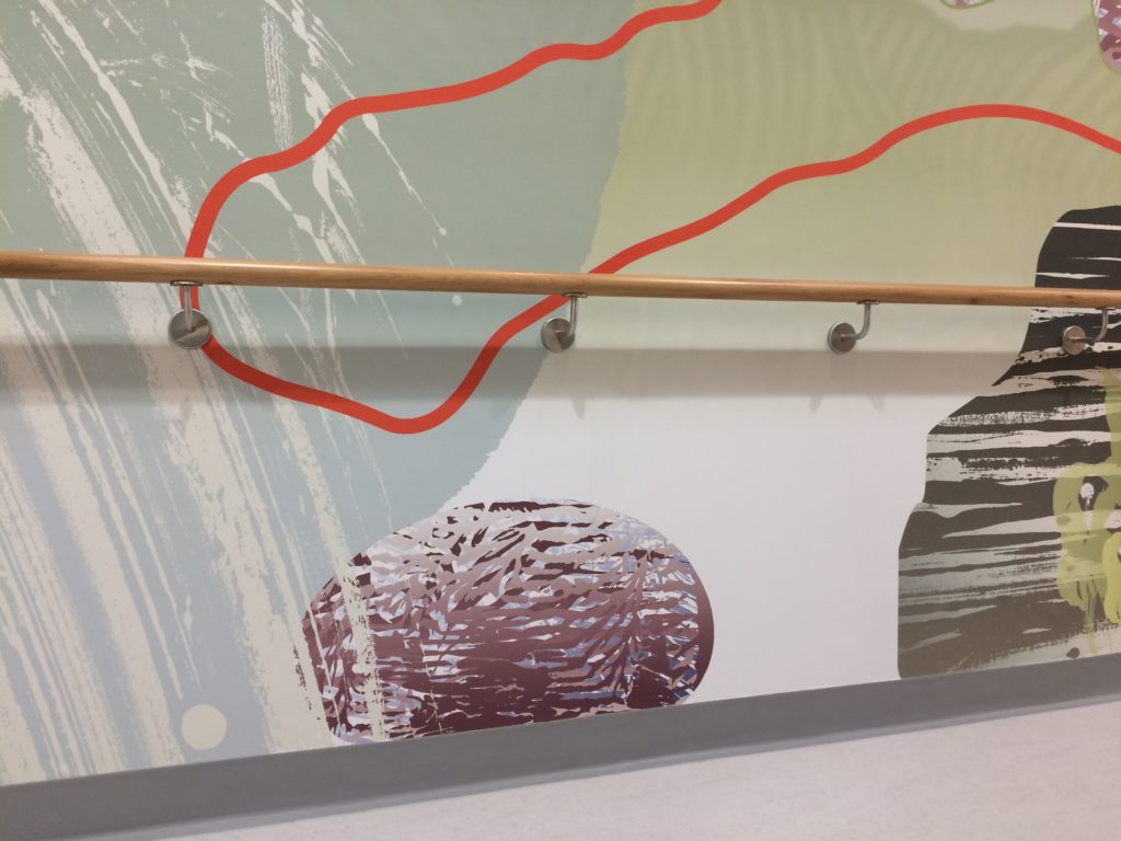
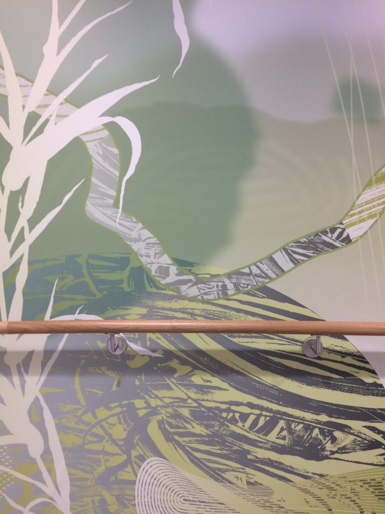
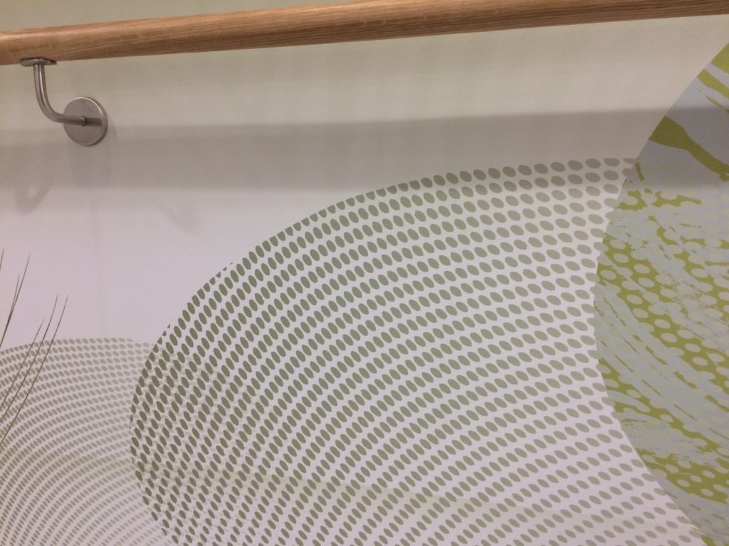
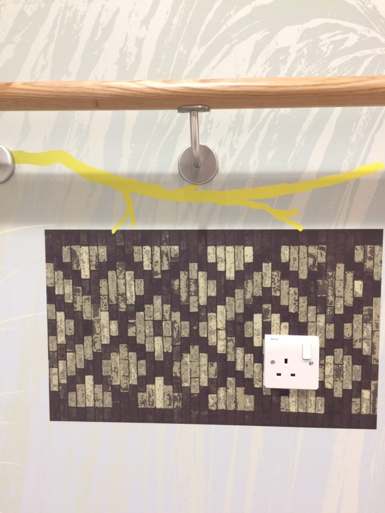
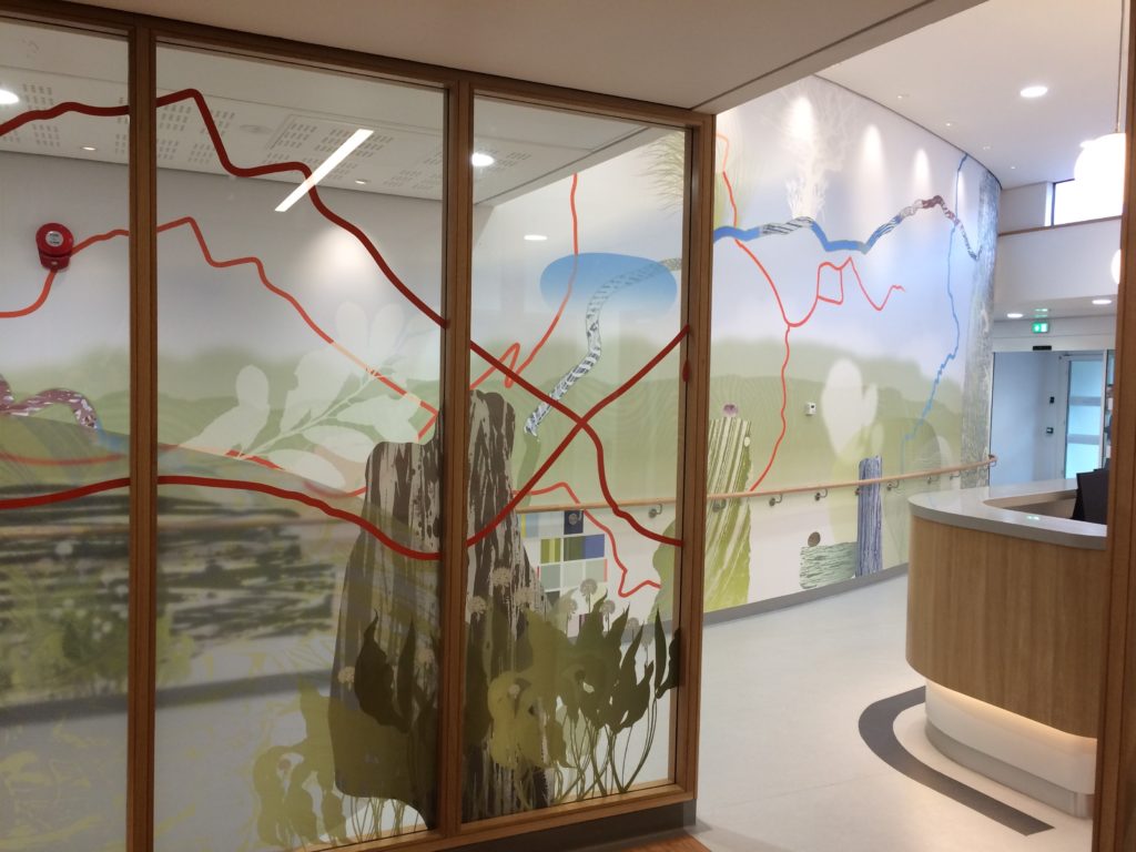
Interior detail of the New Macmillan Unit at Tameside Hospital – Project Artist: Christopher TippingInterior detail of the New Macmillan Unit, showing the main corridor bespoke wallcovering. Project Artist: Christopher TippingInterior of the New Macmillan Unit, showing a detail of the main corridor bespoke wall covering. Project Artist: Christopher TippingInterior of the New Macmillan Unit, showing a detail of the main corridor bespoke wall covering. Project Artist: Christopher TippingInterior of the New Macmillan Unit, showing a detail of the main corridor bespoke wall covering & timber handrail. Project Artist: Christopher TippingInterior of the New Macmillan Unit, showing a detail of the main corridor bespoke wall covering. Project Artist: Christopher TippingInterior of the New Macmillan Unit, showing a detail of the main corridor bespoke wall covering. Project Artist: Christopher TippingInterior of the New Macmillan Unit, showing a detail of the main corridor bespoke wall covering. Project Artist: Christopher TippingInterior of the New Macmillan Unit, showing a detail of the main corridor bespoke wall covering. Project Artist: Christopher TippingInterior of the New Macmillan Unit, showing a detail of the main corridor bespoke wall covering & solid timber handrail. Project Artist: Christopher TippingInterior of the New Macmillan Unit, showing a detail of the main corridor bespoke wall covering & solid timber handrail. Project Artist: Christopher TippingInterior of the New Macmillan Unit, showing a detail of the main corridor bespoke wall covering. Project Artist: Christopher TippingInterior of the New Macmillan Unit, showing a detail of the main corridor bespoke wall covering. Project Artist: Christopher TippingInterior of the New Macmillan Unit, showing a detail of the main corridor bespoke wall covering. Project Artist: Christopher TippingInterior of the New Macmillan Unit, showing a detail of the main corridor bespoke wall covering. Project Artist: Christopher TippingInterior of the New Macmillan Unit, showing a detail of the main corridor bespoke wall covering. Project Artist: Christopher TippingInterior of the New Macmillan Unit, showing a detail of the main corridor bespoke wall covering. Project Artist: Christopher TippingInterior of the New Macmillan Unit, showing a detail of the main corridor bespoke wall covering. Project Artist: Christopher TippingInterior of the New Macmillan Unit, showing a detail of the main corridor bespoke wall covering. Project Artist: Christopher TippingInterior of the New Macmillan Unit, showing a detail of the main corridor bespoke wall covering. Project Artist: Christopher TippingInterior of the New Macmillan Unit, showing a detail of the main corridor bespoke wall covering as seen through the laminated glazed screens. Project Artist: Christopher TippingInterior of the New Macmillan Unit, showing a detail of the main corridor bespoke wall covering as seen through the laminated glazed screens. Project Artist: Christopher TippingInterior of the New Macmillan Unit, showing a detail of the main corridor bespoke wall covering as seen through the laminated glazed screens. Project Artist: Christopher TippingInterior of the New Macmillan Unit, showing a detail of the main corridor bespoke wall covering as seen through the laminated glazed screens. Project Artist: Christopher TippingInterior of the New Macmillan Unit, showing a detail of the main corridor bespoke wall covering as seen through the laminated glazed screens. Project Artist: Christopher TippingInterior of the New Macmillan Unit, showing a detail of the main corridor bespoke wall covering as seen through the laminated glazed screens. Project Artist: Christopher TippingInterior of the New Macmillan Unit, showing a detail of the main corridor bespoke wall covering as seen through the laminated glazed screens. Project Artist: Christopher TippingInterior of the New Macmillan Unit, showing a detail of the external glazing artworks. Project Artist: Christopher TippingInterior of the New Macmillan Unit, showing a detail of the external glazing artworks. Project Artist: Christopher TippingInterior of the New Macmillan Unit, showing a detail of the external glazing artworks. Project Artist: Christopher TippingInterior of the New Macmillan Unit, showing a detail of the external glazing artworks. Project Artist: Christopher TippingInterior of the New Macmillan Unit, showing a detail of the external glazing artworks. Project Artist: Christopher TippingInterior of the New Macmillan Unit, showing a detail of the external glazing artworks. Project Artist: Christopher Tipping
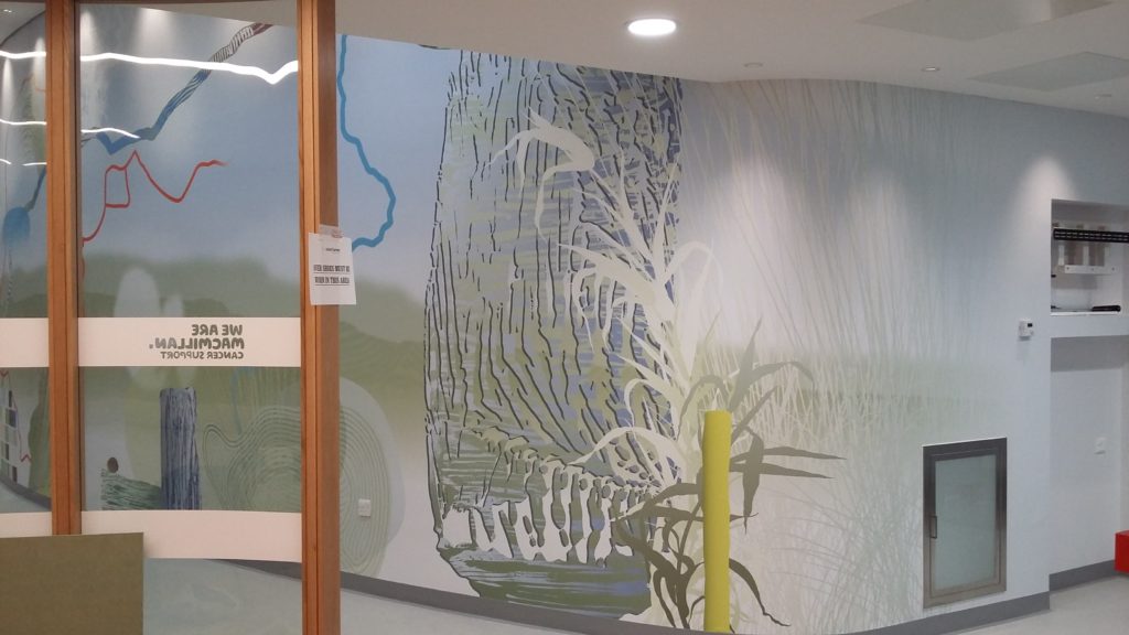
New Macmillan Unit for Tameside& Glossop Integrated Care NHS Foundation Trust
I know that this has been a rather long session of recent postings – but I am in ‘catch-up’ mode and before the new unit opens I wanted to get as much of the project documented, so bear with me if you can !
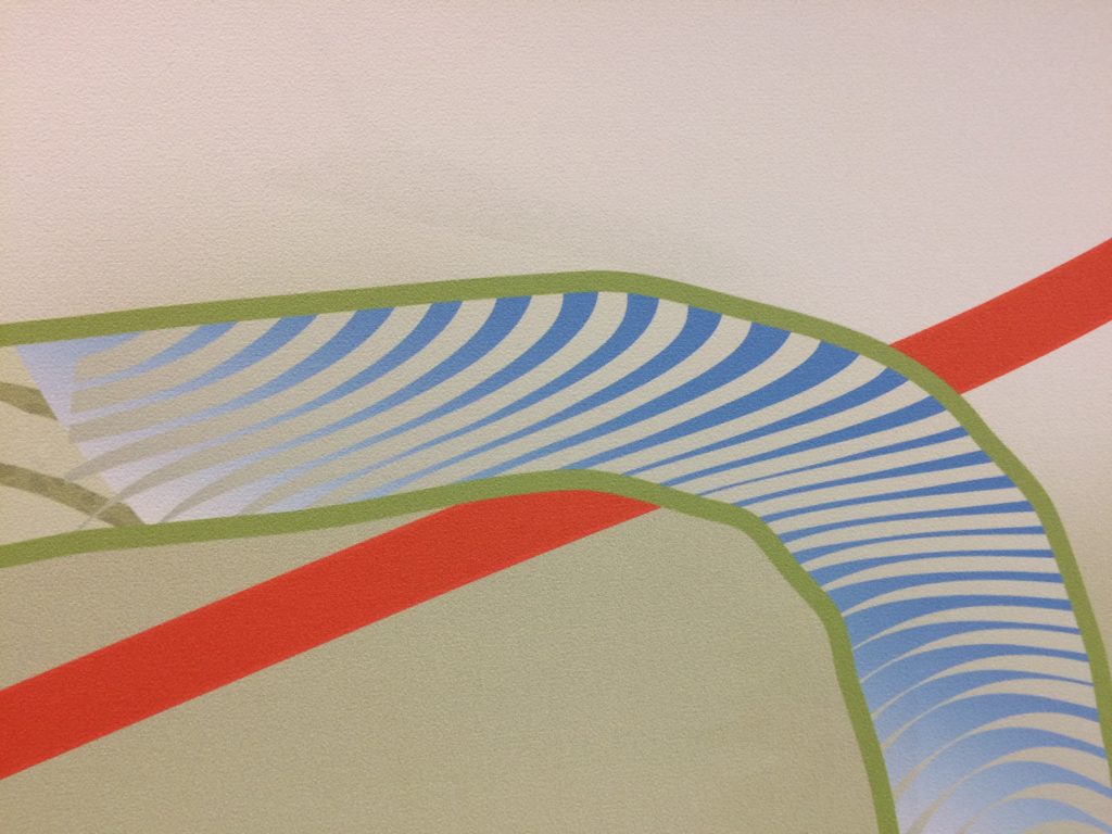
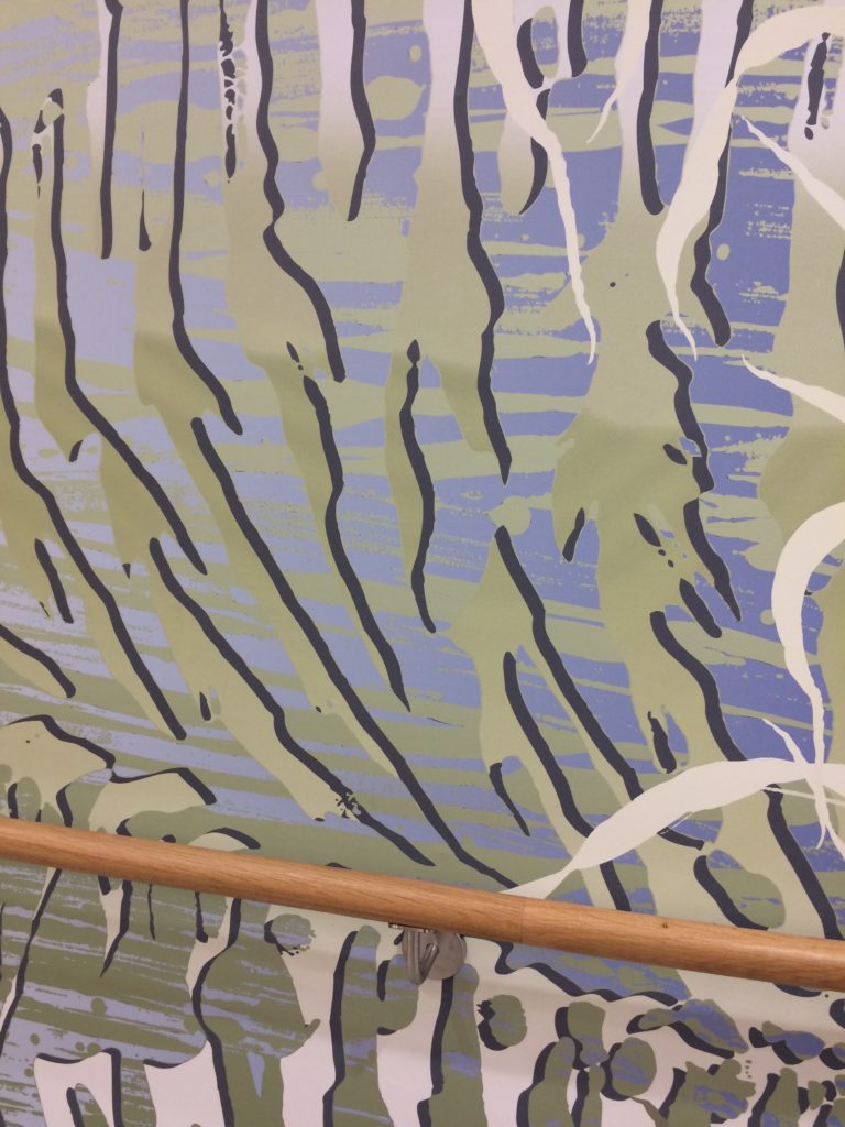
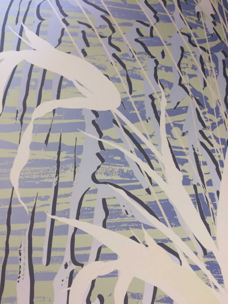
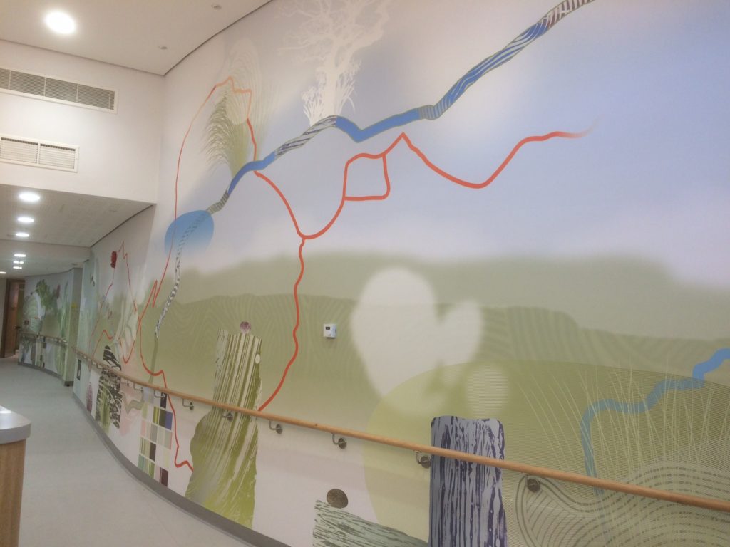
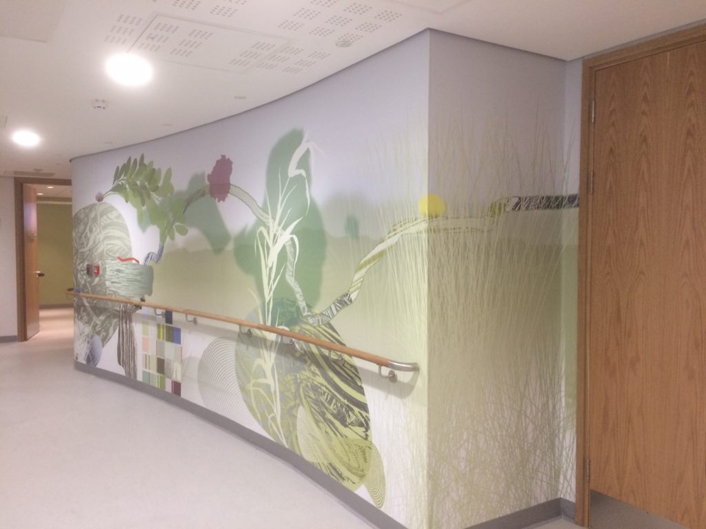
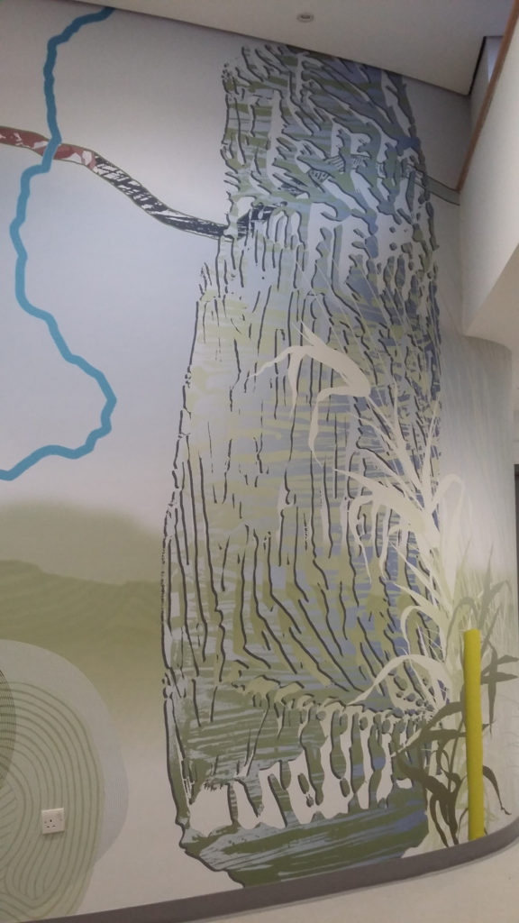
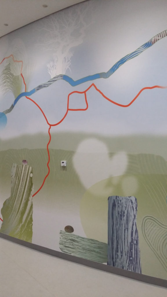
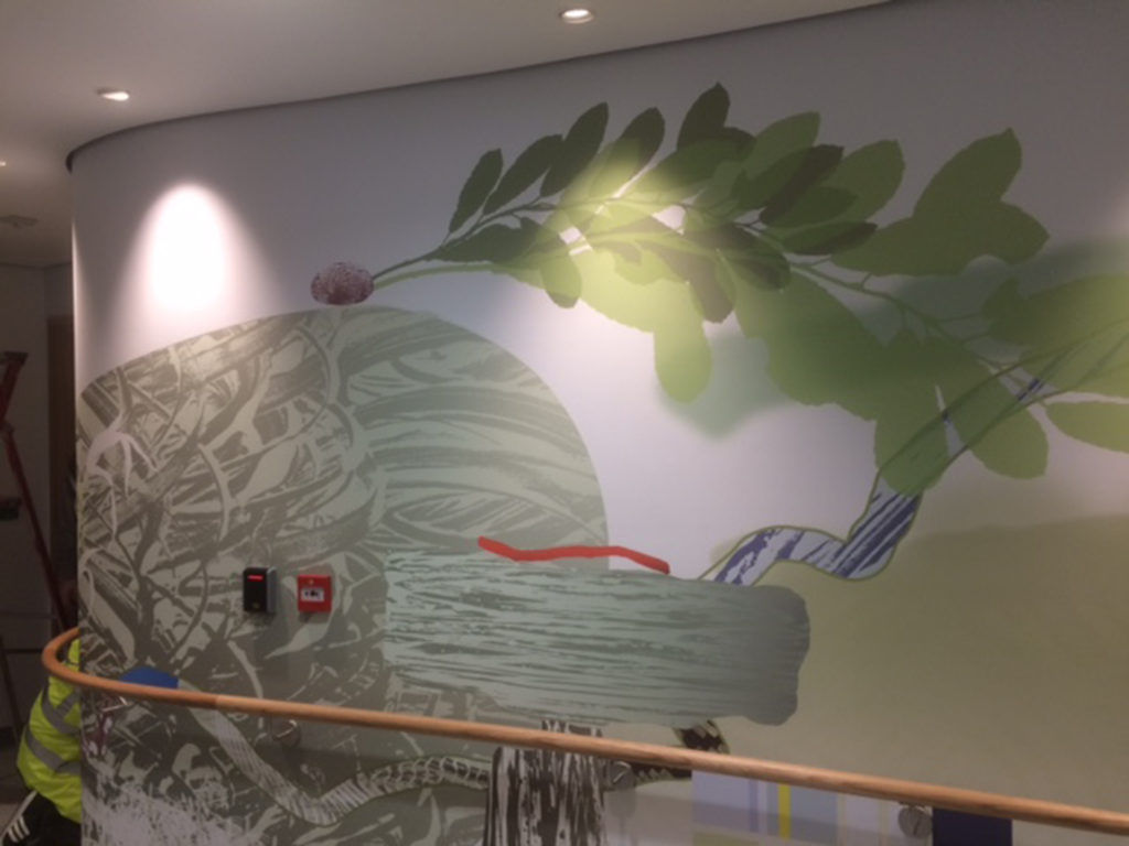
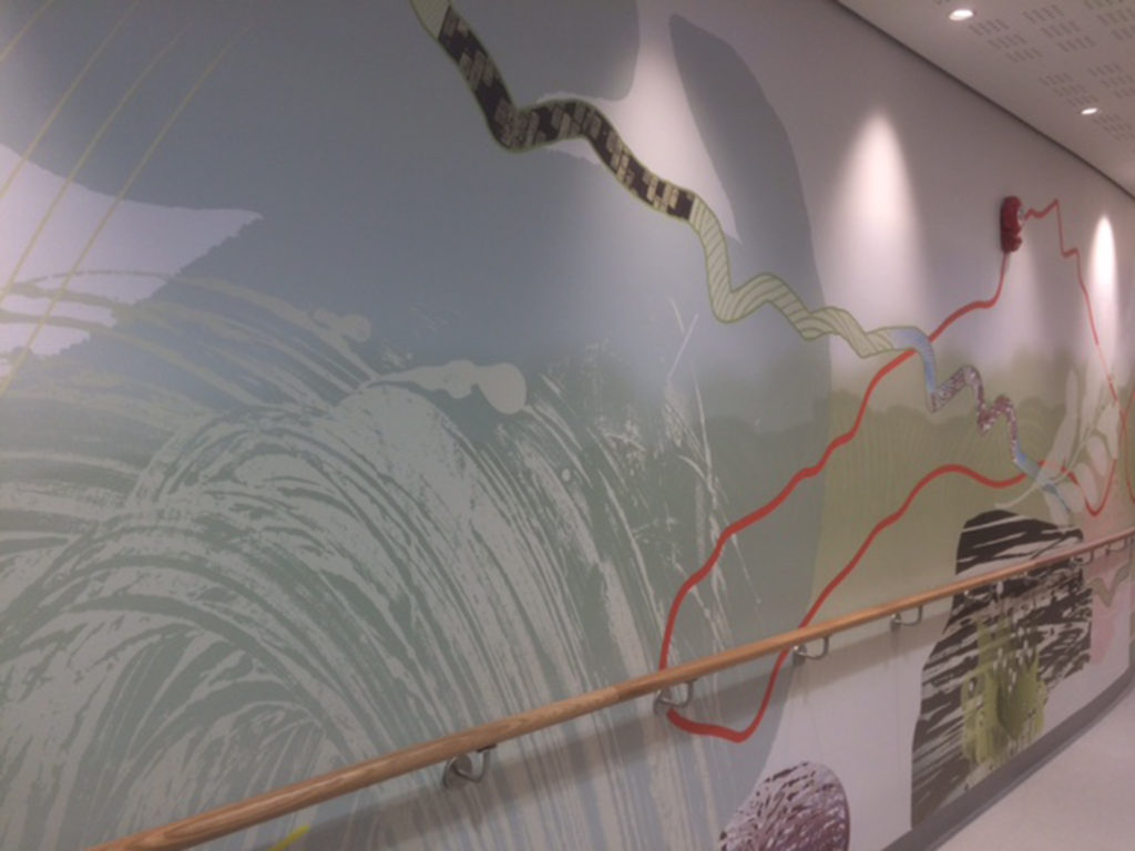
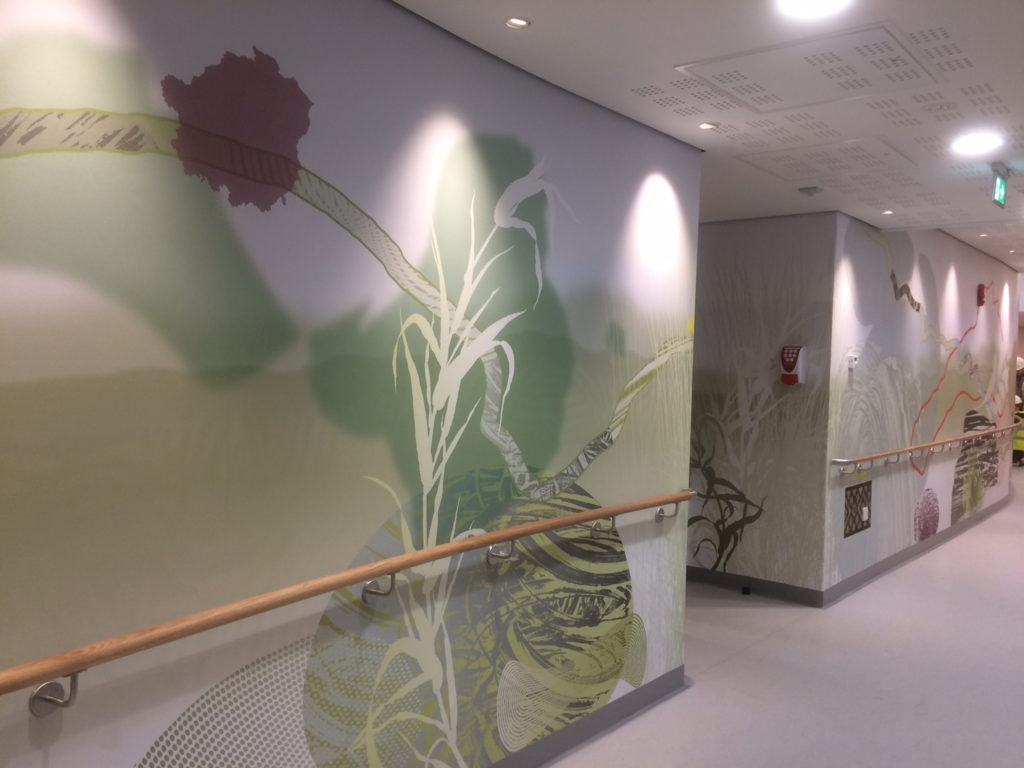
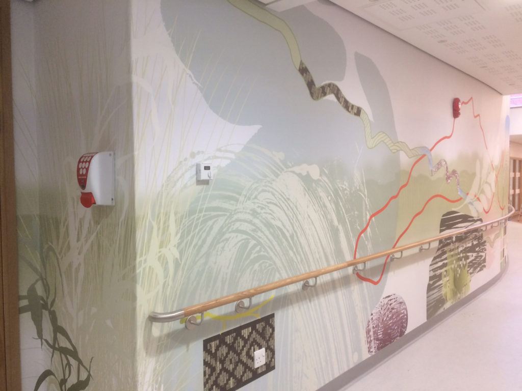
Detail: digitally printed large scale corridor Wallcovering. New Macmillan Unit. Image: Bronwen Gwillim
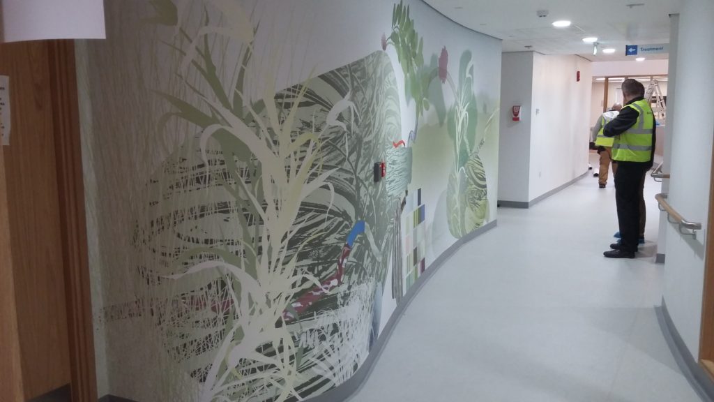
By far the most visible of the installations being delivered is the large scale bespoke ‘landscape’ running the length of the new corridor space. This artwork is not a linear narrative, so can be experienced from whatever direction you are walking in. It isn’t a conventional landscape either, with a foreground, horizon and expansive sky. It may have elements of this about it – BUT, the original walk I made with Stewart Ramsden into the Landscape of Tameside was only the beginning of a creative process and the development of a descriptive iconography which could help to tell a story about a journey.
Detail: digitally printed large scale corridor Wallcovering. New Macmillan Unit. Image: Bronwen GwillimClose up detail: digitally printed large scale corridor Wallcovering. New Macmillan Unit. Image: Bronwen Gwillim
The artwork was developed, manufactured and installed by VGL Ltd. The work is printed onto Dreamscape Suede Wallcovering which has a Poly Cotton fabric backing.
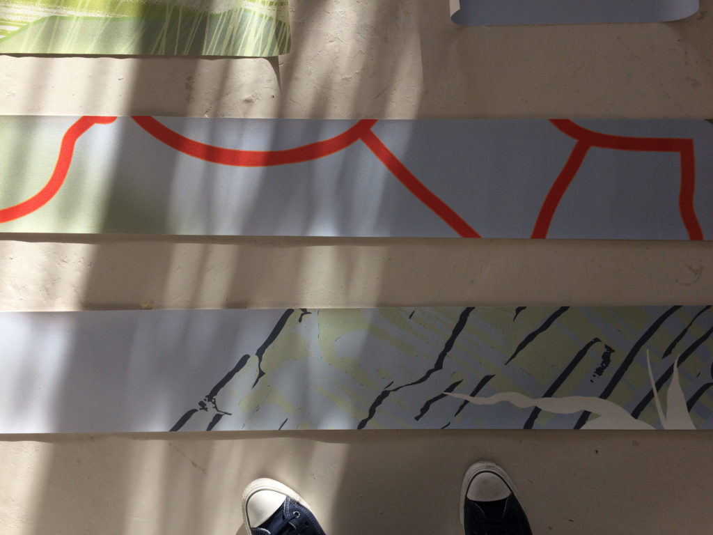
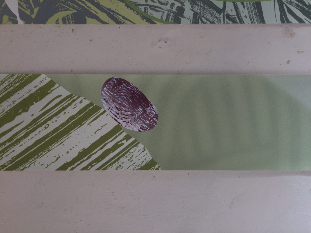
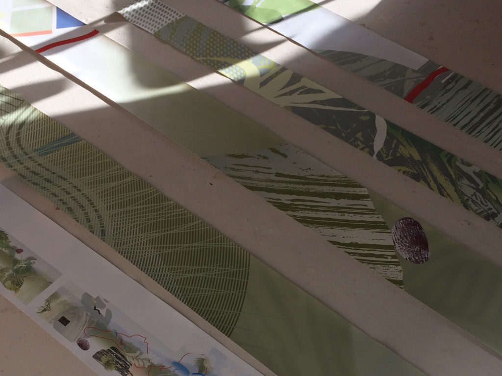
The design work was extensively sampled, with sample installations being carried out at the Hospital – as you can see from the following images. Where necessary the design was then tweaked to fit following comments before finally being approved for full printing and manufacture.
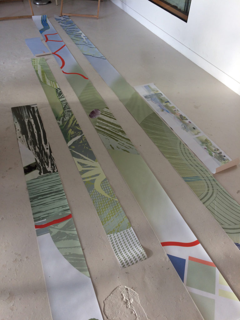
Main Corridor to the New Macmillan Unit by IBI Group Architects prior to the installation of the artworks. Image: Bronwen GwillimThe detail strips of artwork , shown here in red, were to be sample printed by VGL at full scale for discussion and approval. Image: Christopher TippingThe detail strips of artwork , shown here in red, were to be sample printed by VGL at full scale for discussion and approval. Image: Christopher TippingFull scale strip samples of the corridor wallcovering arrived at the studio for review. Image: Christopher TippingFull scale strip samples of the corridor wallcovering arrived at the studio for review. Image: Christopher TippingFull scale strip samples of the corridor wallcovering arrived at the studio for review. Image: Christopher TippingFull scale strip samples of the corridor wallcovering arrived at the studio for review. Image: Christopher Tipping
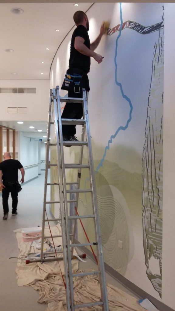
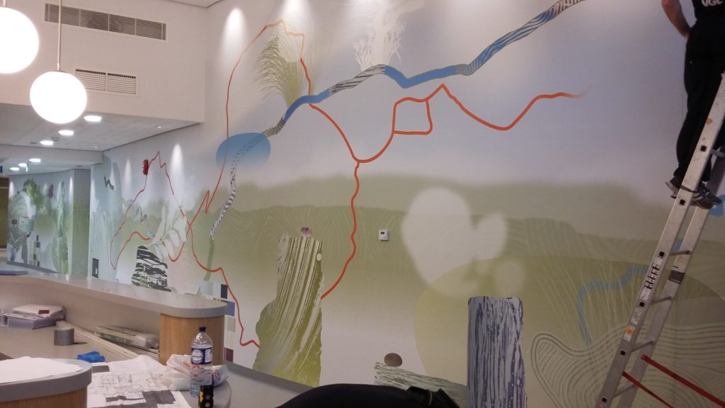
Following approval of the strip samples, a full scale print run started and was installed on site for further comment and review / approval.
Installation of the full scale corridor artwork begins on site. Image: Gareth LlewellynInstallation of the full scale corridor artwork begins on site. Image: Gareth LlewellynInstallation of the full scale corridor artwork begins on site. Image: Gareth LlewellynInstallation of the full scale corridor artwork begins on site. Image: Gareth LlewellynInstallation of the full scale corridor artwork begins on site. Image: Gareth LlewellynInstallation of the full scale corridor artwork begins on site. Image: Gareth LlewellynInstallation of the full scale corridor artwork begins on site. Image: Gareth LlewellynInstallation of the full scale corridor artwork begins on site. Image: Bronwen GwillimInstallation of the full scale corridor artwork begins on site. Image: Bronwen GwillimInstallation of the full scale corridor artwork begins on site. Image: Bronwen GwillimInstallation of the full scale corridor artwork begins on site. Image: Bronwen GwillimInstallation of the full scale corridor artwork begins on site. Image: Bronwen GwillimInstallation of the full scale corridor artwork begins on site. Image: Bronwen GwillimInstallation of the full scale corridor artwork begins on site. Image: Bronwen GwillimInstallation of the full scale corridor artwork begins on site. Image: Bronwen GwillimInstallation of the full scale corridor artwork begins on site. Image: Bronwen GwillimInstallation of the full scale corridor artwork begins on site. Image: Bronwen Gwillim
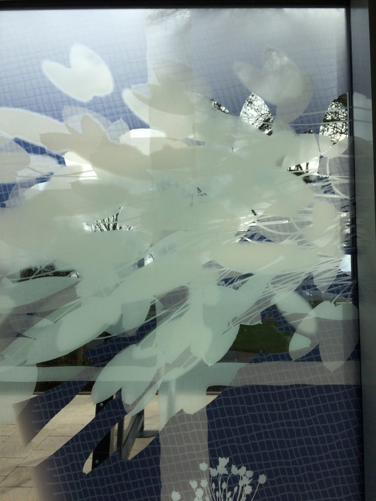
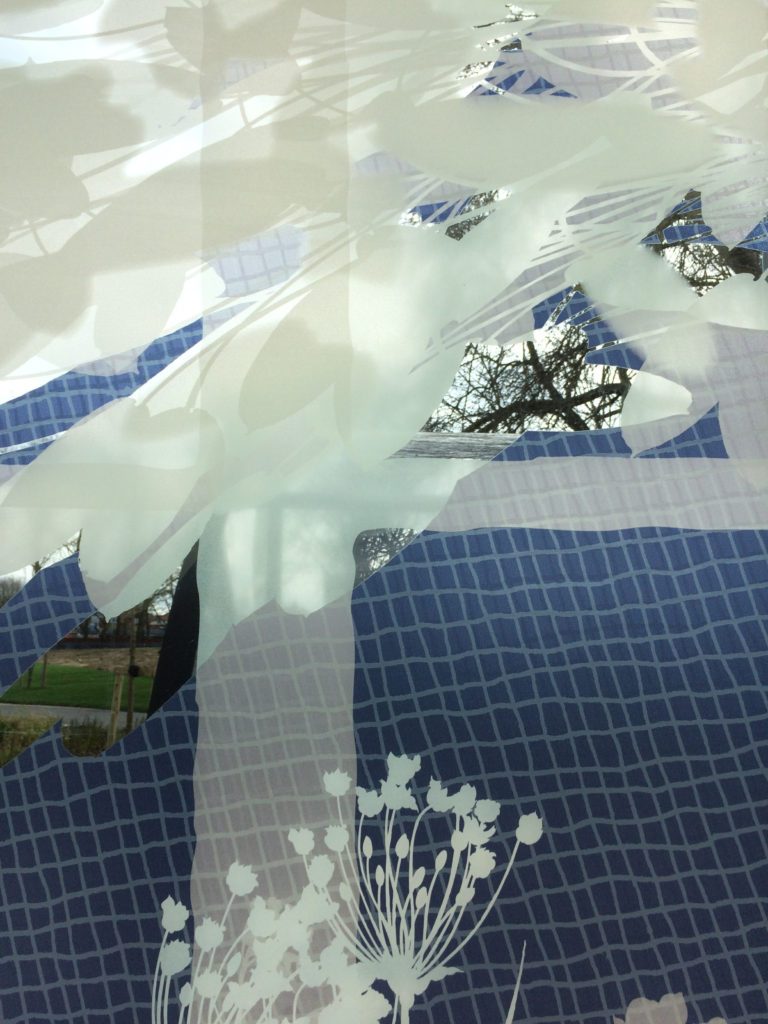
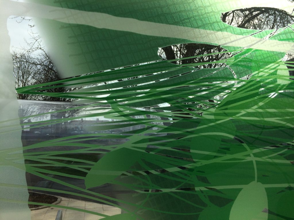
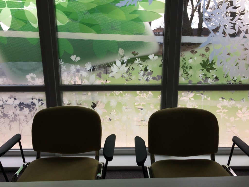
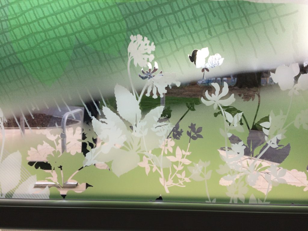
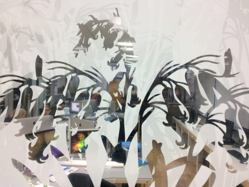
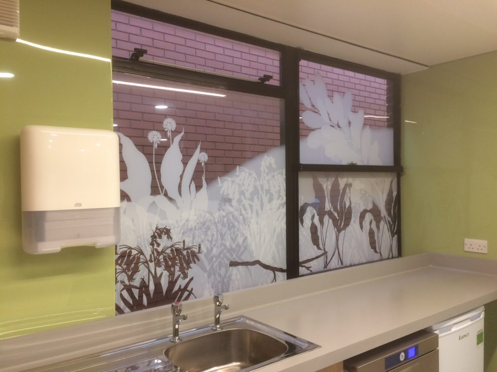
Draft studio sample proof by VGL – glazing vinyl print for review and comment – Image: Christopher TippingDraft site installation of the glazing vinyl print for review and comment – Image: Bronwen GwillimDetail: Digitally printed tonal white onto optically clear vinyl manifestations. image: Bronwen GwillimDraft install of sample proof glazing vinyl print for review and comment – Image: Bronwen Gwillim
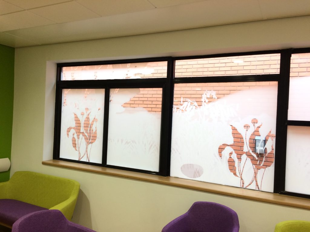
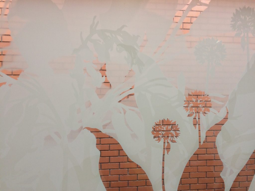
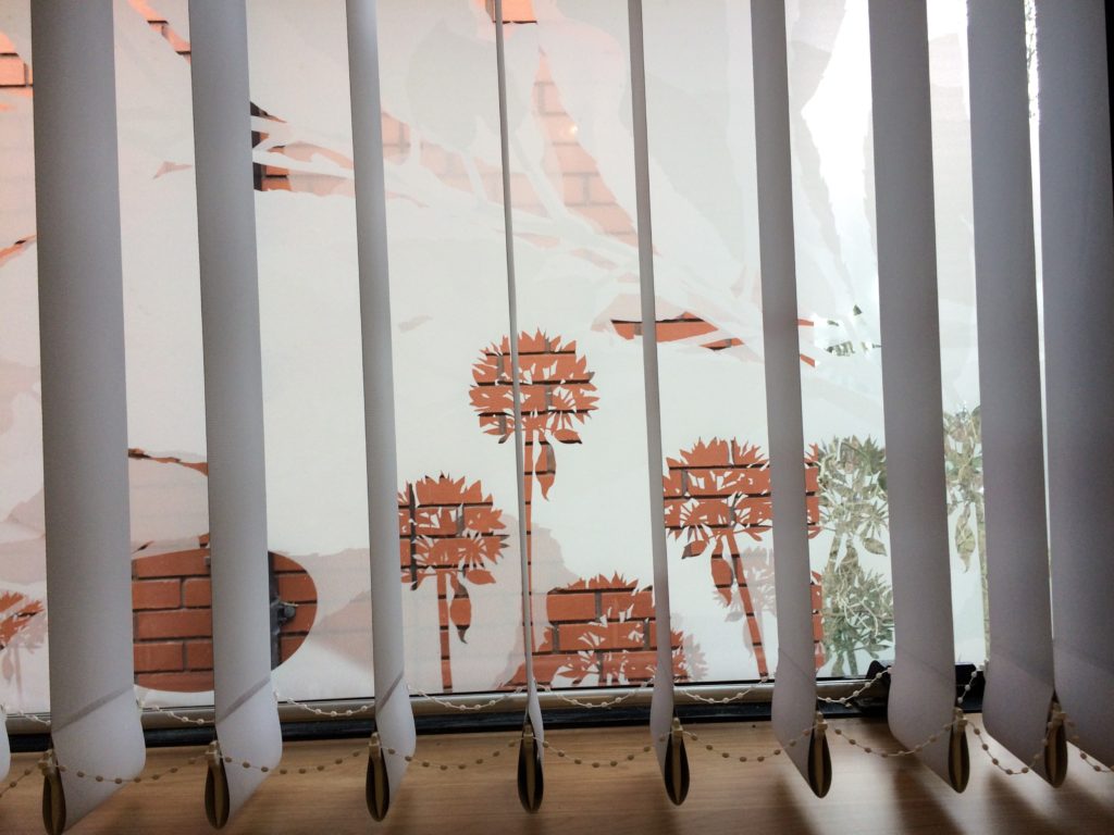
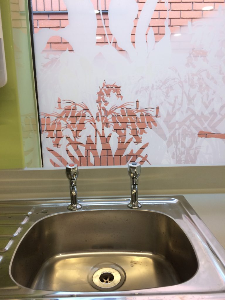
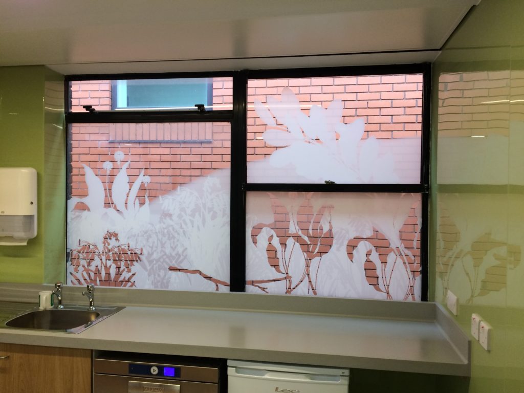
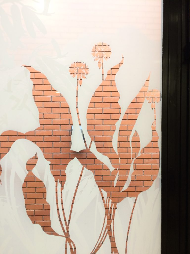
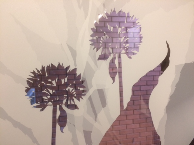
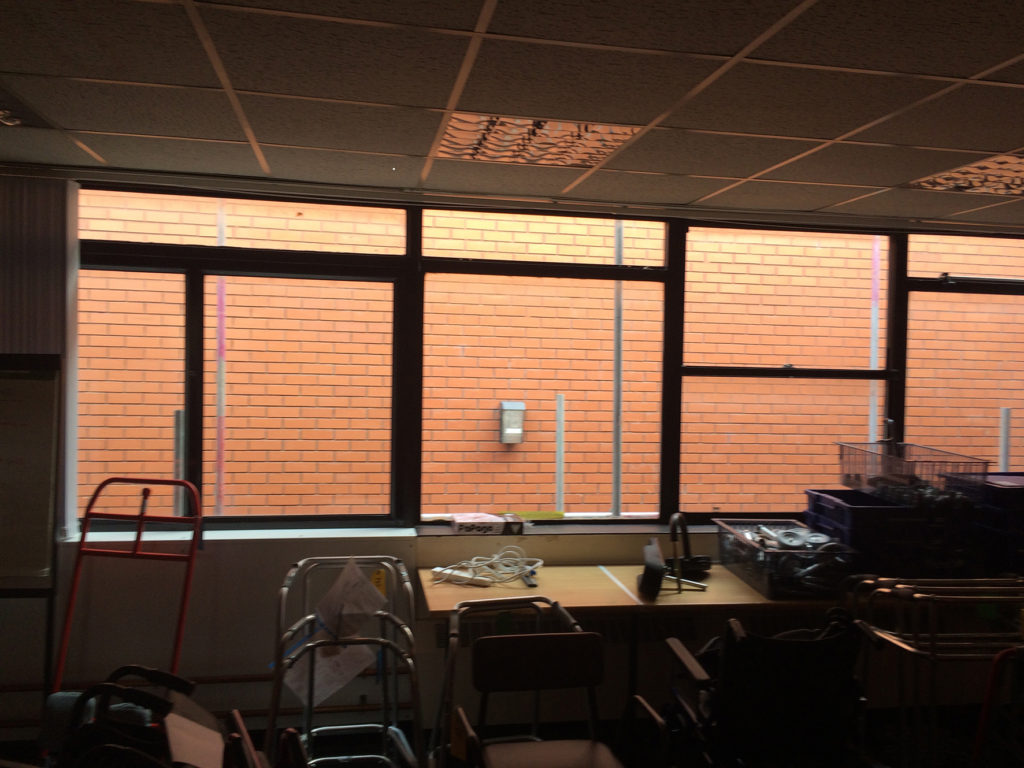
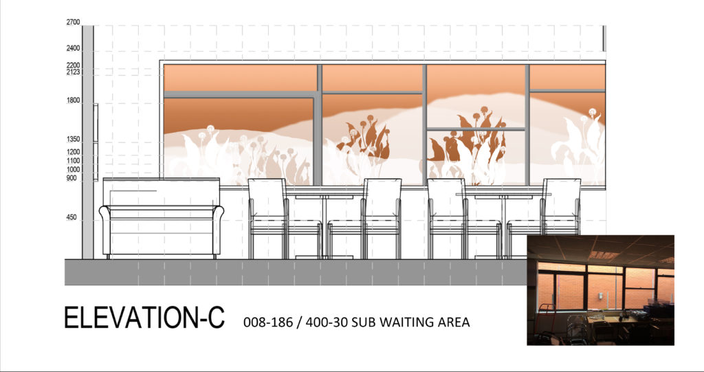
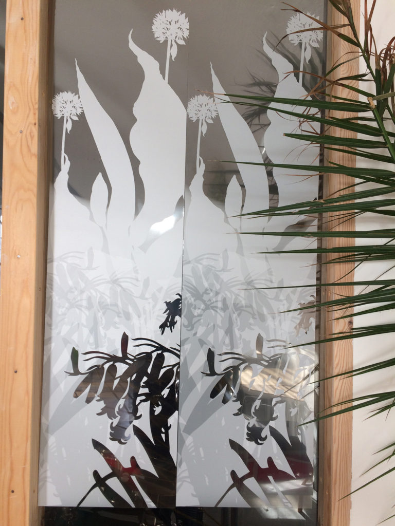
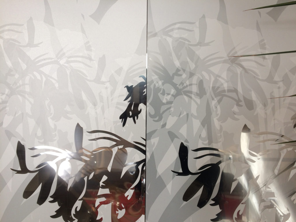
Along the main corridor within the new unit are a series of rooms for staff, service users and their families, consulting and treatment spaces. Almost all of these rooms look out onto a blank brick wall of an adjacent building about 1.5m from the windows. The artwork is digitally printed in tones of opaque and translucent white ink onto optically clear vinyl. Cut out detailing and clear unprinted areas bring the brick all, colour and texture to work with the design and integrate what could otherwise have been an unforgiving backdrop and view to those working and visiting the spaces.
We have collaborated with Vinyl Graphics Ltd– VGL – for this element of the project.
Draft install of sample proof glazing vinyl print for review and comment – Image: Bronwen GwillimDraft site installation of the glazing vinyl print for review and comment – Image: Bronwen Gwillim
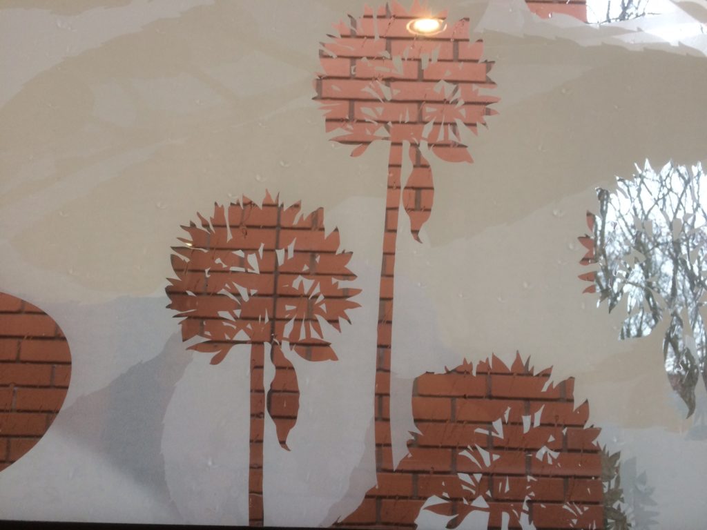
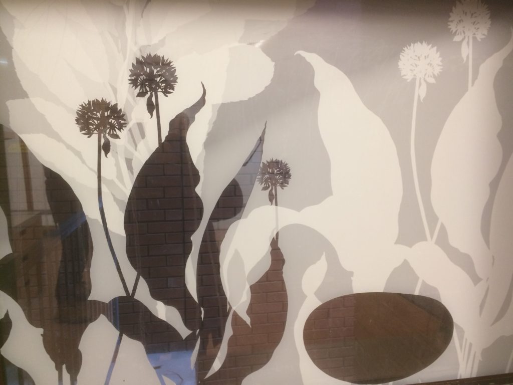
Draft production design for print-white artwork onto optically clear vinyl manifestations. Image: VGL LtdDraft site installation of the glazing vinyl print for review and comment – Image: Bronwen GwillimAdjacent brick wall elevation and backdrop to the new interior spaces – before the project started. Image: Christopher TippingSub-Waiting room design draft using the external brick backdrop as an integrated design feature. Image: Christopher TippingDraft studio sample proof glazing vinyl print for review and comment – Image: Christopher TippingDraft studio sample proof glazing vinyl print for review and comment – Image: Christopher TippingSub-Waiting room design proposal using the external brick backdrop as an integrated design feature. Image: Christopher TippingMulti-Function Room design proposal using the external brick backdrop as an integrated design feature. Image: Christopher Tipping